The British Airways emblem conveys the main ideas of perfection and high standards. It evokes a sense of flight, smooth turns, and blue skies. The notes of speed and clear schedules create a sense of confidence in a successful journey.
British Airways: Brand overview
British Airways began as Aircraft Transport and Travel Limited (AT&T), the first airline in history to launch scheduled international flights from London to Paris, in 1919. Following the emergence of numerous minor airlines in Britain, Imperial Airways, the nation’s first national airline, was formed in 1924 due to its merger.
British Airways Ltd. was formed in 1935 by merging several private British airlines. Before their nationalization and merger in 1939 to form the British Overseas Airways Corporation (BOAC), this business coexisted with Imperial Airways. During the Second World War, BOAC moved military supplies and troops. It started growing its international passenger services after the war.
British European Airways (BEA) was founded by the government in 1946 to operate on local and European routes, while BOAC focused on long-haul flights to America, Asia, and Commonwealth countries. During the 1950s and 1960s, both firms experienced fast growth and acquired jet aircraft such as the De Havilland Comet, Vickers Viscount, Boeing 707, and VC-10.
BOAC and BEA combined to form a single state-owned airline in 1972 as part of a significant restructuring. Cost savings, the removal of redundant tasks, and route network improvement were made possible by the merger. The company expanded quickly in the 1970s, adding wide-body Boeing 747 and Lockheed L-1011 TriStar aircraft to its fleet.
The brand changed from a state-run business with frequently ineffective management in the 1980s to a contemporary, customer-focused airline. Its 1987 privatization was a major turning point. Since being private, the company has updated its fleet, changed its name, and added new service classes emphasizing premium traveler experience.
The airline expanded its global reach during the 1990s. The company launched numerous new long-haul routes and purchased Airbus A320 for short-haul flights in addition to contemporary Boeing 777 and 747-400 aircraft. When the brand bought the insolvent Dan-Air in 1992, it greatly increased its presence at Gatwick Airport. The founding of the international alliance Oneworld in 1999, of which the brand was a founding member, was a significant development.
The company kept bolstering its position in the global market at the beginning of the 2000s. The airline introduced long-haul Boeing 787, Airbus A380, and A350 aircraft, extensively updating its fleet. The 2012 purchase of rival British airline BMI was a significant deal that helped the brand gain a larger market share at London’s Heathrow Airport.
The International Airlines Group (IAG) was formed in 2011 after the company and Spanish airline Iberia successfully merged. Through this merger, both airlines could still operate independently while optimizing their route networks and achieving significant synergy. Later on, IAG bought several other airlines, such as Spanish low-cost carrier Vueling and Irish airline Aer Lingus.
In 2012, the brand finished integrating BMI, which it had purchased from Lufthansa. As a result, the airline increased its number of slots at London’s Heathrow Airport and grew its network of domestic and European routes.
The brand was the first European airline to fly the Boeing 787 Dreamliner for profit in 2013. The company launched new long-haul routes and enhanced the caliber of its passenger services because of this cutting-edge, fuel-efficient aircraft.
The London City Airport affiliate BA CityFlyer got its first contemporary regional aircraft, an Embraer E190, in 2014. These aircraft provided more comfortable travel on short-haul routes and replaced the outdated turboprop Saab 2000s.
The company received its first Airbus A380 and Boeing 787-9 aircraft 2015 as part of its ongoing fleet upgrade. These aircraft enhanced performance and level of service on important long-distance routes.
The airline initiated a comprehensive refurbishing operation for its Boeing 777 cabins in 2016. All service classes had upgraded entertainment systems, in-flight internet access, and new seats. The company debuted a cutting-edge luggage tracking service called “smart tags” that same year, enabling travelers to track their bags using a smartphone app.
The brand accomplished several firsts in 2017. The largest Dreamliner variant, the Boeing 787-10, was delivered to the airline in its first instance. In addition, the company debuted an overhauled First Class cabin design for its long-haul flights.
The company placed a sizable order for new aircraft in 2018. The airline agreed to purchase 18 Airbus A350-1000, 12 Boeing 777-300ER, and 42 Boeing 777-9 aircraft. These aircraft will gradually replace the aging Boeing 747-400s to support expanding and improving the brand’s long-haul network.
The company commemorated its 100th anniversary in 2019. The airline hosted several unique events for customers and employees and released historical liveries on various planes. During the jubilee year, the arrival of the brand’s first ultra-modern Airbus A350-1000 was the main event.
Throughout the 2010s, the brand actively pursued collaborations with other airlines within IAG and the Oneworld alliance, fleet renewal, and service growth. For instance, in 2018, American Airlines and the company formed a joint venture to operate transatlantic routes, providing passengers with better flight schedule coordination and seamless connections.
Meaning and History
British Airways is known not only for its quality service but also for its famous logo. The company had many versions that presented British Airways as a leader in the travel industry. After several changes, the brand name has taken on the colors of the UK national flag and the curved line of the Speedmarque.
What is British Airways?
It is the UK’s national carrier and one of the largest airline companies in Europe. It is part of International Airlines.
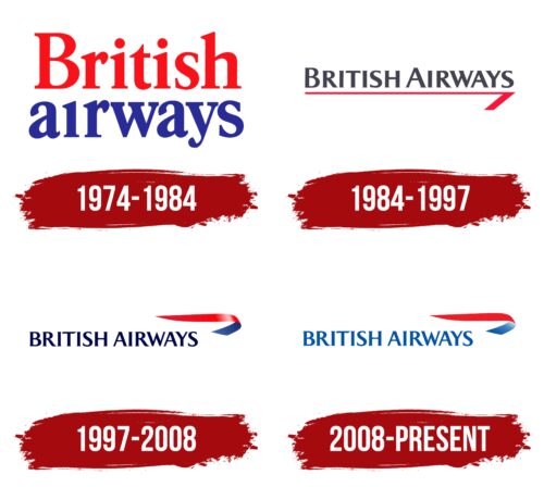
1974 – 1984
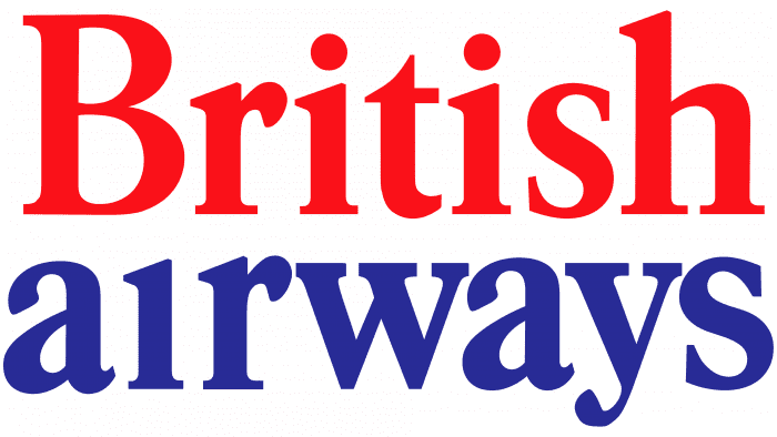
BEA and BOAC already had their branding ideas, so the designers tried to combine them. Negus & Negus compromised and created a simple two-color emblem. It was a red and blue British Airways name divided into two lines.
Above the letter “i” in the word “airways,” there was no dot, which characterized the company not from the best side. There was also a lack of dynamism in the image, which should have supported the airline’s image. This poor image reflected the problems of the industry: inefficient management practices and, as a result, customer dissatisfaction.
1984 – 1997
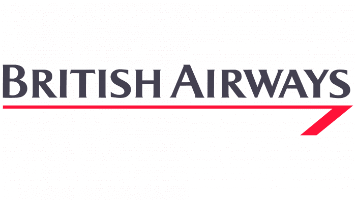
The second version of the logo appeared in 1984. It was designed by the American firm Landor Associates, which caused a mixed reaction in British society due to the unspoken ban on cooperation with foreign design agencies. The airline’s name was written in one line in capital dark gray letters. At the same time, the first “B” and “A” were slightly higher.
Below the inscription appeared a long red line curved like an arrow. It seemed to emphasize the British’s pedantry and disdainful superiority. The new logo was supposed to reflect BA’s corporate culture and confirm the company’s supremacy.
1997 – 2008
This logo is the result of a collaboration with Newell & Sorrell. Representatives of the design agency helped British Airways to get rid of its “stuffy” British image, which prevented the company from achieving international recognition in the eyes of its customers. The final version of the emblem was unveiled on June 10.
On the right was an elegant ribbon called the Speedmarque. It symbolized speed, movement, and innovation, which became the key values of the airline. This symbol was used on the fuselage of airplanes, company uniforms, boarding passes, and other places associated with the British Airways brand. The ribbon was divided into two colors:
- red – symbolizing strength, dynamism, and energy;
- and blue – reflecting quality, reliability, and professionalism.
The airline borrowed these colors from its predecessors, BOAC and BEA. The designers added a gradient to make the logo look bright and modern. The inscription “BRITISH AIRWAYS” on the left side was also dark blue but without a transition of shades. Thanks to a floating serif font called Mylius, it looked original.
2008 – today
In 1997, branding agency Newell & Sorrell developed a new corporate identity for British Airways because the old one was “too British.” Thus, the airline decided to show its globalization by emphasizing international air travel. The internationalism of the nineties was embodied in a red and blue symbol, similar to a waving scarf. Below, aligned on the left edge, the company’s name was written in blue capital letters of equal size.
British Airways: Interesting Facts
British Airways (BA), the UK’s flagship airline, has made significant contributions to aviation history.
- How It Started: 1974 British Airways was created by merging British Overseas Airways Corporation and British European Airways, streamlining the UK’s air services.
- Innovative Comfort: BA was the first to offer fully flat beds in business class in 2000, setting a new comfort standard for air travel.
- Concorde Flights: BA and Air France flew the Concorde from 1976 to 2003, cutting transatlantic flight times in half.
- Global Reach: It flies to over 160 places worldwide, making it one of the biggest international airlines.
- Billion-Dollar Route: BA was the first to earn over $1 billion a year from the London to New York route.
- Eco-Friendly Goals: Committed to environmental sustainability, BA aims to achieve net-zero carbon emissions by 2050 and invests in sustainable fuel.
- Tailfin Art Debate: In the late ’90s, BA’s move to replace its Union Flag tailfin design with global art sparked controversy. Later, BA returned to a traditional look.
- Wine Selection: BA buys more wine than any other airline and boasts the largest airborne commercial wine cellar.
- Royal Service: The airline has long served the British Royal Family and government, even offering a Royal Flight service for state visits.
- Tech Innovations: BA leads in using technology to improve travel, like electronic boarding passes and biometric data for faster airport processing.
- Record Flight: In February 2020, a BA flight from New York to London set a record for the fastest subsonic crossing, thanks to strong jet streams, in under 5 hours.
These points show British Airways as a leader in the airline industry, known for its service quality, commitment to the environment, and pushing aviation forward.
Font and Colors
The graphic element of the British Airways logo is known as the Speedmarque. This distinctive sign is associated with friendliness, flexibility, and speed, which cannot be said about the “rigid” arrow of 1984-1997. The predecessor of the red and blue ribbon is the Speedbird, a similar symbol of Imperial Airways, which became part of the British Overseas Airways Corporation. It was designed by They’re Lee-Elliott in 1932 and first appeared on the nose of the DH.91 Albatross wooden transport plane. The Speedbird was then inherited by BOAC (as an emblem) and British Airways (as the basis for the Speedmarque).
The logo uses a typeface created specifically for the airline. It is one of the modifications of Mylius Modern, a variant with tiny serifs and small bulges at the ends of the letters. It was chosen for its readability, clarity, and elegance.
The color scheme is in line with the company’s corporate palette. The combination of blue, white, and red symbolizes British Airways’ exceptional British heritage, as these colors resemble the national flag. Shades used: Signal Red P485 and Blue P286.
FAQ
What font does British Airways use?
The company uses Mylius Modern as its main font. This font is used everywhere, including airport signage, company websites, and printed materials. Mylius Modern is a font for large headings and plain text that maintains a consistent and easily recognizable company look.
The use of Mylius Modern matches the clean, modern style the airline wants. It is easy to read and looks professional, making the company look modern and reliable. By using the same font everywhere, she ensures that their messages look the same no matter where you see them. This helps them show that they care about quality and their customers.
What is the British Airways airline code?
The company uses several codes to identify itself in the airline industry. The IATA designation “BA” is the most commonly used code. IATA, the International Air Transport Association, assigns these two-letter codes to simplify ticket processing, scheduling, and communications.
The airline has an ICAO code of “BAW”. These three-letter codes, assigned by the International Civil Aviation Organization, are primarily used for air traffic control and airline operations. In addition, the airline has a domestic code 125, which is used for ticketing and routing. These codes play a vital role in the company’s operations and logistics, helping to manage and coordinate flights and services worldwide.
What is the British Airways logo?
In 1997, the company changed its logo as part of a major rebranding effort. It introduced a new design called “Speedmarque,” which replaced the traditional “Speedbird” symbol that had been in use since 1974. The new logo retains some old design elements but has been updated to look more modern and streamlined. This change aimed to update the company’s image to make it more consistent with its innovative values and global presence. The updated logo marked a new era, helping it stand out in the competitive international aviation market and remain relevant to customers worldwide.
When did British Airways change its logo?
It is a leading global airline with a wide range of services. It mainly carries passengers and operates domestic and international flights. The company connects many cities worldwide, including key destinations for business and tourism, and offers various levels of service, from economy to first class.
It transports goods, which is vital for international trade. It uses specialized cargo and passenger aircraft to move goods safely and efficiently. It operates mail delivery services, ensuring letters and parcels are sent quickly and securely across its extensive network. This service supports international communication and business by reliably delivering important goods worldwide.
What do British Airways do?
British Airways is a leading global airline with a wide range of services. It mainly transports passengers and operates flights within countries and internationally. The airline connects many cities worldwide, including key destinations for both business and tourism, and offers different levels of service, from economy to first-class.
The airline transports cargo, which is vital for international trade. It uses specialized cargo planes and passenger aircraft to move goods safely and efficiently. Additionally, British Airways handles mail delivery, ensuring that letters and packages are sent quickly and securely across its extensive network. This service supports international communication and business by reliably delivering important items globally.
What is British Airways’ slogan?
The company uses the slogan “The World’s Favorite Airline” in marketing. This slogan aims to convey the trust and preference of travelers worldwide, showing that the airline is the first choice internationally. The main focus is on becoming known for its extensive network, quality of service, and customer satisfaction. This slogan positions the company as a leader in the competitive airline industry, attracting a wide range of international travelers.
