The Iberia logo represents quality, stability, and safety, key attributes of the Spanish carrier. The modern, minimalistic text block combined with a small icon in a bright color palette enhances focus and recognition.
Iberia: Brand overview
Iberia, officially known as Iberia Líneas Aéreas de España, began its aviation journey in 1927. Horacio Echevarrieta founded the company on June 28 of that year, naming it Iberia, Compañía Aérea de Transportes. The airline’s first commercial flight took off on December 14, 1927, linking Madrid and Barcelona, marking the start of its service.
By 1928, the airline expanded internationally, establishing a route between Madrid and Lisbon. The Spanish Civil War from 1936 to 1939 interrupted operations, but by 1940, the company had been nationalized, becoming the state airline of Spain. A landmark achievement occurred in 1946 when it initiated regular flights to South America, with the Madrid to Buenos Aires route.
The 1950s and 1960s were decades of significant growth. In 1954, it began flights to New York, and in 1960, it introduced its first jet aircraft, the Douglas DC-8. By 1974, the Boeing 747 joined the fleet, enhancing capacity for long-haul routes.
During the 1980s, the airline expanded its European and international network, transporting 10 million passengers in 1987. In 1991, it introduced its frequent flyer program, Iberia Plus. Joining forces with American Airlines, British Airways, Cathay Pacific, and Qantas, the company became a founding member of the Oneworld Alliance in 1999.
A significant change occurred in 2001 when it underwent partial privatization and began trading its shares on the stock exchange. The 2009 merger with British Airways resulted in the International Airlines Group (IAG) creation in 2011.
Entering the low-cost market, the company established Iberia Express in 2012. The period from 2013 to 2014 was transformative, featuring comprehensive restructuring efforts that included fleet renewal, route optimization, and cost reductions.
2016, the airline introduced a refreshed brand identity and new aircraft livery, symbolizing its modernization efforts. The fleet welcomed its first Airbus A350 in 2018, representing another leap forward.
The brand has been a key player in developing air travel between Europe and Latin America. Today, it remains a leading airline in Spain, serving numerous global destinations and playing a crucial role within the IAG group.
Meaning and History
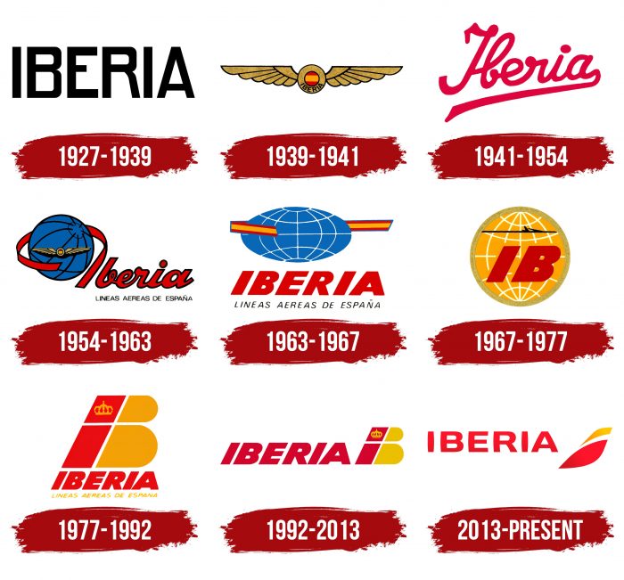
The company’s debut logo was very concise. But over a long period, it often changed, sometimes acquiring a radically different appearance.
What is Iberia?
Iberia is the largest and oldest Spanish airline, recognized as one of the safest in the world. It was founded in 1927 and, since 2010, has been part of the Irish-British-Spanish holding International Consolidated Airlines Group. The airline offers domestic and international flights to dozens of countries worldwide, using modern technologies to enhance service quality, such as providing electronic boarding passes and Internet access during flights.
1927 – 1939
In the initial period of operation, the primary focus was on good readability. That’s why the first brand name was minimalist: it contained only the word “Iberia,” written in black capital letters.
1939 – 1941
The company began using a winged symbol, directly reflecting its line of business.
1941 – 1954
Designers again changed the logo. The inscription was made in red lowercase letters, and the font resembles handwriting.
1954 – 1963
This year began the era of the globe in the corporate style. It is located to the right of the word “Iberia.”
1963 – 1967
After the redesign, the logo received a large uppercase font, a slightly flattened globe, and a ribbon.
1967 – 1977
In 1967, an abbreviated version of the airline’s name – “IB” – appeared against a yellow globe.
1977 – 1992
The developers removed the globe, enlarged the “IB” symbols, and placed the “Iberia” decryption below them.
1992 – 2013
During this period, word and graphic designations swapped places: the full name became the main element in the design, and the abbreviated version was moved to the end.
2013 – today
The modern emblem is minimalist: the word “Iberia” is written in a simple, thin font, and the “IB” sign is depicted as leaves.
Iberia: Interesting Facts
Iberia is Spain’s main airline, and it has been flying people around since 1927. It’s important for flights between Europe and Latin America.
- How It Started: Horacio Echeberrieta started Iberia on June 28, 1927. The first flight was from Madrid to Barcelona, a big deal in Spain.
- Early Flights to South America: Iberia was among the first to fly from Europe to South America. In 1946, they started flying to Buenos Aires in Argentina, making traveling between the two places much quicker.
- First in Central America: By 1974, Iberia was the first European airline to fly to Central America, which helped it become popular in Latin America.
- Jet Planes: 1964 Iberia adopted new, faster jet planes for long flights. This made flying across the ocean faster and nicer for passengers.
- Joining Forces with Other Airlines: In 1999, Iberia helped start the Oneworld alliance, a group of airlines working together to make flying smoother for everyone. This helped passengers connect to more places easily.
- Teaming Up with British Airways: In 2011, Iberia and British Airways merged to create a bigger airline group called IAG. This helped Iberia get stronger and fly to more places.
- Using New Technology: Iberia also uses cool tech to make flying easier, like facial recognition for boarding and a handy mobile app for travelers.
- Promoting Spain: Besides flying, Iberia also helps share Spanish culture and attract tourists to Spain through its flights and how it presents itself.
Iberia has come a long way from its first flight in Spain to being a big name in global air travel. It’s all about moving forward, making flying better for passengers, and sharing what’s great about Spain with the world.
Font and Colors
The development of individual symbolism began with a simple version and took a long journey, eventually settling again on simplicity. Indeed, after several stages with complex design, the choice fell again to a minimalist logo. Leaving behind the globe with parallels and meridians, ribbons, aviation signs, wide letters, and geometric shapes, the company leaders chose a textual version with a small icon. Interbrand develops the corporate style and logo. The emblem consists of two leaf-like strokes formed from the letter “B,” now positioned to the right of the word “Iberia.”
The custom font of the logo is based on a sans-serif typeface with serifs. The letters are convex, more precisely – curved to the sides, as seen in the example of the letter “I,” which has a barrel-shaped form. The color palette is based on a gradient transition from dark to light. It consists of several shades of red and yellow.

