


![]() Qatar Airways Logo PNG
Qatar Airways Logo PNG
The Qatar Airways logo, featuring the oryx, conveys the airline’s character: confidence and speed. The oryx is considered a symbol of Qatar, and its image emphasizes the brand’s connection to the country and its spirit, representing strength and endurance.
Qatar Airways was established on November 22, 1993, under the Qatari royal family as a small regional carrier serving routes across the Gulf. Operations began on January 20, 1994, with a flight from Doha to Amman on a leased Boeing 767-200ER, and the fleet grew to two aircraft.
In 1997, under Hamad bin Khalifa Al Thani, the airline underwent restructuring aimed at global expansion. Akbar Al Baker was appointed CEO, marking a shift in scale and direction. Between 2000 and 2005, the network expanded across Europe, Asia, and Africa, supported by new Airbus and Boeing aircraft.
In 2003, Qatar Airways launched its first long-haul route to London. By 2007, operations moved to the new Doha International Airport, increasing capacity. In 2011, the airline reached its 100th destination, reflecting rapid network growth.
In 2012, it announced plans to join Oneworld, becoming the first major Gulf carrier in a global alliance, and formally joined on October 30, 2014. The introduction of the Airbus A380 in 2013 expanded long-haul capabilities.
In 2015, the airline launched the longest non-stop commercial flight between Doha and Auckland. The 2017 regional blockade disrupted operations, forcing route adjustments and expansion into new markets.
In 2018, Qatar Airways acquired stakes in Cathay Pacific and Air Italy. In 2019, it added Airbus A350-1000 and Boeing 787-9 aircraft while opening new routes. In 2020, the airline adjusted operations amid global aviation disruptions while maintaining international connectivity.
Meaning and History
![]()
The airline’s full name is Qatar Airways Company Q.C.S.C. From the beginning, it chose the Arabian oryx, the State of Qatar’s symbol, as its emblem. It embodies high speed, fitting the concept perfectly. This well-protected animal is cared for throughout the country and by the airline. Over its existence, the company has had three logos.
The color that dominates the emblem’s design does not match Qatar’s national flag, but it is very close. The emblem’s design is unique due to the choice of the animal and the way the oryx is depicted.
What is Qatar Airways?
It is Qatar’s flagship carrier, based in Doha, known for its luxury service and innovative approach to air travel. It operates one of the most modern fleets in the world, including the Airbus A350 and the Boeing 787 Dreamliner, and serves an extensive global network of routes. The company is renowned for its first-class Qsuite, offering private cabins with full beds and the option to convert them into a four-person space for group travel. It stands out for its Privilege Club loyalty program, exclusive benefits, and sponsorship of leading sports teams and events.
1993 – 1997
![]()
The first Qatar Airways logo draws attention with the image of an oryx, an animal that has become a symbol of Qatar. It is the head of the antelope, with its long, slightly curved horns, placed at the center of the emblem, linking the brand to the country’s culture and traditions.
The composition is based on a maroon circle. The color was deliberately chosen to reflect Qatar’s national flag. The oryx’s silhouette, shown in profile, intersects the circular outline, breaking the symmetry.
1997 – 2006
![]()
After the update, the Qatar Airways logo became brighter and placed additional emphasis on Qatar’s national identity. The center features an enlarged image of an oryx, placed within an original circle of gray lines. The oryx faces left, and the figure is rendered in maroon with a small white patch in the area of the animal’s muzzle.
The circular background for the head symbol consists of horizontal stripes separated by gaps, evoking a light breeze and emphasizing the figure’s sense of motion.
The airline name is displayed below the symbol in two writing systems. On the left is the English brand name; on the right, the Arabic version. Both texts are set on a single line.
The Latin version reads QATAR AIRWAYS, with the first word in maroon and the second in gray. The typeface is simple in form, reminiscent of Neo Sans or Gotham, with uppercase letters.
The Arabic inscription on the right is rendered in maroon. The stroke weight of the letters harmonizes with the Latin text.
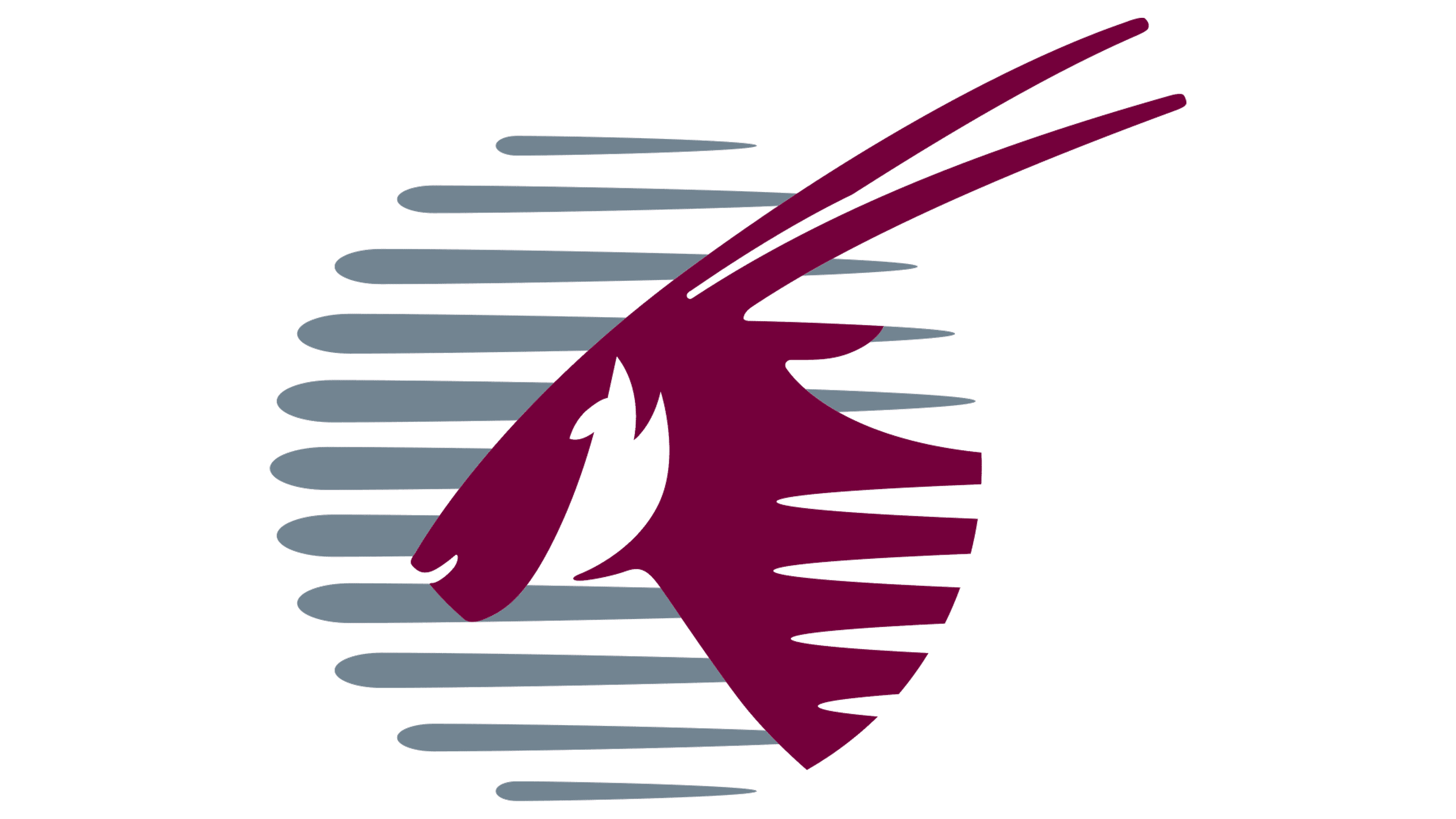
2006 – today
![]()
In 2006, Qatar Airways appeared with an updated emblem. It was unveiled ahead of the Asian Games in Doha, an important event for Qatar. At the same time, a new format for marking aircraft was defined. The enlarged oryx took its place on aircraft tails, becoming the company’s distinctive symbol in the sky.
Changes to the logo affected the placement and scale of the elements. The word QATAR was enlarged and set in uppercase, in a dark maroon. Beneath it, a more restrained AIRWAYS appears in the familiar calm gray, set in a simple, neat sans serif typeface. The Arabic text positioned to the right of the English name retained its previous style and maroon color.
The oryx symbol itself was shifted to the right of the text group. Its image did not change. The animal’s head is shown in profile, facing left, with long, straight horns that slightly diverge and extend upward. The figure’s background is a gray circle with horizontal stripes of varying lengths and softly rounded edges, evoking a gentle gust of wind.
The color palette consists of dark cherry maroon, gray, and white, used as an accent. Their combination emphasizes the connection to Qatar’s national identity. The Optima typeface was used, whose proportions added both elegance and restraint to the lettering. Since its launch, the emblem has not undergone major changes. Only in 2010 was the oryx image reduced in size to make it easier to place on aircraft.
Font and Colors
From the beginning, the Arabian Oryx was branded as Qatar’s main airline. It perfectly embodies speed, being one of the record holders in the running. The animal is depicted only in part; the logo shows the head, part of the neck, and long, sharp horns. Their outlines are repeated horizontally, forming a circle. These strokes also represent broken air currents rushing forward. On the right, they are thin, and on the left, they are wide, most reminiscent of air jets.
In front of the oryx are two rows of words: “Qatar” at the top and the airline’s status in English and Arabic at the bottom. However, a single-line logo is used on the aircraft’s side. It’s located along the front portholes. An antelope is depicted on the tail.
The authors chose an elegant sans-serif font created by the famous German typographer Hermann Zapf for the logo inscriptions. In particular, the font Optima Demi Bold harmonizes with the straight, long horns of the Arabian oryx, balancing them. In 2015, Jotia, designed by Rebecca Hurst, was selected as the corporate font. The emblem’s palette consists of dark purple and metallic gray. They are visible against a white background.