The Boeing logo is an example of energy and development. The emblem indicates technologies ahead of their time, creating products that can launch into orbit and go around the globe. Transmits the striving upward to the cosmic expanses.
Boeing: Brand overview
William Boeing established the company on July 15, 1916, as Pacific Aero Products Co. in Seattle, Washington. Boeing, a prosperous lumber dealer, developed an interest in aviation during his 1915 visit to an air display in Los Angeles. Not long after his founding, the business was renamed Boeing Airplane Company.
The B&W Seaplane, which took flight for the first time on June 15, 1916, was the first airplane that the company manufactured. The company’s ability to quickly grow and establish itself in the market was made possible by its production of training planes for the U.S. Navy during World War I.
In the 1920s, the company concentrated on creating mail and military aircraft. The Boeing Model 40A, employed for postal service between Chicago and San Francisco, became the company’s first commercially successful aircraft. When the company bought Pacific Air Transport in 1928, it became involved in passenger aviation.
The brand kept growing its civil aviation presence throughout the 1930s. The Boeing 247 emerged as the pioneer of modern commercial aviation, capable of transporting up to ten passengers over extended distances. Nonetheless, the Boeing 314 Clipper—the biggest flying boat ever—saw the most success when Pan American World Airways began using it for transatlantic travel.
The company experienced growth during World War II. The business constructed numerous military aircraft, such as the B-17 Flying Fortress and B-29 Superfortress bombers, crucial to Allied air campaigns. The brand hired nearly 100,000 people throughout the war years, up from 10,000 at the beginning.
The company carried on developing commercial aircraft after the war. In the 1950s, it revolutionized the air transport sector by introducing the first successful jet airliner, the Boeing 707. Subsequently, there was the Boeing 720, the renowned Boeing 747, the first long-haul wide-body airplane in the world, and the “Jumbo Jet.”
The brand solidified its position in the aerospace sector during the 1960s and 1970s. The business built the Saturn V rocket’s first stage as part of NASA’s Apollo mission. Along with these successful commercial aircraft, the company produced the narrow-body Boeing 737, the best-selling commercial aircraft in history, and the trijet Boeing 727 for medium-haul routes.
The brand kept growing its product portfolio during the 1980s and 1990s. The business unveiled the groundbreaking Boeing 777, the first airplane to be fully designed with computer-aided design, and the twin-aisle Boeing 757 and 767. The company greatly improved its market position when it acquired McDonnell Douglas, its primary rival, in 1997.
In the early 2000s, the company encountered further difficulties. The terrorist events of September 11, 2001, and the ensuing decline in air traffic had a detrimental effect on the company’s operations. On the other hand, the brand quickly adjusted by concentrating on brand-new, fuel-efficient models like the 787 Dreamliner.
2011 saw the company release the 737 MAX, an upgraded version of its well-liked narrow-body airplane. This variant had a longer range and better fuel economy. The 737 MAX made its first commercial flight in 2017.
However, 346 people lost their lives in two devastating 737 MAX airplane accidents in 2018 and 2019 (Lion Air Flight 610 and Ethiopian Airlines Flight 302). Investigations showed problems with the MCAS flight control system, resulting in the 737 MAX being grounded worldwide and causing serious financial and brand harm to the company.
In 2020, the 737 MAX grounding was gradually lifted following thorough examinations and resolving control system concerns. The brand tried to rebuild trust in the product and the company while delivering these aircraft to customers again.
In addition to the 737 MAX issue, the COVID-19 pandemic in 2020 presented the company with previously unheard-of difficulties. It resulted in a dramatic drop in demand for air travel and, therefore, new aircraft. The business was compelled to drastically cut staff and output while altering its investment strategies.
In 2021, the brand started to recover progressively from the 2020 problem. The business restarted deliveries of important aircraft, including the 737 MAX, 787 Dreamliner, and 777X. Additionally, the company secured several sizable orders from airlines, suggesting a slow but steady revival in the air travel industry.
The company reached several significant milestones in 2022. As part of a NASA contract, the business successfully launched the Starliner spaceship to carry humans to the International Space Station. Additionally, the brand unveiled the 777X, an upgraded version of its well-liked wide-body airplane with better fuel economy and more passenger space.
Meaning and History
In 1903, 22-year-old William Boeing dropped out to start a logging business he inherited from his father. The enterprise was very profitable, so the young man invested the accumulated money in a boat factory. But he never had time to use it for its intended purpose because airplanes carried him away. As a result, Boeing began building amphibious biplanes and registered an aviation company under its name in 1916.
Subsequently, the company was renamed several times and turned into a group of companies, uniting many small manufacturers of aircraft and helicopters under its leadership. Its largest acquisition is the defense and aerospace divisions of Rockwell International Corporation, which were incorporated into Boeing in 1996. Another historical event was the merger with McDonnell Douglas Corporation in 1997.
This move allowed the multinational firm to reach a new level and carry out a small redesign as part of a marketing campaign. All Boeing aircraft are adorned with the classic wordmark, complemented by a black graphic composition of three elements: a ring, an arc, and a triangle shaped like a pointer. The symbol was taken from the old McDonnell Douglas logo, also seen at the Chicago headquarters.
What is Boeing?
It is one of the largest aerospace corporations, founded in 1916 in the United States. It has a very wide range of activities – from the production of passenger aircraft to nuclear testing.
1920 – 1930
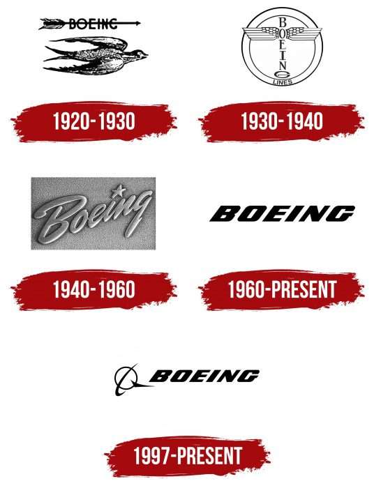
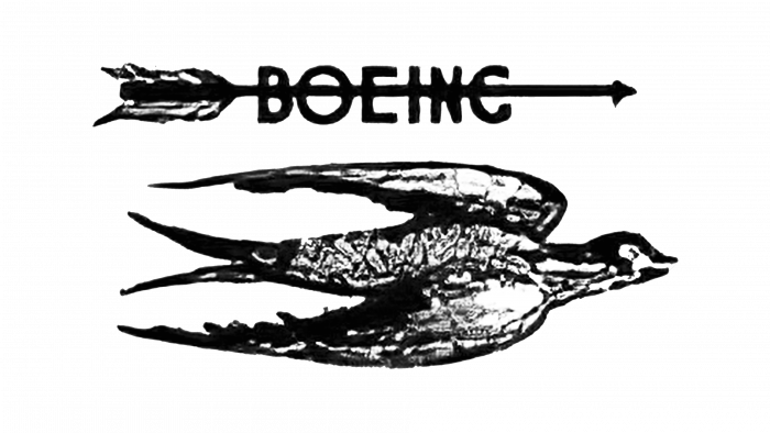
At first, Boeing’s identity was based on the image of a bird with a forked tail. The designers found this a great way to convey the flight dynamics in a static drawing, which looked like a 3D pencil sketch. The bird flew to the east—in the same direction as the arrow with plumage and a triangular tip. A thin horizontal arrow was at the top, and the word “BOEING” was crossed out in bold sans serif type.
1930 – 1940
In the 1930s, a logo that resembled a totem pole was popular. It appeared in 1928, but the company began to use it to decorate aircraft in the middle of the next decade. “Totem” consisted of the letters “B,” “O,” “E,” “I,” “N,” and “G,” arranged vertically, one under the other. The ” O ” ‘s right and left were depicted as white wings with five feathers separated by a black outline. “G” formed a kind of pedestal, for which the designers made it large and flattened. The inscription was inside a white circle with a thin ring frame, while the tips of the wings looked out.
This choice is because Boeing was founded in a Native American region. The famous totem poles are considered the main symbol of Indian culture, and perhaps this fact inspired identity development.
1940 – 1960
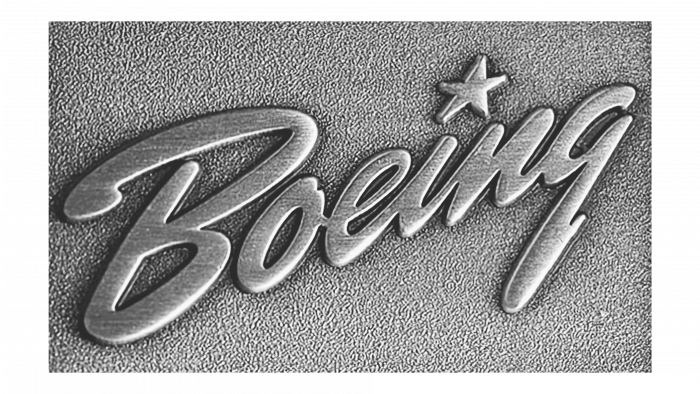
In 1940, the vertical inscription became diagonal and lost its white wings. The word was depicted in a handwritten script, and the letters almost merged due to bold lines and a strong tilt to the right. The first “B” stood out especially: it was uppercase but looked like a lowercase “b” with an arc at the top. In this case, the curved strip extended far beyond the limits of the vertical stroke.
Another important element was the dot above the letter “i” – rather than a dot, but a small five-pointed star. It made the logo elegant and hinted at the company’s aerospace focus. Stylized lettering was an integral part of Boeing’s identity until the 1960s.
1960 – today
In the mid-20th century, Bob Laly and Kith Kinsmen decided to design a logo to adorn any aircraft. Two in-house designers enthusiastically took this idea and developed it into a ten-page presentation with detailed information on the textures and appearance of the badge. However, the main achievement of their collaboration was the custom Stratotype typeface, which was created especially for Boeing. They used it to style the brand name beautifully. The creative collaboration was first shown on the 377 Stratocruiser.
The character looks original because the letters are slanted to the right. It is the basis of visual dynamics associated with high-speed movement. The lettering is bold and black, but due to the “flexibility,” it does not seem massive. It has been used for aircraft design for many decades and has been supplemented with model numbers.
1997 – today
The latest Boeing logo results from a creative effort by Rick Eiber to enhance the company’s identity following its merger with McDonnell Douglas Corporation in 1997. Studio owner Rick Eiber Design was renowned for his creative personality and collaborated with influential firms such as Providence Health System and Microsoft. Moreover, he always worked on graphic design by hand, without using computers.
Rick Eiber has combined the classic Boeing wordmark with the McDonnell Douglas symbol, placing the lettering on the right side. The new element consists of three geometric shapes. In the center is a black ring, crossed diagonally in an arc that looks like an inverted Nike swoosh. In the lower right corner is an elongated triangle of uneven shape.
Boeing: Interesting Facts
Boeing is well-known for its contributions to aviation and space exploration.
- Start: Boeing was founded on July 15, 1916, in Seattle by William Boeing, who was initially in the timber industry but had a keen interest in aviation. The company’s first airplane was the B&W Seaplane, made in Seattle.
- World War II: Boeing was vital in World War II, making many bombers like the B-17 Flying Fortress and the B-29 Superfortress, which were key to the Allies’ efforts.
- Commercial Aviation: In 1958, Boeing launched the 707, the first American jet airliner, kicking off the jet age and changing commercial air travel by making transatlantic flights common.
- The Boeing 747: Known as the “Jumbo Jet,” the 747 was introduced in 1970 as the first wide-body airliner. It set passenger capacity records and became one of the most iconic planes globally.
- Space Exploration: Boeing has played a major role in space exploration, helping construct the International Space Station and working on NASA’s Space Launch System, which is set to be the most powerful rocket ever.
- Environmental Efforts: The company is working to make flying more eco-friendly by researching biofuels, improving planes’ aerodynamic efficiency, and creating aircraft with lower carbon emissions.
- Global Operations: Boeing is a global company with customers in over 150 countries and facilities worldwide, underlining its position as an aerospace leader.
- US Exporter: It’s one of the largest U.S. exporters, with its airplanes, satellites, and defense systems sold worldwide.
- Research and Development: Boeing invests in aerospace technology innovation and is working on new flight deck technologies, composite materials, and drones.
- Future Projects: Looking ahead, Boeing is exploring autonomous flying vehicles and space tourism, including projects like the CST-100 Starliner spacecraft for ISS missions and partnerships for flying taxis.
Boeing’s story is marked by over a century of advancements in air travel and space exploration, establishing it as a cornerstone in the history and future of how we fly and explore space.
Font and Colors
The emblem, borrowed from McDonnell Douglas, is an adopted symbol of the now-defunct Douglas Aircraft. The circle was originally the Earth, the arc line looked like a missile track, and the triangle represented a military plane. Rick Eiber kept the main theme of the logo but made the image more abstract. The symbol reflects the evolution and rapid development of the aerospace industry, reaching new heights.
As far as is known, the Boeing logo font is called Stratotype and was designed by Bob Laly and Kith Kinsmen. It is an oblique bold grotesque used for alphanumeric designations on airplanes. The lettering is black, as is the emblem of geometric shapes.
FAQ
What font is the Boeing logo?
The logo is made in a special font for this aerospace manufacturer. This special font, often called a “stratotype,” is not a common type in the design world. It is designed to match the company’s modern and cutting-edge image. The font is exclusive to the company’s use, maintaining a consistent and unique look. The modern font design with clean lines and elegant style demonstrates the company’s focus on technology and innovation. Despite the stylish appearance, it is easy to read, which is important for a global brand with a logo on many products and in various media. Some features, such as the curved “B” and the sharp edges of some letters, are designed to demonstrate movement and precision. Using this custom font helps set your company apart from others. It is used throughout the company’s branding, helping to create a consistent look across aircraft, communications, and online.
What is Boeing’s logo?
The aerospace manufacturer’s logo is well-known in the industry and includes the company name in a bold sans serif font and a distinctive symbol. This symbol consists of three main parts: a ring, a curved line, and a triangle, each representing different aspects of the company. The ring in the logo symbolizes planet Earth, showing the company’s global reach and influence. This implies completeness and leadership in the aerospace industry. The curved line represents the aircraft’s flight path through the ring, illustrating global air travel. The triangle, shaped like a military fighter, points forward, indicating movement and progress. It reflects the company’s involvement in the defense sector, especially in developing and producing military aircraft.
What is Boeing’s full name?
The full name of this aerospace company is The Boeing Company. This name has been used since 1961, when it replaced the original Airplane Company name. This change reflected a wider range of products and services, not just aircraft. The name change marked the transition from a mere aircraft manufacturer to a major leader in the global aerospace industry. This change was a strategic move for the company to demonstrate its expanded capabilities and commitment to becoming a leader in various areas of aerospace technology.
What military aircraft does Boeing make?
The company is a leading manufacturer of military aircraft, offering various models serving various military purposes. It produces bombers, attack aircraft, fighters, and transport aircraft to meet the diverse needs of modern military operations. One of the key aircraft in the company’s lineup is the F-15EX fighter jet, an advanced version of the F-15 that has been in service since the mid-1970s. They began delivering these aircraft to the US Air Force in March 2021. The F-15EX features improved avionics, greater payload capacity, and improved performance, making it a valuable addition to the military. The line of military aircraft includes:
- Bombers: The company has a long history of producing heavy bombers. The B-52 Stratofortress, in service since the 1950s, is a long-range subsonic bomber. It also developed the B-1 Lancer and the stealthy B-2 Spirit, demonstrating its ability to build sophisticated strategic aircraft.
- Attack Aircraft: It produces the AH-64 Apache attack helicopter, known for its heavy weapons and ability to adapt to the battlefield.
- Transport Aircraft: The C-17 Globemaster III is the company’s key aircraft for quickly transporting troops and cargo to major bases or directly into combat zones.
- Tankers and Surveillance Aircraft: The KC-46 Pegasus is a tanker aircraft, and various surveillance and reconnaissance aircraft are needed for modern warfare and strategic operations.
How does Boeing promote their products?
This company uses a variety of methods to promote its products and strengthen its brand throughout the world. As a leading aerospace manufacturer, it focuses its marketing efforts on reaching a wide range of people working in the aviation, defense, and space industries:
- Print mass-media
- Creative videos
- Event Sponsorship
- Financial Marketing
Using these varied marketing strategies, the company effectively promotes its products and brand through various channels, reaching industry professionals, potential customers, and aerospace enthusiasts.
