“We love the whole world,” the emblem elements read. “All countries are beautiful, and our airplanes will take you to any of them.” The Southwest Airlines logo is the vast expanse of the sky, which the carrier has conquered and feels very confident there.
Southwest Airlines: Brand overview
Southwest Airlines is the largest U.S. airline carrier, founded in the spring of 1967. Its founders were Herbert Kelleher and Rollin King. They originally named the firm Air Southwest Co. It did not receive its current name until 1971, when it became a domestic airline and began flying in Texas. It now has 103 scheduled destinations and about 4,000 flights a day. The headquarters of the organization is located in Dallas (USA).
In 1967, Herb Kelleher and Rollin King founded Southwest Airlines in Dallas, Texas. Initially named Air Southwest Co., the airline was conceptualized over a casual conversation in which Kelleher and King sketched a triangle on a napkin, connecting Dallas, Houston, and San Antonio—the cities they aimed to serve.
By 1971, after overcoming numerous legal challenges from competitors, the airline took to the skies on June 18—the inaugural flights operated between Dallas, Houston, and San Antonio, utilizing three Boeing 737 aircraft. The company distinguished itself with affordable fares and a unique corporate culture.
Throughout the 1970s, the airline expanded rapidly within Texas. Introducing the 10-minute turnaround and unassigned seating policies maximized fleet efficiency and accelerated boarding.
The Airline Deregulation Act of 1978 unlocked new opportunities and the company began providing services beyond Texas, starting with New Orleans.
The 1980s marked nationwide expansion. By 1982, the airline had initiated flights to California and served 27 cities across 13 states by the decade’s end, maintaining low costs and high efficiency.
In 1989, the airline became the first to reach an annual revenue of $1 billion with fewer than 100 aircraft.
The 1990s saw further expansion and innovation. The company continued to add new cities and increase flight frequencies. In 1994, it became one of the first airlines to introduce electronic ticketing.
In 2000, the launch of southwest.com simplified bookings and reduced costs.
In 2004, the airline eliminated fees for changing tickets, offering a significant competitive advantage.
In 2011, the company acquired AirTran Airways for $1.4 billion, enhancing its presence on the East Coast and adding Caribbean destinations.
By 2014, following the integration of AirTran, the company began its international flights to the Caribbean and Mexico.
2017 the airline announced plans to start flights to Hawaii, marking a significant expansion.
The first flight to Hawaii on March 18, 2019, signaled a new chapter in its history.
Meaning and History
Immediately after opening, competing carriers tried to block the launch of Southwest Airlines and sued it. However, after the litigation ended, the company established itself in the market and became the largest low-cost airline with 737 airliners. In 1971, after settling the claims, it started operating flights to only two cities.
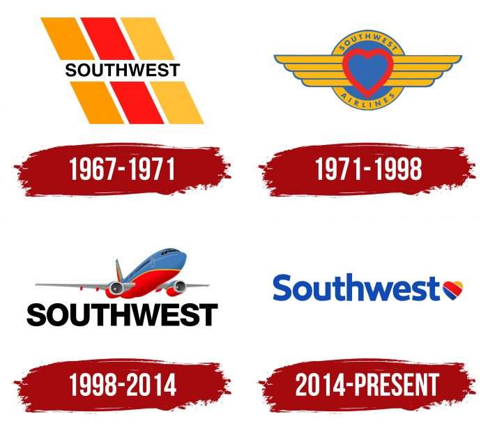
In 1975, the company expanded its available locations in Texas and began flying nationwide in 1979. Since the 1990s, it has fully covered the Southeast internationally. Southwest Airlines received its trademark as soon as it announced itself. It has a total of four logos in its history.
What is Southwest Airlines?
This is the largest low-cost airline in the United States, based in Dallas, Texas. It revolutionizes air travel by offering affordable and convenient flight options across an extensive domestic route network. The company operates a large and uniform fleet of narrow-body Boeing 737 aircraft optimized for high utilization and quick turnaround times, enabling low operating costs and attractive fares.
1967 – 1971
From 1967 to 1971, Southwest Airlines was a young and ambitious company striving to carve out its niche in the airline market. This period was characterized by active development and expansion of the company’s route network. The logo created during this time reflects the company’s drive for innovation and its desire to stand out among competitors.
The logo has three diagonal yellow, red, and orange stripes slanted to the left. These colors symbolize energy, enthusiasm, and warmth, aligning with the company’s positive and friendly image. The arrangement of the stripes creates a sense of movement and speed, emphasizing the dynamism of air travel.
At the logo’s center is the word “SOUTHWEST” in black capital letters. The font is smooth, sans-serif, and wide, making it easily readable and noticeable. The black color of the text adds contrast and seriousness to the logo, underscoring the company’s reliability and professionalism.
The diagonal stripes represent movement and progress, essential for an airline committed to providing fast and reliable flights. The color scheme highlights the company’s positive and friendly approach to its customers. The “SOUTHWEST” text in the logo’s center identifies the company, making it easily recognizable and memorable.
1971 – 1998
The logo adopted in 1971 was a completely new design that reflected the company’s important aspects and values. 1971 was significant as the company was just starting its operations and striving to earn passengers’ trust. The new logo, featuring a heart and wings, emphasizes the company’s customer orientation, care for each passenger, and commitment to high-quality service.
The logo consists of a central element in a heart with wings, symbolizing the love and care the company extends to its passengers. The heart is outlined with a broad red line, highlighting the company’s passion and energy. The wings on either side of the heart resemble an aviator badge, symbolizing aviation and flight. Each wing has four feathers, adding dynamism to the logo and associating it with movement.
The heart symbolizes Southwest Airlines’ unique approach to its passengers, focusing on warmth and attention. The wings, reminiscent of an aviator badge, underline professionalism and high air travel standards.
The company name is placed on a blue ring with a gold outline that encircles the heart and wings. The text is in capital letters of a golden color, symbolizing stability and reliability. The font is smooth and clear, making the name easily readable and memorable.
The red color of the heart symbolizes passion and care, the blue background signifies reliability and trust, and the gold outline and letters represent stability and prosperity. These colors create a harmonious and balanced composition that reflects the company’s core values.
1998 – 2014
The logo used from 1998 to 2014 represents an updated and more specific design, highlighting the company’s aviation focus. Featuring an airplane, the logo underscores the company’s commitment to progress and aviation expertise.
The logo depicts an airplane taking off, symbolizing movement, progress, and a forward-looking vision. The airplane is painted in bright colors: the lower part is red, the upper part is blue, and a thin yellow stripe separates them. These colors symbolize energy, stability, and positivity.
The company name “Southwest” is written in black capital letters. The font is sans-serif, smooth, and modern, emphasizing the airline’s professionalism and reliability. The black color of the text adds contrast and seriousness to the logo, making it easily readable.
The airplane image emphasizes the company’s core activity—air transportation. The red color symbolizes energy and passion, the blue represents stability and reliability, and the yellow stripe adds a touch of positivity and dynamism. This choice of colors creates a harmonious and memorable combination that underscores the company’s core values.
2014 – today
In 2014, the company leadership updated the brand and changed the logo to emphasize its values and commitment to quality service. The designers reintroduced the heart, previously used in the logo, and made it striped by adding three colored lines. This change reflected the company’s drive for renewal and modernization and highlighted its customer orientation.
The logo consists of two elements: text and a graphic symbol. The main graphic element is a heart of three stripes of different lengths: yellow, red, and blue. The heart symbolizes care, customer attention, and the company’s warm attitude towards its passengers. The colored stripes emphasize diversity and dynamism.
The company name “Southwest” is written in large, blue capital letters. The sans-serif font is smooth and modern, underscoring the airline’s professionalism and reliability. The blue color symbolizes stability and trust, particularly important for an airline.
The heart in the logo represents the company’s human approach to its customers and maintains a connection to its history. The colored stripes symbolize various aspects of the company: yellow for energy and positivity, red for passion and care, and blue for stability and trust. The font and color scheme emphasize the airline’s professionalism and reliability.
The Southwest Airlines logo symbolizes care, innovation, and high service standards. It reflects the company’s core values and commitment to providing its customers with the best services. This logo effectively conveys friendliness and professionalism, making the brand recognizable and attractive internationally.
Southwest Airlines: Interesting Facts
Southwest Airlines is a big name in flying, having started in 1967. It’s known for doing things a bit differently than other airlines.
- How It Started: Two guys named Herb Kelleher and Rollin King wanted to make flying cheaper and simpler, focusing on quick trips between Dallas, Houston, and San Antonio.
- Fighting for Dallas Love Field: The Wright Amendment made it difficult for flights to go in and out of Dallas Love Field. Southwest didn’t like that, so they worked hard until the law was changed in 2014, allowing them to fly to more places.
- Choosing Your Seat: When you fly Southwest, you get to pick your seat when you board the plane, not before. This helps keep things simple and flights cheaper.
- Free Bags: Southwest allows you to check two bags for free, which is rare compared to other airlines, which charge extra.
- Always Making Money: Southwest has been making money for over 40 years straight, which is a big deal because making money in the airline world can be tough.
- The “LUV” Airline: Southwest’s symbol on the stock market is “LUV,” which shows they’re all about love and care, from their base at Dallas Love Field to how they treat everyone.
- Just One Type of Plane: Southwest only used Boeing 737s for a long time, which made things like fixing planes and training pilots easier and cheaper.
- Nice Rewards Program: Their Rapid Rewards program is super user-friendly. You can earn points without worrying about them expiring or not being able to use them when you want.
- Caring for the Planet: Southwest tries to be good to the environment by using less fuel, exploring biofuels, and recycling on its planes and at its facilities.
- Happy Workplace: Southwest cares about ensuring their workers are happy and having fun. This good vibe helps their employees treat customers well.
Southwest’s way of running an airline with affordable prices, caring for customers and employees, and staying true to its fun and loving culture has made it a favorite among travelers and a standout in the airline world.
Font and Colors
The emblem has been dominated by aviation themes: runways, wings, and airplanes. The name (short or full) is also obligatory. It was written in small or large letters depending on the tasks to be solved. A heart appeared to indicate that the air carrier puts heartfelt affection and feelings into a person. On the other hand, the background has always remained the same—a completely white space.
Southwest Airlines logos use a font called Southwest Sans, which the company developed with Lippincott and Monotype. Designers Dan Ratigan and Jim Ford proposed it. These studios also created the color palette: sky blue, yellow, and red. Previously, the palette also included orange.
FAQ
What does the Southwest Airlines logo mean?
The heart emblem represents hospitality, warmth, love, care, and adherence to Southwest Airlines’ core values. It is a marker for the airline’s high-quality service.
What is the motto of Southwest Airlines?
The airline’s current slogan is: ‘Low fares. Nothing to hide. That’s TransFarency!’ Previous advertising slogans have had their share of humor, too. For example, ‘The Somebody Else Up There Who Loves You,’ ‘Just Plane Smart,’ and ‘Love Is Still Our Field.
Why is Southwest’s logo a heart?
According to marketing manager Kevin Krone, the heart of the company’s logo symbolizes care about customers. It is a composite image of all Southwest Airlines employees’ hearts put into the business they love.
When did Southwest Airlines start?
The story of American Airlines started in 1971 when a local airline appeared in the three biggest cities in Texas.
