The visualization of the Turkish Airlines company logo demonstrates the brand’s significant advantages, providing a recognizable and memorable identity. The stylized silhouette of a stork symbolizes flight, speed, and safety.
Turkish Airlines: Brand overview
Turkish Airlines is Turkey’s national airline. Founded in May 1933, it operates regular flights to 315 destinations. Based in Istanbul, it is part of the Star Alliance.
In 1933, Turkish Airlines was born under the name “State Airlines Administration” (Devlet Hava Yolları). This state-run entity, part of Turkey’s Ministry of National Defense, marked the dawn of aviation in Turkey. The initial fleet consisted of two King Birds, three Junkers F-13s, and two Junkers W-33s, symbolizing a leap forward in the country’s modernization efforts.
By 1935, the airline began its first international journey, flying from Istanbul to Athens. This inaugural international flight paved the way for broader connections with neighboring nations.
1947, the company ventured into the Middle East, launching routes to Beirut and Cairo. This move highlighted Turkey’s growing regional influence and bolstered its trade and diplomatic ties.
The year 1956 saw a significant transformation as the company rebranded itself to Türk Hava Yolları A.O. (Turkish Airlines), reflecting its aspirations on the global stage.
In 1967, the airline entered the jet age by acquiring Jet DC-9 aircraft, which allowed for an expanded route network and greater operational efficiency.
During the 1970s, the airline continued to grow its fleet and route network, establishing connections across Europe, Asia, and North Africa, thus solidifying its status as an international carrier.
Celebrating its 50th anniversary in 1983, the company had earned a reputation for reliability and quality service.
The airline’s first transatlantic flight to New York in 1985 marked a new chapter, heralding its expansion into the American market.
Throughout the 1990s, the company modernized its fleet by adding Airbus and Boeing aircraft while extending its reach to major cities worldwide.
The airline joined the Star Alliance in 2006, enhancing its global partnerships and operational capabilities.
Between 2008 and 2012, the company experienced rapid growth, expanding its fleet and route network to become one of the world’s largest carriers by the number of countries served.
Marking its 80th anniversary in 2013, the company commenced the construction of a new airport in Istanbul, destined to become one of the largest hubs globally.
By 2015, the airline achieved record-breaking passenger numbers and revenue, reinforcing its position as a leading global carrier.
The company’s move to the new Istanbul Airport in 2018 provided it with a state-of-the-art hub, significantly boosting its capacity and service capabilities.
In 2019, the airline continued its expansion, adding new routes and increasing frequencies on existing ones, further cementing its global presence.
Meaning and History
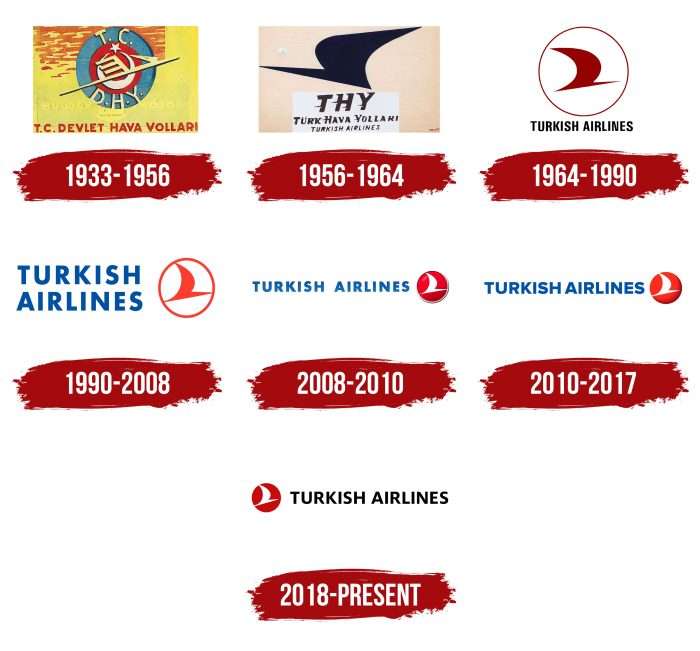
Over its long existence, the airline has had eight logos, each associated with the image of an abstract bird resembling a stork. It is depicted as inclined, soaring upwards as a symbol of moving into the future and reaching new heights.
What is Turkish Airlines?
This is Turkey’s national carrier, based in Istanbul. It is known for its extensive global route network, covering more countries than any other airline. It operates a diverse fleet, including Boeing 787 Dreamliner and Airbus A350, serving over 300 destinations. The airline’s unique feature is its stopover program, allowing transit passengers a free stay in Istanbul. The company is notable for its Miles&Smiles loyalty program, offering extensive opportunities for earning and using miles, and its innovative marketing campaigns, often featuring world-famous celebrities.
1933 – 1956
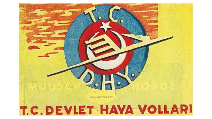
The debut logo of Turkish State Airlines, used from 1933 to 1956, presents a complex and multi-layered composition that reflects the company’s national identity and ambitions.
The logo consists of several elements. At the center is a stylized bird, symbolizing freedom and flight, set against a red circle that signifies energy and dynamism. Above the bird is a crescent and star, elements of the Turkish state emblem, emphasizing the company’s national affiliation.
Surrounding the smaller red circle is a larger blue border featuring the abbreviations T.C. (Türkiye Cumhuriyeti) and D.H.Y. (Devlet Hava Yolları), which translates to Turkish State Airlines. These abbreviations are in a strict and clear font, underscoring the company’s formality and reliability. At the bottom of the logo is the full name, “T.C. DEVLET HAVA YOLLARI,” written in red capital letters on a light yellow background, creating contrast and making the text easily readable.
The logo’s color palette includes red, white, blue, and yellow. Red and white symbolize Turkey’s national colors, while blue adds depth and professionalism. The light yellow background with red dotted highlights in the upper right corner adds dynamism and brightness to the composition.
The period from 1933 to 1956 was a time of establishment and growth for Turkish State Airlines. During this time, the company actively expanded its route network and improved service quality, striving to become a leading carrier in the region. The logo reflects these ambitions and national pride, emphasizing the connection with the Turkish state and its symbols.
The logo created during this period was rich in elements symbolizing state support and national identity. Using the Turkish emblem in the logo highlights the company’s importance to the country and its significance internationally.
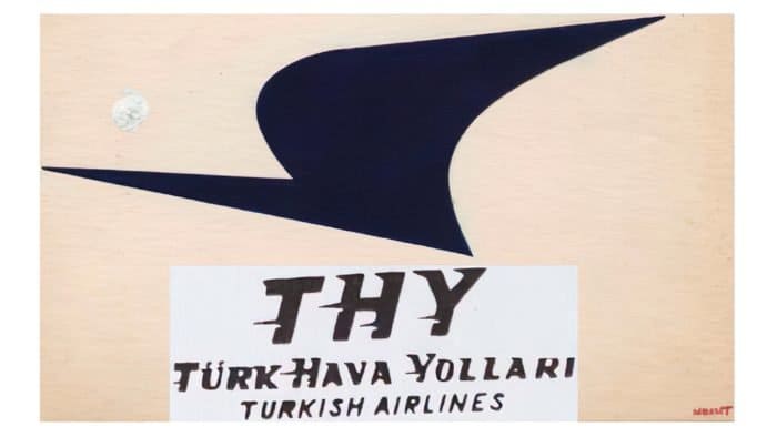
1956 – 1964
The logo of this period is black and white. The bird’s silhouette is enlarged and turned in the opposite direction, with several Turkish inscriptions added.
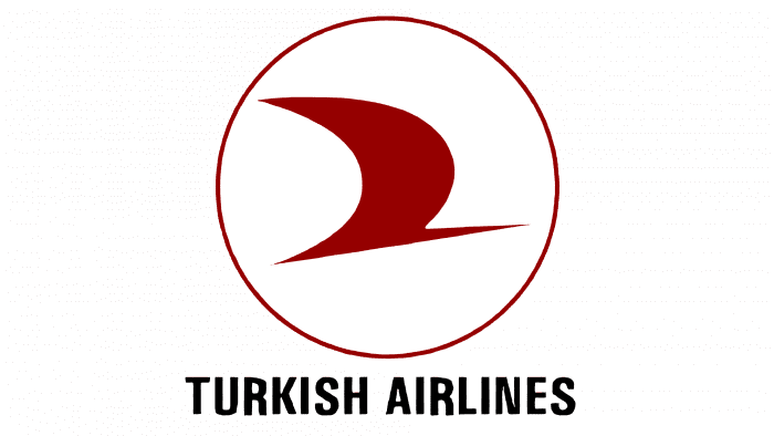
1964 – 1990
Before 1964, the Turkish Airlines logo had a different design. With the introduction of the new emblem, the company made a significant step forward in brand visual identity. The red bird in a white circle became iconic for many years, easily recognizable, and associated with Turkish origins and high-quality service. This combination of colors and shapes emphasized the company’s national roots and global ambitions.
The bird symbolizes flight, freedom, and the aspiration for heights. The red color used for the bird highlights energy and passion, while the white background of the circle symbolizes purity and reliability.
Below the bird image, the name “TURKISH AIRLINES” is written in black capital letters. The font is sans-serif, strict, and modern, emphasizing the company’s professionalism and reliability. The black color symbolizes stability and confidence.
1990 – 2008
In 1990, designers changed the ratio of graphics and text. As a result, the airline’s name became much larger and occupied two rows: the upper – “Turkish” and the lower – “Airlines.” The authors also corrected the color of the letters: instead of black, they used sky blue. They placed a round icon with a soaring bird to the right of the inscription. It is painted red, as is the outline line.
2008 – 2010
To simplify the logo, developers rearranged the company’s name and placed the words on one line, leaving a large interval between them. Although the bird icon remained in its previous place, it also received an update. Designers changed its colors: all white was repainted in red, and red – in white.
2010 – 2017
The changes to the Turkish Airlines logo in 2010 were minimal but significant. The spacing between the words and letters was reduced, making the text more compact and cohesive. The circular frame around the emblem was removed, and the color became less bright and more pastel, giving the logo a more modern and refined look.
The name “TURKISH AIRLINES” is written in capital letters in a darker blue color. The font remains the same: sans-serif, modern, and strict, emphasizing the professionalism and reliability of the airline. The blue color symbolizes trust and stability, which is important for passengers.
2018 – today
Although all elements remain the same, the logo looks different in its current version. Only the icon with the flying bird is now located to the left of the airline’s name, and the phrase “Turkish Airlines” has again become black instead of sky blue.
The Turkish Airlines logo is an elegant and symbolic image that reflects the airline’s essence and goals in the modern world. A white bird is depicted inside a red circle, symbolizing freedom, movement, and a forward-looking vision. The red circle represents energy, passion, and dynamism and is associated with Turkey’s national colors.
The name “TURKISH AIRLINES” is written in black capital letters. The sans-serif font is modern and strict, emphasizing the company’s professionalism and reliability. The black color symbolizes stability and confidence, adding contrast and visual clarity to the logo.
When this logo was introduced in 2018, Turkish Airlines was actively expanding its international routes and striving to establish itself as a leading carrier on the global stage. The company was implementing new technologies and improving service quality to meet the high standards of the aviation industry.
The logo reflects these ambitions and the pursuit of excellence. The white bird, symbolizing freedom and movement, highlights the company’s aspiration to expand its boundaries and provide the best service to its passengers. The red circle, symbolizing energy and passion, points to the company’s dynamic development and commitment to innovation.
Turkish Airlines: Interesting Facts
Turkish Airlines is the main airline in Turkey. It’s known worldwide for its wide range of flights, great service, and reliability.
- How It Started: 1933 Turkish Airlines began with just five airplanes. Today, it’s one of the oldest airlines still flying.
- Flying Far and Wide: It flies to more countries than any other airline, reaching over 300 places in Europe, Asia, Africa, and the Americas.
- Main Airport: Its main spot is at Istanbul Airport, which is big and modern. It’s perfectly placed for flights going from east to west.
- Lots of Awards: It’s received a lot of praise for its service. For example, it’s been called a “4-star airline” and has won awards for having the best food in business class and being the best airline in Europe.
- Part of a Big Team: In 2008, Turkish Airlines joined the Star Alliance, a group of airlines that work together to make flying smoother for passengers.
- Amazing Food: The airline is famous for its food, especially in business class. On some flights, they even have chefs who make delicious Turkish and international foods.
- Stay Connected: On Turkish Airlines flights, you can use Wi-Fi and check out many movies, music, and games so that you won’t get bored.
- Supports Sports: The airline sponsors big sports teams and events and has had famous athletes like Lionel Messi and Kobe Bryant help promote it.
- Cool Extra Services: They’ve come up with neat ideas like the “Miniport” service, where you can drop off your bags in the city and enjoy your day without lugging them around before you fly.
In summary, Turkish Airlines is a big deal in flying because it goes to many places, offers excellent service, and constantly innovates to make traveling better for everyone.
Font and Colors
The Turkish airline company’s logo has always featured a bird image. Over the years, from a barely noticeable abstract stroke, it has turned into a full-fledged winged symbol of flight. The bird is directed upwards at a slight angle, like an airplane taking off. It has a long beak, and its tail and wings touch the edge of the red circle, breaking it at two points. The full name of the carrier is placed behind the icon. Above airplane portholes, a white bird adorns the prominently protruding tail.
The company chose a simple, legible, elegant font for its identity. The font is called Proxima Nova ExtraBold and is a revision of Proxima Sans. It successfully combines a geometric shape and a modern look. Its creator is Mark Simonson. The color palette is also stable: red, blue, and black – the primary options for the Turkish carrier.
FAQ
What does the Turkish Airlines logo mean?
Like many other airlines, the Turkish Airlines logo depicts a bird—a symbol of flight—but designers did not detail it; instead, they used an abstract drawing not to betray the brand’s tradition. The silhouette is directed upwards, like an airplane taking off.
Is Turkish Airlines a good airline?
Turkish Airlines received three stars for service quality, cleanliness, food, and comfort. Some dishes and drinks offered on board were awarded four stars. The luxurious seats in the Boeing 787 and A350 aircraft were rated five stars.
Is Turkish Airlines a 5-star airline?
In 2019, the Turkish carrier was awarded the “5-star global airline” title in the APEX Official Airline Ratings.
Which country owns Turkish Airlines?
The Republic of Turkey owns 49.12% of Turkish Airlines shares, while the rest are freely traded on the market.

