The visual style of the Dutch airplane manufacturer embodies airiness and lightness. The Airbus logo features a widely spaced inscription with large gaps between the letters. At the same time, the bold glyphs indicate high strength and structural integrity.
Airbus: Brand overview
The transportation ministers from France, Germany, and the United Kingdom met in July 1967, marking the beginning of Airbus’s history. They talked of working together to construct a big passenger plane that would rival those made in the United States. The necessity to improve the European aviation industry’s standing in the international market motivated this decision.
Airbus Industrie was formally founded on December 18, 1970, as a partnership of European aerospace enterprises. The German business Deutsche Airbus and the French company Aérospatiale were the original partners; later, the Spanish company CASA and the British company Hawker Siddeley joined.
The A300 was the first aircraft produced by the collaboration, and it made its first flight on October 28, 1972. The A300, a ground-breaking design for its day, became the first twin-engine wide-body aircraft in history.
The company entered the airline business when Air France started operating the A300 for profit in May 1974.
It rapidly broadened its range of products throughout the 1980s. The A300 was originally presented in 1983, while the A320, a narrow-body aircraft that became one of the most successful in the history of commercial aviation, made its first flight in 1987.
The company was able to compete with Boeing in the long-haul market in 1991 when it unveiled the A340, its first wide-body long-haul aircraft.
The company started working on the superjumbo A380 in 1994, which was to be the biggest passenger plane ever made.
In 2000, the corporation was reformed into Airbus SAS, a single organization, to improve management and boost operational effectiveness.
When it took off on its maiden flight on April 27, 2005, the A380 became the world’s largest passenger aircraft and a major milestone in the history of commercial aviation.
The company began developing the A350 XWB in 2010, a wide-body aircraft intended to rival the Boeing 787 Dreamliner.
With the inaugural flight of the A350 XWB on June 14, 2013, a new chapter in the history of wide-body aircraft production began.
The company delivered its 10,000th aircraft on October 14, 2016, solidifying its position as a front-runner in the international aviation sector.
According to a statement released on February 14, 2019, A380 manufacture will end in 2021. The company cited a lack of demand for these extremely large aircraft.
Like the aviation sector as a whole, the company faced enormous hurdles in 2020. The airline industry’s new market conditions required the corporation to modify its production plans and operations.
Meaning and History
The current aerospace company is the result of the merger of several industrial enterprises under the Airbus Industrie GIE consortium, which was established in 1970. Under its leadership, firms worked until 2000, when the new structure EADS NV (European Aeronautic Defense and Space) emerged. A year later, the consortium was reorganized into the Airbus SAS joint-stock company, and in 2006, EADS finally bought its shares and took over its management.
To be recognizable, the European company Aeronautic Defense and Space adopted the name Airbus Group, dividing it into two specialized divisions: NV and SE. They then followed the merger of the executive bodies of Airbus Group SE and Airbus SAS. Although the committees of the subsidiary and parent companies merged in 2017, they legally remained separate organizations. At the same time, the holding company received its current name and contemporary design.
Naturally, all these changes are reflected in their visual identity. The emblems of Airbus Industrie GIE and Airbus SAS received a common style – the symbol of a turbine, reminiscent of a jet engine in operation. They also use a uniform font, identical to Helvetica Black. From 2000 to 2010, the logos of two other firms involved in the initial merger dominated. For example, the four-pointed star was a legacy of DaimlerChrysler Aerospace AG, and the curved arrow was from Aérospatiale-Matra. Then, these elements were removed, and a more concise design was chosen.
What is Airbus?
It is an aircraft manufacturing company that produces airplanes under its own brand. It is part of the European corporation Airbus Group but is officially registered in France and has the status of “S.A.S.”
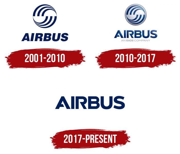
2001 – 2010
The dominant design features a circle divided into two halves. Each half has an abstract, dynamic pattern of curved lines, swirls, and flashes. Symbolically, the emblem can be interpreted as Earth (circle), with the airline as the fastest way to get from one place to another (dynamic curved lines).
The company’s name is in bold, classic, plain font. The letters’ italicization adds dynamism.
2010 – 2017
The curves now have a 3D effect due to adding a gradient to the background. The word “Airbus” is written in a new font. The inscription is no longer italicized and has several distinctive details, such as gaps in the letters “A” and “R.” Additionally, the letters have acquired a three-dimensional appearance due to the added gradient.
2017 – today
The updated Airbus logo is flat and doesn’t contain the twisted logo, only the word mark. The rich, dark blue tone has remained virtually unchanged.
Airbus: Interesting Facts
Airbus is a big company that makes airplanes and space equipment. It was founded in 1970 to help European countries collaborate to make better planes.
- It started in Europe: This company was created to help European countries make planes together. Now, it’s known for making great planes and spacecraft.
- First Plane: This company’s first plane flew in 1972. It was special because it had two engines and was big enough for lots of people to travel not too far away.
- Makes Different Things: This brand doesn’t make planes for people to travel in. They also make military planes, helicopters, satellites, and Mars projects.
- Biggest Plane: The A380 is the biggest plane many people can travel together. It started flying in 2007, but it will soon stop being made because people want smaller planes that use less gas.
- Saving Fuel: This airplane company works hard to make planes that don’t need as much gas, like the A350, made with special materials to make it lighter and use less fuel.
- Fancy Controls: In 1988, this company was the first to use a special system in its A320 plane that lets pilots fly with computers instead of just by hand. This helps save fuel and makes flying safer.
- All Over the World: This company has factories in many countries where it makes and assembles planes, which allows it to help people worldwide.
- Beluga Plane: They have a funny-looking plane called the Beluga that carries parts for other planes. The newer one, the BelugaXL, even has a cute whale face painted on it.
- Caring for the Planet: This brand wants to make flying better for the planet. They’re working on planes that don’t pollute, using things like hydrogen fuel.
- Into Space: This company also makes rockets and helps with space missions, such as sending objects to Mars and building space station parts.
The company is into making flying and space travel better and helping the planet simultaneously.
Font and Colors
The inscription was set in italics in the earliest version of the logo. The straight font has been used since 2010. Initially, it was a grotesque from the Helvetica Neue family—modern, high-tech, with facets so that the carrier’s name conveyed the sensation of an airy structure. After the redesign, the corporate font B612 appeared. It resulted from creative work by specialists, including Nicolas Chauveau, Jonathan Favre-Lamarine, and Thomas Paillot. Jean-Luc Vinot from ENAC also assisted.
As for the color, blue has been and remains a priority for the company. According to the Ral gradation grid, it has the number 5013, and by other systems, it is the number 00205b or Pantone 281C. Previously, its light analog was used. The background is neutral white.
FAQ
What font is the Airbus logo?
The Airbus logo uses the font Helvetica Neue LT. This font belongs to the larger Helvetica family, known for its clear and readable style. Helvetica Neue LT updates the classic Helvetica design, making it more uniform in height and width, which gives it a neat and functional look.
The company uses Helvetica Neue LT for its corporate communications and branding to keep its appearance consistent and professional. However, Arial is used for online and desktop use. This is because Arial is widely available and looks similar to Helvetica, which helps keep the appearance consistent across different formats while ensuring it is easy to read and compatible with various systems.
Is Airbus an airline company?
This entity is not an airline company. It is a leading commercial aircraft manufacturer with a strong presence in the aerospace industry. In addition to making airplanes, it has divisions focused on space, defense, and helicopters. It is Europe’s largest aeronautics and space company and plays a significant role in the global market.
The company designs and sells aircraft, spacecraft, and related systems and services. Its most visible unit, the commercial aircraft division, produces a variety of planes that airlines worldwide use—these range from smaller jets like the A320 to larger, long-range models like the A350. The helicopters division manufactures versatile helicopters for civilian and military use, and its Space and Defence division works on projects like satellites and space exploration missions.
What does the Airbus logo mean?
The current logo is simple, featuring only the company’s name in a unique typeface. Before 2017, the logo included a circle with abstract curved lines next to the company name. This circle represents the Earth, highlighting worldwide operations and its role in the aerospace industry. The curved lines suggest the routes airplanes take globally, showing how the company helps connect different parts of the world. These elements showed the company’s global reach and its importance in air travel. The move to a simpler logo follows a broader trend in business towards more minimalist and straightforward branding.
Who designed the Airbus logo?
A team of designers created the logo. This team approach is typical for corporate branding, which involves effectively blending different elements to represent a company’s identity and values.
The current logo, mainly a wordmark, developed from an earlier design that featured a circular emblem next to the text. During the redesign, the team decided to keep the bold sans-serif font that has always been part of the logo. This choice preserves the link to the company’s history while updating the logo to look more modern.
The logo was simplified to just the wordmark with the familiar font to make the brand more recognizable and clear, no matter where or how it’s seen. This change focuses on being modern and adaptable, crucial in the constantly advancing aerospace industry. The designers worked to refresh the logo while honoring its past, showing a strategic approach to evolving brand identity.
Is Airbus a brand?
Yes, it is a brand. It’s a well-known name in the aerospace industry, known for its distinctive style, trademark, and other unique identity elements that set it apart from competitors.
The company offers a variety of products, including commercial aircraft, military planes, space technology, and helicopters. All these products meet the high standards and innovation associated with the name. This variety helps maintain a strong presence and influential role in the aerospace sector, solidifying its status as a globally recognized brand.
Where is the Airbus hub located?
This entity is a major aerospace manufacturer, not an airline, so it has no airport hub. Instead, its headquarters are located in Blagnac, a French commune. This site serves as the center for administrative and corporate functions.
The company has major production facilities in Toulouse, southern France, and Hamburg, northern Germany. Toulouse is crucial as it hosts the largest production facility and is where many aircraft, including the A320 family, A330, A350, and A380, are developed and assembled. Hamburg is important, too, as it focuses on the final assembly and furnishing of different aircraft models and parts. These sites are vital for manufacturing activities and are significant in global operations.
