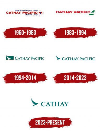
The Cathay Pacific logo is a symbol and an expression of many years of history and culture. This flying bird, depicted in front of the brand name, symbolizes freedom, speed, grace, and superiority – all those qualities that correspond to the high level of the nature of the services provided.
Cathay Pacific: Brand overview
Cathay Pacific is one of Asia’s biggest and most well-known airlines in Hong Kong. On September 24, 1946, American Roy Farrell and Australian Sydney de Kantzow created the airline. At first, the carrier operated charter flights from Hong Kong to Manila, Saigon, Singapore, and Shanghai using just one old Douglas DC-3 aircraft. The corporation took Cathay from an old Chinese name and added Pacific to symbolize its aspirations to rule the Pacific.
The airline’s route network developed, as did its fleet, which included new aircraft such as the Douglas DC-4 and DC-6. Hong Kong to Sydney flights started in 1948, while trans-Pacific flights with stopovers to the US were launched in the 1950s. Using the Lockheed L-188 Electra, the company became the first airline from Asia to conduct international flights in 1959.
The company rose to prominence as a significant international airline by the 1960s. In 1964, Long-haul Convair 880 aircraft, which provided nonstop service from Hong Kong to Japan and Australia, were added to the fleet. Flights to Europe (London, Paris, Frankfurt) and the Middle East started operating in the 1970s.
The 1972 acquisition of Hong Kong Airways, a competitor in Hong Kong, marked a key turning point. The combined airline expanded swiftly and solidified its place in the industry. In the 1970s and 1980s, the fleet was increased with modern wide-body aircraft, including the Lockheed L-1011 TriStar and Boeing 747.
The company began developing North America, Europe, and Australia in the 1980s. The airline listed its shares on the Hong Kong Stock Exchange in 1986, marking its official debut. In the late 1980s and early 1990s, its fleet expanded with the arrival of brand-new Boeing 747-400 aircraft.
The Swire Group, a sizable Hong Kong corporation, acquired most of the airline’s shares by the mid-1990s. Under its leadership, the airline underwent tremendous development, adding contemporary aircraft to its fleet, including the Airbus A330, Boeing 777, and eventually the Boeing 777-300ER. This enabled a substantial extension of the carrier’s route network.
In the 2000s, the company partnered with several foreign airlines. Notably, it joined Oneworld, a global airline alliance, in 2007. Additionally, the corporation improved its standing in the cargo transportation market by running a sizable Boeing freighter fleet.
The airline’s fleet was significantly increased in the 2010s with the addition of the newest Airbus A350 and Boeing 777-300ER aircraft, which increased productivity and service quality. The company grew its Hong Kong hub, becoming a significant international travel center.
The company commemorated its 65th anniversary in 2011. The airline had over 130 aircraft in its fleet and served over 110 destinations across 37 countries.
The airline started a major effort in 2012–2013 to update its long-haul Boeing 777–300ER and Boeing 747–400 aircraft with new cabins and more cozy seats.
2014 saw the delivery of the first Boeing 777-9X, an upgraded 777 family member, to the airline. In addition, the company reached this year’s milestone of transporting its 100 millionth passenger since its establishment.
The airline started using the most recent Airbus A350-900 aircraft for commercial flights 2015. These planes are renowned for their increased passenger comfort, environmental friendliness, and efficiency. The company ordered 48 of these aircraft.
Due to heightened competition from low-cost and quickly expanding Chinese airlines, the company encountered severe financial challenges in 2016–2017. The company’s first losses in more than 20 years required it to optimize its business model.
2018, the airline announced a three-year transformation program to become more competitive by cutting expenses, raising productivity, and enhancing service quality. Additionally, cooperation with its low-cost subsidiary, HK Express, was bolstered.
The company hit several noteworthy benchmarks in 2019. It was named fourth in the world’s top airlines list and won the coveted Skytrax award for being the best carrier in Asia. It has a private VIP lounge. According to a survey, the best business lounge in the world is located at Hong Kong Airport’s Pier.
Nonetheless, the airline participated in political demonstrations in Hong Kong in 2019. It had to fire several staff members for endorsing the protest movement, which sparked conflicting opinions in the community.
Additionally, the company started retiring its aging Boeing 777-200 and 777-300 aircraft in 2019 in favor of the more contemporary and effective A350 and 777-9 models. This procedure is ongoing as part of the fleet optimization strategy.
The airline recorded record financial losses of $2.8 billion by the end of 2020. Compared to 2019, passenger volume dropped 87%. The cargo division did, however, fare somewhat better, reducing overall losses.
The company’s circumstances were extremely difficult in 2021. Due to continuous travel restrictions, the airline could only fly a small fraction of its pre-pandemic flight volumes. Its losses in the first half of 2021 totaled almost $970 million.
In 2021, the airline issued an additional $650 million worth of shares to raise additional funding. The government of Hong Kong, along with longtime shareholders Swire Group and Air China, were the primary purchasers, which aided the carrier’s financial status.
With the start of the mass immunization campaign and the gradual relaxation of quarantine regulations in late 2021 and early 2022, the airline progressively restored its route network. However, continuous limitations in numerous countries make this process uneven and take time.
In 2022, the company continued to acquire new wide-body Airbus A350 and Boeing 777-9 aircraft, which were essential to its plan to boost productivity and save expenses in the post-pandemic phase.
Meaning and History
Interestingly, despite the founding of Cathay Pacific in 1946, its first known logo appeared only in 1960, after it absorbed its main competitor, Hong Kong Airways. Becoming a true regional carrier, the company created a superb sign that reflected its scope and support from the famous parent group. Since then, the emblem has changed several times, but aircraft symbols have always been present.
What is Cathay Pacific?
It’s an airline based in Hong Kong, ranking second in cargo transportation and ninth in passenger flights. It services routes to 81 destinations. It has the highest five-star rating from Skytrax for its work quality. Since 2001, it has been 11 times topped the list as the best airline in the world. The carrier employs over 21,000 staff.
1960 – 1983
The first logo consisted of a large red name and the following symbol – Swire Group’s logo with a drawn airplane contour. Blue inscriptions above and below Cathay Pacific explain what company is represented on the emblem.
The carrier has belonged to the British corporation Swire Group (at that time John Swire & Sons) since 1948, which absorbed the first Cathay Pacific Airways. The former owner was renamed Cathay Pacific Holdings and only received 10% of the updated airline. Therefore, the Swire Group name and its logo – a red and white flag with a blue stripe in the middle – were used in the sign. It is made after the motif of the British heraldic canvas and symbolizes the connection between the colonies and Britain across the ocean.
The name was coined in 1946 by Cathay Pacific’s founder, American Air Force pilot Roy Farrell. Cathay is an ancient name for China. It was chosen to avoid the popular word China. Pacific implies that the company’s planes would fly over the Pacific Ocean, which happened 25 years later. Interestingly, the name wasn’t used in China itself until 1950. The phrase represents a well-known idiom that translates to “peace and prosperity.”
The Swire Group logo is surrounded by lines forming an airplane view from above. The contours resemble the Douglas DC-3, Cathay Pacific’s first cargo liner. The aircraft’s nose is pointed forward, symbolizing ambition for growth and leadership.
1983 – 1994
The company established itself in intercontinental flights, launching routes to Sydney, Dubai, and London in the late 70s and Vancouver in 1983. The aircraft’s name and tail represent an international carrier’s visual identity.
The keel and rudder ensure the aircraft stays on course. Therefore, the emblem demonstrates reliability and coordinate precision, which is important for long-haul flights. Two white stripes on a green background—the main coloring of the liners since the company’s foundation—are their distinctive feature.
All previous inscriptions about the Swire Group and Hong Kong Airlines were removed to focus attention on the name. Cathay Pacific is executed in bold red capital letters, emphasizing the carrier’s scale.
1994 – 2014
In 1994, in addition to passenger transportation, the freight company Air Hong Kong was acquired, further expanding Cathay Pacific’s capabilities. An image update and launching a multimillion-dollar customer service improvement program highlighted growth.
The company’s new logo became an image of a green flag with a red stripe at the bottom, against which a white bird takes off. The image was designed by the American branding firm Landor Associates and was named the Brush Wing.
The bird symbolizes airplanes and points to the theme of flight and travel. As a symbol of freedom, the animal ascends to the clouds to set off in any direction. The choice represents Cathay Pacific’s numerous flights worldwide. It resembles an image of a white Japanese crane. In Chinese mythology, the bird travels between the worlds of spirits and humans. Its image predicts longevity.
The green color demonstrates the changes and growth that await the carrier. The red color conveys:
- The dawn or the sunset line. The bird flies higher than the Sun, guiding the company into the future.
- Hong Kong, whose flag is red. The planes depart from Hong Kong and go to other countries.
- Lights surround the runway. After rushing along it, the plane soars into the sky.
The bird’s wings extend beyond the background, enhancing the feeling of freedom and the boundless sky. The green inscription Cathay Pacific follows the image with serifs at the ends. The pointed elements added clarity and sophistication to the name.
2014 – 2023
In 2014, the company expanded its routes to Europe and the USA. The expansion was emphasized by rebranding. The emblem moved towards minimalism, typical for global corporations. The logo includes a monochrome image of a bird taking off and the company name. The rebranding was done by a brand consulting company from Hong Kong called Eight Partnership—the glyphs in the inscription on the new logo gained thickness, indicating the growing number of flights.
2023 – today
Font and Colors
Aquamarine is the logo that emphasizes flying over the ocean, which the founders aspired to. Routes to Australia and the USA have firmly entered Cathay Pacific’s schedule, reflected in the color palette. The shade speaks of development and expansion.
The font is reminiscent of LP Saturnia Pro Bold. Sharp and small protrusions embody precision and punctuality.

