The Qantas logo reflects the brand’s excellence in the aviation services market. It combines tradition with modernity, embodying the company’s rich history and symbolizing its promising future. Passengers associate this emblem with high service standards, comfort, and safety.
Qantas: Brand overview
In the heart of Queensland’s outback, Queensland and Northern Territory Aerial Services Limited, or Qantas, was born on November 16, 1920, thanks to the visionaries Paul McGinness and Hudson Fysh. The airline initially focused on delivering mail and transporting passengers across remote areas of Australia.
By November 2, 1922, the airline had inaugurated its first scheduled passenger service between Charleville and Cloncurry. This significant milestone paved the way for the regular air travel network within Australia.
The company ventured into international flights on December 10, 1934, collaborating with Imperial Airways. The inaugural international flight from Brisbane to Singapore marked the airline’s expansion into global aviation.
In 1947, the Australian government took ownership of the aviation firm, acquiring all shares to guide the airline’s strategic growth and bolster its international competitiveness.
The brand embarked on transcontinental flights in 1956, launching regular services across the Indian Ocean to Johannesburg with the Lockheed Super Constellation aircraft. This development strengthened Australia’s connection with Africa.
The air operator embraced the jet age on July 29, 1959, with its first Boeing 707-138 arrival. This event marked a new era, significantly reducing travel times and enhancing passenger comfort on long-haul flights.
In 1971, the aviation company introduced the Boeing 747 to its fleet, substantially increasing capacity on major international routes and reinforcing its position as a global carrier.
The airline set a world record in 1979 for the longest non-stop commercial flight by flying a Boeing 747SP from London to Sydney, showcasing its commitment to aviation innovation.
The privatization journey began in 1992, with the Australian government selling a 25% stake in the aviation firm to British Airways to improve efficiency and attract private investments.
By 1995, the brand had completed its privatization and became a publicly traded entity on the Australian Stock Exchange.
To compete in the budget travel market, the air operator launched Jetstar in 2004. This carrier captured a new segment of travelers amid increasing competition from other low-cost carriers.
The introduction of the Airbus A380 to the fleet on September 19, 2008, made the airline the third largest global airline to operate this aircraft, enhancing the long-haul travel experience.
A significant labor dispute on October 29, 2011, led the company to temporarily suspend all flights, a historic and globally impactful decision.
2013, the airline formed a strategic partnership with Emirates, enhancing its competitive edge on routes between Australia and Europe.
On March 24, 2018, the aviation firm began its first regular non-stop flight between Perth and London, demonstrating the capabilities of modern aircraft with this ultra-long-haul route.
The company marked its centenary in 2020, establishing itself as one of the world’s oldest continuously operating airlines. Despite global challenges, the air operator continued its ambitious Project Sunrise, aimed at launching the longest non-stop flights in history.
Meaning and History
What is Qantas?
This is the national carrier of Australia and one of the oldest continuously operating airlines in the world, based in Sydney. The company offers an extensive global route network, covering numerous destinations within Australia and Asia, Europe, North America, Africa, and New Zealand. The carrier operates a modern and diverse fleet of wide-body and narrow-body aircraft, including Airbus A380, Boeing 787 Dreamliner, Airbus A330, and Boeing 737, ensuring exceptional comfort, service, and efficiency. The airline closely collaborates with its subsidiary airlines, including low-cost carrier Jetstar, regional airline QantasLink, and the Qantas Frequent Flyer loyalty program, offering customers a comprehensive and integrated travel ecosystem.
1920 – 1930
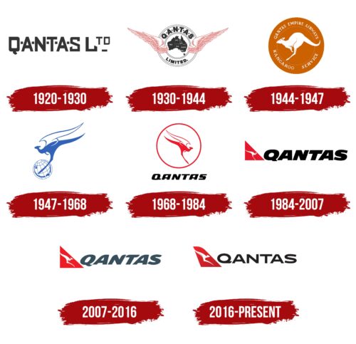
The airline Qantas was originally called Queensland and Northern Territory Aerial Services, but passengers found it easier to remember its shortened name, which became the basis of the original logo. Designers cleverly played with the abbreviation, making it memorable despite the restrained black color. This palette was typical for all emblems of that time due to the prevalence of black-and-white printing.
The inscription “QANTAS LTD” is in an all-caps geometric font with a rectangular shape. The angular style emphasizes the airline’s seriousness and desire to dominate the aviation services market in its region. The letters in the first word are separated by small squares, which significantly worsens the logo’s readability. The straight line of identical squares is associated with airplane windows (which used to be square) or with a schematic representation of passenger seats in the cabin.
To avoid making the inscription too massive, designers reduced and raised the last letter “TD.” This arrangement reflects the idea of lightness and flight, which are central to the airline’s operations. The small rectangular line at the end of the word resembles runway markings, further highlighting Qantas’s connection to aviation.
1930 – 1944
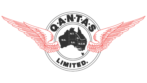
Inspired by its initial success, the brand added real wings to its logo—large, white, with long, narrow feathers. These wings symbolize the aspiration for new heights and demonstrate the company’s huge ambitions, as it launched its first international flights in 1935. The bird wings represent flight, characterizing Qantas as an active and tireless airline. Thin red outlines emphasize every detail, creating a sense of lightness.
In the background, concentric circles form a pattern resembling a roundel. At the center is a simplified map of Australia, with the states W.A. (Western Australia) and VIC. (Victoria), Q. (Queensland), N.S.W. (New South Wales), S.A. (South Australia), and the mainland territory N.T. (Northern Territory) marked. Thin, dotted lines separate them. Only Tasmania, the small island south of the continent, is not labeled, but it is still included in the emblem to maintain geographical accuracy. Using the country’s map, the brand aimed to show its national identity and global service reach.
The company’s name, “QANTAS LIMITED,” is written on a white ring. In the first word, all letters are separated by small black circles, reflecting the style of the era when the logo was used. Another circle replaces the dot after the second word, symbolizing completeness and punctuality, which is crucial in aviation. The bold, sans-serif font enhances readability and creates a sense of power and reliability, fostering passenger trust.
1944 – 1947
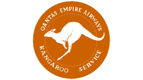
This logo first adorned Qantas Liberator planes in 1944, transporting passengers and cargo across the Indian Ocean. These flights, which lasted over 30 hours non-stop in radio silence, connected two continents during World War II. The kangaroo, Australia’s main national animal, symbolizes resilience, endurance, and strength.
The emblem features a kangaroo mid-leap, showcasing its dynamism and energy. The simple white silhouette is enhanced with small details for realism. This style conveys reliability, stability, and trust, essential qualities for Qantas as an aviation service provider.
The concept designers believed the kangaroo’s ability to leap into the air, despite lacking wings, symbolized the long flights over the Indian Ocean, known as the Kangaroo Service. The leaping kangaroo reflects the idea of intercontinental flights.
In the context of Qantas, this endemic animal highlights the brand’s strong connection to Australia. The logo’s shape is inspired by the Australian one-penny coin, possibly tied to the idea of a “lucky penny.” In some countries, finding such a coin is believed to bring good luck and financial prosperity.
The kangaroo is set within a dark orange circle with the inscription “QANTAS EMPIRE AIRWAYS KANGAROO SERVICE” around it. The capitalized font with sharp serifs gives an impression of swift movement, reflecting the company’s primary passenger and cargo transportation activities.
1947 – 1968
Until 1947, the airline used the traditional image of a kangaroo, implying it was “hopping” from one airport to another, covering vast distances. Designers then decided to add wings to the kangaroo to reflect the idea of air transportation. Since then, the brand has been playfully nicknamed the Flying Kangaroo. This logo, featuring a kangaroo-bird hybrid, was created specifically for Qantas Lockheed L749 Constellation planes flying the Sydney-London route.
The emblem’s style is simplified, with the artists drawing only the animal’s silhouette without details. Even so, it conveys its strength and dynamism. The image evokes a sense of lightness through:
- Thin lines
- An elegant wing outline
- Pointed tips
This sense of airiness and weightlessness is a visual metaphor, drawing parallels between the flying kangaroo and the fast aircraft that easily crosses oceans and connects continents.
The kangaroo holds a globe with parallels and meridians, signifying the airline’s global reach. The globe depicts the British Isles (north) and Australia (south), with an elegant arc representing the Qantas Lockheed L749 Constellation route: the legendary path from Sydney to London.
The blue logo resembles the shades of water and sky, symbolizing an aviation brand. It suggests comfort, calmness, and stability, creating a sense of safety. The white color balances it, perceived as neutral and universal. This is a good choice for an airline aiming to gain customers’ trust worldwide.
1968 – 1984
While the winged kangaroo’s silhouette used to face left, it now faces right—toward the promising future of aviation. The small globe is gone, but the designers retained the emblem’s circular shape, adding a large ring surrounding the kangaroo, drawing attention to it. This is fitting as the kangaroo is one of Australia’s main national symbols.
Although the circle no longer contains parallels and meridians, it still represents the globe. The absence of continents indicates that the airline no longer associates itself with a specific route; it aims for global reach and positions itself as a major international carrier.
The logo no longer features any blue; instead, red has taken its place, enhancing the dynamism of the flying kangaroo. This creates an energetic brand image, highlighting its authority and strength. The red palette is balanced by calm white, with black used for contrast, creating a strong visual impact.
“QANTAS” is written in bold, italicized uppercase letters without serifs, a font style that adds emotional expressiveness. The curved and thickened letterforms convey a sense of movement, freedom, and speed, all associated with the aviation industry.
1984 – 2007
In 1984, the flying kangaroo lost its wings, which did not make it more grounded. On the contrary, designers added a sense of airiness and lightness through thin lines and elegant curves. Despite this, the kangaroo exudes inner strength, reflected in its springy pose, showing that it confidently moves forward with powerful leaps. This allegory represents Qantas, which constantly strives for growth and technological advancement.
The long-tailed animal signifies the brand’s connection to Australia, as it is the country’s main national symbol. Thanks to its endurance, speed, and tirelessness, the kangaroo covers great distances, much like airplanes that travel vast miles to deliver cargo and passengers on time.
The white silhouette of the animal is depicted in the negative space within a red triangle. This simple geometric shape is another reference to aviation. Similar shapes can be found in tail assembly parts, which help control and balance the aircraft. In the context of Qantas, this emblem symbolizes reliability and the company’s high professionalism in caring for passengers’ comfort.
Previously, the brand name was small and inconspicuous, but now it matches the stylized kangaroo in size. This shows the airline’s progress, its pursuit of leadership, and its big ambitions. To make the logo more recognizable, designers used a bold italic font. The dynamic style of the lettering emphasizes the continuous movement of planes that strictly adhere to flight schedules. This vibrant energy is reflected in the color scheme, a symbolic combination of black, white, and red.
2007 – 2016
In 2007, Qantas introduced the Airbus A380 and took this opportunity to update its logo. The new design was intended to adorn the next-generation aircraft but first appeared on an older Boeing 767-300ER. This redesign marked the airline’s entry into the era of giant wide-body airliners and the modernization of its fleet. The emblem is based on the previous logo, maintaining the same structure and color scheme with only minor changes.
- The artists redrew the kangaroo silhouette to align the logo with contemporary design. The curves are now sharper, better expressing the idea of active movement.
- The emblem captures the moment of a leap: the kangaroo’s foot does not touch the bottom of the triangle, making it appear as if it is flying despite the absence of wings. For visual balance, the tail is enlarged and curved upward, while the head is stretched forward.
- The text is recolored to pale gray, which softens the red triangle’s excessive expressiveness.
- The italic font has a more pronounced slant and rounded ends on the letters, reflecting the increased speed of modern airliners.
2016 – today
The refined logo marked a new era in the airline’s history as it decided to add Boeing 787 Dreamliners to its fleet. Since Qantas’s visual identity was already well-recognized, the designers made only minor adjustments to reflect the brand’s commitment to modern aviation technology.
As a result, the red triangle took on the shape of an actual aircraft tail fin. This geometric figure resembles an uneven trapezoid with one smoothly rounded corner, adding lightness and dynamism to the emblem. The kangaroo became more streamlined: its front legs were removed, and its head turned into a small triangle. This abstraction made the animal less recognizable.
To add variety and energy to the logo, the designers introduced a gradient, giving the lower half of the kangaroo’s tail a subtle silver tint and darkening the red base near the bottom. The shadow effect makes the image appear three-dimensional. This gradient texture gives the emblem a modern look, demonstrating the brand’s commitment to progressive ideas.
The font of the word “Qantas” changed. The lettering is now black and styled in a sleek, grotesque font, resembling Turnpike Regular by Font Diner. The main difference is that the letters in the logo are rounded. The smooth, flowing lines symbolize the comfort and safety important to passengers of a leading global airline.
Font and Colors
The Qantas emblem features a straightforward, legible font that exudes modernity and clarity. The name “QANTAS” is written entirely in uppercase letters, which imparts a sense of authority and confidence to the logo. Though the exact font name is not specified, it resembles grotesque fonts such as Helvetica or Arial, known for their simplicity and clean lines.
The logo’s palette incorporates three primary colors: black, red, and white. Black is used for the word “QANTAS,” symbolizing the brand’s strength, stability, and reliability. Red appears on the plane’s tail section, representing Australia’s boldness, energy, and national colors. White is used to depict the kangaroo, highlighting the emblem’s purity and elegance and providing a stark contrast against the red background, making the symbol more striking and noticeable.
The choice of the kangaroo, an iconic Australian animal, reinforces the airline’s national identity and cultural heritage. The thoughtful combination of black, red, and white ensures the logo’s elements are easily distinguishable, enhancing its overall visual appeal and recognizability. The wide, clear font used for the company name adds stability and balance to the design.
