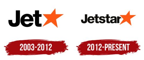
The Jetstar logo demonstrates the airline’s accessibility for travelers with any financial means, as it is a budget airline. The emblem shows that the company stands firmly and looks confidently toward the future.
Jetstar: Brand overview
In 2003, Qantas, the largest airline in Australia, unveiled plans to establish a low-cost carrier to compete with Virgin Blue in the domestic market.
Jetstar was officially launched on May 1, 2004, as a subsidiary of Qantas Group. The airline’s first commercial flight took off from Newcastle to Melbourne on May 25, 2004.
The brand rapidly expanded its domestic network within Australia in 2005, becoming a formidable player in the budget airline sector.
The air operator commenced international flights from Melbourne to Christchurch, New Zealand, on November 23, 2006.
In 2007, the company partnered with Westbrook Investments to create Jetstar Asia Airways, headquartered in Singapore.
The airline initiated long-haul services in 2008, utilizing Airbus A330-200 wide-body aircraft for these routes.
2009 Jetstar Pacific was established in Vietnam in collaboration with Vietnam Airlines, marking the brand’s expansion in Asia.
Jetstar Japan was launched in 2012 as a joint venture with Japan Airlines, Mitsubishi Corporation, and Century Tokyo Leasing.
The airliner welcomed its first Boeing 787 Dreamliner in 2013, becoming the world’s first low-cost carrier to operate this advanced aircraft.
2015, the company undertook a major restructuring to optimize its route network and enhance operational efficiency.
The aviation firm expanded its regional flights across Australia and New Zealand in 2017, increasing connectivity.
The brand underwent a refresh in 2018, introducing a new logo and aircraft livery to modernize its image.
Celebrating its 15th anniversary in 2019, the airline reaffirmed its position as a leading budget carrier in the Asia-Pacific region.
In 2020, the air operator adapted its operational model in response to changing market conditions, focusing on domestic flights within Australia.
Meaning and History
What is Jetstar?
This Australian low-cost airline based in Melbourne is a subsidiary of the national carrier Qantas. It offers affordable flights across an extensive network of destinations covering Australia, New Zealand, Southeast Asia, and the Pacific region. The company operates a modern and standardized fleet of narrow-body aircraft, such as the Airbus A320 and Boeing 787 Dreamliner, configured to ensure efficient and economical operations.
2003 – 2012
The Jetstar logo owes its creation to the rebranding of the old QantasLink name. The new emblem uses a straightforward style. The formal font gives a business-like appearance, adding seriousness to the identity to show potential customers the airline’s readiness to ensure full protection on all routes. This is evidenced by:
- Smooth curves
- Harmonious blend of angles and roundness
- Broad letter strokes
- Minimal spacing between characters
- Bold glyphs
- Thoughtful combination of uppercase and lowercase letters
- Compactness of the text
The text serves as a psychological tool, providing a calming factor that instills confidence in passengers that they can fully trust the airline and have no worries about timely and hassle-free delivery of themselves and their luggage.
The logo’s simplicity indicates the brand’s accessibility and openness to all, its loyal pricing policy, and its commitment to the highest level of service. Comfort is expressed through the even glyphs, optimal readability, and the absence of serifs that typically hinder clear visibility.
Another iconic element in the logo is the star. It is positioned at the end of the text, looks very presentable, adds exclusivity to the emblem, and serves several functions:
- Replaces the second part of the company name (the word “star”)
- Represents the airline as a premium brand
- Indicates its aim to expand destinations
- Highlights the high professionalism of its staff
- Guarantees exclusive service to travelers
The absence of capital letters in the second half of the word “Jet” visually does not disrupt the balance of the text, as the capital “J” is well balanced by the lowercase “t.” The “t” has an upward stroke, so both glyphs (first and last) are the same height.
Balance is present in the color scheme: although the name is painted in black, it is nicely offset by the orange used for the star. Together, they form a strong tandem based on contrast. This helps to visually distinguish each part without detracting from the adjacent one.
2012 – today
The airline continued the theme of stars and premium quality in its new logo, making it clearer and simpler for the audience. They made just one change, logical and natural, ensuring that the company name immediately catches the clients’ attention and stays memorable.
Instead of the star replacing the second part of the name, they introduced a normal text ending—”star.” It uses the same font as the first half, creating a perfect harmony. The smooth black letters convey the seriousness of the airline and its high responsibility to passengers. The updated logo demonstrates:
- A business approach to work
- Attention to detail
- Excellent technical condition of the aircraft fleet
- Perfect pre-flight preparation
- Stress resilience and balance
The ambiguity in the name Jetstar was removed by clearly separating text and graphic elements, eliminating the dual meaning and wordplay that made it seem more like a puzzle than the name of a serious company. This change reflects the brand’s maturity and reliability. The smooth, even letters create an atmosphere of calm, reliability, and confidence.
The five-pointed star retained its shape, style, and position. It remains slightly tilted and turned. Designers trimmed its upper half to prevent the last letter from obscuring the left point.
The result is a charismatic and unique symbol that stands out against the bright orange. Their proximity has significant meaning, representing day (sun) and night (darkness), suggesting that the airline operates around the clock, delivering passengers to their daily and night destinations.


