The Mitsubishi logo perfectly balances software, parts quality, and the car’s look. The emblem shows that a harmonious combination of three faces gives rise to comfortable and practical cars.
Mitsubishi: Brand overview
Mitsubishi is the abbreviated name of the multinational giant Mitsubishi Group. He forms the large professional organization Mitsubishi Keiretsu. The company’s founder was Iwasaki Yataro, who brought it to the market in the spring of 1870. Now, it owns many subsidiaries and enterprises in different directions, expanding its interests to mining, shipbuilding and automotive, gas and oil, banking, chemical, aviation, insurance industries, and many other areas of the economy. This group includes four parent organizations: Mitsubishi Corporation, Mitsubishi Heavy Industries, Mitsubishi Electric, and MUFG Bank. The head office is based in Tokyo (Japan).
The company’s roots go back to the second half of the 19th century when Iwasaki Yataro became the head of the shipping company Tsukumo Trading. In 1873, she rebranded herself as Mitsubishi. Success came to her after the Japanese government agreed to deliver soldiers and military materials. The firm, in turn, also supported the country’s new leadership, deploying troops and weapons in 1877 to suppress the Satsuma Rebellion. Later, Yataro began investing in ship repair, finance, and mining industries.
In 1884, the entrepreneur rented the Nagasaki Shipyard to move on to building ships. He later renamed the facility Nagasaki Shipyard & Machinery Works. It underwent several more changes until it became Mitsubishi Shipbuilding Co., Ltd. in the early 20th century. In 1917, the company assembled the debut Mitsubishi Model A, the first production car in Japan. But then the car was discontinued, as it cost much more than its American counterparts.
In 1934, Mitsubishi Shipbuilding merged with the Mitsubishi Aircraft Co. organization, which produced aircraft engines and other components for ships and aircraft. The newly formed structure was named MHI (Mitsubishi Heavy Industries), the largest private company in Japan. It focused on the manufacture of large vehicles and equipment.
In 1937, the firm designed and assembled a prototype military sedan. It became the first four-wheel-drive vehicle made in Japan. However, immediately after the war, the enterprise switched to producing passenger cars. In 1950, the allied states ordered the liquidation of industrial conglomerates, resulting in MHI split into three regional companies.
Meaning and History
It is a multidisciplinary organization that produces automobiles, chemicals, paper, glass, beverages, electronics, and much more, so its emblem is multi-component. Banking operations, construction, and property insurance are priority work areas. This factor left its mark on the identity: the Mitsubishi logo consists of three identical parts that form an inseparable figure. This is how the brand communicates to customers the philosophy of the unity of purpose and the processes leading to it.
What is Mitsubishi?
Mitsubishi is a group of companies that develop Japan’s industry. It consists of about 40 organizations with different lines of business. They are engaged in property insurance, construction, banking, manufacturing of metal products, electronics, drinks, glass, paper, raw chemicals, and more. And Mitsubishi Motors Corporation makes cars.
1870 – 1875
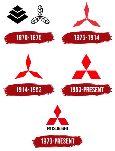
The organization’s debut emblem is directly related to its name since Mitsubishi is formed from the words “mitsu,” which translates as “three” and “hishi” – “water chestnut.” The image of this plant is often used in Japanese to denote a diamond or rhombus. Therefore, the logo consists of a combination of the Iwasaki family crest with three diamonds of different sizes overlapping each other and an asymmetrical “blade” with three oak leaves, which was the personal mark of the Yamauchi dynasty controlled Shikoku, where Yataro was born. Both symbols were used at the same time.
1875 – 1914
In this Mitsubishi logo, the resemblance to two transport elements was visible: an aircraft’s propeller and a ship’s blade. This decision is connected with the company’s roots and the technical scope of its activities. The main and only component was the construction of three elongated diamonds. But they did not connect closely in the middle but formed a ring with a hole, which indicated that this was a rotating screw. A trial transition to the red color has occurred at this time.
1914 – 1953
In 1914, the corporate logo was changed due to the expanded coverage of various areas of technology production and the final transition to the Mitsubishi name. At that time, the company had other transport-building directions, so it was decided to graphically combine the heraldry of the two dynasties with ship blades and an aircraft propeller. This is how elongated rhombuses appeared, connected at the center by the ends. The developers added color to them by replacing black with red.
1953 – today
Now, the blade images are unified and look like three-wide rhombuses. The two lower elements lie sideways on the edge, and the upper rises above them at the narrowest part. They are all connected in the center. Moreover, the logo has variants, both with an inscription and without. The text consists of the name of the transnational giant and is located under the corporate icon.
1970 – today
“Mitsubishi” appeared under the logo for greater brand recognition. This option was mainly used in the media and other print media.
Mitsubishi’s corporate identity is based on historical heraldry – the coat of arms of the Iwasaki family and the symbol of the Yamauchi dynasty, which controlled the area where Iwasaki Yataro was born. Initially, these were oak leaves and rhombuses stacked one on top of the other. Then the designers rethought them and combined them into one symbol – a rhombus for a diamond since the word “hishi” is translated as “water chestnut.” In Japan, it symbolizes this precious mineral, so the locals call this sign “three diamonds.”
In addition, according to Japanese canons, a figure consisting of three elements diverging in different directions is called “triseps” – a designation of heavenly power. That is, the founder put a very great meaning in the name of the purchased company: a messenger from heaven and an earthly jewel. All this is graphically combined and conveyed in the logo.
Mitsubishi: Interesting Facts
Mitsubishi is a towering figure in Japan’s corporate arena, with a presence across a broad spectrum of industries, particularly its automotive division.
- Shipping Beginnings: Mitsubishi’s journey began in 1870 with Yataro Iwasaki’s establishment of a shipping company. “Mitsubishi” merges “mitsu” (three) and “bishi” (diamond shape), mirroring the Iwasaki family emblem.
- Varied Interests: Beyond cars, Mitsubishi’s ventures encompass electronics, construction, finance, and chemicals, showcasing its vast industrial footprint.
- Automotive Milestone: The Mitsubishi Model A, launched in 1917 as Japan’s inaugural series-production car and inspired by the Fiat Tipo 3, remains a historical hallmark with only 22 units ever made.
- EV Trailblazer: Ahead of the electric vehicle trend, Mitsubishi unveiled the i-MiEV in 2009, positioning itself as a pioneer in mass-produced electric vehicles.
- Motorsport Legacy: Mitsubishi’s acclaim in the World Rally Championships, especially through the Lancer Evolution series, highlights its competitive spirit and engineering prowess in motorsport.
- S. Manufacturing First: In 1988, Mitsubishi became the first Japanese carmaker to initiate production in the U.S. through a partnership with Chrysler, establishing the Diamond-Star Motors plant in Illinois.
- 4WD Innovation: A forerunner in 4WD technology, Mitsubishi introduced the first electronically managed Traction Control System in 1990, with its Super All-Wheel Control system lauded for enhancing driving stability and performance.
- Green Efforts: Mitsubishi Motors champions environmental stewardship with its “Environmental Vision 2020,” targeting reduced CO2 emissions and minimizing its ecological footprint.
- Aerospace Contributions: Beyond terrestrial ventures, Mitsubishi has made strides in aerospace, notably with Mitsubishi Heavy Industries’ development of the Mitsubishi Regional Jet, Japan’s pioneering domestic passenger jet.
- Iconic Vehicles: The Mitsubishi Pajero (Montero in some regions), a multiple-time Dakar Rally victor, and the Mitsubishi Eclipse, a favorite among car enthusiasts and pop culture, are among its celebrated models.
Mitsubishi’s storied legacy, marked by innovative strides, a diversified business portfolio, and a notable influence in the automotive sphere through groundbreaking technologies and environmental commitments, underscores its enduring prestige.
Font and Colors
The word “Mitsubishi” can be used separately or as part of a logo. It is in an individual font with the letter “B” separated in the middle. That is, the right and left sides are not closed. There is also an “M” with a taper at the bottom on the central part.
The logo’s palette is sparse. In the early versions, only black and white were present. Later versions are more diverse since an additional color has appeared: the icon is red, the inscription is black, and the background is white.
FAQ
Is Mitsubishi a Japanese car?
Yes, Mitsubishi is a Japanese car brand. The company produces its vehicles at various facilities throughout Japan. For example, the Mizushima plant in Kurashiki, Okayama, specializes in producing technologically advanced models. Additionally, there is a major research and development center in Okazaki, Aichi, where the brand works on new automotive technologies. Having these facilities in Japan helps ensure the vehicles meet the high standards expected in local and global markets.
What is the slogan of Mitsubishi?
The slogan “Manage your ambitions” marks a new direction for the brand. Introduced as part of the new strategy, this phrase underscores the brand’s focus on innovation and growth. It encourages customers to pursue their dreams with determination, using the brand’s vehicles to achieve their goals.
What does the Mitsubishi logo mean?
The Mitsubishi logo with three red diamonds comes from the family crests of the brand’s founder, Yataro Iwasaki. It includes elements from his heritage:
- Oak leaves from his mother’s family crest, representing their origins
- Rhombuses from his father’s side
These elements are shaped to look like the blades of a ship’s or aircraft propeller, hinting at the brand’s history in air and water transport manufacturing.
The diamonds in the logo stand for strength and durability, which the brand strives to reflect in its products. The logo symbolizes the company’s strong heritage, values, and dedication to innovation and technological progress. It represents the brand’s evolution from its early maritime and aeronautical activities to its current role as a major global player in the automotive and electronics markets.
Why is the Mitsubishi logo red?
The Mitsubishi logo has a significant history with its three interlocking diamonds. The design is inspired by the three-leaf crest of the Tosa clan and the three stacked diamonds of the Iwasaki family, symbolizing success.
The red represents durability and quality, reflecting the brand’s desire to create reliable products. Over time, this symbol became well-known through Mitsubishi’s cars and electronics.


