


![]() American Airlines Logo PNG
American Airlines Logo PNG
The American Airlines logo has spread its wings over the world. The airline transports passengers between continents, demonstrating the strength, speed, and reliability of American aircraft. The emblem promises: “Once you try it, you’ll want to fly with us forever.”
American Airlines traces its roots to 1926, when Colonial Air Transport began carrying mail between New York and Boston. Early aviation relied on postal contracts as its main source of revenue.
In 1930, consolidation led to the creation of Aviation Corporation, which brought together dozens of small carriers. On June 11, 1934, American Airlines emerged as a unified company, incorporating firms like Robertson Aircraft Corporation, Southern Air Transport, and American Airways. Cyrus Rowlett Smith became its first president.
In 1936, the airline introduced the Douglas DC-3, improving the economics of passenger travel. In 1939, shares were listed on the New York Stock Exchange. During World War II, the company supported military transport operations.
In 1953, a nonstop transcontinental flight on the Douglas DC-7 connected New York and Los Angeles. In 1959, the Boeing 707 entered service, opening international routes.
In the 1960s, the fleet expanded, including a 1968 order for the Boeing 747. In 1972, the SABRE reservation system changed ticket sales and revenue management.
In 1987, the airline acquired AirCal and expanded on the West Coast. Around the same time, the AAdvantage program launched.
The early 1990s brought financial strain, but restructuring stabilized operations. In 1999, American became a founding member of Oneworld.
The 2001 attacks involved two company aircraft, leading to major security changes. In 2011, large orders from Boeing and Airbus were placed for fleet renewal.
In 2013, a merger with US Airways was finalized in 2015, creating one of the largest carriers. By 2020–2023, the airline retired older aircraft, added models such as the Boeing 787 and Airbus A321neo, expanded partnerships with Alaska Airlines and GOL, and explored eVTOL projects with Vertical Aerospace.
Meaning and History
![]()
In the early years, the company created a “glamorous” image because air travel was considered exclusive, and wearing a pilot’s uniform with the AA logo was a special privilege. Now, the air carrier is perceived quite differently.
He was forced to change his logo to distract customers from other issues, including a recent bankruptcy, negative reviews, and the scandal involving a web designer who was fired just for wanting to redesign American Airlines’ interface. With this in mind, the main goal of the latest rebranding was to showcase dynamic change. The company owners hoped to start again with a new logo and a reimagined aircraft livery.
What is American Airlines?
It is the largest airline in the world. It has the largest fleet in terms of the number of aircraft. It is based in the United States and has a wide international route network. Its original name is American Airlines.
1934 – 1945
![]()
In 1934, American Airways changed its name to American Airlines. Despite this, she retained her old emblem, designed back in 1931: a blue circle depicting a globe with a giant eagle standing on it. On the two sides of the bird’s raised wings were the letters “A”: one to the left, the other to the right. In the background, a diagonal line ran between them. The bezel ring, beam, and both “A” were red, which reduced contrast.
The logo’s author is one of the airline employees, Goodrich Murphy. He came up with an original idea himself, but he spied an image of an eagle in the Scottish hotel’s booklet. The color combination is an obvious reference to the US flag.
1945 – 1962
![]()
In 1945, the designers removed all elements except the letters and the eagle. Simultaneously, the logo looked completely new because the bird was enlarged and turned to the right. Although the drawing style remains the same, minor details have changed. The colors were redesigned with blue as the primary and white as the background.
1962 – 1967
![]()
In the early 1960s, the emblem developers reimagined the design, returning to the classic red, white, and blue color scheme. To do this, they again enclosed the eagle and letters in a bright ring, as they had in 1934-1945. Another change is the addition of the inscription “AMERICAN,” which appeared beneath the bird to clarify the abbreviation.
1967 – 2013
![]()
In 1967, Massimo Vignelli commissioned Massimo Vignelli to develop new visual identity elements: the aircraft’s logo and livery. Until then, only two capital letters, “AA,” were depicted on the tails of airliners. The Italian designer has completed them with an abstract cruciform eagle in a “V” shape. He also created a text sign for the air transport enterprise, consisting of the merged words “AmencanAirlines.” The left half of the lettering was red, and the right half was blue. The simple Helvetica font emphasized the company’s professionalism.
2013 – today
![]()
In early 2013, design firm FutureBrand modernized the American Airlines eagle beyond recognition. The modern graphic sign, the Flight Symbol, has long been in the public domain because the United States Copyright Office deemed it insufficiently original for registration. The airline only acquired the copyright for its stylized bird in 2018.
Another challenge the developers faced was the enterprise’s customers’ and employees’ rejection of branding. Due to significant controversy, CEO Doug Parker put two logos to a vote at the end of 2013: the Flight Symbol and a messy retro design that combined the old and new emblems. Naturally, when choosing between these two options, many voted for the first, which the airline’s management wanted.
Font and Colors
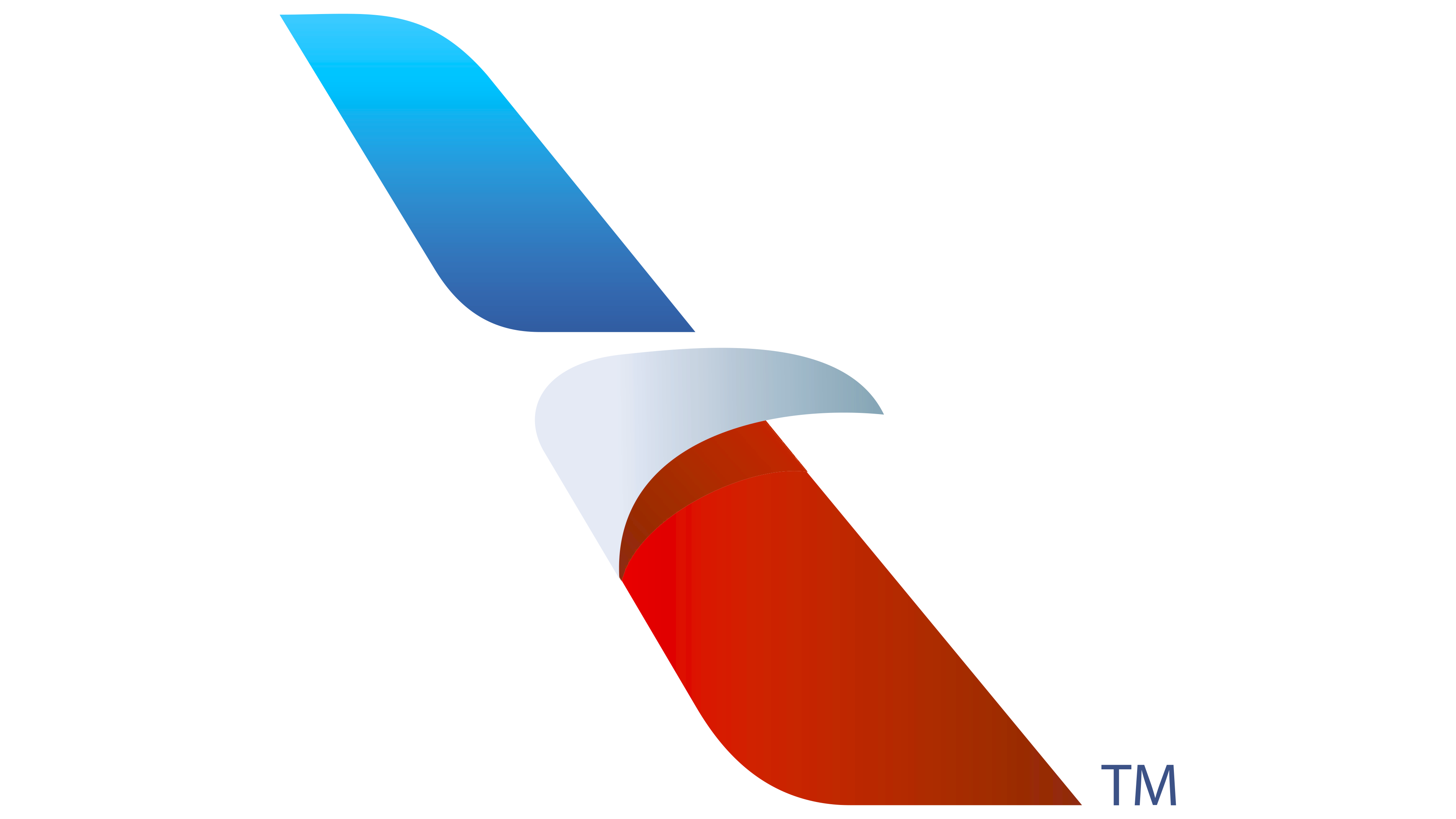
The main element of the American Airlines identity is the eagle, the national symbol of the United States. Now, the bird looks like a three-color diagonal stripe with a triangular projection, very similar in shape to an airplane’s tail. According to FutureBrand’s representatives, you can see the letter “A” and a star in this sign. But they are too abstract to be obvious. Many believe that the previous version of the logo was much better. Its creator, Massimo Vignelli, shares the same opinion.
The American Airlines name is to the left of the new graphic. The designers chose a sans-serif font for the lettering, similar to Helvetica, used from 1967 to 2013.
A distinctive feature of the logo is its three-color palette, which evokes the US flag. Shadows and gradients give the Flight Symbol visual depth.
FAQ
What is the American Airlines symbol?
The company uses an eagle as its symbol. The eagle is a key part of their brand, showing strength and freedom. It has been with the airline for a long time and covers the company’s vast network across the U.S. and other countries. This same eagle inspired the name for its regional service, American Eagle Airlines, which handles shorter flights within the U.S. and to nearby international destinations. The eagle is a popular symbol in America, appearing in various company logos and national emblems because it represents patriotism and toughness.
What is the logo for American Airlines?
The company’s logo, known as the ‘Flight Symbol,’ combines the features of an airplane and a bird, highlighting the speed and essence of flight. It has red and blue diagonal wings, symbolizing an airplane’s movement, with a stylized eagle’s head between them, linking to the company’s long-standing use of the eagle as a symbol of strength and freedom. The colors are the same as the American flag, emphasizing the company’s role as a national carrier.
Where was American Airlines founded?
The company started as American Airlines, which was created by several independent air carriers from the West, Midwest, and Northeast United States. These carriers joined forces to build a stronger, more extensive network, enabling the new airline to offer nationwide service. This foundation was key to its becoming a major force in the aviation industry, eventually making it one of the top airlines in the United States and earning it a significant influence on national and international air travel.
Who Created the American Airlines logo?
The latest logo for the company, known as the ‘Flight Symbol,’ was designed by FutureBrand, a London-based branding agency. FutureBrand is part of the Interpublic Group of Companies, an American firm focusing on advertising and marketing. The new logo is part of the company’s effort to update its brand.
This new logo was introduced with the company’s newer planes and technology. The update helps the company stay competitive and appeal to travelers worldwide with a fresh, unified look.
Did American Airlines change its logo?
Yes, the company has updated its logo several times. The latest version was launched in 2013 as part of an effort to update the airline’s image. The logo now features a stylized eagle that links to the airline’s history while giving it a modern look. In 2013, the company bought new aircraft and improved customer service. This update was a key step in refreshing the airline’s visual and business approach.