


 Quality Inn Logo PNG
The modern Quality Inn logo appears refined and elegant, reflecting the brand’s long journey and successful evolution. Over the years, the hotel chain has developed a unique visual identity that, despite numerous updates, has retained its appeal. Each rebranding added new touches and distinctive features to the emblem; the latest version, embodied in a minimalist style, is no exception.
The current version combines the best of previous designs, offering viewers an original, graceful simplicity. It captivates with its mysterious beauty, expressed primarily through its color scheme. The combination of gold, white, and green creates a harmonious image, giving the visual symbol a luxurious yet restrained appearance. This color trio enhances the graphic elements and complements the text, creating a unique and easily recognizable brand style.
Quality Inn traces its roots to 1939, when the Stewart family opened a Florida motel under the Quality Courts United name. The business targeted motorists seeking affordable, comfortable lodging when roadside motels were still relatively new. In 1941, the family and six East Coast owners formed a cooperative with shared standards for cleanliness, comfort, and guest service. By 1953, the network had more than 100 members.
The company became Quality Motels in 1963 and expanded beyond the East Coast. A 1968 stock-market listing funded further growth and moved the business toward a corporate structure. In 1972, the name changed to Quality Inns International as hotels opened in Europe and the Caribbean.
The group acquired Comfort Inn in 1981, entering the budget segment and beginning a multibrand model. It became Quality International in 1986, then Choice Hotels International in 1990 as the portfolio grew to include Quality, Comfort, and Sleep Inn. During the 1990s, investment focused on property upgrades and standardized operations.
In the 2000s, the chain added improved reservation systems and high-speed internet. A 2008 renewal program updated exteriors, interiors, and amenities. During the 2010s, the brand revised bedding, breakfast, and service standards, followed by a 2016 value campaign. Safety protocols and contactless options expanded in 2021 and 2022, while the brand remained part of the group in 2023.
Meaning and History
What is Quality Inn?
This well-known mid-range hotel chain offers cozy and affordable accommodations for business travelers and tourists. Hotels in North America and abroad provide standardized services to ensure a comfortable stay. Guests are offered free breakfasts, high-speed internet, and spacious rooms. Many hotels also provide additional amenities such as business centers, fitness centers, and laundry services. Regular customers can use a loyalty program to earn points for free nights and other rewards.
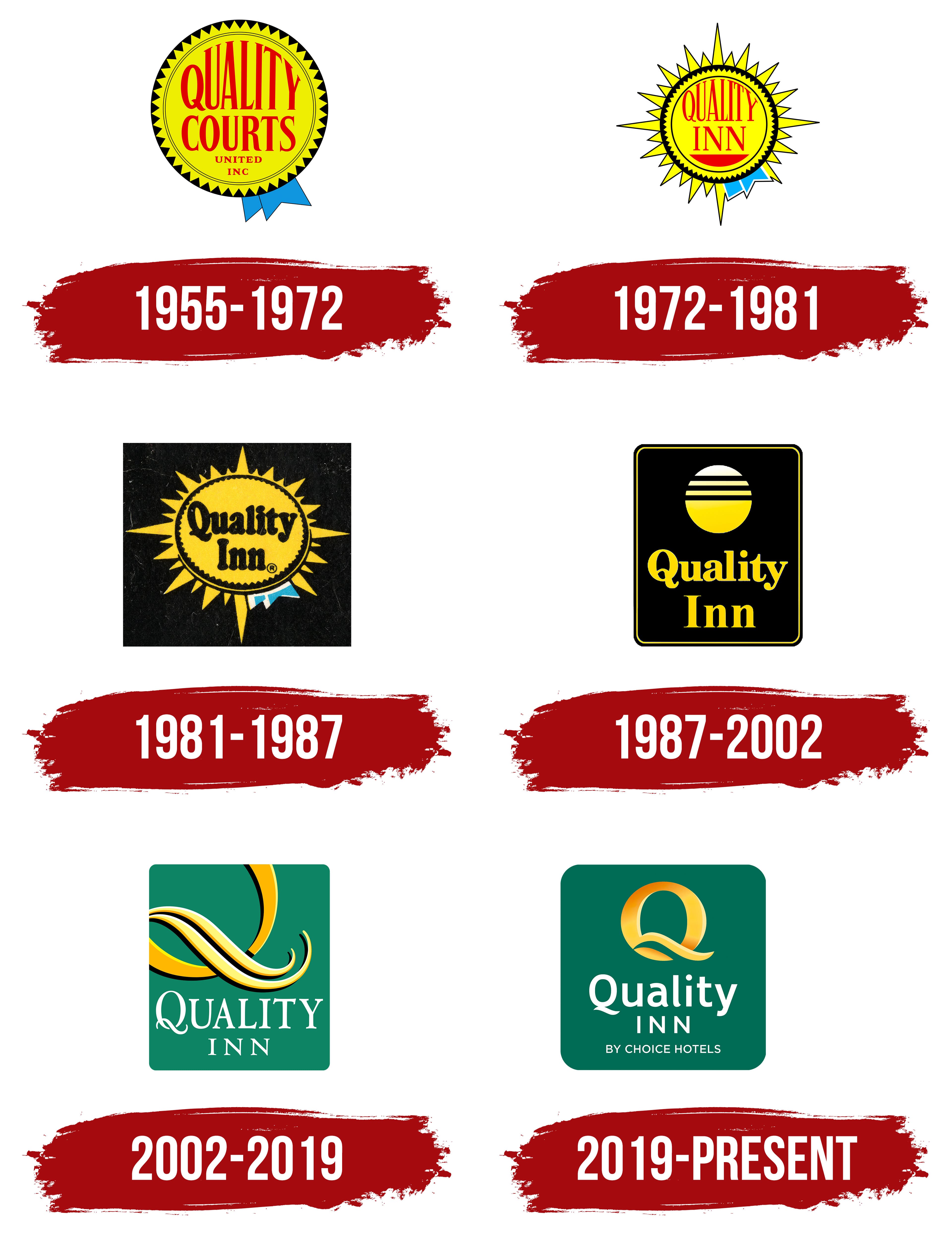
1955 – 1972

The Quality Inn hotel chain traces its origins back to 1939, when a small network of hotels was opened in Florida. Over time, the brand expanded significantly, and in 1955, the first logo appeared, marking the beginning of the chain’s rapid growth. The company then established itself as a hotel brand that stood out among competitors with its unique and appealing visual identity.
The chain’s first logo featured a symbol resembling an award or badge of honor. The round shape was interpreted as a sun symbol, representing warmth, coziness, and a comfortable stay. This radiance promised high-quality service, linking it to sunny vacations and enjoyable time at the hotels. Two blue ribbons outside the circle added elegance and emphasized high service. They implied guests could expect comfort and quality, even on a moderate budget. The logo conveyed a hotel accessible to everyone while still offering excellent service and coziness.
The color palette created a harmonious and attention-grabbing combination. The identity’s main colors were yellow, red, blue, and black. Red took the leading role, highlighting the text element, which stood out vividly against the yellow background. This contrast enhanced the visual effect, making each identity element stand out while still blending harmoniously. Through the play of colors, the design achieved unity and coherence, reflecting the chain’s shared identity.
The logo included four words, each placed on a separate line. This step-like arrangement allowed the information to unfold gradually, with each word adding new details. Interestingly, each subsequent line of letters became smaller, adding flow and continuity. This approach emphasized structure and created a sense of logical transition from one element to another, adding dynamism to the overall identity concept.
1972 – 1981

In 1972, a new logo, distinguished by its brightness and artistic execution, was presented to the hotel chain’s audience and clients. Although the updated emblem did not introduce radically new meanings, it retained recognizable elements familiar to regular guests while becoming more detailed. The designers’ main task was to refine the fragments’ detailing to strengthen the brand symbol’s presence.
The sun symbol, the emblem’s key element, took on a more realistic form. Each ray, carefully drawn and directed in different directions, symbolized warmth, happiness, and the hotel chain’s growth. The rays embodied the brand’s expansion and success, reinforcing associations with the comfort and coziness found in every hotel.
Light blue ribbons, reminiscent of a prize medal, remained on the logo, maintaining their elegance. Two black outlines of different shapes and widths added expressiveness and clarity to the emblem. The hotel brand name now consisted of two words, each on its own level. Elegant, wide, tall red letters captured attention and stood out against the background. Thanks to their brightness and harmonious contrast with the background, the text became more noticeable and memorable.
The sun was at the bottom of the logo’s circle, depicted as a red semicircle. Repeating this element was a successful move that gave the symbol completeness and enhanced its aesthetic appeal.
1981 – 1987

In 1981, the audience first saw the new hotel brand symbol. The logo underwent significant changes, retaining three elements from its previous version.
The motifs were completely updated. The new background, in dark tones with vintage-style elements, stood out and added elegance to the logo. This background drew attention to both the text and the image. On the black background, a sun was depicted, meticulously drawn with 29 rays. A distinctive feature was the sun’s yellow circle, which had a black outline that seemed to overlay the primary color. The rays extended beyond this outline, creating a three-dimensional effect.
The main geometric shape became a black square, and a circle symbolized the sun. The two ribbons, previously one color, now combine blue and white, adding dynamism and freshness. The text element was set in bold black, perfectly harmonizing with the logo’s overall concept.
1987 – 2002

In 1987, the visual symbol changed, gaining clarity and precision for the first time. It became more elegant and minimalist while maintaining themes of beauty and sophistication.
The new identity centered on a large black rectangle. This background created depth, enhanced by the yellow border outlining the shape. The contrasting colors gave the logo volume and expressiveness.
The yellow text stood out against the dark background. The hotel brand name sat on two lines at the bottom of the emblem. Each word started with a capital letter, and the bold, sans-serif font and other simple elements added clarity.
The sun remained an important part of the logo, continuing the tradition. Now, it rose above the text, symbolizing success and prosperity. The sun consisted of a lower semicircle and four long horizontal lines, conveying light and warmth. These lines were carefully drawn, showcasing the excellence of the graphic execution.
2002 – 2019
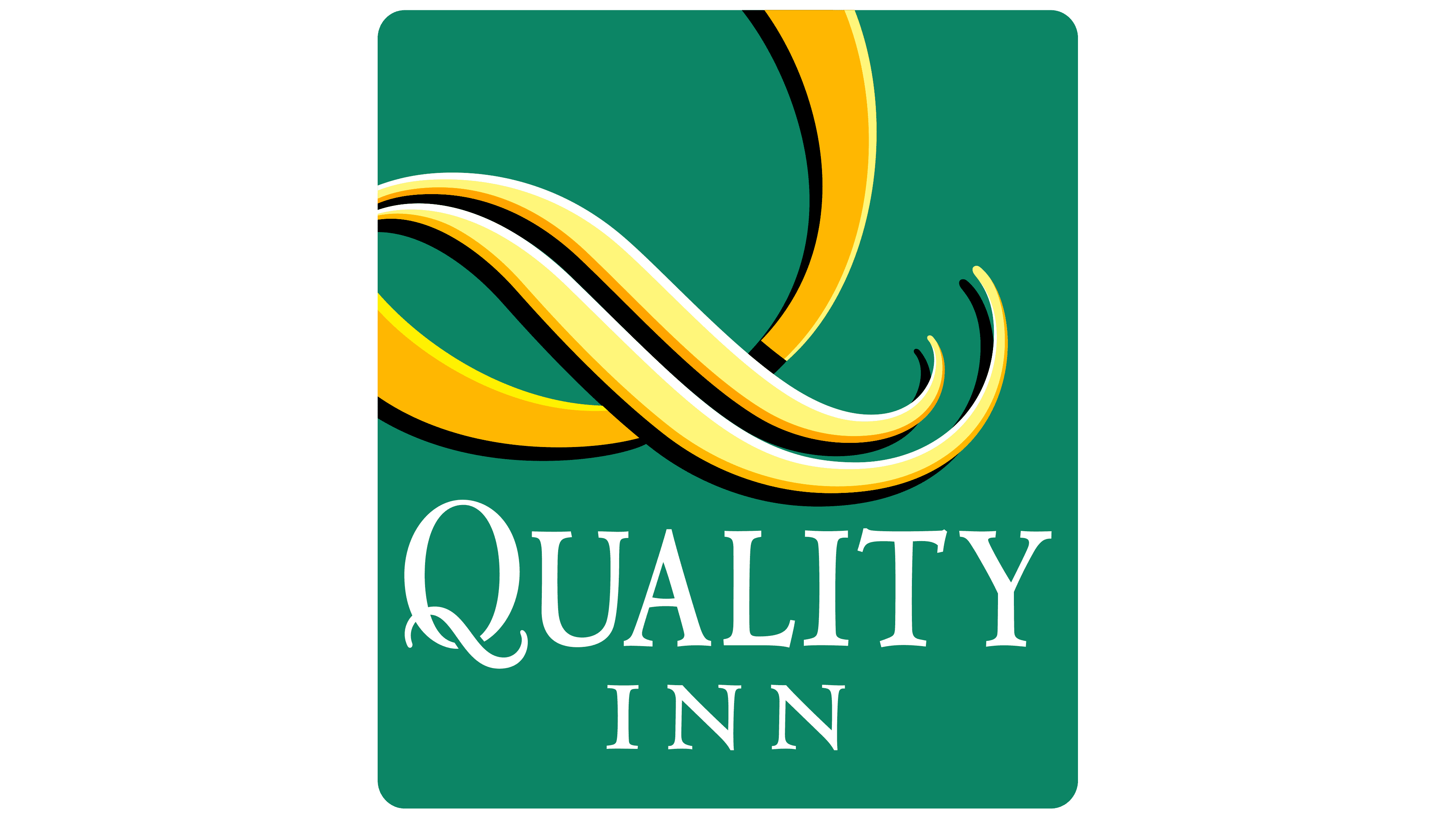
For the first time in the brand’s logo history, the sun image was removed, which had long symbolized success, warmth, and well-being. The identity has now taken on a minimalist form, eliminating additional elements. In their place, the letter “Q” has appeared, which, despite its simplicity, retains a symbolic resemblance to the sun. This dual meaning underscores that the brand continues to develop, leaving familiar symbols behind without losing their significance.
The letter “Q” is only partially visible, forming a semicircle that seems to disappear beyond the logo’s boundaries, creating an impression of mystery and dynamism. It becomes the central element, drawing attention with its elegant and elongated shape.
The brand name is now placed on different levels, giving the text element even greater expressiveness. The two words, rendered in a graceful font, make the emblem easy to recognize. The mysterious hook of the letter “Q” enhances the visual effect, adding a sense of movement and perfection.
2019 – today
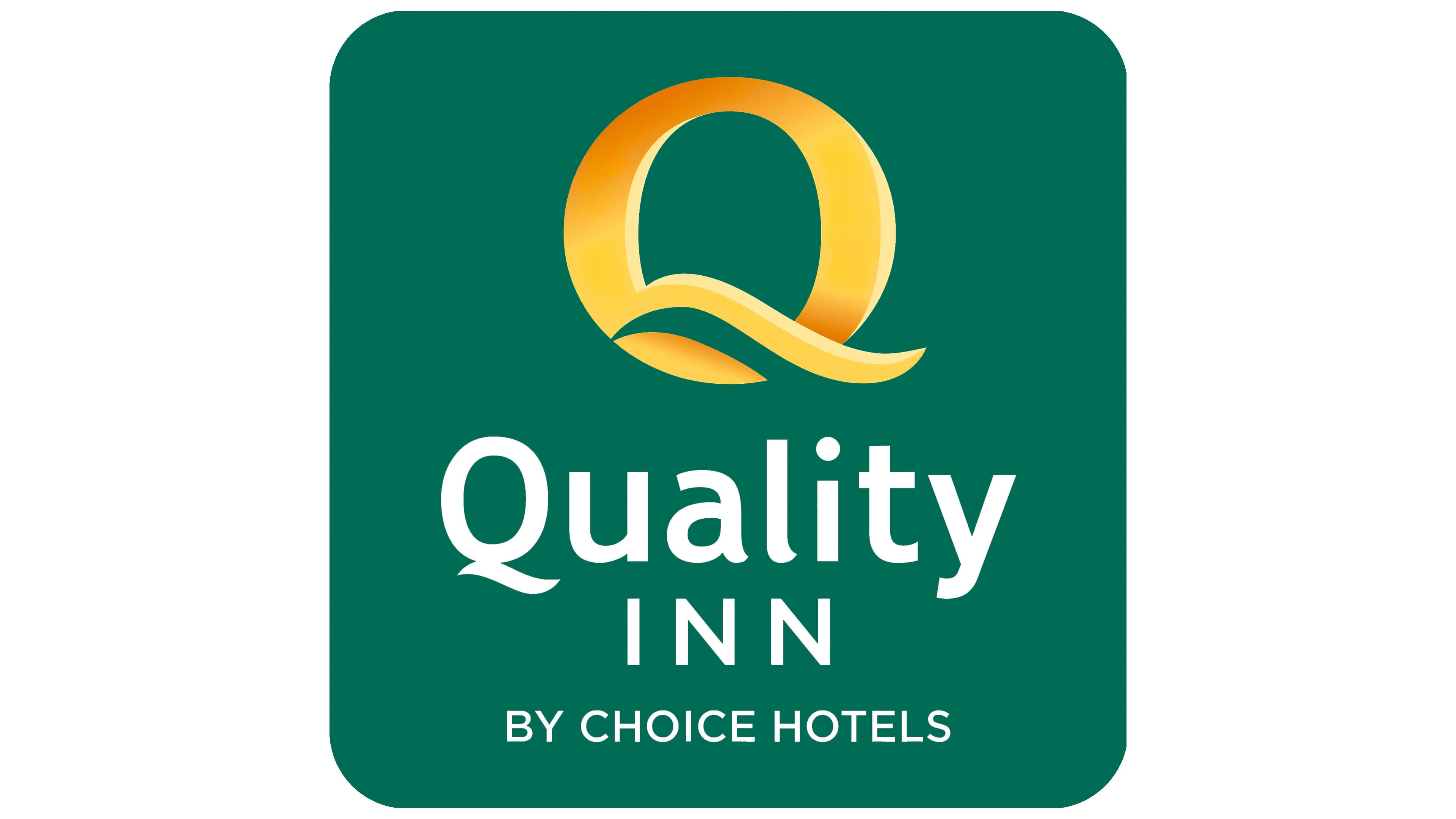
The Quality Inn logo, introduced in 2021, blends simplicity and elegance. The primary colors green, white, and gold are key in conveying the brand’s core message: high-quality services, stability, and accessible luxury.
The green background symbolizes harmony, tranquility, and nature, highlighting the comfort and coziness the hotel chain aims to offer its guests. This color is associated with nature and relaxation, giving clients peace and calm during their hotel stay. The white font represents cleanliness and openness, important elements the brand strives to embody in its service.
The top of the emblem features a golden “Q” that resembles a shining sun. This element may symbolize renewal, growth, and the pursuit of higher service standards. The golden hue hints at luxury, not excessive, but accessible to everyone who chooses this hotel chain.
The logo’s font is simple and elegant, giving the entire composition a sense of reliability and stability. The “Quality Inn” inscription is clear and easy to read, emphasizing the company’s professionalism and many years of experience in the hospitality industry. The phrase “BY CHOICE HOTELS” at the bottom adds confidence, indicating affiliation with a larger network and strengthening guest trust.
The Quality Inn emblem highlights the reliability, accessibility, and pleasant comfort that the hotel offers its visitors.