 Choice Hotels Logo PNG
Hotel chains provide travelers with accommodations, offering rooms and basic services for leisure and business trips. Hotels focus on standard accommodations and convenient booking. The Choice Hotels logo represents a company that manages a hotel chain and provides lodging for tourists and business travelers.
Choice Hotels International began operations in 1939 as Quality Courts United. At the time, seven motel owners joined forces to establish unified service standards along U.S. highways. The concept of a network of independent motels with common service rules gained recognition.
In the 1940s and 1950s, the network grew amid the postwar rise of automobile travel. In 1963, the company adopted the new name Quality Courts Motels, Inc. In 1968, it went public and used the raised capital to develop a franchising model.
In 1972, the organization changed its name to Quality Inns International. During this period, the company began expanding outside the United States. In 1980, the company acquired the Comfort Inn brand. In 1981, it launched the Clarion brand, designed for full-service hotels.
In 1987, the company took its current name, Choice Hotels International. The name reflected its goal of expanding its brand portfolio. From 1989 to 1997, Econo Lodge, Rodeway Inn, Sleep Inn, and MainStay Suites joined the network.
In the 2000s, Choice began developing online booking and introduced the Choice Privileges loyalty program. In 2011, the company made a major acquisition in Europe, expanding its international presence.
In 2015, Choice introduced the WoodSpring Suites brand. In 2018, Choice acquired the WoodSpring Suites chain for $ 231 million.
In 2023, Choice attempted to acquire Wyndham Hotels & Resorts. The proposed amount was about $9 billion, but the deal did not go through. In 2024, the company focused on digitalizing its franchise model.
The company manages more than 7,500 properties in 45 countries. Its brands include Comfort, Quality, Clarion, Sleep Inn, and Econo Lodge.
Meaning and History
What is Choice Hotels?
An international hotel group operating one of the largest franchise hotel networks in the world. It includes about 7,500 properties and more than 630,000 rooms in 45 countries. The company’s main activity centers on midscale and economy brands: Comfort, Sleep Inn, Quality, Clarion, MainStay Suites, Econo Lodge, and Rodeway Inn. The company operates under a franchise model and runs the Choice Privileges loyalty program, which has more than 22 million members.
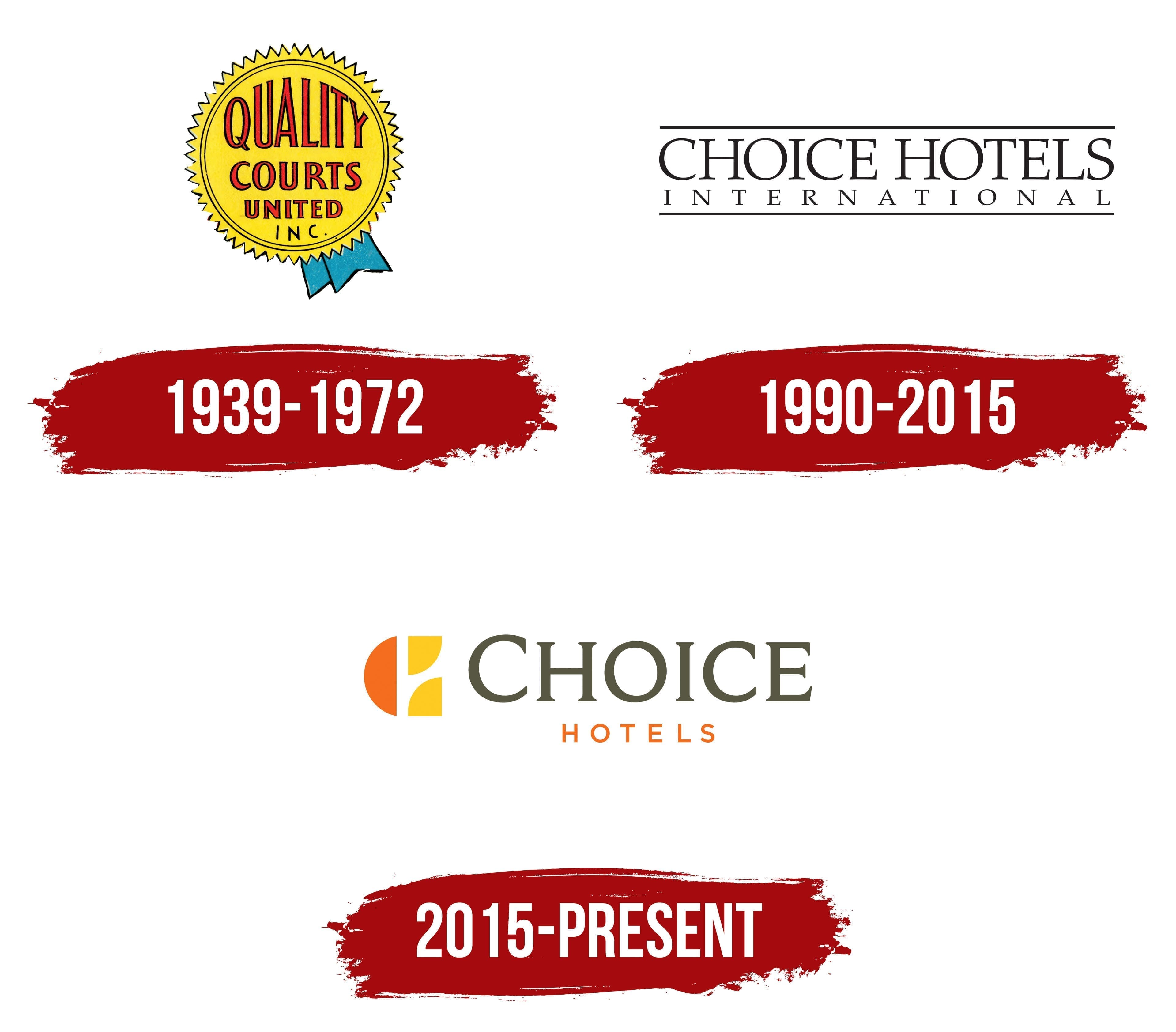
1939 – 1972
Quality Courts began through an agreement among 7 motor court owners in Florida. In 1939, the business owners started operating under a shared name and adopted common requirements for guest accommodations. Two years later, the organization incorporated as Quality Courts United, Inc. Choice Hotels identifies it as one of the first hotel associations in the United States to unite independently operated properties under a shared brand and coordinated service standards.
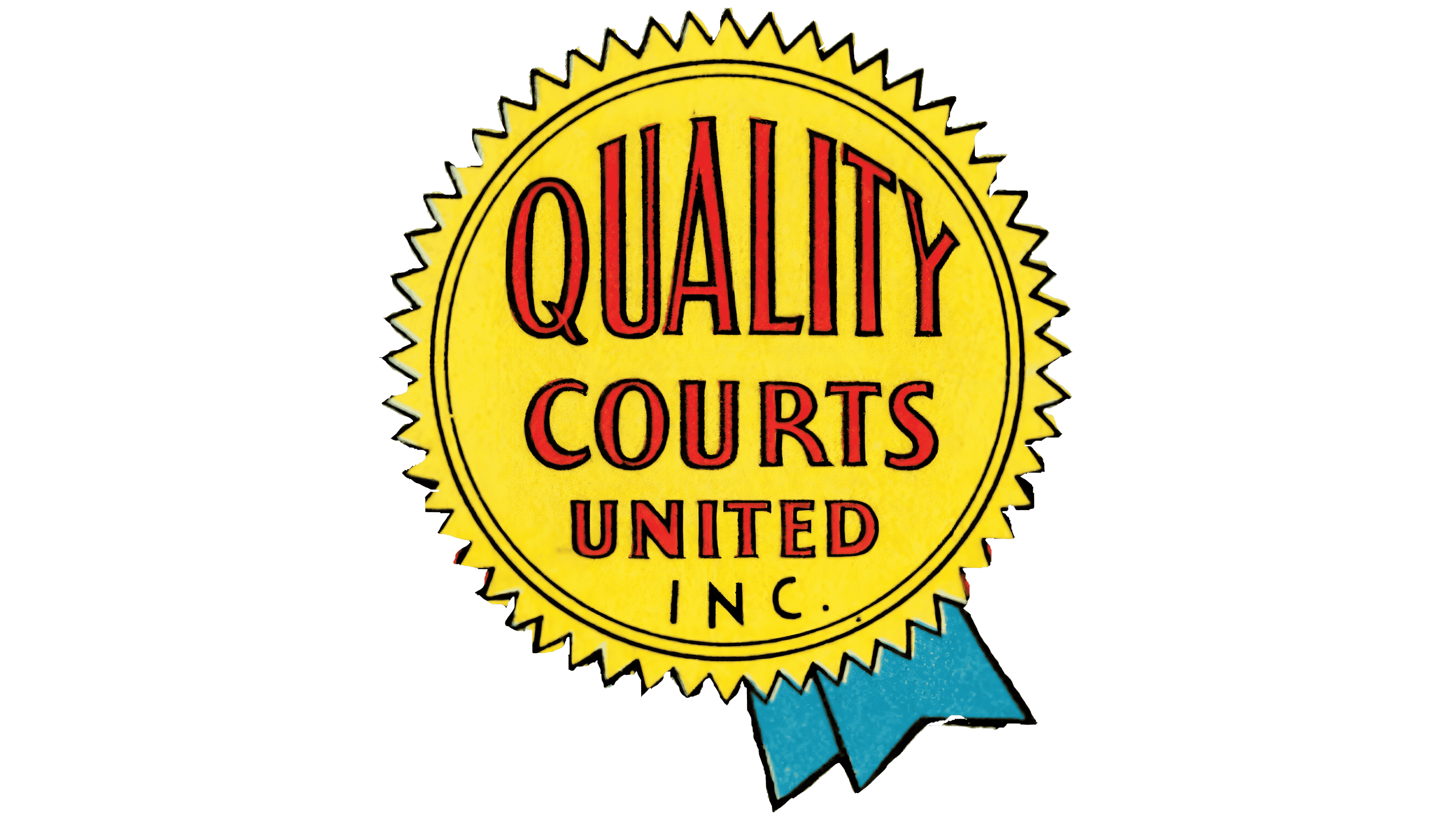
The Quality Courts United identity centered on a circular seal with a serrated outer edge. A dark outline and double interior line surrounded a yellow field. Two short light blue ribbons with black borders appeared along the bottom. The ribbons extended in opposite directions, making the emblem resemble an award medal or quality seal.
The image reflected the association’s operating principles. Motels retained independent management while using a shared name and following established guest service requirements. The seal identified a property as part of Quality Courts United and a participant in the shared system. Travelers received information about a consistent accommodation standard, while motel owners confirmed their membership in the hotel network.
The name occupied 4 lines inside the circle. QUALITY appeared at the top in large elongated letters. COURTS followed in a smaller size, with the compact word UNITED below. INC. completed the inscription near the bottom. All words appeared in uppercase and were centered to maintain the symmetry of the circular seal.
The letters in the 3 primary lines had narrow vertical proportions, thin sections, and contrasting heavy strokes. A black outline surrounded the red fill and separated the text from the yellow field. INC. used a thin style, while its small size made the abbreviation secondary. Differences in scale guided the reader from QUALITY to the company’s legal form.
By the early 1970s, the network had outgrown its former name. The organization opened a European division in Brussels in 1970 and began developing Quality Motels of Canada. Quality Courts Motels became Quality Inns International in 1972. According to Choice Hotels, the renaming accompanied the company’s expansion beyond the United States. Courts was associated with the American roadside motor court tradition, while Inns was better suited to an international hotel network.
1990 – 2015
By 1990, the company’s portfolio had outgrown the Quality Inns International corporate name. The network covered several accommodation categories, while Quality referred to only part of its hotel offerings. Following the renaming, the group became Choice Hotels International, Inc. The name reflected its international scale and business structure, which united several hotel brands.
Preparations for the transition began in 1981 when Quality Inns started dividing the network into separate brands. The portfolio introduced Quality Royale, Quality Inn, and Comfort Inn. Clarion, Sleep Inn, and Comfort Suites followed, along with Econo Lodge and Rodeway Inn. The company operated across several hotel segments and needed a shared name suitable for different types of accommodations.
The English word “choice” refers to the opportunity to select a suitable option. The company connected its new name with the growing number of hotel brands and its expansion beyond the United States. Guests could choose from several accommodation options within one group. For hotel owners, the name served as a corporate foundation uniting brands with different service levels and market positions.
The Choice Hotels International logo consisted of a typographic composition. The name appeared between 2 thin horizontal lines. One line ran above the text, while the other completed the block at the bottom. The black treatment resembled a traditional hotel sign or publishing signature.
CHOICE HOTELS occupied the first line in large uppercase serif letters. Tall, narrow characters formed a dense row and filled most of the available space. Their construction resembled Trajan and Times Small Caps. The matching height of both words combined the group’s new name with its reference to the hotel industry.
INTERNATIONAL appeared on the second line. It used smaller uppercase letters with thin strokes. Expanded spacing stretched the word across nearly the full width of the upper line. The arrangement maintained balance between the 2 levels and communicated the group’s international status. Horizontal lines united the differently sized text into a rectangular block for corporate documents, business materials, and applications beside individual hotel brands.
2015 – today
Choice Hotels International introduced a new corporate identity on May 4, 2015, following approximately 2 years of development. The update coincided with the hotel group’s 75th anniversary, portfolio expansion, and entry into higher price segments. The company aimed to reach younger customers and strengthen the connection between the parent brand and its hotel chains. The company implemented the identity across international markets throughout 2015.
The former black typographic signature was poorly suited to digital channels and Choice’s extensive brand structure. INTERNATIONAL was removed from the primary logo, while a compact colored monogram appeared beside the shortened name. The corporate mission became “Connect the world through the power of hospitality.” Choice presented hospitality as a way to connect people, hotels, and the group’s brands.
The monogram consisted of orange and yellow components joined into the initials “C” and “H” from Choice Hotels. An orange semicircle formed the left side. Yellow rounded sections resembling quarter circles joined it at the top and bottom, facing in different directions. Interior openings revealed the outlines of the “C” and “H” within the shared figure.
Chief Operating Officer Pat Pacious called the monogram a “gateway to all these brands.” The explanation reflected Choice’s position between guests and the group’s hotel chains. The emblem represented the parent company and united its numerous brands within one system. Compact proportions worked well on small screens and in limited spaces.
Yellow was retained following audience research. The results showed a strong association between the color and the Choice name. Rich orange was added as its counterpart. The 2 colors separated sections of the monogram and revealed the interwoven initials. The geometry of the “C” and “H” became the basis for additional figures used in corporate materials.
CHOICE appeared to the right of the emblem in large uppercase letters with a dark gray-brown color. The serif typeface resembled Charter and Georgia. HOTELS appeared below in a smaller size. Expanded spacing and a thin sans-serif style brought the lower line closer to Gotham or Avenir Light. Orange matched the left semicircle and connected the wordmark with the monogram.
McCann New York also ran an advertising campaign for the project. Tom Sullivan, a group creative director at McCann, includes Choice Hotels among the team’s projects and refers to a complete redesign of the identity guidelines. The agency used The Clash song “Should I Stay or Should I Go” in the campaign. The communications centered on travel for in-person connections.
After acquiring Radisson Hotel Group’s American hotel business in 2022, Choice Hotels continued using the 2015 monogram. It appeared on its own or beside CHOICE HOTELS. Updates to Quality, Clarion, Comfort, and Country Inn & Suites in 2019 and 2025 involved the identities of individual chains, while the parent company retained its established corporate branding.