 Ryman Hospitality Properties Logo PNG
Large hotel complexes combine accommodations, conference venues, and concert halls in a single space. These facilities support business events, large gatherings, and leisure, with all infrastructure elements working in harmony. The Ryman Hospitality Properties logo represents a company that manages hotels and event venues, combining accommodation and event hosting into a single format.
Ryman Hospitality Properties was founded in 1925 as Nashville Life and Casualty Insurance Company in Nashville, Tennessee. In its early decades, the company focused on insurance. In the 1960s, it entered the media and entertainment sector. In 1964, the company acquired radio station WSM, which owned the Grand Ole Opry program. This music show is considered the oldest in the United States. In 1968, the company built the Grand Ole Opry House. It became the show’s new venue.
In 1972, the Opryland USA theme park opened. In 1977, the company was renamed Gaylord Broadcasting Company and began developing television operations. In 1983, the Opryland Hotel opened with more than one thousand rooms. It was designed for conferences and business events. By the late 1990s, the hotel had grown to 2,800 rooms and was among the country’s largest. In 1997, Opryland USA closed. Its site was converted into the Opry Mills shopping center.
In 2000, the Gaylord Palms Resort in Orlando began operations. In 2004, Gaylord opened the Texan Resort. In 2008, the company opened the Gaylord National Resort in Maryland. The global financial crisis of 2008 and 2009 negatively affected the industry. The company carried out debt restructuring. In 2012, Gaylord Entertainment changed its business format and began operating as a REIT. It was renamed Ryman Hospitality Properties. The new name reflected its connection to the historic Ryman Auditorium.
In 2018, the company opened the Gaylord Rockies Resort in Colorado. Investments in the project exceeded $ 800 million. In 2019, it acquired the Block 21 complex in Austin. In 2020, the pandemic caused record losses and staff reductions. In 2021 and 2022, the business began to recover. By 2023, results exceeded 2019 levels.
In 2024, Ryman Hospitality invested in developing concert venues and music festivals.
The company operates five large hotels under the Gaylord Hotels brand. Their total capacity is 10,000 rooms. It also owns a portfolio of music assets and remains a publicly traded REIT on the New York Stock Exchange.
Meaning and History
What is Ryman Hospitality Properties?
An American real estate investment trust based in Nashville, specializing in hotel and entertainment properties. The portfolio includes Gaylord Hotels resorts with convention centers across the United States, including Opryland, Palms, Texan, National, and Rockies, as well as JW Marriott San Antonio managed by Marriott International. The total conference space exceeds 3 million square feet, and the hotel has more than 11,000 rooms. The trust owns a controlling interest in Opry Entertainment Group, which includes the Grand Ole Opry, Ryman Auditorium, radio station WSM 650 AM, the Ole Red bar chain, and the Block 21 complex in Austin.
1975 – 1987
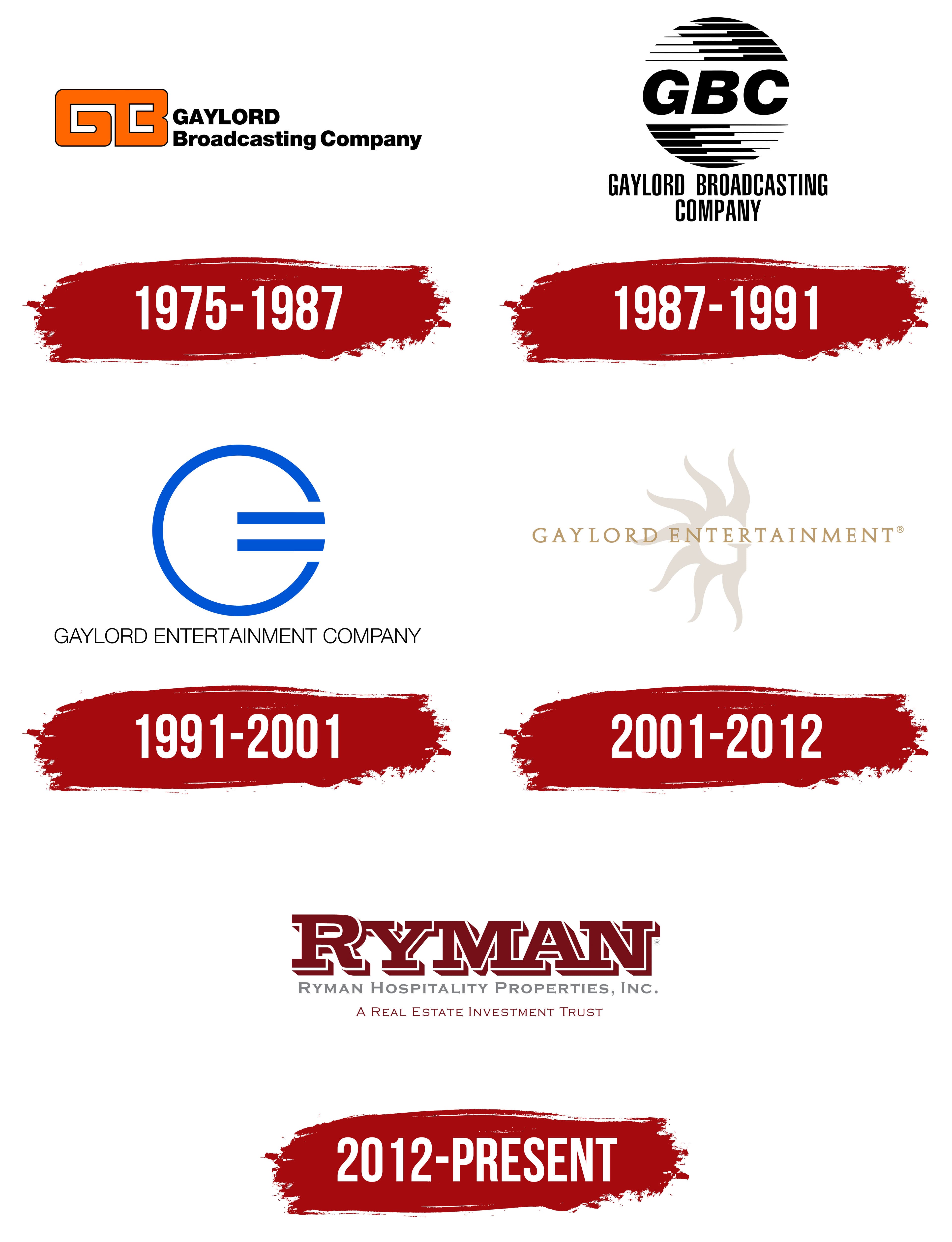
An orange GB monogram appeared to the left of the two-line name in Gaylord Broadcasting Company’s early logo. Broad rectangular strokes formed a horizontal block with rounded outer corners. A thin black outline surrounded the orange shape, while white cutouts separated the “G” and “B.” On the right, large black GAYLORD lettering occupied the upper line. Below it, “Broadcasting Company” appeared in smaller letters using the same bold sans-serif style. “Broadcasting” identified the company’s line of business.
The Gaylord family developed Oklahoma Publishing Company and its broadcasting businesses. Gaylord Entertainment later brought together radio, television, concert venues, and hotels. In 1983, the group acquired the Opryland complex, including its hotel and the Grand Ole Opry. The purchase marked the beginning of its hotel business.
The current name, Ryman Hospitality Properties, connects the company’s hotel operations to Nashville’s musical history. It owns large hotel complexes with conference facilities. Its entertainment business is associated with Opry Entertainment Group. The early GB emblem belongs to the group’s broadcasting era, before its operations expanded.
1987 – 1991
In the 1980s, Gaylord Broadcasting Company replaced the orange GB monogram with the black abbreviation GBC. Adding the third letter brought all the words in the name into the abbreviation. A stacked arrangement replaced the horizontal layout. A large circular emblem appeared above the company’s full name. This version remained in use until 1991.
Three heavy sans-serif capitals run through the middle of the circle, leaning slightly to the right. The lower curve of the “G” ends in a sharp projection. Black horizontal bands of varying lengths and thicknesses form the circle’s upper and lower sections. Their edges follow a stepped pattern. At the top, the pattern rises from left to right, while the lower portion descends in the opposite direction. Gaps between the bands interrupt the outline.
The full name appears beneath the emblem on 2 lines. GAYLORD BROADCASTING occupies the upper line, with COMPANY below. The narrow, tall sans-serif capitals are closely spaced. Both lines are black, matching the abbreviation and the bands above.
1991 – 2001
The Gaylord Entertainment Company name appeared in 1991, when Oklahoma Publishing Company brought its broadcasting and entertainment assets together under a shared name. “Entertainment” encompassed activities beyond radio and television. The logo reflected that change. A large blue symbol replaced the heavy GBC abbreviation, with the full name in small lettering beneath it.
The emblem centers on a circle with an opening on the right, resembling a capital “G.” Two horizontal strokes inside the circle suggest an “E” and resemble the offset bars of an equals sign. Blue areas transition into purple tones. Edge highlights and darker shading add depth to the lines. In the dark-background version, a blue glow sets the emblem apart from the nearly black field.
GAYLORD ENTERTAINMENT COMPANY runs beneath the symbol in narrow, thin, upright sans-serif capitals. The lettering appears black on a light background and white in the dark version. The proportions of the logo changed. The large monogram became the dominant feature, while the full name served as a small caption beneath it.
2001 – 2012
The Gaylord name suited a hotel chain expanding beyond Nashville. Research among meeting planners, travel agencies, and guests associated it with upscale hotels. Opryland had a stronger connection to Nashville and country music. In 2001, the company began bringing its Opryland convention hotels under the Gaylord Hotels brand as it prepared to enter new markets. Gaylord Entertainment’s sun emblem also became part of the hotel identity, connecting the company’s shared name to its properties.
In the early 2000s logo, GAYLORD ENTERTAINMENT runs across a large, pale sun. A “G” sits at the center of the rounded shape, surrounded by curved rays of varying lengths. The rays are arranged asymmetrically. The beige-gray symbol is paler than the gold lettering. Its upper and lower portions extend beyond the text line.
Both words use serif capitals, alternating fine lines with heavy strokes. The name received a different lettering style from the previous sans-serif version. The gold letters and muted sun connected the entertainment company’s name to the imagery used for Gaylord Hotels.
2012 – today
The Ryman surname entered the company’s name through the Ryman Auditorium. The building opened in 1892 as the Union Gospel Tabernacle, initiated and supported by riverboat captain Thomas Green Ryman. After he died in 1904, the hall was named for him. It hosted Grand Ole Opry performances from 1943 to 1974. The historic venue’s name preserved a connection to Nashville’s musical history within the corporate name.
Ryman Hospitality Properties became the company’s name in 2012, when its role in the hotel business changed. Marriott International took over the Gaylord Hotels brand and hotel management, while Ryman retained ownership of the properties. “Hospitality Properties” identified the hotel real estate and the company’s role as its owner. The Marriott-managed chain continued using the Gaylord name. In 2013, the company completed its transition to a real estate investment trust for tax purposes.
The logo consists entirely of lettering. Large, dark burgundy RYMAN lettering appears at the top, with heavy capitals and broad slab serifs. The initial “R” is taller than the other letters. White outlines within the letters and an offset burgundy shadow create a layered effect. Beneath it, a smaller light gray line spells out Ryman Hospitality Properties, Inc. in varying-height capitals. In the extended version, a third line carries the burgundy wording “A Real Estate Investment Trust,” identifying the company’s organizational structure. The middle line gives the full corporate name beneath the large RYMAN surname.