


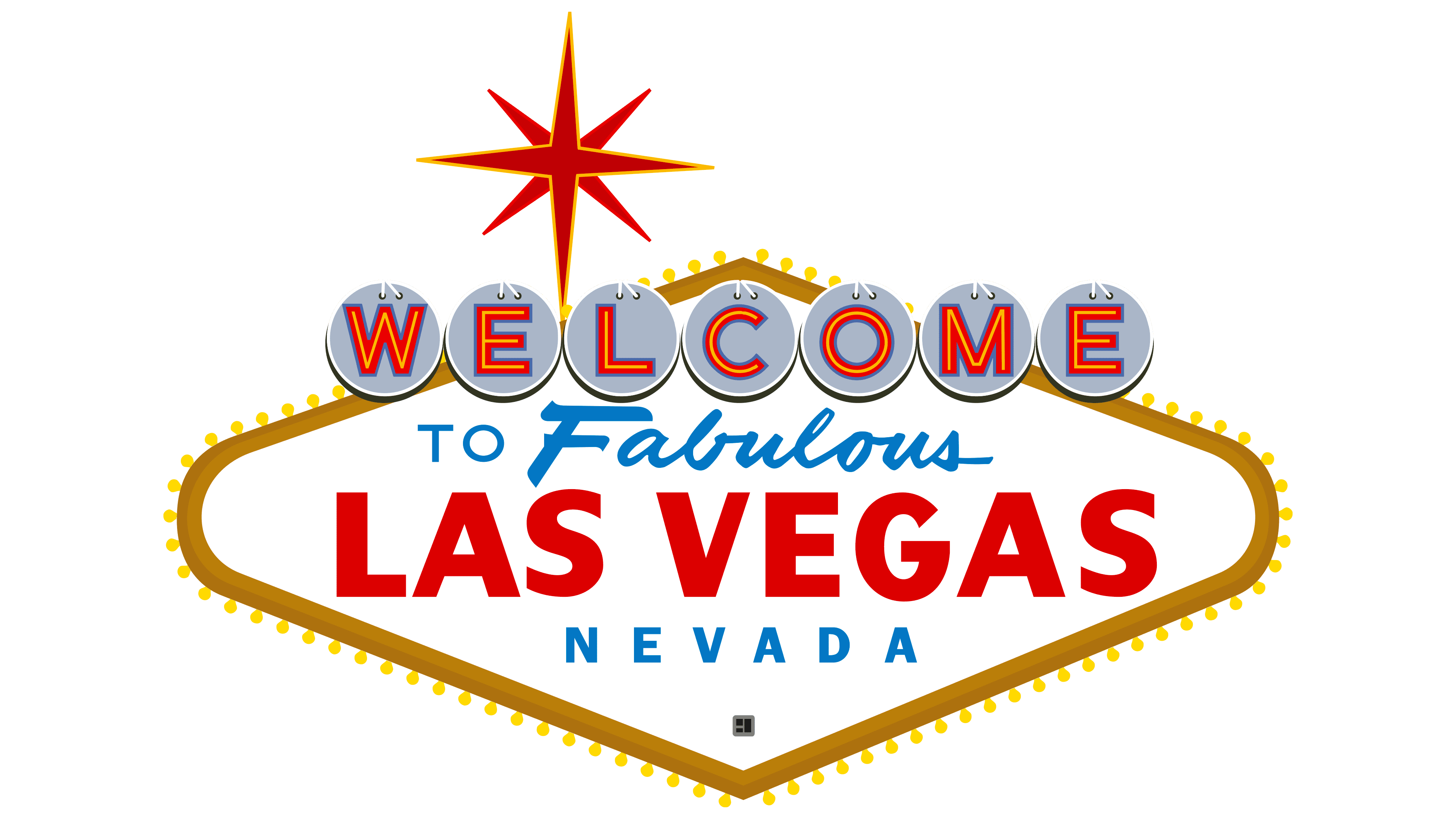
Las Vegas Logo PNG
The city’s global visibility is directly reflected in the Las Vegas logo. It’s extraordinary, radiant, and luxurious. Every detail is enchanting and legendary, for under the iconic star, a person forgets about the mundane and dives into an endless ocean of joy. The emblem carries happiness, hope, love, and a thirst for luck.
Las Vegas took its name in 1829, when Spanish scout Rafael Rivera found water sources in the Mojave Desert and called the area Las Vegas, meaning “the meadows.” Mormon settlers tried to build a fort there in the 1850s, followed later by a temporary US Army post and the arrival of the railroad.
The city’s formal starting point came on May 15, 1905, when Senator William Clark auctioned more than 100 acres near the new rail depot. In 1906, the Nevada Hotel opened at Fremont Street, later becoming the Golden Gate. Nevada banned gambling in 1910, but illegal casinos continued to operate until the state legalized gambling again in 1931, during construction of the Boulder Dam, later Hoover Dam.
The Strip began in 1941, when Thomas Hull opened El Rancho Vegas outside the city’s main downtown area. On December 26, 1946, Benjamin “Bugsy” Siegel opened the Flamingo with backing from eastern crime figures, including Meyer Lansky. After Siegel was killed in June 1947, the city gained national attention, and by 1954 Las Vegas was drawing 8 million visitors a year.
In the 1950s, Desert Inn, The Sands, and Sahara brought performers such as Frank Sinatra, Dean Martin, and Sammy Davis Jr. In 1966, Howard Hughes arrived and bought Desert Inn, then several casinos, helping push Las Vegas toward corporate ownership. In 1989, Steve Wynn opened The Mirage, starting the megresort era, followed by Treasure Island, Bellagio, MGM Grand, and Venetian. MGM Grand bought Mirage Resorts in 2000, while Wynn Resorts opened Wynn Las Vegas in 2005.
Meaning and History
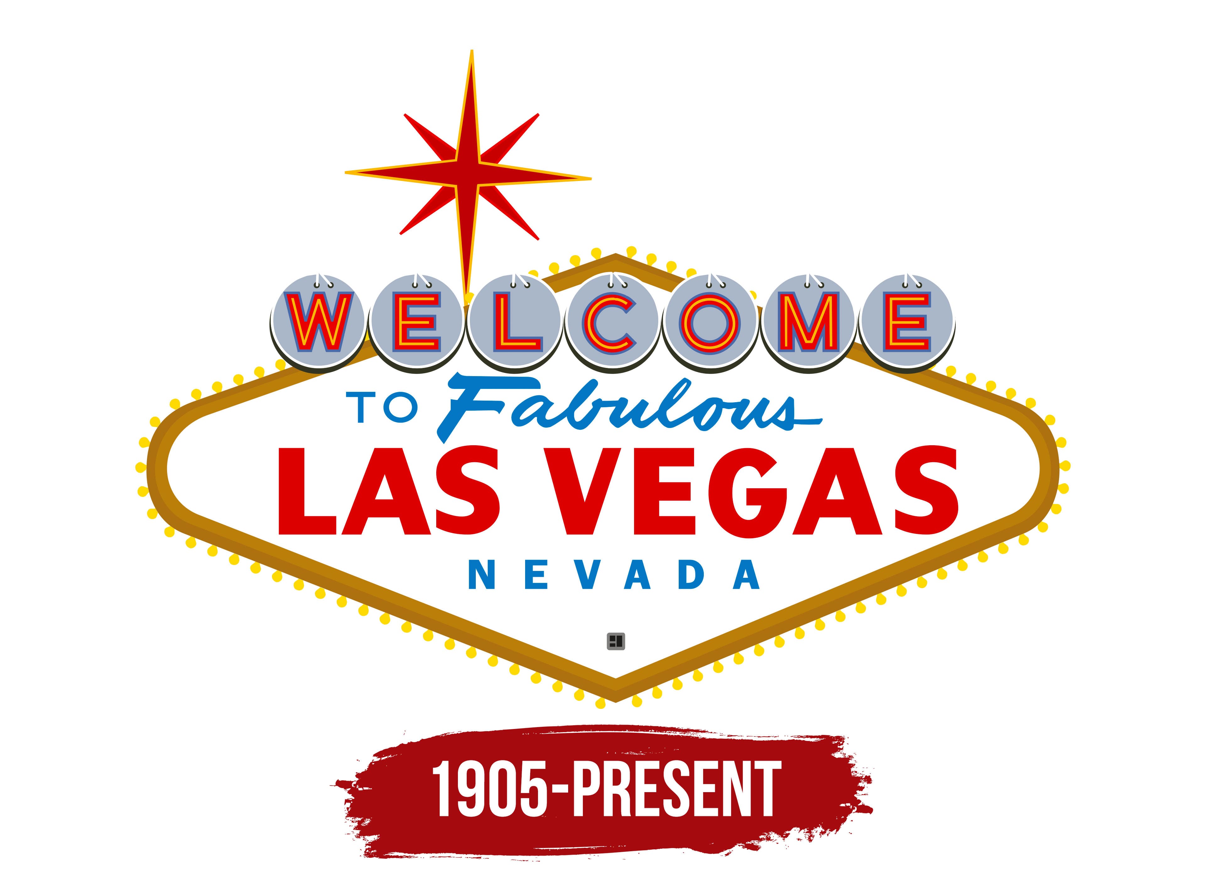
The settlement that would become the basis for the largest entertainment complex in the US was founded in 1905. By the beginning of the 21st century, it had transformed into a magnetic capital of entertainment, capable of bringing joy to anyone who spends even a short time there. The positive energy is reflected in the Las Vegas logo, which has become its business card and a symbol of triumph over sorrow. This sign encapsulates key characteristics of the casino city:
- hospitality (the word “Welcome”);
- administrative location (“Nevada”);
- brilliance and luxury (an eight-point star);
- uniqueness and magic (the inscription “Fabulous”);
- brightness (a combination of hot red and sky-blue shades).
The Las Vegas emblem was unveiled in 1959 and installed four miles from the city limit on Paradise Boulevard South. It looks like a roadside pole nearly 8 meters tall, mounted on two vertical posts, connected at the top by a crossbeam.
What is Las Vegas?
Las Vegas is a major city in the southwestern US, ranking 25th in population. It serves as Nevada’s cultural, commercial, entertainment, and financial center, renowned for its hospitality and casinos, shows, hotels, and resorts. The city is among the top three best places in the US for business meetings. Its logo appeared in 1959 and represented a road sign four miles from Las Vegas. It was designed by Betty Jane Willis, a graphic designer and American artist from the Western Neon company.
1905 – today
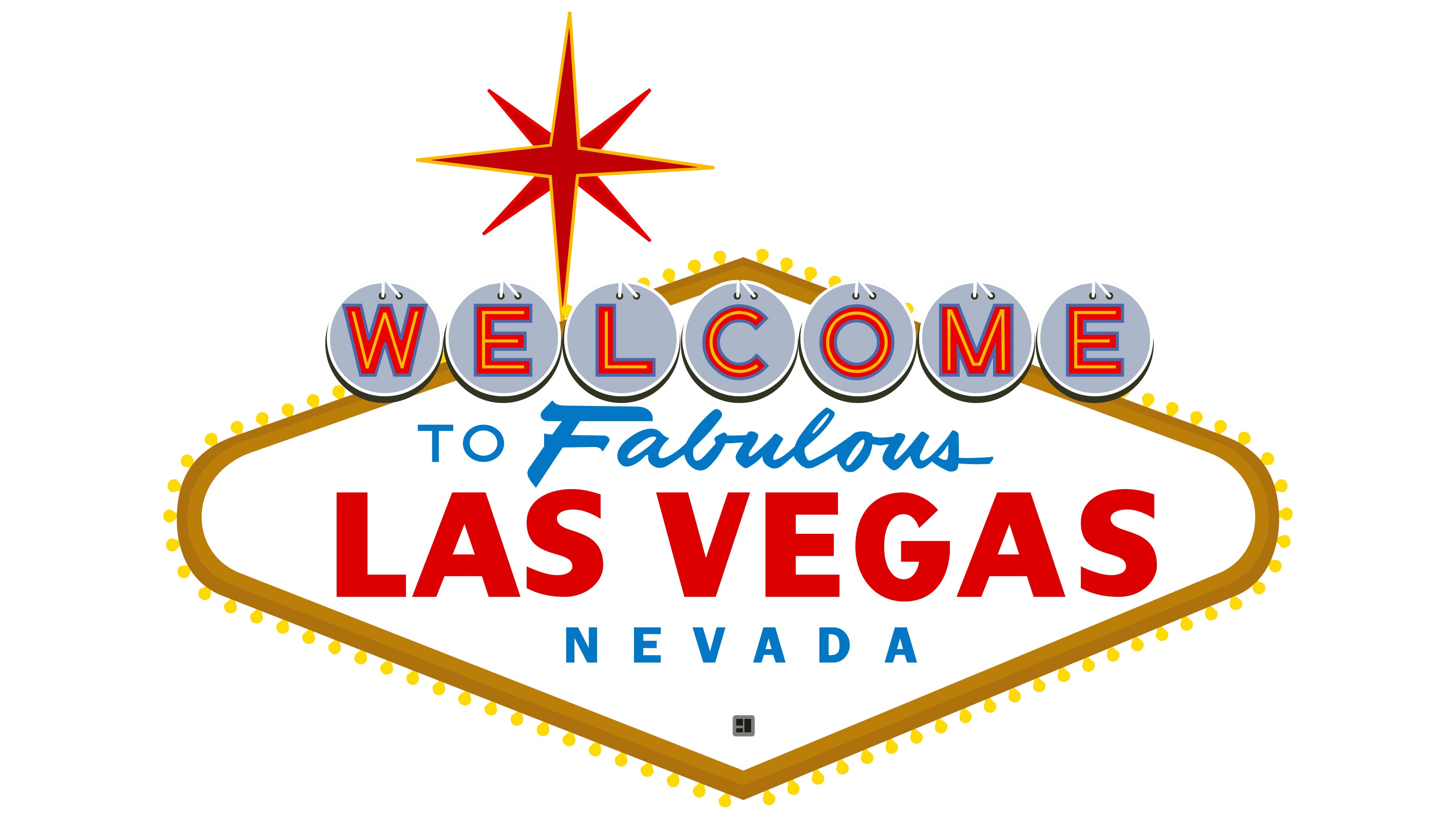
The logo is a horizontally stretched diamond. Its top and bottom points are sharp, and the sides are rounded. Each letter in the word “Welcome” is enclosed in a circle and placed on a white background. These circles symbolize silver dollars, signifying Nevada’s nickname as the Silver State. Each “coin” contains a single red glyph, which, in reality, has a neon outline.
Below is the word “Fabulous,” painted in blue and rendered in a fluid 1950s cursive style, as if handwritten. The largest area of the sign is reserved for the city name, Las Vegas. It spans almost the entire width of the diamond and is set in red sans serif. The blue word “Nevada” follows in uppercase letters and wide letter spacing. It occupies the lower part of the four-tiered logo.
Beneath the crossbeam of the sign, in the gap between the upward protruding pillars, a star with eight rays is depicted. It’s red, with a thin yellow outline, constructed from narrow neon tubes. The intersecting lines form its framework and add dynamics to the sign, giving it an explosive look.
Fonts and Colors
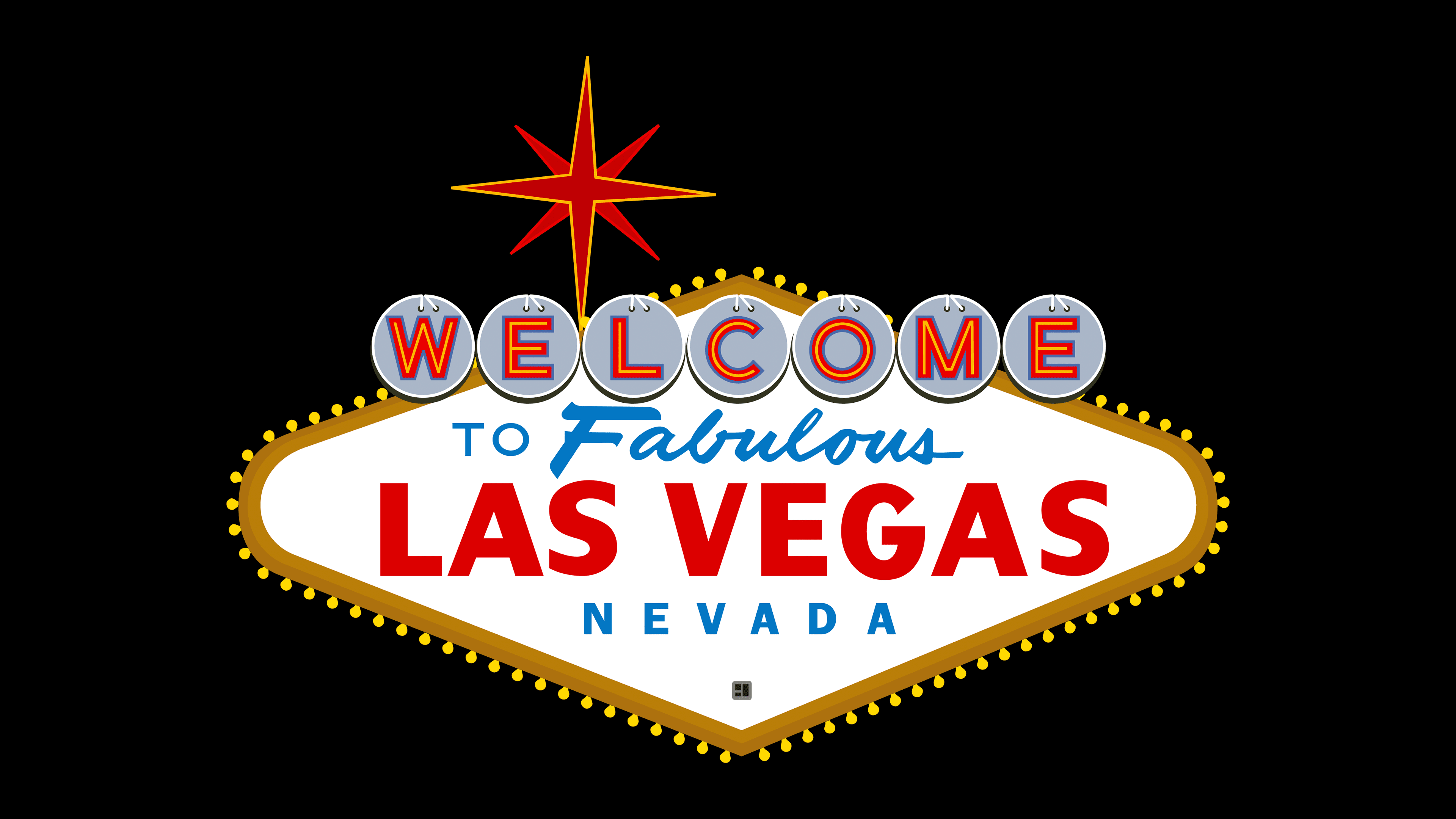
The inscriptions in the Las Vegas logo are rendered in different typefaces. These are the Helvetica and Arial font families. They are harmoniously combined and well-balanced. The color scheme features neutral white, scorching yellow, light red, and sky blue.