


![]() Comme des Garçons Logo PNG
Comme des Garçons Logo PNG
The general Comme des Garçons logo is traditionally textual. It unites several fashion lines, as the company has many subsidiary brands. The bold font with semi-bold letters ensures easy readability and quick recognition of the fashion platform.
Comme des Garçons was founded in Tokyo in 1969 by Rei Kawakubo. She had no formal training in fashion design, having studied fine arts and literature at Keio University before working in advertising at the textile company Asahi Kasei. After leaving employment, she began creating clothes independently and registered Comme des Garçons as a company in 1973.
During the 1970s, the brand developed mainly in Japan. Its collections used restrained colors, asymmetry, and loose sculptural forms that moved away from conventional ideas of feminine tailoring. The major international break came in 1981, when Kawakubo presented her first Paris collection. The black, torn, and deliberately rough-looking garments shocked many Western critics. Still, the show fixed the brand’s place in avant-garde fashion.
In the 1980s and 1990s, Comme des Garçons expanded into menswear, perfume, and accessories. Junya Watanabe joined the company in 1987 and launched his own line under the group in 1992. Adrian Joffe, Kawakubo’s husband, later led international expansion. Under his direction, the brand experimented with short-term guerrilla stores. It opened the first Dover Street Market in London in 2004.
In the 2000s and 2010s, Comme des Garçons widened its audience through collaborations with H&M, Nike, Converse, and Supreme. The Converse Chuck Taylor models with the Play heart logo became one of its most recognizable products. In 2017, the Metropolitan Museum of Art in New York staged a major Rei Kawakubo retrospective. The brand developed alongside Yohji Yamamoto and Issey Miyake, while remaining legally registered in Paris and creatively directed from Tokyo.
Meaning and History
![]()
The Comme des Garçons brand was established in 1969 in Japan’s capital. It began its professional activities by introducing punk-style clothing to the world. The company was officially opened in 1973. It was named after a line from the song “Tous les garçons et les filles” by French singer Françoise Hardy: “Comme les garçons et les filles de mon âge.”
Despite its name (meaning “like boys” in French), the fashion brand did not introduce its men’s clothing line on the runway until 1978. The logo was established at the brand’s inception. The sign is made in the fashion industry’s traditions, so it is predominantly textual. The logo is based on the brand’s name, written in uppercase letters. However, it is not devoid of symbolism. A miniature star fulfills this role, suggesting it is a luxury clothing brand.
What is Comme des Garçons?
Comme des Garçons (abbreviated as CDG) is a fashion company with offices in two fashion capitals: de facto in Tokyo and legally in Paris. It is involved in product design and manufacturing, sales, and the opening of a chain of stores in several countries worldwide. Its product range includes clothing, jewelry, perfumes, and footwear. The founder of the fashion house is designer Rei Kawakubo.
1969 – today
![]()
The Comme des Garçons emblem features a harmonious combination of text and graphics. The key focus is the brand name, set in a straight, confident, and strict sans-serif font, characteristic of high-fashion logos. The only drawn element is a star. It occupies the bottom position, located under the letter “C,” written in the French manner with a subscript diacritical mark. In this case, the miniature star replaces the comma (,).
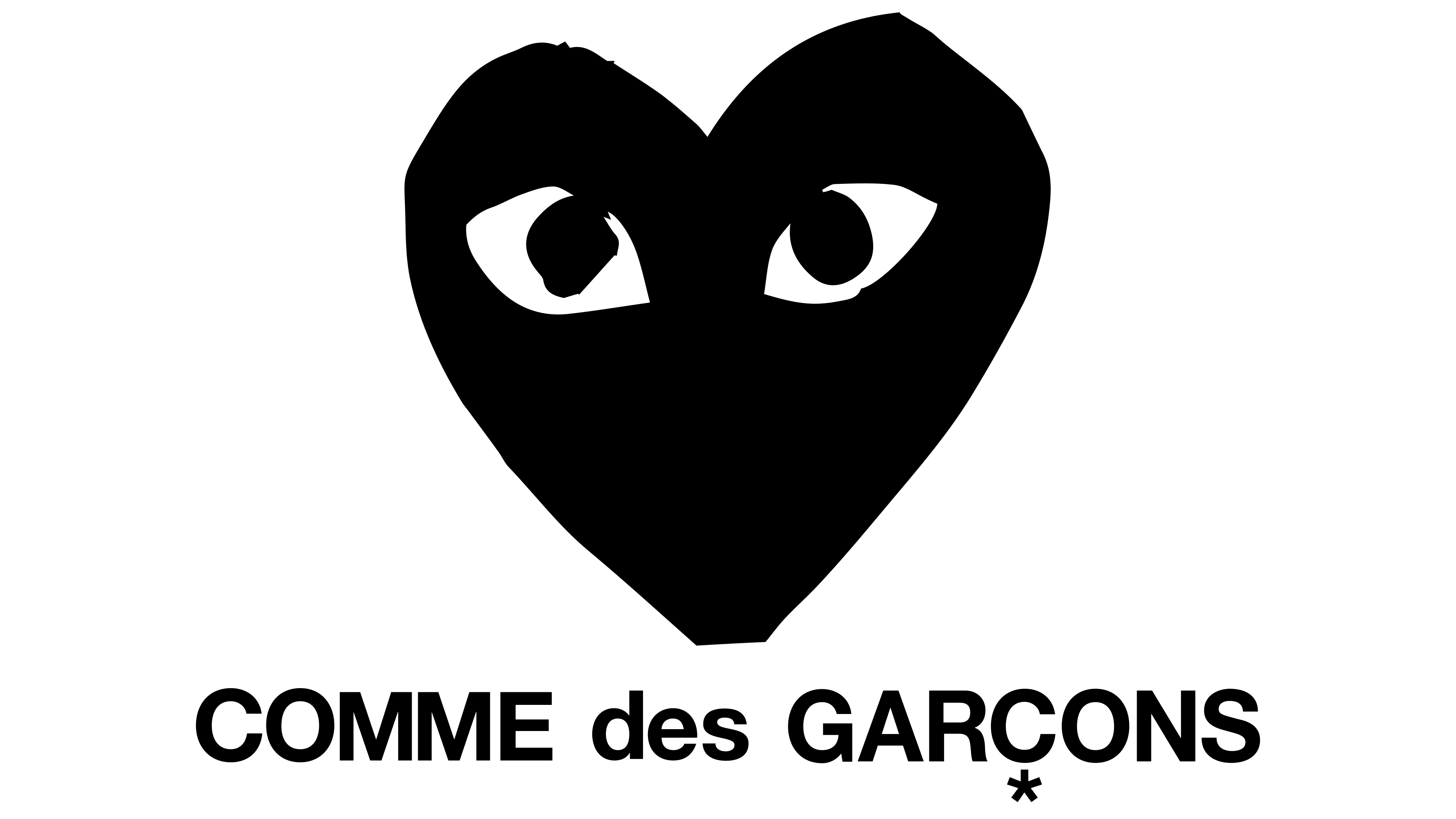
An image of a red heart with eyes often accompanies the word logo. This is the brand’s basic symbol used on branded products. It appears both alone and accompanied by the name. The author of this design symbol is Filip Pagowski, a Polish artist. He created it at the personal request of Rei Kawakubo after attending several of the company’s fashion performances. Thus, the star is not the only image in Comme des Garçons’ visual identity.
Font and Colors
The brand is set in a clean, confident typeface resembling Neue Helvetica Pro 93 Black Extended. The letters are large, uniform in height, and precisely aligned, giving the logo a cohesive and polished appearance. A distinctive detail is the small star that replaces the standard diacritical mark beneath the letter “C,” adding a touch of individuality.
A notable design feature is the lowercase preposition, in contrast to the uppercase styling of the other two words in the name. This choice lends the composition a lighter, less formal tone.
The company uses the Bohemian Typewriter typeface for slogans by Lukas Krakora, which adds a sense of informality and creativity that complements the more structured main text.
The color palette is restrained and minimalist, centered on black. This approach results in a sleek, elegant look that maintains a sense of modernity and style.