Conoco: Brand overview
Founded in 1875 as the Continental Oil and Transportation Company, Conoco Inc. quickly became a pioneer in the U.S. oil and gas industry. Recognizing the importance of controlling the entire supply chain, the company strategically invested in oil wells and pipelines, securing a reliable source of crude oil and gaining greater control over production and distribution.
In 2002, Conoco merged with Phillips Petroleum to form ConocoPhillips, establishing a strong global oil and gas presence. The merger created the third-largest integrated energy company in the United States, capable of exploring, producing, refining, and marketing energy.
After the merger, ConocoPhillips continued to thrive, and the Conoco brand retained its reputation. However, in 2012, the company separated its downstream assets, including Conoco-branded gasoline and service stations. This led to Phillips 66, an independent downstream energy company, taking over responsibility for the Conoco brand in the US.
Meaning and History
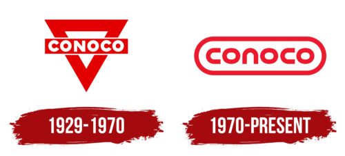
1929 – 1970
1970 – today
The main and only element of this logo is the name of the company – Conoco. The name is derived from the old name – Continental Oil Company – using the initial letters. The inscription is on a white oval background framed by a wide red stripe. Interestingly, the style of almost all the letters is the same: they look like brackets turned downward (n) or to the right (c). The only letter that differs is the “o,” which looks like an ellipse. The font is strict, block, bold, and lowercase.
The red stripe around the oval makes the logo more colorful and eye-catching. The letters that look like inverted brackets give the logo a neat and unique style. The letter “o” standing out as an ellipse breaks the pattern, making it quite interesting.
Conoco color codes
| Pigment Red | Hex color: | #ed192d |
|---|---|---|
| RGB: | 237 25 45 | |
| CMYK: | 0 89 81 7 | |
| Pantone: | PMS Bright Red C |


