


 Crest Logo PNG
The Crest logo emphasizes the brand’s reliability and recognition in oral hygiene. Its simple design symbolizes the product’s everyday use and high quality.
Crest grew out of fluoride research at Indiana University in the 1940s. Dental student Joseph Muhler, working with biochemistry professor Harry Day, studied why fluoride reduced tooth decay. Procter & Gamble began funding the work in 1949, and chemist William Nebergall joined in 1950. After testing over 150 fluoride compounds, the team developed a stable stannous fluoride formula when an overnight heating mistake prevented the fluoride ions from reacting with the polishing agent.
The toothpaste reached test markets in 1955 and launched across the United States in 1956. Crest promoted cavity prevention through science rather than cosmetic claims, while Colgate remained the leading rival. On August 1, 1960, Crest became the first over-the-counter toothpaste the American Dental Association (ADA) recognized as effective against cavities. Sales nearly tripled within two years, and by 1962 Crest had become the top-selling toothpaste in the US.
In 1976, the American Chemical Society listed fluoridated Crest among 100 major discoveries of the previous century. NASA selected it for astronauts in 1981, and in 1985 Crest introduced the first toothpaste clinically proven to help prevent tartar buildup.
Crest Whitestrips were announced in 2000 and reached stores in 2001, bringing peroxide-based tooth whitening into home use. In 2006, Crest Pro-Health received ADA acceptance for protection across six areas, including cavities, gingivitis, plaque, sensitivity, stains and bad breath.
Meaning and History
What is Crest?
It was the first American fluoride toothpaste approved by dentists, significantly reducing tooth decay. Known for advertising characters that promote dental health, the company offers whitening toothpastes, strips, brushes, and mouthwashes. In Europe, it is sold under various names and remains popular due to its effectiveness and affordability.
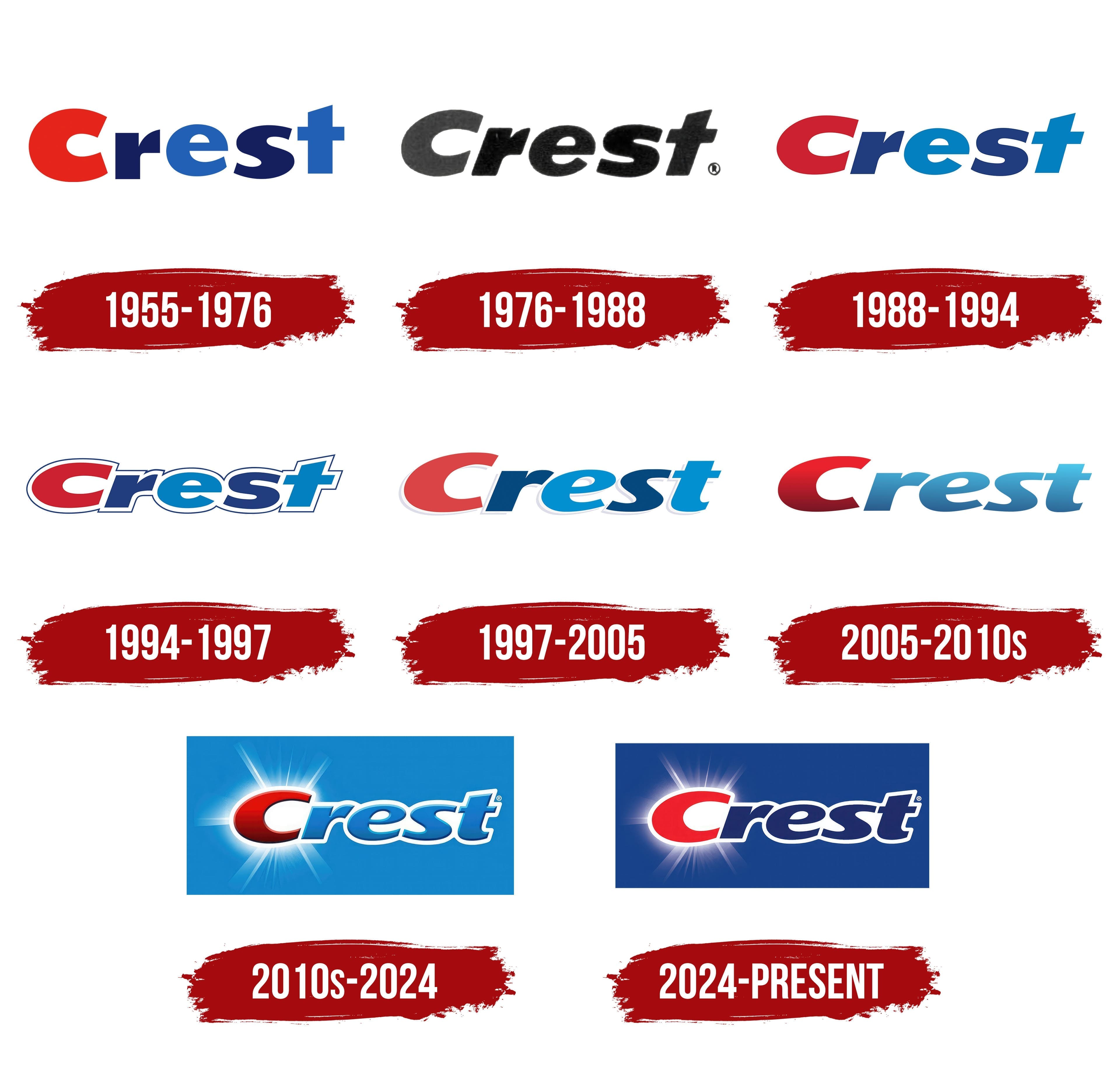
1955 – 1976

In the mid-1950s, as Procter & Gamble prepared to launch Crest toothpaste featuring stannous fluoride under the brand name Fluoristan, it created its first official logo. Donald Deskey, a designer known for shaping the visual identities of many P&G products, oversaw its development. The logo debuted in February 1955 during test-market releases and, starting in January 1956, accompanied national sales across the United States, beginning with the first commercial batch.
The wordmark “Crest” was rendered in a custom, ultra-bold sans-serif typeface. Its distinguishing feature was its use of color: the initial letter “C” appeared in vibrant red, while the remaining letters alternated between two shades of blue. This established a visual rhythm, balancing the emotional warmth of red with associations of reliability and freshness tied to blue.
The typeface, created specifically for this project, had no exact parallels; however, stylistically, it was similar to fonts such as Indecise Expanded Semi Bold Italic and Savant Italic. The letterforms were adapted for visual cohesiveness and expressiveness, featuring slightly angled strokes, smooth connections, and tight spacing that combined to form a strong, confident composition.
The signature pairing of red and blue, along with the character of the letters, became permanent elements of Crest’s visual identity, enduring through subsequent decades in updated variations.
1976 – 1988

By the mid-1970s, Crest had adapted its logo to meet new advertising standards, maintaining continuity while making it appear more dynamic. In 1976, an updated version was introduced, retaining the previous wordmark structure but adjusting its style and visual rhythm.
The letters were tilted to the right, enhancing a sense of motion. The overall silhouette became more compact, and the proportions tighter, allowing the logo to appear consistently effective on packaging and in TV commercials. The color tone became darker, adding depth and contrast to print and broadcast materials.
The typography remained a custom extra-bold italic but was refined: strokes became heavier, letter connections tighter, and diagonals more prominent. As a result, the logo gained stability and improved visual clarity against dynamic backgrounds.
The color palette for this version was simplified, moving away from the accent colors of the previous era to a monochromatic scheme. This increased the logo’s versatility and simplified adaptation across various advertising materials.
This logo was prominently used in the “Cavity Creeps” advertising campaign, where its visual style blended seamlessly with vibrant, animated storylines.
1988 – 1994

The 1988 Crest logo update restored the brightness and visual lightness the brand had lost in the more restrained 1970s design. While preserving the previous italic form and letter proportions, the color scheme was revisited: the initial “C” returned to bold red, and the subsequent letters adopted vibrant shades of blue in smooth, alternating tones.
The shape remained close to the previous version, retaining its dynamic rightward tilt, emphasizing energy and modernity. However, the logo’s silhouette was now outlined in white, clearly separating the lettering from its background and improving readability across various media.
The typography maintained its custom character, refined over decades specifically for the brand. The stroke thickness and connections stayed consistent, ensuring continuity. Still, the overall impression was refreshed through enhanced color contrast and the new white outline.
The color palette reintroduced Crest’s signature triad: red, blue, and white. The red at the start served as a visual anchor, the blue letters represented purity and freshness, and the white outline clearly emphasized each element.
This version appeared on packaging for Crest Regular and Crest Sparkle, including the children’s line, and was featured in print and television ads in the late 1980s. The visual concept allowed the logo to perform equally well on small tubes and large advertising formats.
1994 – 1997
In 1994, the Crest logo became clearer and more structured while preserving key principles from the previous version. The wordmark remained italicized, leaning to the right, and kept the familiar color scheme: a red “C” followed by other letters in varying shades of blue.
The primary update was the introduction of a double outline. Each letter received a thick white contour running around both the outer edges and the inner spaces. This white layer was complemented by a narrow dark-blue line along the outer edge, sharply separating the logo from its background and creating a neat appearance. The effect added depth without using shadows, keeping the logo clean even on brightly colored packaging.
The typography remained custom-made, inherited from earlier generations, but became visually more compact: letters were slightly narrower and shorter. This adjustment made the logo easier to adapt to various formats, from slender tubes to advertising banners.
The palette continued to emphasize the contrast among the three colors. Red provided a striking initial accent, while blue tones evoked purity and freshness.
1997 – 2005

The Crest logo, introduced in 1997, evolved into a more fluid and softer design. Visually, it abandoned the double outline of its predecessor, making the logo simpler and less cluttered. Letters gained smoother lines and a slightly freer shape, and the overall silhouette became more dynamic, thanks to enhanced curvature and gentler transitions between strokes.
The palette retained a classic approach. The letter “C” remained red and the other letters blue, but the shades became lighter and softer. This removed the harshness, making the logo appear more approachable than the vivid, high-contrast colors of previous years.
The typography remained custom, still within the heavy, italic, sans-serif category, but the outlines were reworked for greater fluidity. A subtle shadow created a gentle embossing, separating the logo from its background without creating an obvious border. Stylistically, this font resembled Arias Black Italic, though it featured distinctive shapes unique to Crest’s brand identity.
2005 – 2010s

Another redesign preserved continuity with the previous logo while visually lightening it and making it more contemporary. Letter contours remained within the custom italic style, but the outer shadow that previously provided slight depth was removed.
The primary innovation was the incorporation of gradient fills. The red “C” received a vertical gradient, transitioning from a darker shade at the bottom to a lighter shade at the top. The remaining letters were painted in a soft blue gradient, with darker shades at the bottom and brighter shades at the top. This created depth without complicated 3D techniques and emphasized the smooth shapes.
The typography remained a heavy, italic sans-serif, similar to Arias Black, but the proportions were adjusted.
The palette consisted of three colors: red, sky blue, and a deeper blue.
This version appeared on Crest packaging throughout the mid-to-late 2000s, including the Pro-Health and 3D White product lines. It reflected the brand’s shift toward a smooth, modern style while retaining decades-old brand recognition.
2010s – 2024
The redesign of the 2010s maintained continuity with the mid-2000s version but made the logo more vivid and luminous. Letterforms remained similar to the previous custom italic style. However, the strokes were slightly refined, and the top bar of the “t” was given a gentle slope, enhancing dynamism.
The primary visual focus shifted toward color treatment and effects. The “C” became a deep red, with a gentle vertical gradient from a darker base to a lighter top, complemented by a glossy highlight and a subtle inner shadow. This created a tangible sense of volume. The rest of the wordmark was rendered in cool shades, transitioning from light blue at the top to deep blue at the bottom, with color play at the edges to create a raised effect. This palette suggested freshness and cleanliness, aligning with the brand’s image.
Each letter had a white outer outline, complemented by a thin, dark stroke that clearly separated the logo from the background. Packaging and advertising often incorporated an additional compositional element: shining rays emanating from around the letter “C.” This radiant effect reinforced associations with “sparkling cleanliness” and drew attention to the word’s beginning.
This visual approach aimed to highlight the brand’s energy and its association with a fresh sensation.
2024 – today

The 2024 update is the simplest in recent decades, emphasizing clean shapes and maximum readability. In this version, designers removed inner shadows and gradients, giving letters a solid, vibrant fill.
The logo retains its italicized, sans-serif style and leans to the right, creating a sense of motion. The red “C” has become brighter, now featuring a soft, glowing halo that draws attention to the first letter and visually connects it to the concept of “sparkling cleanliness.” The rest of the word is presented in dark blue, ensuring strong contrast with the red initial and maintaining legibility on both light and colored backgrounds.
Letterforms remain similar to the previous version, though proportions are slightly tighter and lines clearer. A white outline surrounds the entire word, clearly separating it from the background.
This design gives the logo a more precise, confident look while preserving the brand’s recognizable color palette. The glow around the “C” serves as a decorative detail and symbolic emphasis, highlighting the product’s key benefit: a fresh, clean feeling after use.
Font and Colors
The logo features large, italicized, sans-serif lettering with smooth curves that lean to the right. The typography is custom-designed but closely resembles typefaces such as Indecise Expanded Semi Bold Italic or Savant Italic in terms of proportions and visual weight, albeit with modified lines and smoother stroke transitions.
The color scheme relies on the contrast between two main tones. The “C” appears in vibrant red, accented by a soft, glowing halo that enhances its visibility and brightness against the rest of the word. The remaining letters are blue, and the white outline around the entire text ensures excellent readability. This combination provides balanced visual appeal: the red adds energetic emphasis, while blue conveys reliability and stability.