


 ADA (American Dental Association) Logo PNG
The ADA logo represents the unity of dentists who have contributed to the advancement of their field and to improving people’s health. The association has evolved into a platform where professionals share experiences, establish standards, and collaborate on enhancing the quality of dental services.
The American Dental Association began in Niagara Falls, New York, in 1859, when 26 dentists formed a national professional body. The organization adopted its current name in 1860. It worked to establish ethical rules, practical standards, and stronger oversight for dental education and practice.
During the 1870s, membership expanded, and the association launched a professional journal for dentists nationwide. By the 1890s, it was helping define dental-school curricula and accreditation standards. In 1908, the ADA opened a research center to test dental instruments and materials, adding a scientific role to its work.
In the 1930s, the association became more involved in public health policy and introduced certification programs for dental products. Cooperation with the US Armed Forces during the 1940s strengthened military dentistry and preventive care. Research support in the 1950s and 1960s included water fluoridation, continuing education, and other measures to reduce oral disease.
During the 1970s, the ADA took a larger role in legislation, professional regulation, and public education. In the 1980s and 1990s, it evaluated new materials and technologies and expanded cooperation with overseas dental societies. In the 2000s, the association prioritized digital radiography, electronic records, and online clinical resources. By 2023, the association represented more than 160,000 dentists and remained active in research, education, product evaluation, and access to dental care.
Meaning and History
What is ADA (American Dental Association)?
This is a leading organization in dentistry, setting high standards across the industry. It helps improve oral health by researching, testing, and certifying products. The organization provides dentists with valuable resources, educational programs, and opportunities for professional growth to keep their knowledge up to date. More than 160,000 professionals are part of a network that facilitates the exchange of experience and advances dental practice. The familiar quality mark on dental care products has become a symbol of reliability and safety, recognized by dentists and everyday consumers.
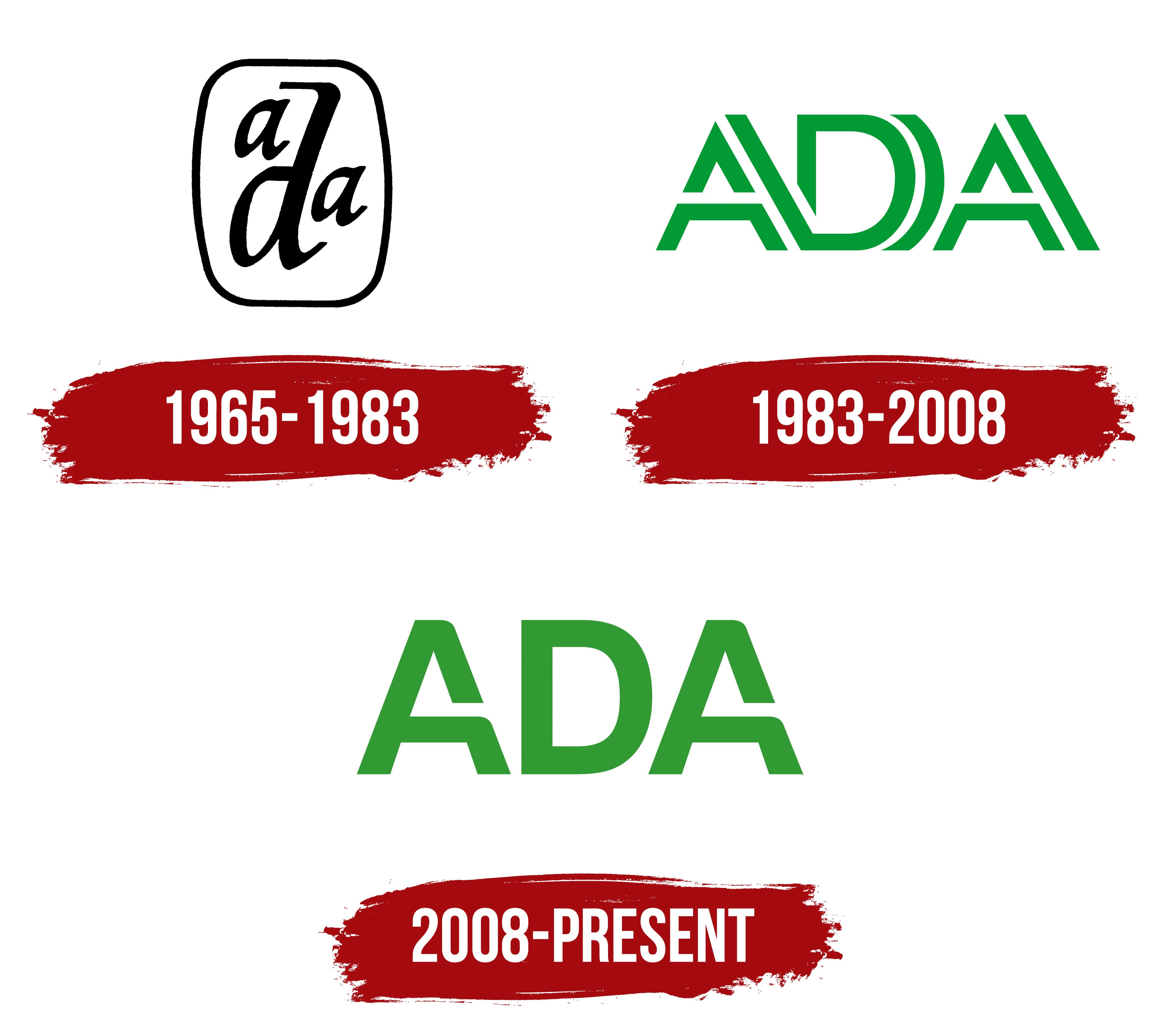
1965 – 1983

During this period, the organization standardized dental services and supported scientific research. The minimalistic design emphasized a serious approach and a desire for development.
The American Dental Association (ADA) logo is made in a short style using calligraphic symbols. The design features an oval frame, with the letters “A” and “D” positioned at the top and bottom, respectively, and the letter “D” centered. Its elongated lines and font style tie the composition together.
A font with soft curves. The letter “a” stands out for its roundness, and the “D” is accentuated by dynamic intersections. Their design combines smoothness and austerity, creating a balanced visual image. An oval frame completes the design. The black-and-white color palette conveys versatility and professionalism.
The logo reflects ADA’s core values: professionalism and unity. The font and shape symbolize attention to detail and a high level of competence and are associated with the qualifications of the organization’s specialists.
1983 – 2008

The logo of the second design change reflects the changes that occurred in the ADA during the 1980s. Then, the organization focused on introducing new technologies and treatment methods, which is reflected in a more modern design. The green color has become a symbol of health and harmony, and the updated font style emphasizes progress, with a focus on geometry and symbolism.
The composition is built around three letters – “A,” “D,” and “A,” located in a horizontal line. Its straight lines and sharp corners characterize the font. The central letter “D” is highlighted with curved lines that resemble the shape of tooth enamel or the outline of a tooth.
The new color palette uses a rich green hue, symbolizing health and renewal. The transition from black and white to green emphasizes patient care and the desire for modern standards in dentistry.
The font looks balanced, with straight “A” lines creating a sense of stability and “D” curves adding movement. Fragments of the logo are visually connected, forming a cohesive graphic structure.
2008 – today

The logo symbolizes the stage of development in which the organization focuses on introducing new technologies and raising dental standards. The emblem of the modern model is made so that the basis is the same three letters: “A,” “D,” and “A.” They are arranged in a single line and painted a rich green.
The font has changed. The letters have characteristic features: the “A” is cut off in the middle of the stem, adding an element of openness, and the “D” stands out for its massiveness and rounded interior, linking the strict lines into a single composition. The symmetry of the forms creates a harmonious, holistic image.