


 Benadryl Logo PNG
The Benadryl logo symbolizes the medication’s reliable, round-the-clock protection. The capsule-shaped emblem reflects the idea that it contains the ingredients needed to prevent allergic reactions. This visual emphasizes that the product creates a strong barrier between irritants and the user, ensuring peace of mind and confidence in allergy protection at any time of day.
Benadryl began in the 1940s, when American scientist George Rieveschl developed diphenhydramine while working at Parke-Davis, later part of Pfizer. The medicine entered prescription use in 1946 after FDA approval. Early tablets treated hay fever and other allergic conditions. At the same time, use later expanded to some cold and flu symptoms during the 1950s.
Research in the 1960s supported wider treatment of allergic reactions. During the 1970s, the drug became available without a prescription, giving consumers broader access. Liquid versions appeared in the 1980s, followed in the 1990s by extended-release products and topical gels for itching, skin allergies and insect bites.
Ownership changed in 2000, when Johnson & Johnson acquired the brand through an over-the-counter medicines division. During the 2000s and 2010s, the range grew to include sprays, dissolving tablets and children’s products. Allergy Plus Congestion arrived in 2011, combining diphenhydramine with phenylephrine. New liquid flavors followed in 2013, and an updated anti-itch gel applicator appeared in 2015.
Packaging gained revised dosage instructions in 2017. A pollen-tracking app launched in 2018, while a 2019 consumer study guided later product changes. An allergy education portal opened in 2020, Benadryl Naturals launched in 2021, and fast-dissolving oral strips entered the range in 2023 for use without water. The company expanded clinical work with allergists and academic institutions.
Meaning and History
What is Benadryl?
It is a well-known over-the-counter antihistamine medication used mainly to relieve allergy symptoms. The active ingredient in the drug, manufactured by Johnson & Johnson, is diphenhydramine, which effectively relieves symptoms such as sneezing, runny nose, itchy eyes, and skin reactions caused by allergies or colds. The brand offers a variety of products, including tablets, liquid gels, and topical creams. The drug is primarily known for its anti-allergic properties, but its soothing effect also makes it useful for treating motion sickness and as a sleep aid. This medication can be purchased over the counter in most countries and is included in many home medicine cabinets.
1946 – 1950s

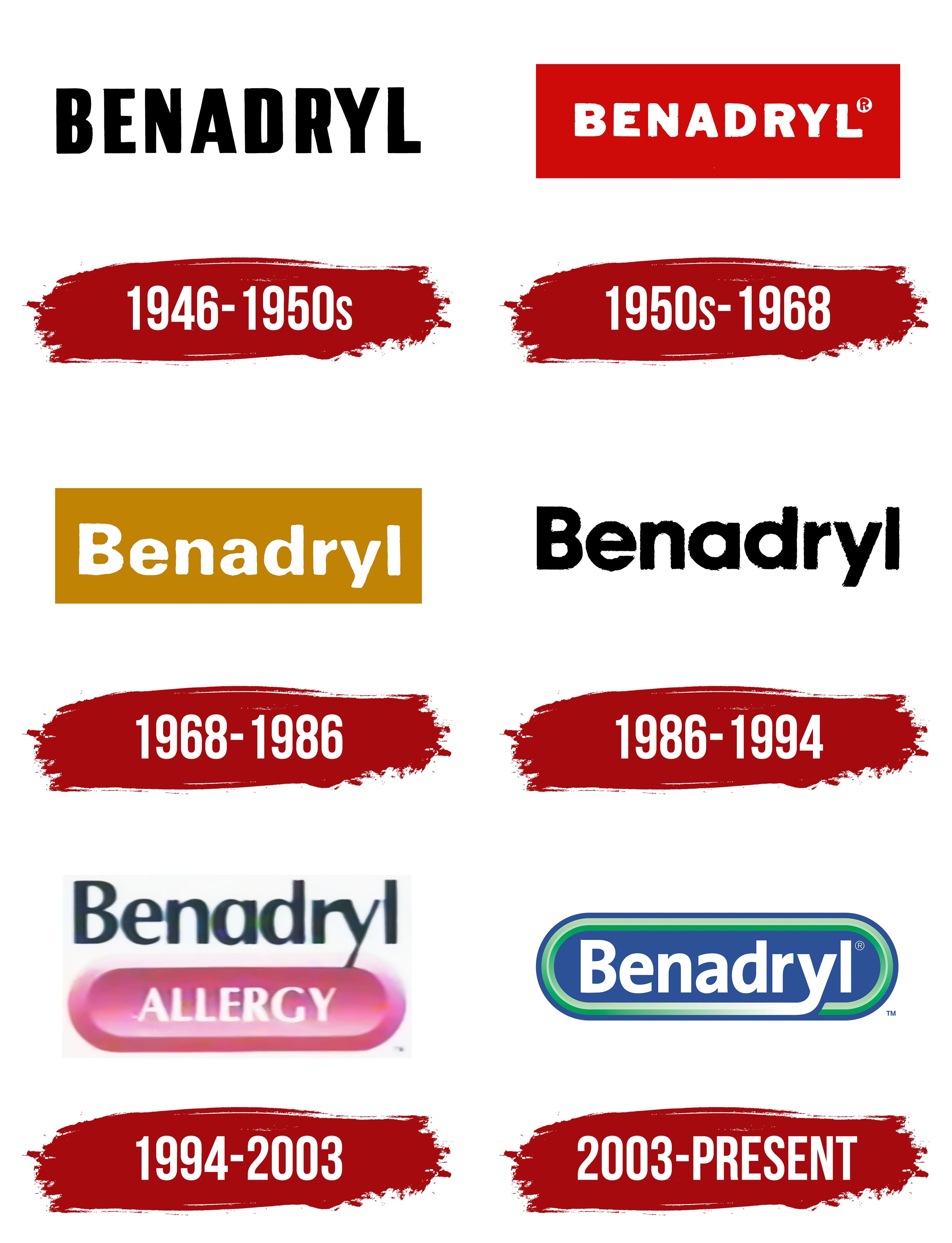
The first Benadryl emblem is simple and concise. The black capital letters of the name emphasize the product’s reliability and instill confidence in its effectiveness, promising the user the desired results.
1950s – 1968

Adding a red background to the Benadryl lettering made the emblem more noticeable and appealing. In medicine, red often symbolizes inflammation and problem areas. The white text centered within this “hot spot” represents the relief of symptoms such as coughing, sneezing, and watery eyes, emphasizing the safety and effectiveness of the medication. The capital letters highlight its strength and dominance over illness. The extended glyphs suggest a broad range of applications, as the product treats various ailments in different countries.
1968 – 1986

Replacing the red background with gold symbolized the brand’s worldwide recognition. Benadryl tablets and syrups, available over the counter in Asia, America, and Europe, confirm their status as one of the most popular remedies for allergy relief. The updated font gives the lettering a more respectable, official appearance, emphasizing Benadryl’s authority as a trusted, recognized allergy treatment.
1986 – 1994

During this period, the emblem represents an updated version of the original logo. The black lettering, without a background or additional elements, emphasizes the brand’s confidence in its recognizability. Benadryl is already well-known worldwide and doesn’t require excessive promotion. The modern font makes the logo stylish and easy to read. This design lacks distinguishing marks, as more contemporary antihistamine medications are emerging in the market.
1994 – 2003
In 1994, the logo received an interesting update. A pink button with the problem’s name was placed on a white background. The soft pink color, unlike bright red, does not appear intimidating but is still associated with pain and discomfort. Above the button is the name of the medication offering the solution. This design created an associative link in consumers’ minds between allergies and Benadryl, reinforcing it as a remedy for combating unpleasant symptoms.
2003 – today
The Benadryl logo, which has been in use since 2003, reflects the brand’s evolution toward a more restrained, informative visual identity. The emblem is designed as an elongated cylinder, which immediately evokes associations with medication capsules. This is intentional; the shape emphasizes the product’s pharmaceutical nature, highlighting its medical reliability and purpose.
The blue color chosen for the main background symbolizes professionalism, a serious approach to treatment, and a commitment to health. This shade of blue is often associated with medicine and instills trust, creating the impression that the product is developed with all quality and safety standards in mind. This design reinforces users’ confidence that Benadryl is a reliable choice for combating allergies and other conditions requiring intervention.
An interesting design element is the white stripe that extends from the last letter “y” and encircles the entire logo. This element is not merely decorative; it symbolizes the protection the medication provides its users. The white line seems to wrap around the entire brand, emphasizing that Benadryl creates a protective barrier, shielding individuals from the unpleasant symptoms of allergies.
The green stripe running along the edges of the emblem adds a layer of symbolism. Green is traditionally associated with nature, safety, and health. It suggests that the product helps restore quality of life by caring for the well-being of those with allergies. Visually, this color complements the blue, balancing professionalism and natural care.
The brand’s visual identity reflects its mission to help people feel better, regardless of the challenges posed by allergic reactions.