


![]() FDA Logo PNG
FDA Logo PNG
Accounting, control, and orderly business reflect the FDA logo. The organization conducts rigorous testing of medicines and vaccines and develops rules to ensure citizens’ safety. The emblem shows that without checking in the administration, the doors to the U.S. market are closed.
The FDA’s main goal is to protect public health. This organization assesses the safety of the products that U.S. residents use daily. This includes food, medicines, cosmetics, electronics, medical devices, vaccines, tobacco products, biologics, feed, and animal drugs. The federal agency protects consumers from counterfeit products to eliminate potential harm to public health. The U.S. Food and Drug Administration (FDA) was established in 1906, evolving from earlier food safety efforts dating back to the late 19th century, initially within the U.S. Department of Agriculture. Harvey Washington Wiley, known for his “Poison Squad” experiments that highlighted the dangers of food additives, became instrumental in shaping the agency’s early focus. Public outrage over unsafe meatpacking conditions exposed by Upton Sinclair’s novel The Jungle led directly to the Pure Food and Drug Act, which established the FDA’s predecessor, the Bureau of Chemistry and Metallurgy.
The agency significantly expanded its authority following the 1938 tragedy involving the toxic Elixir Sulfanilamide, thereafter requiring manufacturers to prove drug safety before market approval. Further strengthened by successfully preventing approval of the harmful drug thalidomide in the U.S., the FDA introduced stricter drug-testing and informed-consent requirements for clinical trials. Subsequent decades brought expansions into regulating medical devices, nutrition labeling, tobacco products, and cosmetics, along with expedited drug approval processes, particularly in response to public health crises like HIV/AIDS. Recent initiatives emphasize modernizing oversight through digital technologies, advanced safety analyses, and updated regulatory frameworks, solidifying the FDA’s pivotal role in safeguarding public health through rigorous product oversight.
Meaning and History
![]()
The FDA was formed in 1906 as the Bureau of Chemistry. The organization was renamed the Food and Drug Administration in 1931 to reflect the broad scope of its activities. The agency’s structure includes many divisions with distinct missions. For example, CDRH employees oversee the safety of radiation-emitting devices, and CFSAN representatives oversee food quality.
All medical product manufacturers in the U.S. must be registered with the FDA. This registration includes an annual inspection to ensure the company maintains proper manufacturing conditions. Materials and devices undergo mandatory testing to gain approval.
The agency’s branching structure prevented it from unifying its communication materials, leaving the FDA without a streamlined identity. Without a unified visual identity, there was confusion about the logos of the different divisions. As a result, they lost the semantic connection between them: they were not perceived as part of the same system.
In 2016, the organization underwent a global rebranding to standardize its design and use a recognizable visual identity to unify all the centers and offices that comprise the streamlined FDA structure.
Old logo
![]()
The exact time of the early Food and Drug Administration logo is uncertain. It is known only that it was created after 1931 because it reflects the organization’s modern name, adopted by the Bureau of Chemistry 25 years after its founding. The graphic symbol contained the abbreviation “FDA” written in bold type. The first letter rose above the others and covered them with long horizontal strokes. In this way, the designers expressed the agency’s key mission of providing protection.
Under the abbreviation was the phrase “CONSUMER PROTECTION,” describing the FDA’s primary mission. A thin, sans-serif typeface was used. The text was placed in a dark gray rectangle.
Before 2016
![]()
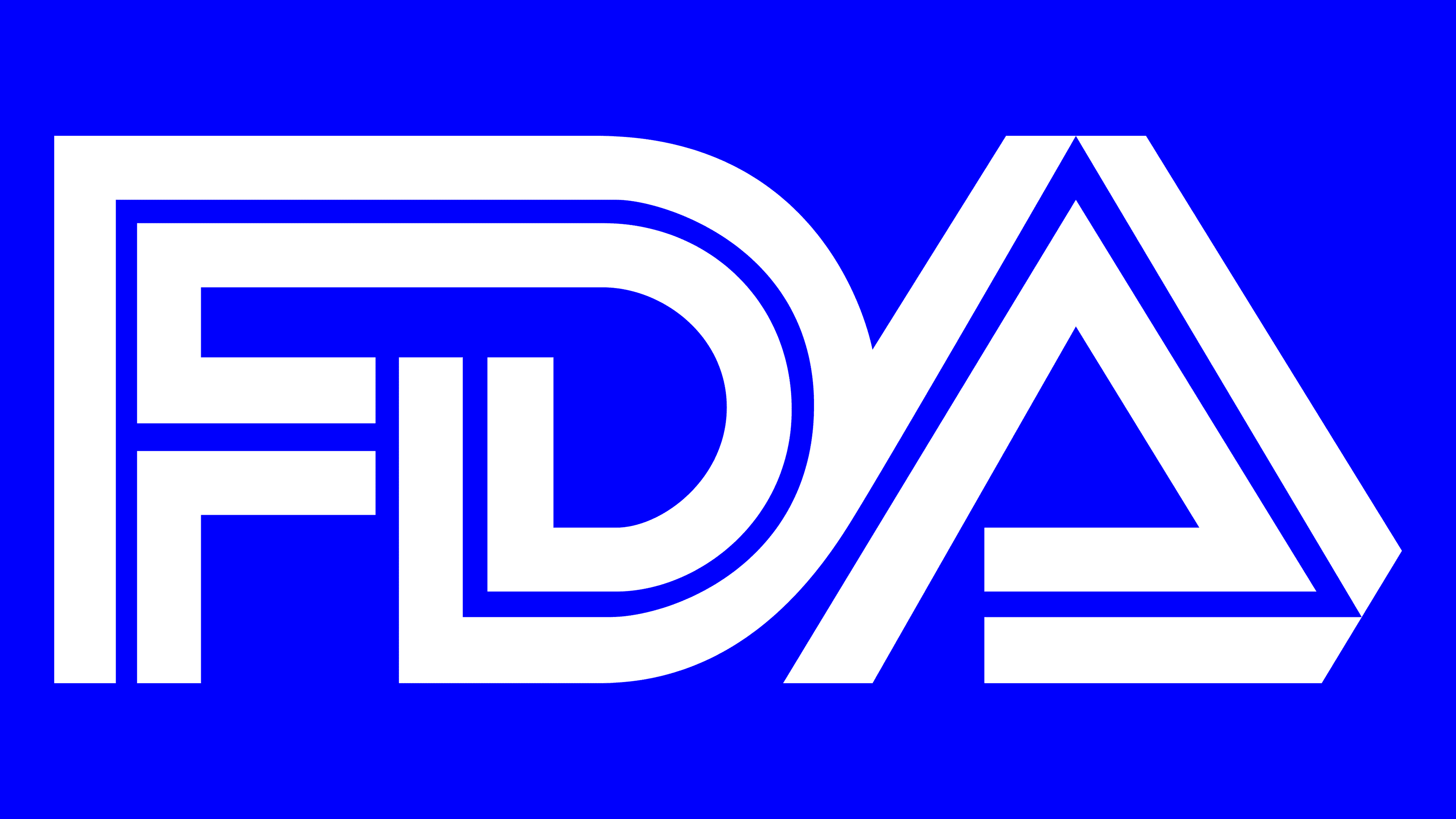
The “Food and Drug Administration” adhered to a monogrammed logo in the middle of its activities. It contained the letters “F,” “D,” and “A,” each consisting of three lines. Each mark’s base was a thin white middle, encircled on both sides by bold black stripes. The “D” and “A” had merging side outlines, while the “F” and “D” were fully merged to form a single solid figure of an abstract shape.
2016 – today
![]()
The logo, designed in 2016, features two parts: a monogram and a wordmark. And the lettering is always on the figure’s right side. The abbreviation “FDA” occupies the upper half of the blue vertical rectangle. This element was created using a 6/5 modular grid to achieve geometric harmony and to adjust sizes without breaking proportions.
The text contains the full name of the organization, “U. S. FOOD & DRUG ADMINISTRATION,” in uppercase. All words except the last are written in bold letters in the first line. “ADMINISTRATION” occupies the second row and consists of thin, noncontrasting letters without serifs.
Sometimes the icon with the abbreviation can be used independently of the inscription. It is stylized as a cell of the Mendeleev table, as it inspired the new design. According to the modern concept, the agency identifies itself with an element of the periodic table because its influence extends to many products in all areas of people’s lives. The FDA’s visual identity is based on the table’s “blocks”.
The same logo can be combined with different department names to unify the organization’s structure. This is something the Food and Drug Administration lacked before 2016. The universal graphic system has saved on the production of communication materials because they no longer need to be created from scratch.
Font and Colors
The brand’s primary typeface is Din FF, which is known for its simplicity and clarity of form. It includes multiple weight variations; the logo uses two: a bold version for the text “US FOOD & DRUG” and a lighter version for the word “ADMINISTRATION.” The inscription is in uppercase letters, creating a formal and authoritative appearance.
The logo’s color palette is based on two key shades: blue (#007CBA) and white (#FFF). Blue is the primary color for the background or the lettering, while white complements the composition, adding contrast and a clean overall look. In some cases, black (#2E2925) is used instead of white to maintain visual contrast.
The logo appears cohesive on both light and dark backgrounds, preserving a formal style and clear recognition, and is suitable for a government agency with defined, serious responsibilities. The typeface and colors communicate trust and authority without decorative or unnecessary elements.