


![]() Sanofi Logo PNG
Sanofi Logo PNG
The Sanofi logo exemplifies professionalism and reliability, mirroring the company’s stature in the global pharmaceutical industry. Its design accentuates a commitment to innovation and high-quality standards in drug production, symbolizing the pursuit of advanced healthcare solutions.
Sanofi was founded on February 15, 1973, as a pharmaceutical subsidiary of the French state oil company Elf Aquitaine. The move followed the 1973 oil crisis, when Elf used rising oil revenues to diversify beyond energy. Sanofi absorbed Labaz, a Belgian company founded in 1941, gaining factories, products, and an early position in cardiovascular medicine.
Throughout the 1970s and 1980s, Sanofi expanded through acquisitions. It bought into Choay in 1975, acquired Clin Midy in 1980, entered Eastern Europe through Hungary’s Chinoin in 1990, and moved into the U.S. market through Sterling Winthrop, then owned by Eastman Kodak. In 1994, Sanofi bought Sterling Winthrop’s prescription drug business, strengthening its American operations.
Synthélabo had developed separately after its 1970 formation from Laboratoires Dausse, founded in 1834, and Laboratoires Robert & Carrière, founded in 1899. L’Oréal took control in 1973 and expanded its prescription drug distribution in central nervous system treatments and internal medicine. In 1999, Sanofi and Synthélabo merged to form Sanofi-Synthélabo, then sold cosmetics, diagnostics, animal health, chemicals, and other non-core units to focus on prescription drugs.
In 2004, Sanofi-Synthélabo acquired Aventis, created from Rhône-Poulenc and Hoechst Marion Roussel, after a contested deal valued at about €54-55 billion. The company became Sanofi-Aventis and gained Sanofi Pasteur, its vaccine arm linked to the Pasteur Institute tradition. In 2011, it shortened its name to Sanofi and acquired Genzyme for about $20 billion, adding rare-disease therapies. Later, Sanofi expanded into immunology with Dupixent, developed in collaboration with Regeneron Pharmaceuticals.
Meaning and History
![]()
Sanofi’s frequent logo updates correspond with its several name changes. In 1999, it merged with Synthélabo to become Sanofi-Synthélabo. In 2004, after acquiring Aventis, it was renamed Sanofi-Aventis. The corporation reverted to its original name in 2011 to make it easier to pronounce in other countries. Each rebranding involved a reimagining of the emblem. Initially, a simple wordmark, it gained a stylized image of a heart against a backdrop of people. The Bird of Hope symbol, and in 2022, the design was aligned with the Play to Win business strategy, focusing on creating innovative vaccines and drugs.
What is Sanofi?
Sanofi manufactures drugs, vaccines, contact lenses, diagnostic equipment, and other medical products. It’s a French corporation headquartered in Paris, established in 1973. Gradually, Sanofi incorporated many competitors, including Synthélabo, Aventis, Genzyme, Bioverativ, and Ablynx. The company offers treatments for autoimmune, rheumatological, cardiovascular, neurological, oncological, respiratory, and other diseases.
1973 – 1999
![]()
Sanofi’s inaugural logo was unveiled in 1973, alongside the company’s formation, showcasing a stark, minimalist wordmark in light blue set against a pristine white backdrop, encapsulating simplicity and clarity.
This blue-and-white palette conveys professionalism and trustworthiness, reflecting the brand’s commitment to excellence and mastery in its field. It portrays Sanofi as a beacon of loyalty and transparency in the pharmaceutical industry.
Crafted in a bespoke sans-serif font with bold strokes, the initial wordmark design resembles the Pump STD Medium typeface but is tailored to add a contemporary edge. Notably, the “A” was redesigned with a direct vertical bar, while the “S” received a more classic curve, lending a unique and modern character to the logo’s typography.
1999 – 2004
![]()
In the wake of its 1999 merger with Synthelabo, Sanofi embarked on a rebranding journey, necessitating a fresh visual identity to accommodate its newly formed name within the logo. The brand opted to retain its original color scheme, a testament to its ideal suitability for entities within the health sector, underscoring the company’s core values of reliability and commitment to excellence.
The newly combined name, Sanofi-Synthelabo, was artfully integrated into a single line, distinguished by a graceful curve in place of the conventional hyphen, symbolizing the union of the two entities. This updated wordmark is characterized by bold, sans-serif lettering, reminiscent of the Futura Maxi STD Bold typeface, albeit with slight modifications for added breadth and a softer rendition of the “F.”
This reimagined logo design conveys both solidity and sophistication, mirroring Sanofi-Synthelabo’s enduring dedication to strength and dependability. It stands as a beacon of the brand’s formidable presence and trustworthiness in the healthcare industry.
2004 – 2011
![]()
The 2004 merger of Sanofi-Synthélabo and Aventis formed Sanofi-Aventis. Its name, part of the logo, was set in a bold sans-serif font. All letters were lowercase and blue. Designers rounded them to convey safety and care, with semi-circular indentations even on the tops of the “i” strokes. A long arc with sharp ends underscored the inscription.
Above were three human silhouettes in light blue, standing together and joyfully embracing. This symbolized support and compassion, as the pharmaceutical corporation cared for society’s health and expressed its love through innovative medicines. Another love demonstration was the large white heart at the center of the emblem. Its halves were formed by negative space, outlined by a dark blue stripe.
2011 – 2022
![]()
In May 2011, Sanofi’s shareholders agreed to rename the company to Sanofi, dropping the second part of its name to simplify pronunciation for non-French speakers. A new logo was also introduced, featuring a more muted shade of blue. All six letters were capitalized and styled in a sans-serif font. Certain corners of the letters “A,” “N,” and “F” were rounded, visually softening the wordmark.
At the top is the Bird of Hope. Its smooth white silhouette only roughly resembles a bird and is actually white negative space within an abstract circle. The colored part of the drawing consists of three drops: green, beige, and blue. Arranged in a ring, they represent the planet, symbolizing life according to the designers. They also reflect Sanofi’s three principles:
- Growth;
- Adaptability;
- Innovation.
White signifies air, beige represents earth, green represents plants, and blue signifies water and sky.
2022 – today
![]()
On February 3, 2022, the Sanofi brand was transformed in line with the Play to Win business concept launched in 2019. The logo change was a logical continuation of the strategy, as the company decided to unite its various divisions and brands acquired over time under a single common name. FutureBrand carried out the redesign.
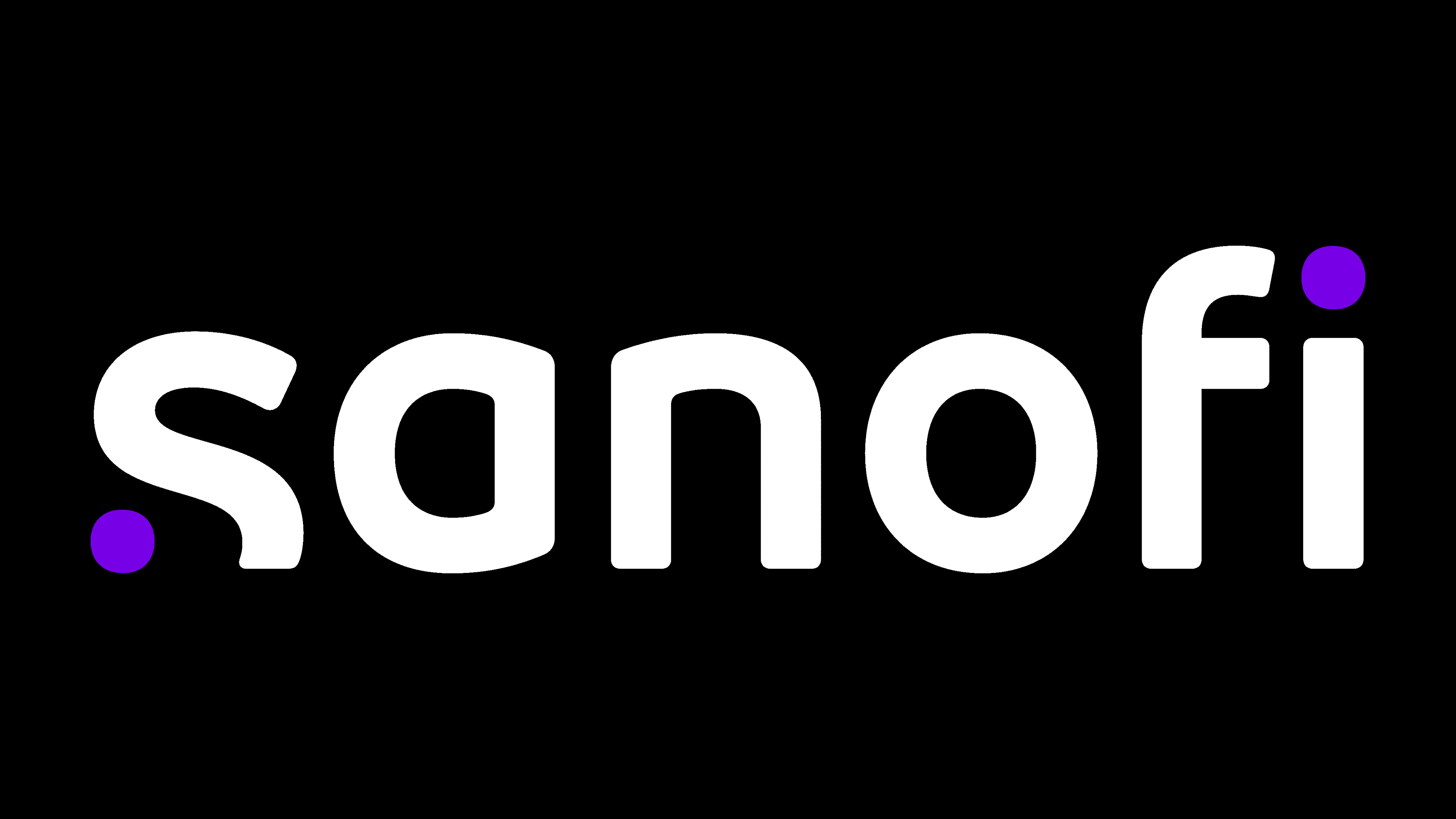
The word “Sanofi” is in lowercase, as it was in the 2004 emblem. However, it now has a unique look, with the letter “s” being the most unusual. Its bottom is cut off and, on the left side, complemented by a large purple dot. A similar dot sits above the “i.” Braille inspired the logo creators for the visually impaired, so the placement of the mini-circles roughly matches the arrangement of dots forming “s” and “i” in Braille script.
The transformed “s” resembles a “dismantled” and mirror-reflected question mark. According to company representatives, it represents the question “What if?”, which typically sparks research and experimentation. The “i,” in turn, is an inverted exclamation mark, symbolizing the thrill of a successful result. Thus, the emblem reflects the journey between two points, the beginning and the end. This is the process of laborious work that enables the discovery of innovative solutions.
Font and Colors
In 2011, the Ulm Grotesk Medium font, with its characteristic roundings, was used in the logo. All letters were uppercase, as this better highlighted the contrast between straight edges and softened corners. In 2022, the wordmark was converted to lowercase. Designers at FutureBrand created a special typeface for the pharmaceutical manufacturer Sanofi, called Sanofi Sans.
The colors also changed: while the 2011 emblem featured white, blue, beige, and green, in 2022 it was replaced with black and purple. These represent Sanofi as a serious and professional company with a flair for creativity.