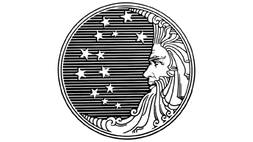
The Procter and Gamble logo is textual but abbreviated. It presents a short name, where the abbreviation acts as a graphic element. In recent years it has also had a blue circle with one side resembling a crescent moon. It symbolizes a segment of something unified, which is part of the whole.
Procter and Gamble: Brand overview
| Founded: | October 31, 1837 |
| Founder: | William Procter, James Gamble |
| Headquarters: | Cincinnati, Ohio, U.S. |
| Website: | pg.com |
Procter & Gamble is an international corporation from the United States engaged in releasing a wide range of products presented in many areas of life. Thus, it specializes in means to maintain cleanliness, household items, cosmetics, and personal care attributes. The time of its origin is 1837. Since then, it has grown to become a major consumer goods company. Its professional portfolio has several brands related to the food industry. The founders of the company are William Procter and James Gamble. The location of its headquarters is located in Cincinnati, Ohio.
The beginning of production, which grew into a global corporation, was started by two British immigrants. Arriving in Cincinnati, the former candlemaker and the former soapmaker decided to do what they did best. But the idea for the joint business came to Alexander Norris, their father-in-law. The fact is that William Procter and James Gamble married his daughters, Olivia and Elizabeth. As a result, he persuaded his sons-in-law to produce candles and soap. Marketing played a huge role in further promoting the company. The manufacturers provided products to all walks of life, and during the American Civil War, they made an agreement to supply goods to the military.
As a result, many in the country became aware of Procter & Gamble’s existence. It also occasionally had innovative products in its product line and actively sponsored the filming of soap operas by promoting its advertising.
Meaning and History
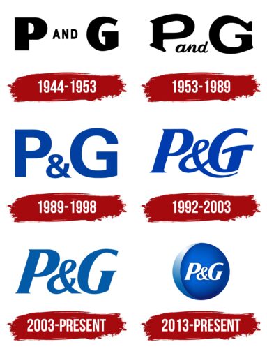
At first, the P&G logo was round and didn’t have any inscription – only a “+” sign, which later turned into a placer of stars, and then disappeared at all. A verbal emblem replaced it. In total, the modern period covers six logos.
What is Procter & Gamble?
Procter & Gamble is the full name of the American company P&G, which produces a large list of household, food, cosmetic, and hygiene products. The corporation entered the market in 1837, beginning with producing soap and candles. William Procter and James Gamble founded it. It was their surnames that were used as the basis of the logo. The company is headquartered in Cincinnati, Ohio.
1944 – 1953
A characteristic feature of the Procter & Gamble emblem is the absence of the classic ampersand (&). Instead, the designers used “and” – conjunctive conjunction. It is located in the middle between the bold letters “P” and “G,” which appear blocky.
1953 – 1989
The new logo remained monochrome but got a replacement for the font in which the “and” union was typed: it is italicized and lowered down. The capitals of the acronyms had individual roundings and serifs.
1989 – 1998
The Procter & Gamble logo changed its color palette, making monochrome a thing of the past: it is now colored blue. The glyphs are flat, bold, solid, and chopped. This time an ampersand joins them.
1992 – 2003
The new style of lettering significantly transformed the emblem. The “P” and “G” became slanted, and the ampersand got an elongated end going under the last letter. Miniature serifs appeared on the feet of the glyphs.
2003 – today
In the current version, the designers shortened the long line and curved it at the ampersand. They also removed the massive part of the “G,” making the letter tall and neat.
2013 – today
Another Procter & Gamble logo is now used in parallel – in a blue circle with a blue border on the left. It denotes the thin crescent moon sickle that was on the earlier emblems.
Moon and Star
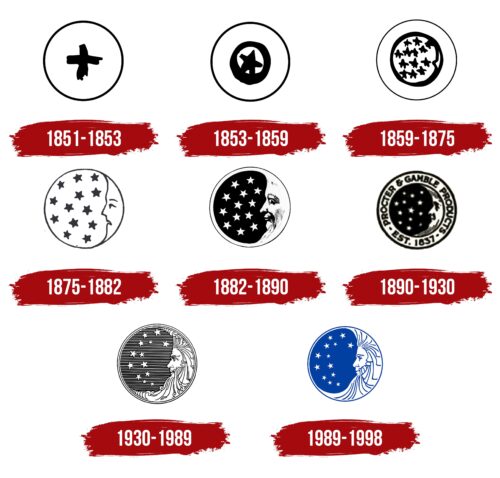
Procter & Gamble’s original emblem was copied from sign workers used to mark boxes of Star Candles so they could be transported and found quickly. It was a cross-shaped mark in a circle. Later, the designers turned it into a star. And then there were many of them, and a crescent-shaped month appeared on the side. Because of the “satanic” connotations that some saw in the P&G logo, the company switched to a text-based identity.
1851 – 1853
The logo was a plain cross that marks the right thing. A thin ring surrounded it.
1853 – 1859
The cross was redrawn into a five-pointed star in a circle. A narrow ring surrounded them.
1859 – 1875
The designers reduced the size of the stars and increased their number to 13 – the number of American states. A triangular protrusion resembling a nose was placed on the right.
1875 – 1882
This Procter & Gamble logo first featured a crescent moon looking at the stars. It had a distinct face with eyes, eyebrows, and a mouth. The anthropomorphic character was depicted in the profile.
1882 – 1890
Artists painted a good-natured smile on the crescent, painted the stars white, and placed them on a black background.
1890 – 1930
For a short time, a rondel-like emblem appeared: around the central part with the crescent and stars was a wide band with several inscriptions.
1930 – 1989
Competitors and detractors saw this version of the logo as the embodiment of Satan. They allegedly saw the crescent moon horns and the encrypted number 666. In reality, it was a thin moon with a beard and long hair, peering at the stars from the side.
1989 – 1998
Procter & Gamble removed the curls in the beard and hair by straightening it. It also asked to make the moon man’s face more welcoming and open and to change the black background to blue.
Font and Colors
The Procter & Gamble logo can be called a long-suffering one. This is because, for many years, it was persecuted by those who claimed that the company’s management was involved in the Church of Satan. However, the moon (crescent moon) and stars served as an original way to show the company’s products’ influence on customers’ lives in all its “phases” at any time of the day or night.
At various times, P&G logos used typefaces that resembled Breve News Bold Italic, Univers, Vremena Grotesk Medium, and HeadlineNEWS Regular fonts. The modern lettering echoes Helvetica in its minimalism.
The corporate palette consists of black or blue combined with white and can have several symbolic meanings:
- Seriousness and professionalism: black and white are associated with formality, seriousness, and professionalism, which can be important for a company involved in producing household chemicals and other household products.
- Trust and Reliability: Blue is associated with trust and reliability, which can be important for a company producing body and home care products that consumers should feel comfortable using.
- Style and elegance: black and white is often associated with style and elegance, which can reflect the high level of quality and luxury of P&G products.
- Minimalism and modernity: Black, white, and blue are used in modern, minimalist designs, which may indicate the company’s modernity and innovation.
Overall, P&G’s palette choice may symbolize its focus on quality, reliability, professionalism, and modernity.
Procter and Gamble color codes
| Celestial Blue | Hex color: | #4c94c6 |
|---|---|---|
| RGB: | 76 148 198 | |
| CMYK: | 62 25 0 22 | |
| Pantone: | PMS 299 C |
| Bright Navy Blue | Hex color: | #0264d5 |
|---|---|---|
| RGB: | 2 100 213 | |
| CMYK: | 99 53 0 16 | |
| Pantone: | PMS 2935 C |
| Royal Blue | Hex color: | #12206b |
|---|---|---|
| RGB: | 18 32 107 | |
| CMYK: | 83 70 0 58 | |
| Pantone: | PMS 662 C |

