


![]() Cruz Azul Logo PNG
Cruz Azul Logo PNG
The Cruz Azul logo in the second part is predictably blue because the word in its name, translated from Spanish, literally means this color. It also contains red and white, both of which serve as backgrounds. At the same time, the football team’s emblem is completely different from the usual signs and more like a medical organization’s symbol.
Cruz Azul’s history began before the football club existed. In 1881, British entrepreneur Henry Gibbon founded a hydraulic lime plant on the old Jasso hacienda in Hidalgo, México. The business later became Cooperativa La Cruz Azul, a cement producer. One of its workers was Carlos Garcés López, a footballer who played in México’s first official national-team matches in 1923 and joined the 1928 Olympic squad.
In 1925, the cooperative considered creating a sports club, initially focusing on baseball. Garcés López argued for football, and on March 22, 1927, a workers’ referendum made football the official sport of the enterprise. On May 22, 1927, the club was founded, with Garcés López as its first coach. The early team was made up of factory workers and played in amateur regional competitions.
From 1932 to 1943, Cruz Azul represented Hidalgo eight times in national-level amateur tournaments. In 1961, the club entered México’s second division, then won promotion in 1963/64. To comply with federation rules against commercial club names, Jasso was officially renamed Ciudad Cooperativa Cruz Azul. After a modest 1964/65 debut in the top division, Raúl Cárdenas became a coach in 1966.
In 1968/69, Cruz Azul won the Primera División, the Copa México, and the CONCACAF Champions’ Cup. In 1971, the club moved to México City and Estadio Azteca, then became a force in Mexican football (Liga MX), winning titles in 1971/72, 1972/73, and 1974. Rivals included Club América and Guadalajara. After the 1997 title, Cruz Azul reached the 2001 Copa Libertadores final against Boca Juniors. On May 30, 2021, it beat Santos Laguna 2-1 on aggregate to win its ninth league title.
Meaning and History
![]()
The team’s logo has remained unchanged since its inception in 1927. Despite minor adjustments, it always contained a blue cross within a white circle and a red square, with the title at the top and bottom. In 1972, stars began to appear on the coat of arms, representing the number of Liga MX titles. At first, there were three of them, and each year the number increased until the stars completely disappeared from the emblem in 2022. At the top, the inscription “Club de Futbol” was replaced, and at the bottom, instead of the word “Mexico,” the phrase “Cruz Azul” appeared. In total, there are eleven logos in the history of this team.
What is Cruz Azul?
Cruz Azul is the name of a Mexican soccer team. It is one of the top 100 in the world and one of the oldest in the country, having been founded in 1927. The club represents Liga MX and is owned by Cementos Cruz Azul. The headquarters is located in La Noria, in the suburbs of Xochimilco.
1964 – 1971
![]()
The emblem consists of a coat of arms with six points: five at the top and one at the bottom. It is drawn with a thin contour line and, inside, with several inscriptions: “AC Cruz Azul” and “Club Deportivo.” The phrases are typed in a narrow sans-serif font. They surround a red ring containing a blue double-bordered cross.
1971 – 1972
![]()
During this period, the heraldic shield disappeared, and a vertical rectangle took its place, divided into several zones. A cross occupies the center of a white circle, which, in turn, is inside a red square. The upper part is reserved for the sponsor’s name, “Deportivo.” Below is the name of the football team. The letters, as before, are thin, smooth, and chopped.
1972 – 1973
![]()
In 1972, the first three stars appeared in the logo. They are located at the top of the emblem: one in the center and two to the right and left, near the rectangle’s corners. No other changes were noticed.
1973 – 1974
![]()
The same logo, but with four stars grouped in pairs: above a rectangle with a cross in a white circle and a red square, and at the corners on both sides.
1974 – 1979
![]()
After the victory, the football team’s emblem was adorned with another star. Now there are five of them: one in the center and two to its right and left.
1979 – 1980
![]()
The logo features six five-pointed stars with sharp rays. They are small and ungrouped, with three in each of the two compositions. The rectangular frames that contained the words “Deportivo” and “Cruz Azul” have disappeared.
1980 – 1995
![]()
For a few more years, the emblem with seven stars was used. To arrange everything compactly in a single space, the designers used a “cap,” placing it above the red square labeled “Deportivo.”
1995 – 1997
![]()
In 1995, there was a major redesign, after which the Cruz Azul logo became round. The blue ring completely encircles a red square with a cross on a white background. It has seven white stars at the top and the inscription “Mexico” at the bottom.
1997 – 2021
![]()
One might say that the most radical changes were undertaken during this period. The designers changed the logo’s color: instead of dark blue, they used light blue. By adding a star for another team’s league victory, the developers increased the number of stars and set them apart with a large indent. They made the font in the word “Mexico” larger and the ring surrounding the cross in a white square.
2021 – 2022
![]()
The football club has returned to its dark blue identity. In parallel, a new font was approved, almost identical across all inscriptions. The letters are bold, smooth, and sans-serif. Nine stars are drawn on the rim surrounding a white field with a red square. The frame has an additional thin stroke.
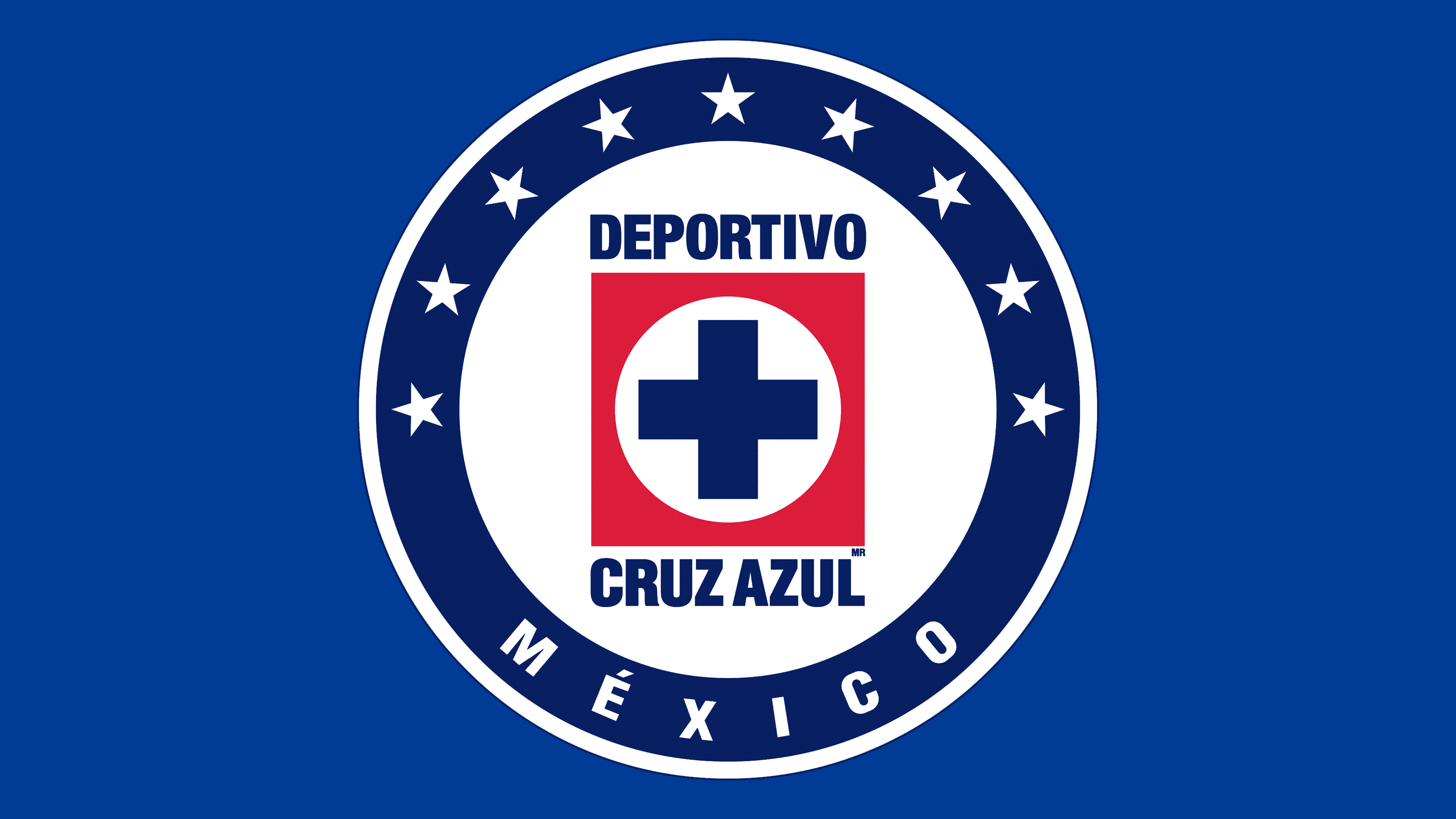
2022 – today
![]()
The Mexican team abandoned the stars in the logo, so the words “Club de Futbol” appeared at the top and “Cruz Azul” at the bottom. The designers removed the name above and below the red square. The cross in the center is now much larger than before.
Font and Colors
Mexican football players decided to make major changes to their identity in connection with the corruption scandal surrounding their sponsor, Deportivo. Therefore, they decided to remove any mention of it from the logo to show the fans their honesty and independence. The changes were made in the summer of 2022. The new version also lacks stars.

The Cruz Azul logo uses a signature sans-serif typeface: smooth, flat, and tall. Moreover, there was never an antiqua in it, only a grotesque. It is reminiscent of Placard Std Bold Condensed and Railroad Gothic Pro. The Spanish word “Azul” means “blue,” so this color dominates the sports club’s identity. It is complemented by red and white.