


![]() Dairy Queen Logo PNG
Dairy Queen Logo PNG
The Dairy Queen logo is sweet, tasty, and uplifting. All products are prepared from fresh ingredients and feature beautiful designs. The visual symbols represent cold and warm desserts.
Dairy Queen has been in business since 1940. Its first product was soft-serve ice cream, followed by Blizzard milkshakes and creamy desserts with cookies, cotton candy, pumpkin pie, candy, cakes, and other fillings. Frozen yogurt was a low-calorie alternative. DQ also serves malt and soft drinks, burgers, fries, toast, chicken, and other dishes to complement its large assortment of sweets.
Dairy Queen started in 1940 in Joliet, Illinois, thanks to John Fremont McCullough’s invention of soft-serve ice cream. This new ice cream could be served right from the freezer, offering a softer alternative to traditional ice cream. The first Dairy Queen store opened on June 22, 1940, quickly winning over customers with its ice cream, sundaes, and cones.
McCullough saw the potential to grow and started franchising Dairy Queen, spreading its unique ice cream across the U.S. The 1950s introduced the Blizzard, a thick milkshake with mix-ins, and the Dilly Bar, a chocolate-coated vanilla ice cream bar, both of which became staples.
In the following decades, Dairy Queen expanded its menu and reached internationally. In 1998, Warren Buffett’s Berkshire Hathaway acquired Dairy Queen, providing resources for continued growth. The 2000s and 2010s brought new products like the Orange Julius menu and $6 Buck Lunch, modernized stores, and an updated brand look.
Dairy Queen has become a brand that connects generations and is known for its nostalgic appeal, fun atmosphere, and signature treats. With over 6,800 locations in over 25 countries, Dairy Queen is a favorite spot for cold treats and quick meals.
Meaning and History
![]()
The McCullough family developed the recipe for soft-serve ice cream in 1938. John Fremont and his son Alex “tested” the new product at a friend’s store. The result of the experiment was promising: in just one day, customers took away more than 1,500 servings. So, the budding entrepreneurs had to develop a special freezer to maintain an ideal temperature regime. After that, they opened their own business, which quickly grew into a franchise network.
Every American in the second half of the 1950s knew about Dairy Queen soft-serve ice cream. But that wasn’t enough for the brand owners, and they added hot food to the menu, including hamburgers and hot dogs. In the late 1990s, Berkshire Hathaway bought out DQ and continued to develop the successful concept. Fast-food restaurants became famous for serving tasty treats for families. And many of the branches now look the same as in the 1950s: chain executives deliberately kept the old design to evoke a nostalgic mood. The only thing that has changed is the logos, which have had a common structure since 1958.
Signs have long-used symbols, such as red ellipses with sharpened edges. Previously, they were complemented by images of ice cream cones and a friendly Eskimo girl. But in modern times, Dairy Queen’s identity is more unified: the main brand sign is the letters “DQ” inside a red figure with two orange-and-blue bands.
What is Dairy Queen?
This is a chain of fast-food restaurants in the USA, owned by a corporation of the same name. She is abbreviated as DQ, which is reflected in the Dairy Queen logo. Its main specialization is dairy products, later supplemented with other dishes. Soft ice cream and cocktails have always been the basis of the signature menu. Then the assortment was expanded, and drinks appeared. The company was opened in 1940. The office is currently located in Bloomington, Minnesota.
1940 – 1960
![]()
The debut logo was completely different from today’s logo. The black lettering “DAIRY QUEEN” was in a square font with partially rounded corners. The letters had no serifs; the only decorative element was the thin gray lines running through each stroke’s center. This sign adorned the first DQ restaurant in 1940. It was most often elevated above the roofs of buildings and accompanied by additional elements, such as a soft-serve ice cream cone or an Eskimo in national dress.
1960 – 2007
![]()
In 1958, the fast-food chain had a new graphic symbol. That’s when the foundation for the current Dairy Queen style was laid. The brand’s full name remained the same as in the previous logo, but its design changed dramatically. The lettering became white, and the font took on a different geometric shape, with high-contrast glyphs and soft curves. All but the first letters were lowercase.
The background for the text was a red drop-shaped ellipse with two pointed edges. At first, the base was asymmetrical: the right corner seemed more elongated than the left. In the 1970s, the two parts flattened out. This sign, too, was complemented by an image of an ice cream cone when used on buildings. Although the font remains on some cutlery, it is no longer relevant, and the logo is still found in retro-designed restaurants, including Brazier stores.
2001 – 2007
![]()
In 2001, the Dairy Queen chain modernized its logo to keep up with the times. Before that, it was sometimes shortened to DQ, but in 2001, the acronym became the official brand name. This innovation is reflected in the logo. After a small redesign, the inscription “Dairy Queen” was removed. The capital letters “D” and “Q” took their place, remaining white and preserving their unusual font in a geometric grotesque. But the ellipse-shaped base changed: it became dark pink. It did not go beyond experiments with color because the classic badge ensured brand recognition.
2007 – today
![]()
In 2007, the designers made the graphic symbol symmetrical and repainted it in a rich red hue to resemble lips. The font was transformed: the acronym now uses italic letters with serifs (the “D”). There is also a wordmark with a red “Dairy Queen” inscription. It adorned the branded spoons and modern branches of the restaurant chain.
Font and Colors
Two color lines have been added to the top and bottom of the logo to represent the menu’s diversity. The blue line represents all cold foods, including soft-serve ice cream, and the orange line represents burgers, toast, and other hot foods. Before their inception, the Dairy Queen emblem was less symbolic. All elements were used to make the brand recognizable, so they hardly ever changed.
The designers developed a custom set of glyphs for DQ, so it’s unparalleled. But the overall style, slant, serifs, and high contrast of the letters are reminiscent of Commercial Type’s Algebra ExtraBold. Some designers note that the logo’s font resembles the New June Serif ExtraBold Italic and Trada Serif Black Italic.
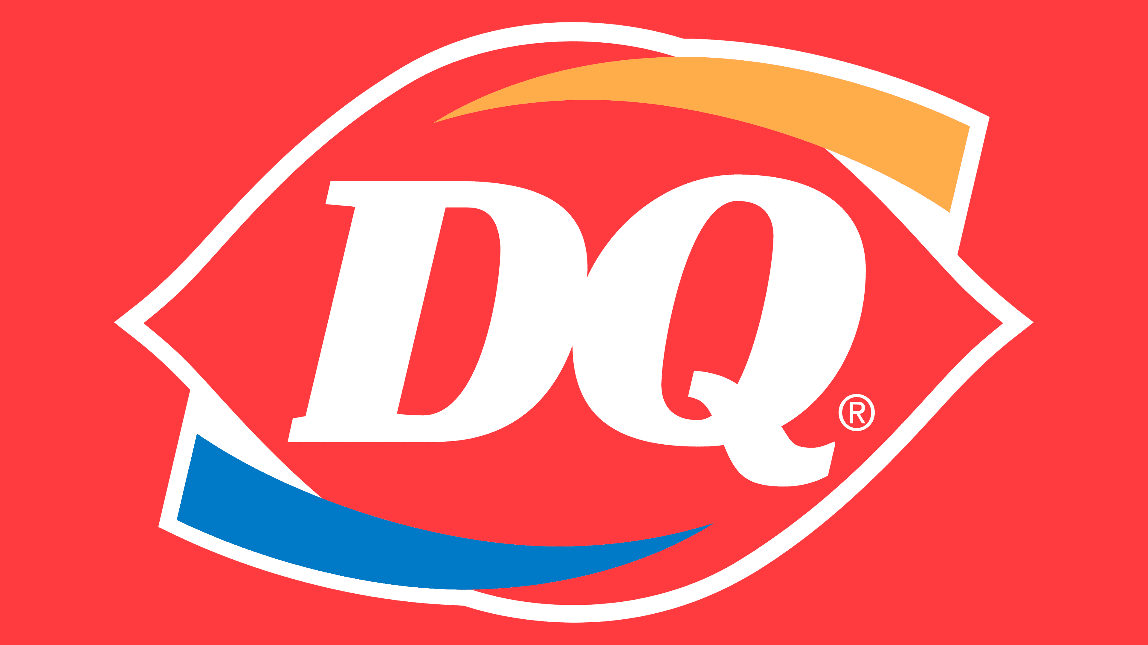
The logo’s main color is red, with white, orange, and blue accents. The first is used for contrast, while the second and third symbolize hot and cold dishes.
FAQ
What was the first Dairy Queen logo?
The original Dairy Queen logo from 1940 was simple yet effective. It showed the name “Dairy Queen” in stylized letters with a soft-serve ice cream cone at one end. This logo was important because it clearly showed what Dairy Queen was all about: its soft-serve ice cream, which was new and different from the hard ice cream that was common at the time. The soft-serve cone in the logo became a symbol of Dairy Queen, underscoring its fresh take on ice cream. This logo set the stage for the Dairy Queen brand, focusing on the fun and innovation of soft-serve ice cream, which soon became what Dairy Queen is known for.
What is Dairy Queen’s brand name?
International Dairy Queen Inc., or IDQ for short, is a major food company based in Minneapolis, Minnesota. It manages Dairy Queen, a well-known fast-food and soft-serve ice cream chain in the U.S. Dairy Queen is famous for its Blizzards, ice cream treats, and fast food like burgers and fries.
IDQ works through two main parts: the American Dairy Queen Corporation in the U.S. and Dairy Queen Canada, Inc. in Canada. These parts help run over 7,000 Dairy Queen stores in more than 20 countries worldwide. Dairy Queen is popular worldwide and knows how to cater to different tastes.
The leaders at IDQ work hard to keep Dairy Queen loved by everyone. They do this by introducing new Blizzard flavors, expanding food options, and using new technology to make buying food easier. Thanks to IDQ, Dairy Queen has grown from a small ice cream shop to a major international fast-food and treats brand.
What font does DQ use?
Dairy Queen changed its logo to make it stand out more. At first, the “DQ” text was in a simple, clean font without any fancy details. Then, they decided to switch to a bold font with thick lines and small extra lines at the ends of letters, making it lean forward a bit. This new font makes the logo pop and fits Dairy Queen’s fast service.
They also added orange and blue stripes to the logo. Orange is for their hot food, like burgers and warm meals, and blue is for their famous soft-serve ice cream. These colors help show what Dairy Queen is all about.
In 2007, Dairy Queen adopted this new logo, featuring an updated font and colors, as its main symbol. This change gave the brand a fresh look while remembering its roots in serving hot food and ice cream. The updated logo aims to attract more people by mixing old traditions with a new look.
Does Dairy Queen use real ice cream in their milkshakes?
Dairy Queen calls their drinks “shakes,” not “milkshakes,” which hints at what they’re made of. Their shakes and malts use “Artificially Flavored Vanilla Reduced Fat Ice Cream” as their base. Despite its name, this doesn’t fit the bill for what most people consider real ice cream.
Real ice cream usually has a certain amount of milk fat and natural flavors. Dairy Queen’s version cuts down on fat and uses artificial flavors instead. This choice affects the taste and nutrition, but means their shakes don’t count as real ice cream in the traditional sense.
It’s important for customers who care a lot about natural ingredients or have specific health needs to know this. Dairy Queen’s shakes might hit the spot if you want something cold and sweet, but they’re not made with traditional ice cream. So, if you’re after the real deal, keep this in mind when you’re at DQ.
What is Dairy Queen ice cream made from?
Dairy Queen’s Vanilla Kids’ Cone ice cream is made with a blend of ingredients for a creamy, sweet taste. It starts with milkfat or nonfat milk for the dairy part and sugar and corn syrup to make it sweet and smooth. To get that soft texture Dairy Queen is famous for, they add whey, protein, mono, and diglycerides that mix fat and water smoothly. They also added artificial vanilla flavor to ensure it tastes like the classic Dairy Queen ice cream everyone loves.
They use guar gum, polysorbate 80, and carrageenan to keep the ice cream thick and smooth. Guar gum prevents ice crystals from forming, polysorbate 80 distributes fat evenly, and carrageenan thickens the ice cream. They also add Vitamin A Palmitate, giving you some vitamin A.
The ice cream usually comes in a cake cone made from wheat flour, which provides added nutrients such as niacin and iron. This makes the cone more than just something to hold the ice cream; it’s part of the treat.
This shows how much goes into making Dairy Queen’s ice cream tasty, creamy, and enjoyable, upholding the brand’s tradition of serving great frozen desserts.
What is the meaning of the Dairy Queen Logo?
The Dairy Queen logo is more than just a symbol; it tells the story of the brand’s offerings and history. Introduced in 1960, the logo’s heart is red and shaped like lips. This design has become a key part of Dairy Queen’s image, showcasing its welcoming, friendly vibe.
In 2007, the logo got a makeover with two half-circles added around the red lips. These aren’t just for looks; they mean something. The blue half-circle at the bottom represents Dairy Queen’s cold treats, such as ice cream and milkshakes, which have been a big part of the brand since its start. The blue color evokes cool, refreshing desserts.
The orange half-circle at the top represents Dairy Queen’s hot food, like toast and burgers. The orange color makes you think of warm, tasty meals. Using warm and cool colors, the logo shows that Dairy Queen has something for everyone, whether you want something hot or a cool treat.
Adding these elements to the logo not only made it look modern but also deepened its meaning. It’s a place where you can find something to enjoy, no matter what you’re in the mood for. This design highlights Dairy Queen’s focus on offering a variety of good-quality food and treats, aiming to make every customer happy.
What does the Dairy Queen logo symbolize?
The Dairy Queen logo shows how much people like their sweet ice cream and tasty fast food mix. The main part of the logo is red lips, which means taste and happiness. These aren’t just for show; they represent the joy people get from Dairy Queen’s food. The lips also look like a kiss, showing how much customers love Dairy Queen’s food.
The logo also has two colored lines to show what Dairy Queen sells. The blue line is for cold items like Blizzards and ice cream, which Dairy Queen is famous for. Blue makes you think of feeling cool and refreshed, perfect for describing the experience of eating an ice cream on a warm day. The orange line covers Dairy Queen’s hot food, such as burgers and fries. Orange stands for warmth and energy, just like having a satisfying hot meal.
Overall, the Dairy Queen logo isn’t just a brand symbol; it tells a story of good food and happiness. It highlights Dairy Queen’s wide range of food, from cool ice cream to warm fast food, making it stand out in the fast-food world.
Where did the Dairy Queen logo come from?
The Dairy Queen logo comes from the ideas and respect its founder, J.F. McCullough, had for cows in the dairy business. He often called cows’ the queen of the dairy business’ because he believed high-quality dairy products were key to his restaurant. This led him to name his store Dairy Queen when he opened the first one in 1940 in Joliet, Illinois. The logo appeared there for the first time, highlighting McCullough’s commitment to offering top-notch dairy treats and honoring cows’ essential role in his business.
Over time, the Dairy Queen logo has become a symbol of the brand’s history, its focus on quality, and its tribute to the dairy industry’s heart – the cow. Starting from one location in Illinois, the logo is now known worldwide. It carries McCullough’s legacy of valuing the Dairy Queen, the cow, adding depth and significance to what Dairy Queen stands for: quality and tradition.
What is Dairy Queen’s slogan?
Dairy Queen is known for its tasty treats and fast food, and it uses catchy slogans to show what it’s all about. Its first slogan, “This is Fan Food, not Fast Food,” tells us Dairy Queen focuses on making food that wins hearts, not just quick bites. This slogan highlights how much people love Dairy Queen’s ice cream and shakes, making it more than just another fast-food spot.
Then they came up with “Happy Tastes Good,” which goes further to say that eating at Dairy Queen is about feeling good, not just filling up. It shows Dairy Queen’s belief that their food brings joy, making every bite a happy moment.
Despite these great slogans, the Dairy Queen logo remains simple, showing only the letters “DQ.” This simplicity ensures nothing detracts from the slogans’ message, letting them shine and share Dairy Queen’s joy and fan-favorite food.
In short, Dairy Queen’s slogans have been key to conveying their commitment to making delicious food and bringing happiness. These slogans have helped keep Dairy Queen dear to its fans in the competitive fast-food world.
What does the term Dairy Queen mean?
“Dairy Queen” is the name of a famous American fast food chain specializing in dairy products. The name humorously refers to cows because they provide the milk, a key part of the restaurant’s early menu. By calling it “Dairy Queen,” the founder was playfully saying that the cows that supply the milk are like royalty in his business. Even though Dairy Queen now serves various fast foods beyond dairy items, the name still pays tribute to the important role that dairy, and by extension, cows, had at the beginning of the chain.