![]() Decathlon Logo PNG
Decathlon Logo PNG
The Decathlon logo serves as the primary identifier of the retail network, signifying the quality and reliability of its products. It inspires customer trust by assuring them that branded products will last long and won’t fail, even in unexpected situations. The Decathlon emblem is designed in a geometric style, with a clear structure, straight lines, and a rigid style. This likely relates to the company’s business nature, as it manufactures and sells sports goods, where items must be comfortable, convenient, and functional.
Decathlon opened on July 27, 1976, in Englos, near Lille, founded by Michel Leclercq, a former Auchan employee and a relative of its founder, Gérard Mulliez. He identified a gap: shopping centers lacked sports equipment, while specialized stores were expensive and limited in selection.
The concept was built on three ideas: all sports in one place, self-service, and low prices. The team of six, all sports enthusiasts without retail experience, developed the format and chose the name Decathlon, which refers to 10 core sports.
During the first decade, the chain expanded across France. In 1986, it entered Germany, followed by Spain in 1992. Expansion continued across Europe, competing with higher-priced formats and fragmented retail.
A key factor was vertical integration. The company designed, produced, and sold its own products, allowing it to compete on price with Sports Authority and Intersport.
Own brands became central: Quechua, Kipsta, Domyos, Btwin, Tribord. In 1997, Decathlon launched its Sports Lab for product development. By 2000, revenue exceeded €1 billion.
In the 2000s, expansion moved beyond Europe. China opened in 2003, Russia in 2009, and Brazil in 2012. By 2015, the company operated globally, with Leclercq handing leadership to Michel Aballe.
In 2022, Barbara Martin Coppola became CEO, previously working at IKEA. In 2023, Decathlon acquired Bergfreunde. By 2024, revenue reached €16.2 billion with 1,817 stores in 79 countries.
Meaning and History
![]()
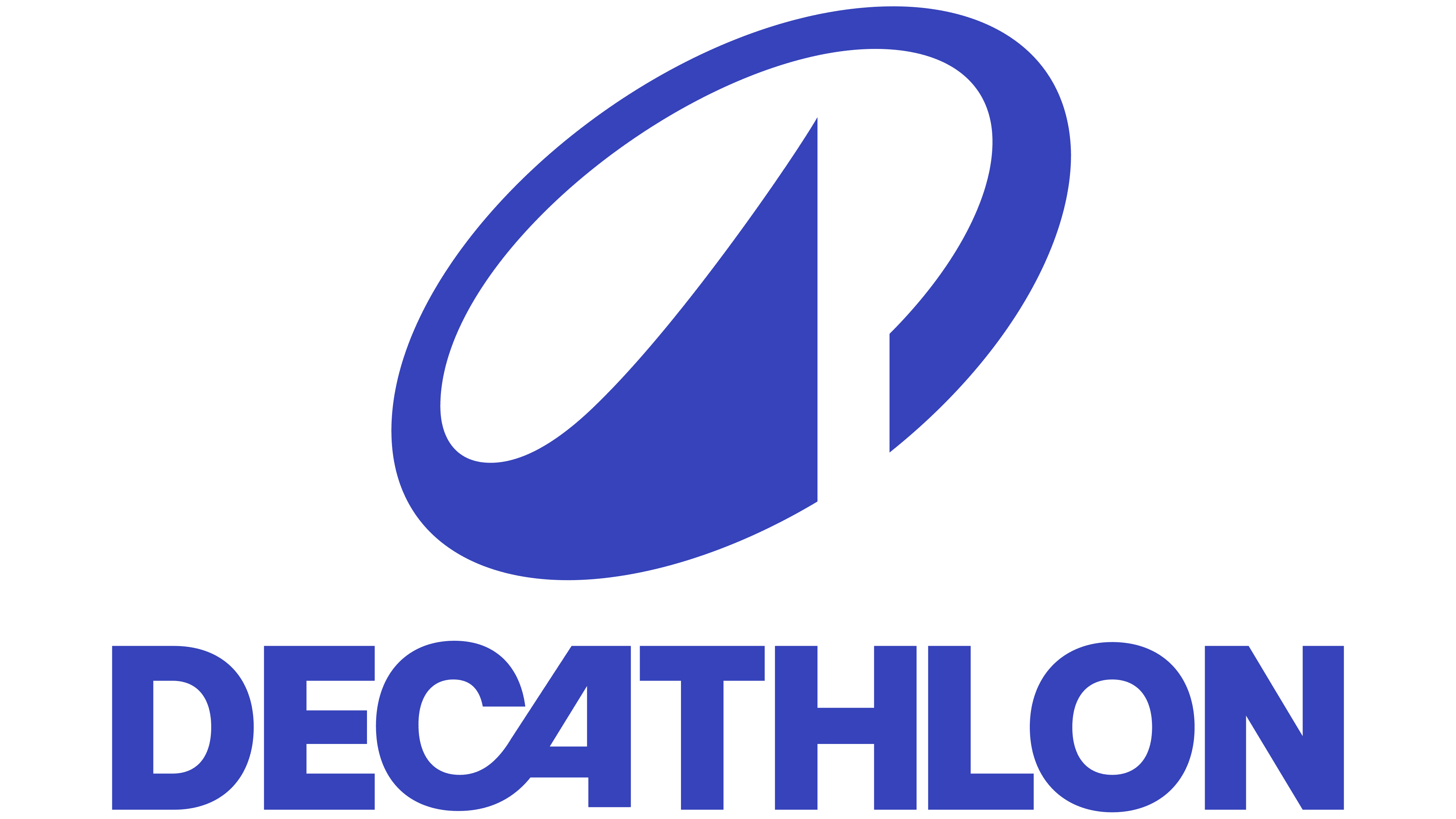
The company’s logo resonates with its name, “decathlon.” This word perfectly conveys the nature of its activity: manufacturing and selling equipment for most sports directions. The universality is also emphasized by the graphic symbol placed in a bright blue rectangle.
The inscription is done in uppercase, bold font similar to Avant-Garde Bold. The characters are placed very close together, so many of them merge into a single structure. The letter “D” is connected to “E”; “C” to “A”; “O” to “L”; and “N.”
The company uses its name as a trademark. Some letters in it are joined, demonstrating a spirit of support and the desire to help find everything necessary for any sport.
The most interesting merger is between “C” and “A.” The leg of the second symbol doesn’t touch the surface and is positioned higher than the others. Its smooth, rounded transition resembles a skateboard ramp or a high wave in surfing.
What is Decathlon?
Decathlon is a chain of stores specializing in equipment, accessories, and gear for swimming, tennis, basketball, snowboarding, soccer, and other sports. The company was founded in France in 1976. Over time, it opened stores in more than 50 countries and became one of the world’s largest sports goods retailers. It owns about 20 brands and several research centers where new products are developed.
1976 – 1980
![]()
The first version of the logo is the word “Decathlon” with horizontal lines of different colors. The stripes are divided by the letter “A” and are located above and below. The inscription was immediately executed in a recognizable style, still used today, all characters are even, strict, and geometric. In some places, they have connections: the letter “O” merges with the adjacent “L” and “N,” “A” with “C,” and “E” with “D.” Moreover, the front leg of “A” doesn’t reach the common lower border; it ends slightly higher.
1980 – 1990
![]()
Designers removed the stripes, recolored the name from black to green, and added the lower inscription “A FONT LA MARQUEE.” The letters in it are unevenly placed: they look like jumping due to the height difference. Furthermore, the symbols at the end of the phrase are depicted much larger than at the beginning.
1990 – 2024
![]()
After a radical image change, the trademark received an updated emblem: the letters became white, the background was light blue, and the style was simple. The only thing designers left unchanged is the writing of the word “Decathlon.” The name on the emblem is original and looks the same as it did forty-five years ago.
2024 – today
![]()
The management has adopted a new logo to elevate the company’s prestige and showcase its readiness to achieve new heights. The emblem’s concise style highlights the brand’s business character, the absence of obstacles to achieving goals, and modernity, reflecting recent branding trends towards simple forms and two-dimensionality.
At the same time, the Decathlon logo demonstrates generational continuity, showing how experience helps the company make a strong start and move forward confidently. This idea aligns perfectly with its main business activities.
The concept is reflected in the close connection between the letters “C” and “A,” which transition smoothly into each other without affecting readability. They symbolize that the company’s sports equipment can easily conquer any peak. The tandem of these letters resembles three locations:
- Seas and oceans with high waves for surfing;
- A mountain for climbing, skiing, and snowboarding;
- A ramp for fast turns and tricks on a skateboard.
The graphic element conveys the authentic French charm of a slanted ellipsoid with a pointed left end in the center and a cut-off contour at the bottom. This redesign has completely transformed the emblem and added distinctiveness, as the badge’s shape resembles the brand name’s first letter. The sharp curves symbolize speed and movement.
The wide recognition of the Decathlon logo is enhanced by the fonts used for the name. These are Sequel Sans and Neue Plaktrade with geometric sans-serif glyphs. The letters in the inscription are solid, large, and smooth, demonstrating the sports products’ strength, reliability, and convenience. All emblem elements are painted bright blue, close to a neon shade, to show clients the brand’s dynamism and convey its active energy.
Font and Colors

The word is written in a standard white sans-serif font on a bright blue background with a barely noticeable neon hue. Such contrast energizes, invigorates, and conveys the desire to move forward. According to the developers’ concept, this label is the exact expression of vital force.
The official Decathlon palette consists of light blue (background) and white (letters). The unofficial one can be in various combinations, as the symbols are colored in turquoise, white, dark blue, or black.