Although they no longer exist, many defunct car brands have had an impact on the automotive industry. While thriving companies have become known to the general public, many brands from countries such as the US, UK, Germany, and Italy have gone out of business. These defunct companies were once legends in the automobile industry.
The reasons for the decline of these brands are not always due to poor marketing or failed branding. Rather, financial insufficiency and an inability to adapt to changing market conditions are to blame. Despite their ultimate collapse, these companies faced challenges, often related to inadequate funding or an inability to evolve to meet market demands.
Examining these defunct brands reveals the rich history of their storylines, iconic logos, and unique customer experience methods. These brands had their own approaches to interacting with consumers, providing invaluable insights into the market trends and consumer behavior of their time.
Importantly, these defunct brands continue to influence modern companies. Elements of their logos and design philosophies have made it to today’s automotive brands. Whether it’s a certain shape – a circle, a wing, or even an animal figure – traces of these companies of the past are present in today’s design paradigms.
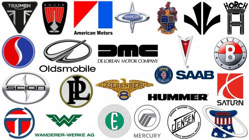
Here are some of the most famous automobile companies that are no longer in business but continue to indirectly influence the industry.
Failed car companies
The American automobile industry is famous for its rapid development and fierce competition, creating a formidable environment for newcomers. This relentless pace has been a defining factor that has led many companies to achieve immense fame but never see their end. This cautionary tale is not limited to the US: the instability of the automotive industry affects brands around the world, making long-term survival questionable.
One of the factors contributing to a company’s demise is inadequate market research. Not understanding or misjudging the target audience can lead to a company’s demise. Often, companies rush into production without fully understanding the wants and needs of consumers, resulting in inventory delays, financial losses, and eventually production stoppages.
Unmet expectations also play an important role. Companies that claim to deliver top-notch performance at affordable prices can lose the public’s trust if they fail to meet these lofty goals. Loss of trust is a steep uphill climb, and many companies fail to recover in time, leading to their collapse.
While these companies may have shut down their product lines, their influence lives on. A portion of consumers, particularly collectors and vintage model enthusiasts, keep the memory of bygone brands alive. Finding classic logos or parts for restoration is a treasure hunt that keeps the enthusiasm alive.
Vintage cars find a home in museums dedicated to automotive history. The cars and brand memorabilia on display provide a glimpse into a bygone era while reminding us of the inexorable nature of the marketplace.
By scrutinizing the rise and fall of companies of the past, valuable lessons can be learned. Their mistakes and missteps become cautionary tales for current and future automotive businesses. The most important takeaway is the importance of customer-centered planning, adapting to the marketplace, and maintaining credibility.
These companies have made rich contributions to the automotive sector through both their successes and failures. Their influence is profound: they changed design standards, influenced consumer expectations, and laid the groundwork for market trends. Even if they no longer exist, their imprints remain in the industry, serving as inspiration and instructive lessons.
The world’s most famous discontinued car brands
Delving into the realm of famous defunct car brands reveals intriguing shifts in the automotive sector. These companies once wielded considerable influence, revolutionizing design, technology, and consumer experience. Before their closure, these brands often set industry standards, launched iconic models, and were pivotal in technological advancements.
Berkeley
The British brand Berkeley, which specializes in the production of high-performance sports cars, occupies a unique place in automotive history despite its short existence of about four years. One interesting aspect of Berkeley’s manufacturing approach was the use of motorcycle engines in sports cars, which set the brand apart from other manufacturers.
Fans of the brand grew quickly, a testament to its influence and the quality of its cars. The unwavering enthusiasm with which Berkeley cars are greeted by their fans proves the brand’s ability to attract a loyal following and emphasizes its influence in the automotive community even after discontinuation.
When considering the brand, the Berkeley emblem deserves special attention. This logo is a large stylized letter “B” set against a red and silver background in the shape of a circle. The central image is framed by a silver ring with the brand name and four stars. The colors and elements of the logo combine elegance and boldness, reflecting the brand’s commitment to high performance and style.
The use of motorcycle engines in Berkeley sports cars demonstrates the company’s innovative approach to design and construction. Motorcycle engines tend to be more compact and lighter than traditional automotive engines, which can help improve vehicle performance, such as speed and maneuverability. By utilizing these engines, Berkeley effectively blurs the lines between the two segments of the automotive world, making its products even more unique.
DeLorean
DeLorean Motor Company (DMC) occupies a unique niche in automotive history, thanks in large part to its involvement in the Back to the Future film series. The DMC-12, a stainless steel sports car with swinging doors, became an icon almost overnight, immortalized on screens and in popular culture. However, the company’s life was short-lived: it ceased operations after just seven years, between 1975 and 1982.
The cinematic fame of the automobile should not overshadow the design and branding elements that contributed to the company’s memorability. DMC chose a simple but impactful logo consisting of a lettered abbreviation of the brand name – “DMC” – and the full company name elegantly placed below in a serif font. The result is an elegant, authoritative, and memorable logo.
In addition to the high-profile Hollywood look, DMC demonstrated a bold approach to automobile manufacturing. Despite its short existence, the company managed to leave an indelible mark in a highly competitive market.
Duesenberg
Operating from 1913 to 1937, Duesenberg Motors, despite its relatively short existence, left an indelible mark on the American luxury and racing car segment. The brand was the first American car to win the French Grand Prix, a testament to its engineering prowess and superior performance.
Duesenberg cars were synonymous with luxury, characterized by lavish interiors and advanced technology. At the heart of each car were advanced engineering solutions, providing high-speed performance that often surpassed the competition. The cars were characterized by unparalleled comfort and sophistication, from high-quality materials to intricate detailing.
The logo exudes prestige and elegance and is dominated by an elaborate golden eagle. The eagle with intricate details symbolizes freedom, power, and the desire to soar. Beneath the eagle’s tail is the number “8”, subtly emphasizing the brand’s focus on performance and historically significant straight-through engines. Along with the eagle, the serif capital letters that spell out the word “Duesenberg” indicate timeless elegance and unwavering quality.
Hummer
Hummer, a name often associated with ruggedness and durability, entered the automotive arena in 1992. This brand specialized in producing sporty SUVs and pickup trucks, quickly gaining a reputation as a vehicle that could traverse almost any terrain. Although the brand ceased to exist, it returned in 2020 under the GMC brand, but no longer as an independent unit but as a specialized line of vehicles.
The model lineup was characterized by power, off-road capabilities, and impressive appearance. Many of the brand’s vehicles were built with military requirements in mind, which made them popular with consumers looking for reliable and durable vehicles. Fuel economy was often compromised, but this was considered a small price to pay for high performance and durability.
The simplicity of the Hummer logo is embedded in every vehicle. Using bold, thick block letters to spell out the name “HUMMER,” the logo epitomized traits such as stability, reliability, and strength. This straightforward design fit the brand’s unique selling proposition of offering simple and reliable vehicles. The heavy typeface conveyed the brand’s core values, echoing the rugged and indomitable nature of the cars themselves.
Despite bankruptcy and disappearing for a while, the legacy of the Hummer brand lives on, especially in the form of its revival in 2020 as a specialized lineup under the GMC brand.
Jensen Motors Limited
Jensen Motors Limited, hailing from the United Kingdom, actively produced its cars from 1922 to 2011. This longevity is a testament to the brand’s historical significance in the automotive world. Jensen Motors specialized in the manufacture of exclusive bodies, which made it a sought-after partner for other notable automakers. This specialization provided a competitive advantage and allowed the company to stay relevant in the ever-evolving automotive market. Financial problems became an insurmountable obstacle, leading to the company’s closure due to its inability to generate adequate profits.
The visual style of Jensen Motors is also noteworthy for its enduring influence. The logo contained a unique lettering inside a round black icon. This was no ordinary design; it was in a stylized serif font that gave the brand a sophisticated feel. Noteworthy are the sharp lines accentuating the letters “N” and the initial “J” elements that give a special flavor to the entire design.
Over the years, Jensen Motors has undergone a number of transformations. The brand has shown a wide range of capabilities, from its early years specializing in sports cars to its later diversification into commercial vehicles. Collaboration with other major automakers in specialized body repair has been a significant part of the company’s operations and has highlighted its prowess. This special role has allowed Jensen Motors to leave an indelible mark on the automotive industry.
Mercury
Conceived by Ford Motor Company in 1938, the Mercury brand was intended to fill a unique niche in the automotive market. The brand was intended for consumers who wanted an automobile experience that fell somewhere between Ford’s base cars and Lincoln’s more upscale models. The goal was clear: to give buyers a choice between style, performance, and affordability.
Mercury vehicles were designed to appeal to a wide range of consumers, offering a combination of features that were characterized by functionality and a commitment to excellence. Over the decades, the brand managed to create a diverse lineup of vehicles, from sedans to SUVs, each of which embodied the qualities of reliability and luxury that Mercury sought to epitomize.
Mercury’s emblem was not left to chance; it was designed to be just like the cars themselves. The rectilinear emblem in the shape of a circle had three horizontal lines in the center. These lines symbolize the roadbed, evoking associations with the automobile.
Despite its long history and contributions to American automotive culture, Mercury eventually came to its end and ceased operations in 2011.
Oldsmobile
Oldsmobile, an American automobile manufacturing company, was founded in 1897 and continued in business until 2004. The brand has earned a reputation for building vehicles for a wide variety of driving conditions. From luxury cars to family-friendly options, Oldsmobile has something for every car enthusiast. Unfortunately, despite its long history and extensive lineup, the brand faced financial difficulties that led to its demise, making room for new entrants into the automotive market.
One notable aspect of Oldsmobile was its innovation in automotive technology and design. The company was often at the forefront of innovation, introducing features and systems that later became standard on many cars. It wasn’t just a car manufacturer; it was an organization that defined the trajectory of the American automobile industry for more than a century.
The Oldsmobile emblem also has a unique significance. The emblem is a silver oval with a diagonal slanting line running from the lower left corner to the upper right corner, which brings to mind the open road. This logo is accompanied by a simple word mark in a sans-serif font. The logo symbolizes movement and innovation, reflecting the essence of the Oldsmobile brand – reliable and modern cars that meet the most diverse requirements of drivers.
Financial difficulties and falling sales eventually led to the closure of the brand. However, it was not just a discontinuation but the end of an era that had many milestones and contributions to the American automotive industry. Despite the emergence of new, more competitive brands, Oldsmobile’s influence has remained in the annals of automotive history.
Panhard
Originating in France, Panhard was a prominent name in the automotive industry from 1887 to 2012. Specializing mainly in the production of sports and racing cars, the brand has carved out a niche for itself by focusing on cars that appeal to lovers of speed and agility. Over the course of its existence, Panhard has earned a reputation for design and aesthetics.
The Panhard logo has become elegant and unique. In a black circle, a monogram consisting of the intertwined letters “P” and “L” was encased in a bright yellow ring. This color contrast was a departure from the norm in automotive branding at the time and provided Panhard with an edge in market recognition. This visual mark was more than just a symbol; it embodied the brand’s personality, constantly reminding it of its uniqueness in a competitive market.
But Panhard’s contribution to the automotive world was not limited to sports and racing cars. Throughout its history, the brand has diversified its portfolio into other vehicle categories. For example, Panhard produced a variety of military vehicles built with the same technical excellence as their civilian counterparts. The brand’s experience in building high-performance vehicles naturally translated into the creation of rugged and durable military-grade vehicles.
Panhard tried its hand at luxury by offering limousines that combined elegance with modern performance. These limousines were the perfect blend of comfort and technology, designed for customers who wanted to experience the epitome of luxury on wheels.
Despite the company’s eventual demise in 2012, Panhard’s long history and wide range of vehicles have left an indelible mark on the automotive industry.
Pontiac
With nearly a century of presence in the global automotive market, Pontiac made its name in history before finally ceasing production. The brand was known for its ingenuity in vehicle design, technology, and performance, leaving an indelible mark on the industry.
The brand’s logo, depicting a bright red arrow encased in a silver outline, represents two attributes – safety and adventure. The shield-like appearance emphasizes safety, while the arrow indicates a desire for innovation and forward-thinking. This symbolism resonates deeply with the values that Pontiac strives to embody in the design of its vehicles.
Among Pontiac’s lineup of vehicles, the Trans Am holds a special place. Known for its high performance and aesthetic appeal, the Trans Am has become a cultural icon, capturing the imagination of an entire generation. This model epitomized Pontiac’s excellence in combining form and function and set new standards for what a sports car should offer in terms of performance and aesthetic appeal.
But Pontiac’s reach was not limited to consumer vehicles. The brand asserted itself in a variety of segments, including luxury cars and high-performance models designed for specific needs.
The merger with General Motors marked the end of Pontiac’s existence as an independent brand, but it had little effect on its legacy. The company’s discontinuation further cemented its iconic status as automotive experts and enthusiasts continue to analyze and evaluate its contributions to the industry.
Rover
Rover, a British automobile manufacturer, began operations in 1925 and quickly became synonymous with quality and high performance. One of the company’s most notable legacies is the creation of the Land Rover range of vehicles, vehicles that went on to carve out a lucrative niche in the automotive industry. Sadly, Rover ceased operations in 1967 following its merger with Leyland Motors.
The cars produced by Rover were not just standard cars; they were symbols of British craftsmanship. The focus has always been on combining luxury and performance. From luxurious interiors to powerful engines, Rover cars were designed to provide the driver with an unforgettable experience on the road.
The Rover logo is another element that speaks to the brand’s individuality. Rover has chosen a complex and sophisticated logo, in contrast to the more minimalistic designs of other automobile brands. It depicts a golden ship with a large red sail encased in a triangular emblem. In addition to this image, it reads “Rover” in serif capital letters. This design not only reflects sophistication but also embodies the brand’s commitment to quality and performance.
The Land Rover range continues to occupy a place in Rover’s history. Originally designed for agricultural use, these vehicles quickly gained popularity for their durability and adaptability. The merger with Leyland Motors marked the end of Rover as an independent company.
SAAB
SAAB, originally from Sweden, has become an intriguing name in the world of defunct car companies. The company began in 1945, focusing on creating exceptional automobiles within a limited budget. A notable feature of SAAB was its desire to push the boundaries of car design, especially with its unconventional center console layout. However, this ingenuity was not enough to save the company from the damaging effects of the 2008 financial crisis. By 2016, SAAB had ceased operations, leaving the intellectual property partially in the hands of General Motors.
The SAAB symbol demonstrated a progressive ethic, as evidenced by the design of its logo. In bold block letters, the logo used a soft shade of gray, in stark contrast to the norms of its time. SAAB’s penchant for experimentation was evident not only in the design of its cars but also in its desire to redefine the driver’s experience. Experiments with the layout of the center console reflect SAAB’s desire to create ergonomic and user-friendly interfaces.
Over the years, SAAB experienced many challenges, from economic downturns to market competition. Despite the discontinuation, the brand left a lasting impression through its innovation and reluctance to follow traditional car design. Although the 2008 financial crisis dealt a significant blow to SAAB’s operations, the brand’s legacy continues to spark discussions about design and innovation in the automotive industry.
Scion
The Scion brand, created by Toyota in the United States, was aimed at attracting young buyers, especially those about to buy their first car. The idea was to create a range of cars that would be characterized by a fashionable and sporty appearance without being too heavy on the wallet.
Scion cars were specifically designed to offer a combination of modern aesthetics and high performance. Toyota wanted these cars to have distinctive features that appealed to young drivers, such as customizable options and advanced technology.
The Scion logo, recognizable due to its elliptical shape, features a stylized “S” that gives the brand added sophistication. This “S” is not just an initial but a design statement that sets the tone for the brand’s image.
The name “Scion” carries the connotation of “descendant” or “successor,” subtly alluding to the parent organization, Toyota. This connection was not merely nominal; it symbolized Scion’s role in the larger organization. Despite its initial promise and unique identity, Scion was absorbed by Toyota after three years of existence as an independent subsidiary.
Studebaker
Studebaker is a hallmark of American automakers and traces its history back to the 1850s. In the early days, the company specialized in building rugged wagons designed primarily for the agricultural and mining sectors.
Another important aspect of Studebaker’s identity was its eye-catching emblem. It was not just a trademark but a symbol endowed with meaning. Composed of bright shades of blue and red, the emblem was accented by a streamlined silver “S” in the center. This striking iconography didn’t just make the brand easily recognizable; it embodied the essence of Studebaker’s innovative vision and bold aesthetic.
Unparalleled in its industry, Studebaker looked to the future, experimenting with electric vehicles at the dawn of the 20th century. This was not just a passing fad but a statement of intent, demonstrating the company’s willingness to break patterns and explore uncharted areas of automotive design and technology.
Through these distinctive elements – the transformation from wagon to advanced automobile, the early introduction of electric vehicles, and vibrant branding – Studebaker has earned a special place in automotive history.
Triumph
Triumph, a famous British automobile brand, originated in 1885. Initially, the company was engaged in the production of bicycles, but in 1923 it switched to the production of cars. An important milestone in the development of the company was its acquisition by Leyland Motors, which eventually led to the discontinuation of the Triumph brand.
Triumph’s unique logo design was a distinctive feature that broke the traditional branding conventions of the automobile industry. The emblem featured a circle with a wreath, a symbol traditionally associated with winning competitive races. The wreath was complemented by the company’s name in large letters, which clearly demonstrated the brand’s confident position in the market.
The transition from bicycles to automobiles is a testament to Triumph’s willingness to adapt and evolve. While bicycles and automobiles meet different consumer needs, both are part of a broader spectrum of personal mobility. Triumph’s diversification did not just change its model lineup but marked a transformational phase in its corporate trajectory. Entering the car manufacturing market meant the brand was ready for a more challenging and competitive market.
The acquisition of Triumph by Leyland Motors opened a new page in the development of the brand, although it was eventually discontinued. The collapse of the Triumph brand demonstrates the vulnerability of even established brands in an unstable market environment. Economic forces, industry competition, and consumer preferences often collude, making business sustainability a challenge.
Wanderer
The Wanderer company occupies an important place in the history of the German automobile industry as a diversified manufacturer of not only passenger cars but also vans, motorcycles, and other vehicles. Established in 1896, this brand was actively developing until it was discontinued in 1945. Subsequently, it was incorporated into Auto Union, which is still part of the automotive industry today.
A distinctive feature of the Wanderer brand was its logo – a vivid graphic work that leaves a lasting impression. The symbol was a stylized letter “W” in green with a continuation in the form of wings. This visual image was not just an identifier; it embodied the brand’s commitment to quality and innovation. The company name was also placed under the logo, providing an additional level of brand recognition.
Wanderer’s multi-disciplinary approach also represents an intriguing element of the brand. Unlike manufacturers specializing in a single industry, Wanderer’s portfolio was not limited to cars but also to motorcycles and vans, indicating a comprehensive understanding of mobility and engineering.
Wanderer’s longevity until 1945 speaks to its resilience and ability to adapt to an ever-changing market. Despite its eventual disbandment, the brand’s influence remained even after its incorporation into Auto Union.
Other extinct car brands
Defunct car brands often hold a special place in automotive history, capturing attention even years after disappearing from the market. Although some of these brands were famous in their heyday, the fluid dynamics of the automotive industry have given rise to numerous other brands that met similar fates.
Amati
Amati, a short-lived division of Mazda, sought to enter the luxury car market in the 1980s. Despite initial interest and revitalization, the brand was shut down in 1992, having never produced a single car off the assembly line. The ambitious venture was an interesting footnote in the annals of automotive history, illustrating the difficulties of creating a new brand in a competitive sector.
The emblem, which was under development at the time of the division’s liquidation, was two V-shaped figures arranged in such a way as to resemble wings. Although the emblem never adorned automobiles, it shows how Amati sought to combine elegance and freedom in its branding.
Amati’s brief existence sparked curiosity among observers and consumers alike. Its entry into the luxury segment was a bold move for Mazda, known mainly for its mass-market cars. The initiative demonstrated the company’s desire to diversify and compete in high-margin markets. Despite the setbacks, this venture gave analysts and competitors a glimpse of Mazda’s ambitions, even if those ambitions were never fully realized through Amati.
Another aspect to consider is the timing of Amati’s demise, which coincided with a difficult economic period in Japan. These circumstances created a less-than-ideal environment for launching a luxury brand, which added another layer of complexity to Amati’s short history.
AMC
Created by the merger of Hudson Motor Company and Nash-Kelvinator Corporation, American Motors Corporation (AMC) was a significant event in the U.S. corporate world, claiming to be the largest merger in the country’s history at the time. Initially, AMC’s primary goal was to innovate and produce fuel-efficient automobiles, but this goal later shifted to the development and production of SUVs.
The shift from economy cars to SUVs meant a significant shift in the company’s product line, emphasizing its versatility and willingness to adapt to market demands. However, this move was not enough to keep the company afloat, and by 1988, AMC was dissolved. Subsequently, another automobile company, Chrysler Eagle, absorbed its Jeep models.
The company’s logo was designed with patriotic overtones and featured a red, white, and blue color scheme arranged in geometric shapes. This design choice directly reflects the brand’s American heritage, embodying its roots and values in one logo. The company name was written in bold sans-serif letters, emphasizing the straightforward and unprincipled approach to car manufacturing.
Despite its promising prospects and historical significance, AMC faced many problems that led it to collapse. These included fierce competition, changing consumer preferences, and an inability to maintain brand personality in a rapidly evolving market.
Edsel
While many automobile brands have come and gone over the years, Edsel, a division of the legendary Ford Motor Company, stands out among them. For a brief period from 1956 to 1959, Edsel sought to embody the quintessential American automobile.
Occupying a niche in the mid-priced segment of the market, Edsel sought to offer cars that combined elegance, sophistication, and distinctly American styling. The first presented car models did not arouse enthusiasm and enthusiasm among potential buyers. The reserved reaction of the market significantly influenced the fact that the brand failed to gain popularity.
One of the distinguishing features of the Edsel brand was its unique logo. The Edsel logo consisted of a bold letter “E,” typed in a sans-serif font and surrounded by a green circle. Surrounding this circle were lines that were carefully crafted and evoked a sense of movement, emphasizing the brand’s focus on innovation and forward-thinking design.
Despite the obvious branding cleverness and significant financial backing from Ford Motor Company, Edsel faced many challenges. It failed to stand out in a crowded market faced quality control problems and an economic downturn that led to its demise.
Horch
Horch, a brand deeply intertwined with the heritage of the Auto Union, began its journey in 1904. Specializing in the production of high-quality premium cars, the brand established its reputation in a nascent automotive market that was just beginning to understand luxury and superior engineering. The company, part of a larger group that included automotive giants such as Audi, Wanderer, and DKW, sought to set the gold standard in luxury automobiles.
The Horch emblem itself is an aesthetic artifact that echoes classic designs. It features a bold block letter “H,” above which the brand name is displayed on a banner. This arrangement was far from accidental but carefully considered to reflect an image of royalty and sophistication. In particular, the text image of the word “Horch” mimics a crown – an obvious symbol of the company’s commitment to craftsmanship and unrivaled artistry in the automotive industry.
Horch’s history came to an end in 1959 when the brand’s potential to achieve enduring popularity was interrupted. Horch’s legacy has made automotive history in large part due to its commitment to quality and its dedication to setting unrivaled standards in automotive design and functionality.
Kaiser-Frazer
Kaiser-Frazer, an American automobile manufacturing company, has entered the annals of history despite its short span of operation from 1945 to 1951. This company is often on the radar of enthusiasts who study defunct automobile brands, which attests to its indelible impact on the industry.
The company managed to carve a niche for itself in the years following World War II, a period characterized by significant changes in American consumer behavior and industrial production. As one of the few automakers to succeed in that era, even if only for a short time, Kaiser-Frazer exemplifies resilience and adaptability.
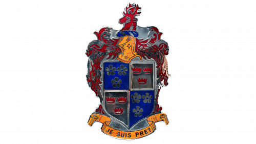
Another distinction of the Kaiser-Frazer is its remarkable logo, which is an inspired combination of traditional heraldic symbols. Dominated by a stag’s head, the emblem also includes various crowns and floral motifs, united at the bottom by a golden banner. Kaiser-Frazer cars were often ahead of their time in terms of design and technology, which favored the brand in a market hungry for innovation.
Despite its short history, the brand managed to gain popularity in the industry, challenging existing design traditions and becoming a driving force of technological progress.
Marcos
Marcos, a British sports car manufacturer, started in 1959. The organization became known for creating high-class and fast cars aimed at a niche audience. The name of the brand is an amalgamation of the surnames of its founders. The company went through various business cycles until 2007 when it voluntarily liquidated in anticipation of the financial crisis that unfolded worldwide.
The Marcos logo is a prominent element of the company’s corporate identity. It is in the form of a star with two dots pointing up and down and serves as an evocative symbol. The central element of the emblem is a blue icon on which the company name is printed in a stylized sans-serif font.
Over the years, Marcos has pushed the boundaries of sports car manufacturing. Known for their blend of style and performance, the cars often featured advanced technology and design elements. Although the company’s lifespan was relatively short compared to other automotive giants, its impact on the sports car niche was undeniable. The brand was focused on a certain segment of the market, which valued speed, maneuverability, and exclusivity, embodied in each car that came off the assembly line Marcos.
Although the brand has ceased to exist, it has left behind a legacy that continues to be a topic of discussion in various automotive circles. From its unique logo to its limited but influential lineup, Marcos created an identity that still remains in the annals of automotive history.
Rickenbacker Motor
The Rickenbacker Motor Company, established in the heart of the automotive universe, the state of Michigan, despite its short existence (1922-1927), holds a special place in automotive history. Founded by Eddie Rickenbacker, a World War I ace pilot, and Barney Everitt, a well-known name in the automotive industry, the company was one of the pioneers in four-wheel brakes.
The company’s logo was derived from the emblem of Eddie Rickenbacker’s fighter squadron. The emblem was an inverted hat framed by the colors of the American flag enclosed in a ring. The choice of these elements reflected the patriotism, courage, and daring that characterized Eddie Rickenbacker’s military service. This emblem was displayed on both the front and rear of the cars, providing brand recognition that was hard to miss.
The founders of the company had different but complementary skills. Eddie Rickenbacker, known for his aviation accomplishments during World War I, lent not only his name but also his technical expertise in aerodynamics and mechanical systems. On the other hand, Barney Everitt, with his extensive knowledge of automotive engineering, offered a synergy combining advanced technology with practical automotive design techniques.
During its short existence, the Rickenbacker Motor Company achieved considerable recognition for its technological innovations.
Saturn
Founded in 1985, Saturn LLC exists as a subsidiary of General Motors. The main purpose of the company was to compete with Japanese compact cars, which were gaining significant popularity in the American market. By focusing on innovation, Saturn LLC became a unique phenomenon in the automobile industry. The company’s ethos was reflected in its slogan, “A Different Kind of Car Company,” which indicated its desire to offer something new in a market where established norms reigned supreme.
With the dominance of imported cars, especially from Japan, Saturn LLC sought to change the situation. The company invested heavily in research and development to make breakthroughs in automobile design, fuel efficiency, and consumer performance. Despite significant advances in these areas, the brand was unable to sustain itself in the long term. In 2010, the company ceased operations, ending its 25-year run in the automotive world.
The company did not hesitate to create an iconic and strong logo. This visual identifier was a red square that encompassed a white graphic depicting a segment of the planet Saturn. The choice of these colors was far from random. The red square symbolized strength and vitality, while the white image of Saturn was meant to evoke a sense of the unknown, space, and cosmic curiosity. The letters “U” and “R” in the company name were combined, creating an almost ligature effect. This design choice was not just an aesthetic decision but was in keeping with the company’s mission to offer something different.
Although Saturn LLC is no longer in business, its legacy remains as a company that attempted to rewrite the rules of the compact car market in the United States.
Talbot
Starting in 1903, Talbot became a well-known automobile brand with roots in British and French engineering. The longevity of the company is remarkable: it survived for more than nine decades before it ceased operations. Over the years, Talbot produced many vehicles that were recognized for their ingenuity, performance, and aesthetic qualities. Even after the company’s discontinuation, its influence remains a topic of discussion in the automotive world.
The company logo captures the essence of the brand using a 3D image of the letter “T.” This logo is set against a bright red background, complemented by blue and white elements, suggesting the French and English flags. Complementing this visual lineup is a bold word mark in sans-serif font that exudes a sense of modernity.
The elements chosen for the Talbot logo were decorative and carried a symbolic load. The use of red, white, and blue colors deliberately reflected the brand’s dual heritage – its British and French origins. At the same time, the three-dimensional “T” and modern word mark indicated the company’s forward-thinking approach to vehicle design and production.
A merger of owners eventually saw Talbot taken over by Peugeot, but not before the brand had established itself as one of the brightest names in the French automotive sector. Although Talbot is no longer in operation, its contribution to automotive design and engineering cannot be unrecognized.
Remembering defunct car brands
The automotive industry is replete with examples of brands that have come and gone, and their names are sometimes forgotten by today’s consumers. Although these companies no longer exist, their contributions to automotive technology and design often remain intact, laying the foundation for today’s vehicles.
One of the most significant impacts of these defunct companies has to do with innovation. The pioneering technologies and design elements originally developed by these companies continue to be utilized in modern developments. This is evident in areas such as fuel efficiency, safety, and even the development of electric and autonomous vehicles. These defunct brands often became testing grounds for new ideas that were later adopted and optimized by the surviving companies.
Studying these defunct brands provides a glimpse into the evolution of automotive branding, particularly logo design. Logos serve as markers of identity and indicators of the time in which they were created. Over the decades, the styles, colors, and graphic elements of logos have changed, reflecting changes in consumer tastes, cultural attitudes, and technological advances.
There is no denying that branding has an impact on a company’s destiny. The iconography, typography and even color scheme chosen can convey certain signals to potential consumers. A logo can speak of luxury or affordability, innovation or tradition, simplicity or complexity. Understanding how logos have transformed over the years can provide invaluable insight into broader trends in consumer psychology and market dynamics.
While these defunct brands may not have a direct impact on the modern consumer, their legacy continues to resonate in various aspects of the automotive world.
