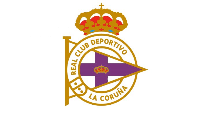
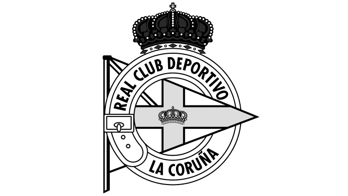
Membership in a Spanish football club is comparable to the highest royal regalia and awards. The Deportivo La Coruña logo represents the best, the most deserving. The emblem conveys the motto of the team – only forward to victories.
Deportivo La Coruna: Brand overview
| Founded: | 2 March 1906 |
| Founder: | Abanca Corporación Bancaria, S.A. |
| Headquarters: | Coruña, Galicia, Spain |
| Website: | rcdeportivo.es |
Deportivo La Coruña is one of the largest Galician clubs. It appeared in 1906 when young gymnasium students from Sala Calvet formed their football team. A year later, King Alfonso XIII granted her patronage, like many other sports organizations in Spain.
For over 70 years, the club has played home games at the Abanca-Riazor stadium. His competition with Real Club Celta de Vigo went down in history as Galician derby. The last meeting of bitter rivals took place in La Liga, from which Deportivo La Coruña has long been eliminated. It is currently downgraded to Segunda División B.
Meaning and History
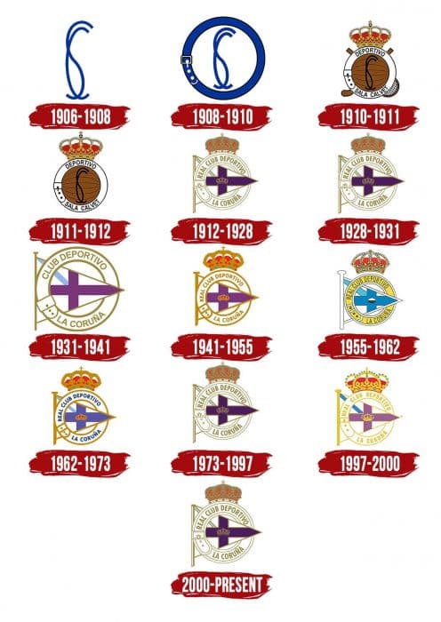
Surprising fact: the most famous Deportivo emblem has remained almost unchanged since 1912. And the path that it has traveled does not differ in variety because the designers experimented only with the color palette. Perhaps this is due to the graphic sign’s symbolism because each element in its composition has a special meaning and cannot be replaced by something else. Until 1912, simpler and more minimalist logos were used.
What is Deportivo de La Coruña?
Deportivo de La Coruña is the popular form for the official name Real Club Deportivo de La Coruña, which includes professional footballers. The team is based in Galicia, Spain, and plays in the third-tier Primera División RFEF – Group 1. It was established in 1906.
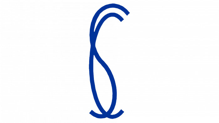
1906 – 1908
The first emblem contains the Sala Calvet gymnasium’s initials, in which the football club was established. The “SC” letters are presented as a thin blue monogram.
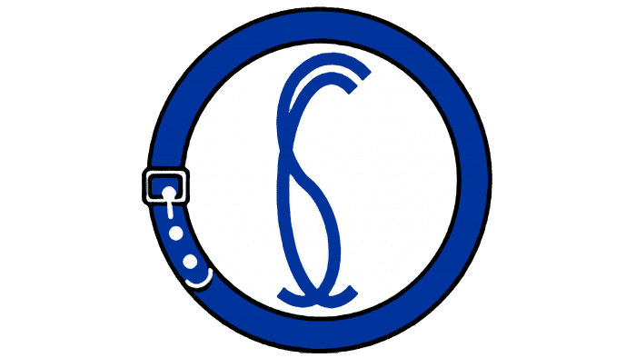
1908 – 1910
A blue knight’s belt frames the monogram in the form of a ring. The central circle is white, as is the general background.
1910 – 1911
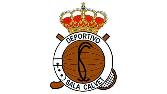
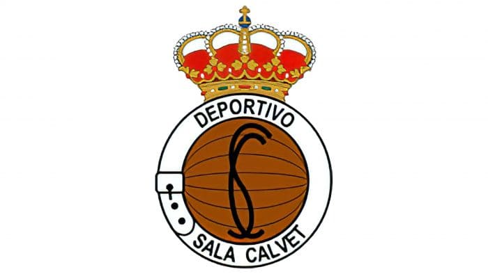
The team celebrated the patronage of Alfonso XIII with a new royal crown logo. The belt and monogram remain in place, but the outlines and letters are black. The ring’s inner part is white, so the inscription “DEPORTIVO SALA CALVET” is visible on it. There is a brown soccer ball in the center, with a golf club and tennis racket in the background.
1911 – 1912
The designers removed all sports attributes except the ball. The racket and clubless emblem represent Deportivo La Coruña as a football club.
1912 – 1928
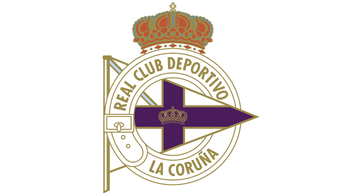
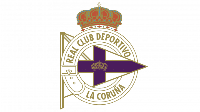
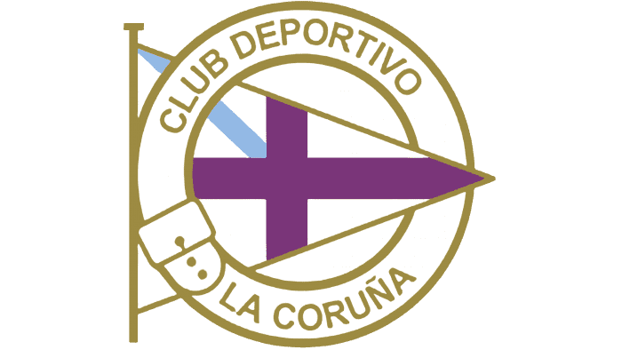
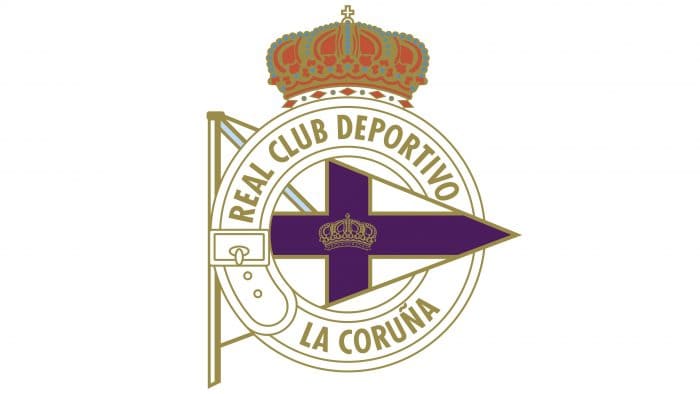
The ball and the “SC” monogram are a thing of the past. They were replaced by the Sala Calvet Gymnasium’s triangular pennant, which features a purple cross with a mini-crown in the center. However, the large crown has not disappeared anywhere. In the banner’s left corner is a blue diagonal stripe taken from the flag of the Galicia region. Inside the knight’s belt is written the name of the club, indicating the patronage of Alfonso XIII: “REAL CLUB DEPORTIVO LA CORUÑA.”
1928 – 1931
The large crown has become a little smaller; everything else has not changed.
1931 – 1941
The club had to remove both crowns because the use of such symbols after the overthrow of Alfonso XIII was considered a crime.
1941 – 1955
After the end of the Spanish Civil War, the team adopted the classic crown emblem. Gone is the blue diagonal line representing the Galicia flag.
1955 – 1962
The missing blue stripe is back. The design of the crown has changed: small light blue dots appeared on it. The knight’s belt is yellow, and the cross on the pennant is blue.
1962 – 1973
The designers have made the ring white to make the club’s name written in gold letters easier to see.
1973 – 1997
The blue crossed lines turned purple again, as in the original banner of the Sala Calvet gymnasium.
1997 – 2000
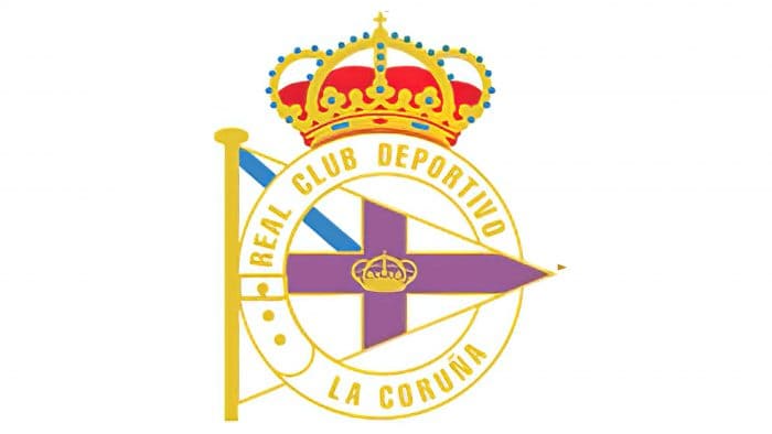
At the end of the 20th century, the club adopted a bright emblem with a yellow predominance: it was used for the inscription, crown, and contours. The proportions of the elements have changed slightly.
2000 – today
The designers have returned the classic dark gold color. Many elements have outlines that were not there before. The crown’s design has changed: its inner part is completely red, and the lower rim is white.
Deportivo La Coruna: Interesting Facts
Deportivo La Coruña, also called Depor, is a soccer team from A Coruña, Galicia, in Spain. It’s a team with a long history and has significantly contributed to Spanish soccer.
- Beginnings: Founded in 1906, Depor is one of Spain’s oldest soccer clubs. It started in local competitions before joining the national leagues.
- Big Win: The team won its first La Liga championship in the 1999-2000 season, surprising everyone by beating top teams like Real Madrid and Barcelona.
- European Matches: In the late ’90s and early 2000s, Depor did well in European tournaments. They made it to the semi-finals of the UEFA Champions League in the 2003-2004 season.
- Super Depor Time: From the late ’90s to the early 2000s, people called this period “Super Depor” because the team was doing well, finishing high in La Liga and playing in the Champions League.
- Big Victory: On March 6, 2002, Depor beat Real Madrid 2-1 in the Copa del Rey final at Real Madrid’s stadium during their 100th anniversary. Fans call this win the “Centenariazo.”
- Riazor Stadium: Depor plays home games at the Riazor Stadium by the Atlantic coast in A Coruña. Opened in 1944, it’s one of Spain’s most famous soccer stadiums.
- Ups and Downs: The team has been relegated from La Liga a few times in the 21st century, which has been tough on the fans.
- Rivalry: Depor has a big rivalry with Celta Vigo, another team from Galicia. Their matches are a big deal in the area.
- Money Problems: Depor’s financial issues, including debt and restructuring efforts, have affected its performance.
- Young Talent: The club is known for its youth academy, “La Fábrica de Sueños” (The Dream Factory), which has produced many successful players.
Despite its challenges, Depor remains a cherished and respected team in Spanish soccer. Its history includes great achievements, memorable moments, and dedicated fans.
Font and Colors
Deportivo La Coruña’s current graphic is very reminiscent of the 1912-1928 version, which appeared six years after it was founded. And all the emblems that were between them are also incredibly similar. Common symbols unite them:
- knight’s belt
- Sala Calvet pennant
- stripe with the flag of Galicia
- the name of the club and the crown is denoting royal support.
When creating the inscription “REAL CLUB DEPORTIVO LA CORUÑA,” the designers used a bold grotesque. In 2014, it was used as the basis for the RCD Carme Condensed custom cut font, which has become the main decoration of new player kits.
The main color of the logo is white. Despite this, the palette is quite varied. It includes red (# DB5232) for the inside of the crown, blue (# B9D9EC) for the diagonal stripe and small details, purple (# 57175E) for the cross, gold (# A38D44) for the lettering and outlines.
Deportivo La Coruna color codes
| Palatinate Purple | Hex color: | #57175e |
|---|---|---|
| RGB: | 87 23 94 | |
| CMYK: | 7 76 0 63 | |
| Pantone: | PMS 2623 C |
| Dark Tan | Hex color: | #a38d44 |
|---|---|---|
| RGB: | 163 141 68 | |
| CMYK: | 0 13 58 36 | |
| Pantone: | PMS 7754 C |
| Beau Blue | Hex color: | #b9d9ec |
|---|---|---|
| RGB: | 185 217 236 | |
| CMYK: | 22 8 0 7 | |
| Pantone: | PMS 290 C |
| Medium Vermilion | Hex color: | #db5232 |
|---|---|---|
| RGB: | 219 82 50 | |
| CMYK: | 0 63 77 14 | |
| Pantone: | PMS 171 C |
