Deutsche Post: Brand overview
Deutsche Post emerged in 1995 as a result of the transformation of Germany’s state-owned postal service, Deutsche Bundespost, into a private company. This privatization was the result of a larger restructuring that liberalized the German postal industry. The newly created Deutsche Post became part of Deutsche Post AG, which was a development of the postal division of Deutsche Bundespost. In the process of liberalization, independent companies such as DHL and Postbank emerged to handle logistics and banking.
In the new millennium, Deutsche Post embarked on an aggressive global expansion. This ambition was manifested in the strategic acquisition of global companies such as DHL in 2002 and Exel in 2005. By 2008, with the full liberalization of the postal market, all remnants of Deutsche Post’s exclusive rights to deliver mail in Germany were eliminated. However, the company retained its position as the main provider of postal services in the country.
Today, Deutsche Post DHL Group is an international titan in logistics and parcel delivery. The conglomerate operates in four main sectors: Post & Parcel Germany, Express, Global Forwarding & Freight, and Supply Chain. The Deutsche Post brand is firmly entrenched in Germany, catering to the public’s need for postal services, offering enterprise-level postal solutions, and opening various retail outlets. An impressive achievement of the brand is the daily delivery of approximately 59 million letters.
In the ever-evolving world of commerce, the company is not resting on its laurels. Email delivery has become an important part of its portfolio, and innovations such as the development of electric vehicles emphasize its commitment to sustainability. As a testament to Deutsche Post DHL Group’s scale and influence, its global workforce exceeded half a million employees in 2019, and its revenue exceeded 63 billion euros.
Meaning and History
1989 – 1995
1995 – 1998
1998 – 2019
2019 – today
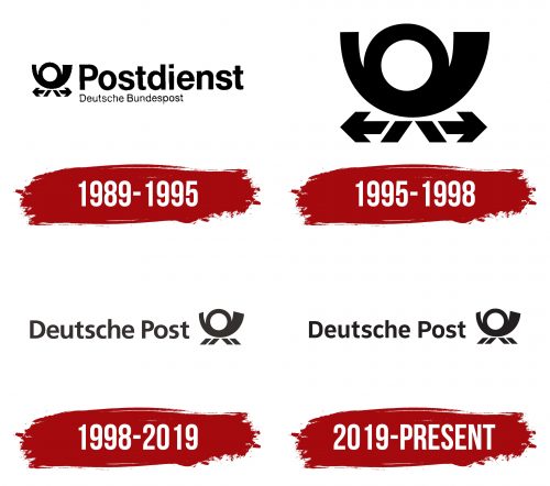
The German postal service deeply respects tradition, evident in its visual identity. This identity prominently features the post horn, the oldest symbol associated with postal workers, used historically to announce their arrival. With its circular handle, the horn was sounded by carriers when delivering mail or transporting it by carriage, serving as a signal of the postal service’s presence.
This iconic black horn is stylized in the logo with two sets of parallel lines at the bottom, short but wide, resembling four diagonal parallelograms. These details add a modern touch to the ancient symbol and connect the past with the present, bridging tradition with contemporary design.
To the left of the horn, the brand’s name is displayed in a precise sans-serif font with semi-rounded glyphs, where straight angles and smooth lines are harmoniously combined. This choice of typography further emphasizes the blend of tradition and modernity, presenting the postal service as a reliable and timeless institution.
Through this design, the postal service successfully communicates its longstanding commitment to connecting people and its role in the modern world. The logo, with its historic symbol and modern design elements, reflects a proud heritage while adapting to current times. This careful balance of old and new highlights the service’s dedication to progress without losing sight of its roots, making the logo a meaningful representation of the brand’s identity and values.


