


![]() Dynamo Zagreb Logo PNG
Dynamo Zagreb Logo PNG
The team has an unusual history, as shown by the Dinamo Zagreb logo. The emblem depicts two periods in the football club’s existence. In each of them, the organization acted as a professional player.
Dinamo Zagreb traces its roots to 1911, when HŠK Građanski was founded in Zagreb and became a leading club in prewar Yugoslavia, winning five titles. In June 1945, the new authorities dissolved Građanski, HAŠK, and Concordia. On June 9, 1945, FD Dinamo was founded, inheriting its players, supporters, and blue color.
In the 1946–47 season, Dinamo finished second in the Yugoslav league, and in 1947–48 won its first title ahead of Hajduk Split and Partizan. Over time, it secured four league titles and seven cups, joining Hajduk Split, Partizan, and Red Star Belgrade as one of the top clubs.
In 1967, Dinamo won the Inter-Cities Fairs Cup. After losing the 1963 final to Valencia, the team defeated Leeds United in the 1966–67 final, winning 2:0 in Zagreb and drawing away. It remains the only Croatian club with a European trophy.
In 1991, the club was renamed HAŠK Građanski, and then in 1993 became NK Croatia Zagreb. Under that name, it won five Croatian titles and reached the Champions League group stage in 1998–99 and 1999–2000. On February 14, 2000, the Dinamo Zagreb name returned. In 2011, it became GNK Dinamo.
From 2005–06 to 2016–17, Dinamo won the Croatian league for twelve consecutive seasons, collecting over twenty-five titles in the independent era. The rivalry with Hajduk Split remains central.
The academy produced Luka Modrić, Mario Mandžukić, Mateo Kovačić, and Davor Šuker. In 2018, many players on the Croatia national team had links to Dinamo. In 2020–21, the club defeated Tottenham Hotspur 3:0 after a first-leg loss, with a hat-trick by Mislav Oršić.
Meaning and History
![]()
Most of the Dinamo Zagreb emblems are similar in shape and color, but they can be roughly classified into two groups. The first is the most numerous. It includes round graphic signs with a red-and-white checkerboard pattern. The second category includes triangular heraldic shields with the letter “d” and a red five-pointed star on a blue background. Also available with “d” version without a shield.
What is Dinamo Zagreb?
Dinamo Zagreb is a professional soccer team from Croatia, based in Zagreb. It was founded in 1911 as HŠK Građanski and was renamed in 1945. Today, it is the most successful club in the country, having won 23 Prva HNL titles, 6 Croatian Super Cups, 16 Croatian Cups, and 1 Yugoslav First League title.
1926 – 1945
![]()
Many of the Dinamo Zagreb logos are derived from the latest club crest, HŠK Građanski Zagreb. It was a circle diagonally divided into two. Above was a pattern of alternating red and white squares, while below the blue semicircle was dominated by the monogram “GSK.”
1945 – 1954
![]()
In 1945, the sports society Dinamo Zagreb was founded based on the disbanded pre-Yugoslav clubs. Its emblem consisted of two capital letters “S.D.” and one lowercase “d.” The single “d” has been increased. Next to her was a red five-pointed star – a famous communist symbol.
1954 – 1970
![]()
The designers placed the “d” on the blue triangular shield. The white top of the logo bore the words “NK DINAMO” because it was renamed Nogometni Klub Dinamo Zagreb.
1970 – 1982
![]()
In 1970, the shield turned completely blue. Only the golden outlines “d” and the team name stood out on it. The developers left the red star.
1982 – 1988
![]()
The emblem is back to white. A thin red line has been outlined around the outer edge of the image.
1988 – 1990
![]()
In the late 1980s, the club returned a circular logo split in two. A checkerboard pattern of red and white squares occupied the upper half. At the bottom was the “d” with a mini-star. The letter was white, the background behind it was blue, and the outlines were gold.
1990 – 1991
![]()
The circle border and dividing lines are yellow.
1991 – 1993
![]()
After Yugoslavia’s breakup, the club changed its name to HAŠK Građanski. As a result, instead of the lowercase “d,” the logo now has the capital “HG” written in italics.
1993 – 1995
![]()
In 1993, another name change took place. Now the football team is known as Croatia Zagreb, a name reflected in its identity. The designers retained the circular shape and the red-and-white squares pattern, depicting a large C. They placed a small blue shield with a ball in the center and the word “CROATIA.” Above the shield was a golden crown; below it was the inscription “ZAGREB” and two blue lions on the right and left.
1995 – 2000
![]()
The developers have complicated the logo by presenting it as a multi-colored set of concentric circles. On the right side were mini versions of the HŠK Građanski Zagreb and Nogometni Klub Dinamo Zagreb logos, as well as a miniature red-and-white shield with a blue “S.” The frame of the club emblem was divided into two half-rings with the words “N. K. CROATIA “and” ZAGREB. ”
2000 – 2009
![]()
2000 saw the beginning of the GNK Dinamo Zagreb era. It marked the return of an old logo similar to the one used in 1990-1991. The designers reshaped the “d,” updated the color scheme, reduced the thickness of the yellow outlines, and moved the star to the center.
2009 – 2010
![]()
The circle’s stroke is now blue, and the thin yellow lines between the squares are gone. The mini star has also been removed.
2010 – 2011
![]()
In 2010, dividing contours appeared between the elements, but this time not yellow, but light gray. Also, the designers chose a different shade of blue.
2011 – 2012
![]()
The logo’s creators changed the colors again. The main innovation of this period is a gradient that darkens toward the middle.
2012 – 2013
![]()
The gradient was removed, and the shade of blue approached ultramarine.
2013 – today
![]()
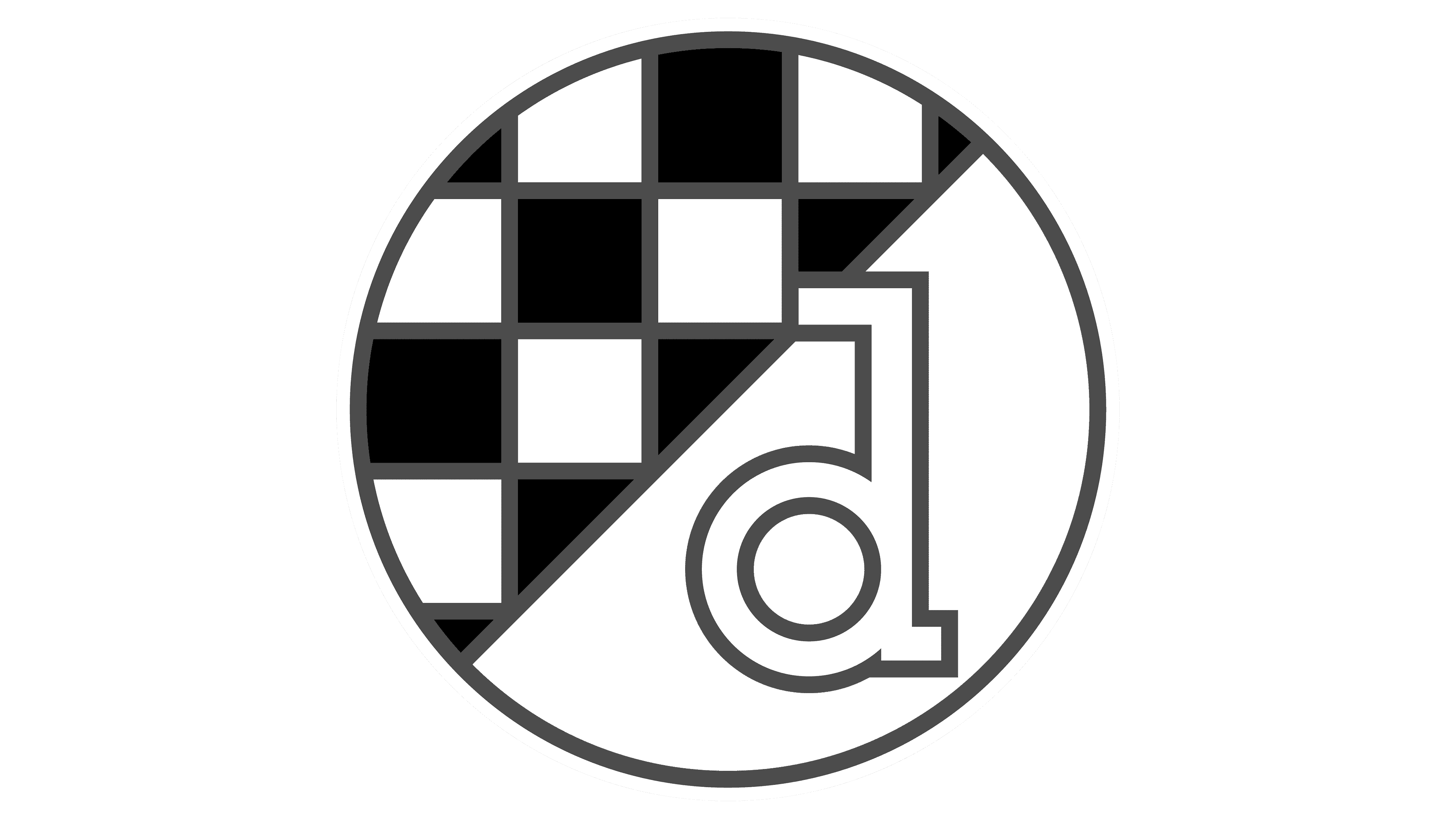
In the current logo, the elements have wide gold outlines. The letter “d” is depicted against a dark blue semicircle.
Font and Colors
The graphic sign indicates that Dinamo Zagreb is a direct descendant of HŠK Građanski Zagreb. Designers often changed the design, but they always retained the classic elements: a red-and-white square pattern and the club’s initials on a blue semicircle.
The original “d” appeared in 1945. It was created from scratch without using fonts. The logo’s main colors are Dark Cornflower Blue (#1D3A8D), Lust (#E32118), white, and dark gold.