Pieces of Dutch cheese and ham resemble elements of the emblem. Domino’s logo shows everyone can create their dream pizza from the restaurant’s most delicious and diverse ingredients. A spicy or sweet taste will turn out – it’s up to the client to decide.
Domino’s: Brand overview
Domino’s is an American pizza chain named Domino’s Pizza, Inc. It was founded in 1960 as a local restaurant, Dominick’s Pizza, and then developed into an extensive international structure. The company first appeared in Ypsilanti, Michigan. Today, its head office is in Domino’s Farms Office Park in Ann Arbor, which is in the same state. The founders of the fast-food chain are James Monaghan, Tom Monaghan, and Dominick DiVarti. Her specialties are chicken wings, pizza, sandwiches, pasta, and desserts.
Domino’s, a name now synonymous with pizza worldwide, began its journey in 1960 in Ypsilanti, Michigan. It was a small shop called DomiNick’s, started by brothers Tom and James Monaghan. Their goal was simple: make and serve great pizzas to their local area every day.
By 1965, Tom Monaghan had bought his brother’s part of the business and decided to change its name to Domino’s Pizza. He aimed for a name that was easy to remember and worked well over the phone. The change also brought a new Domino logo, quickly becoming a symbol of the brand’s identity and aiding its rapid growth.
The ’70s saw Domino’s expand quickly, using franchising and promising fast delivery—often within 30 minutes—or it was free. This unique selling point helped Domino’s stand out and grow to 200 stores by 1978; by 1989, it had 5,000 stores globally.
The ’90s were tougher, with more competition and critiques of pizza quality. Domino’s also faced negative press from lawsuits related to its delivery promise. To address these issues, Domino’s dropped its 30-minute guarantee to focus on safety and quality and revamped its pizza recipe.
The 2000s and 2010s were about digital innovation. In 2008, Domino’s introduced pizza tracking, letting customers watch their pizza’s journey from kitchen to doorstep. Embracing online ordering and launching a mobile app significantly boosted its digital sales, which, by 2020, made up over 75% of its U.S. sales.
In addition to digital moves, Domino’s broadened its menu with chicken wings, sandwiches, and desserts. They expanded globally, becoming a key player in India, Australia, and Europe.
With over 17,000 stores in 90 countries, Domino’s shows strength and flexibility, even when facing challenges like the COVID-19 pandemic.
Domino’s story is about starting small, innovating, and evolving. From a modest pizza shop in Michigan to a global pizza empire, Domino’s has changed the industry with its emphasis on quick service, convenience, and tech advancements.
Meaning and History
In December 1960, the two Monaghan brothers bought a small pizzeria in Ypsilanti, located near Eastern Michigan University, owned by Dominick DiVarti. To do this, they borrowed $900 500, which they gave as a deposit. At first, the business partners wanted to manage the store, sharing their working hours equally jointly, but James was wary of leaving the postman position because he had a full-time job. Eight months later, he traded his half with Tom for a Volkswagen Beetle, which delivered orders.
By 1965, three pizzerias were already in the network, located in the same district. Moreover, Monaghan wanted everyone to have the same name and that they represent a common trademark. However, the former owner of the DomiNick shop did not allow him to use that name, and Tom decided to choose a different one. One day, Jim Kennedy, his pizza delivery guy, came in with an order and offered to name the restaurant Domino’s. Monaghan officially renamed its small chain Domino’s Pizza, Inc. that same year.
The logo has changed accordingly: it has become in the form of dominoes. At first, there were three points on them – by the number of stores. Tom wanted to keep adding one at a time but then changed his mind as many fast-food restaurants began to skyrocket. The company’s first franchise appeared in 1967; in 1978, it grew to 200 points.
In 1975, Tom Monaghan survived a lawsuit filed by Amstar Corporation for alleged trademark violations and unfair competition. This company manufactured Domino Sugar, which was synonymous with Domino’s. However, after five years of litigation, the New Orleans Fifth Circuit Court of Appeals ruled in favor of the pizzeria. So, she retained the name and, accordingly, the corporate logo—she had six of them in total.
What is Dominos?
The Dominos brand means Domino’s Pizza, a pizza chain where they also prepare sandwiches and hot dogs in addition to the main product. The company under this name was registered in 1965, and in 1967 its first restaurant was opened. Despite this, the official date of Domino’s foundation is considered to be 1960, when the Monaghan brothers bought a catering establishment and began to develop it.
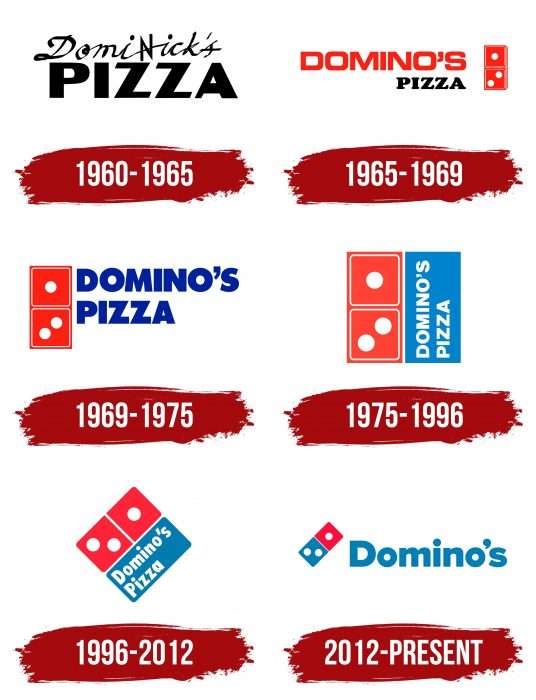
1960 – 1965
In the early years, the store originally used the logo on the sign. It looked like an inscription in two lines: at the top – “DomiNick’s,” and at the bottom – “Pizza.” The first word had sharp letters in italics by hand. They were as if scratched into the surface, with the “N” turned over and facing the opposite direction. The second lettering contained solid, confident, wide characters in black.
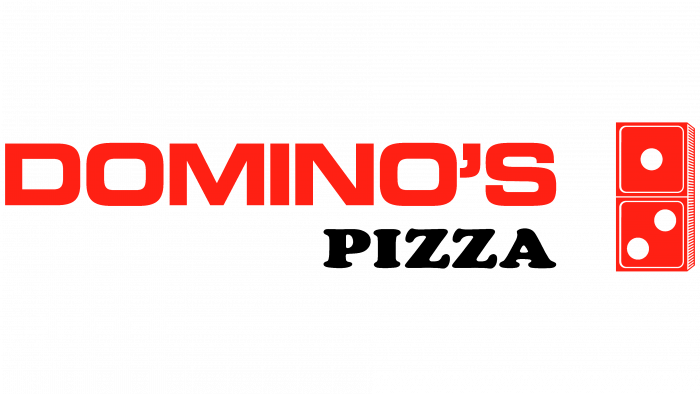
1965 – 1969
At first, the original emblem consisted of one domino with three dots: one at the top and two at the bottom. They indicated the number of pizzerias that were part of the fast-food chain: in the early years, one restaurant was bought, and two after a while. The domino was painted red, the fire’s color and the hot pizza’s blush. Several thin white stripes gave the knuckle volume. On the left was the network’s full name, each word opposite one of the parts of the dominoes. The top lettering was red sans serif; the bottom was black with serifs.
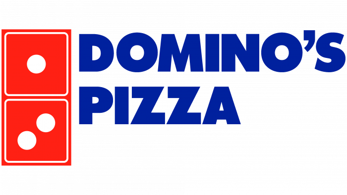
1969 – 1975
The logo of those years received more streamlining: it became smooth and even, including the letters. The designers moved the lettering to the right side and changed its style using a font from the Futura family. The name still occupied two rows but was located more compactly and not opposite each part of the knuckles. The domino was also changed: the authors of the logo placed it straight, removing the volume so it looked flat. The colors became richer: the authors added cobalt to the red.
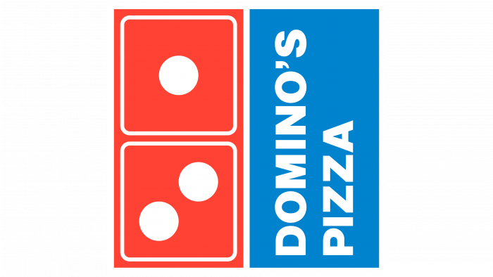
1975 – 1996
The developers placed a light blue rectangle next to the domino knuckle, entered the restaurant’s name, and rotated it vertically. They painted the phrase “Domino’s Pizza” white.
1996 – 2012
In 1996, the designers almost radically changed the style of the pizzeria logo. They removed the thin light boxes around the points and rounded the edges of the squares and rectangles. In addition, the developers made a rhombus out of the icon and put it in one corner to resemble a diamond. They also changed the font, using thicker lowercase letters.
2012 – today
At the end of the summer of 2012, the fast-food chain underwent a rebranding, resulting in the word “Pizza” disappearing from the name. This was due to a new management concept: she stated that their franchise company is already more than just a pizzeria because it offers many other specialties. Naturally, the changes also affected the logo. The authors reduced the size of the dominoes by increasing the inscription. They dyed the knuckle red and blue and placed it diagonally before the name. The logo was first advertised on this form in October 2012.
Domino’s: Interesting Facts
Domino’s Pizza started in 1960 in Ypsilanti, Michigan, and is now one of the biggest pizza delivery companies in the world.
- Start: Tom and James Monaghan bought a small pizza shop for $500. James later traded his share for a Volkswagen Beetle. Tom renamed the store Domino’s Pizza in 1965.
- Delivery Innovation: Domino’s was among the first to promise pizza in 30 minutes or free. This policy helped them grow but was later stopped for safety reasons.
- Worldwide: With over 17,000 stores in over 90 countries, Domino’s tailors its menu to match local tastes.
- Tech-Savvy: The company uses technology like the Pizza Tracker and tested drone deliveries, making ordering pizza easy and fun.
- Pizza in Space: In 2001, Domino’s delivered a pizza to the International Space Station, a big stunt that showed they could take pizza delivery to the next level.
- Big Sales: Domino’s showed it can handle many orders, selling over 2 million pizzas daily, especially on Super Bowl Sunday.
- Special Delivery Cars: The DXP vehicles are made just for delivering pizzas. They have a warming oven and room for 80 pizzas, keeping them hot until they reach your door.
- Helping Out: Domino’s gives millions of pizzas to frontline workers and helps in communities and during disasters.
- Pizza Theater: Some stores let customers watch their pizza being made, aiming to make buying pizza more interesting and fun.
- Noid Mascot: The Noid represented delivery challenges in the ’80s. It was very popular and retired, but it sometimes appears in ads.
From its small beginnings to becoming a leader in pizza delivery, Domino’s has shown how being innovative and adaptable can make a brand loved worldwide.
Font and Colors
The brand identity has been associated with the name in text and graphic format. Therefore, the domino is a sign of his distinction. During the evolution of the emblem, the developers placed it at different angles, forming either a volumetric (1965th year) or a flat image (since 1969). Moreover, both the text and the icon were equally accentuated. In 2012, the franchise changed its name, so only one word remained in the image – “Domino’s.”
The emblem used several typefaces. One is Futura Condensed ExtraBold, created in 1927 by Paul Renner and published by Linotype. The modern version uses a font similar to Pluto Sans Heavy, designed by Hannes von Dohren. Its free counterpart is Dokyo Font.
The corporate range comprises two shades of blue (cobalt) and red (scarlet, crimson). They were always white, used for dots on dominoes and letters in the name.
FAQ
What are the three Colours on the Domino’s logo?
The Domino’s logo stands out with its red, white, and blue colors, each chosen for a specific reason to make the brand memorable and distinct in the pizza world.
Red brings a sense of passion and energy, mirroring Domino’s dedication to making hot, fresh pizzas and pushing forward with service and innovation. Its color naturally makes you hungry, perfect for a food brand.
The white in the logo stands for purity and quality, showing Domino’s promise to use top-notch ingredients and maintain high pizza-making standards. It also makes the red and blue pop more, catching your eye.
Blue offers a cool contrast to red’s warmth, adding feelings of reliability and trust. It shows you can count on Domino’s for on-time delivery and satisfying food. Blue also gives off a professional vibe, making Domino’s seem trustworthy in the food industry.
These three colors work together to make the Domino’s logo unforgettable. They do more than make Domino’s look different from other pizza places; they tell us about its commitment to quality, love for food, and reliable service. The mix of red, white, and blue is a smart branding move that uses color psychology to attract customers and stand out in a crowded market.
How do you pay at Dominos?
At Domino’s, you can easily pay for your order with either cash or a credit card, fitting the needs of many customers. This means you can pay most conveniently, whether getting your order delivered or picking it up yourself. You can use your credit card to pay online through the Domino’s website or app or in person. This choice in how to pay is about making your experience smooth from start to finish, showing Domino’s dedication to great customer service and a stress-free process for getting your food.
Can you edit a Dominos order after ordering?
If you need to change or add something to your Domino’s order after placing it online, you must do this through email. Once your order is confirmed, you can’t change it directly on the website or app. Just email the address on Domino’s contact page or the one in your order confirmation email. Include your order details and exactly what you want to change or add. This way, Domino’s can handle your request accurately and quickly.
Which country owns Domino’s?
Domino’s Pizza is a well-known American pizza chain that started in 1960. It’s headquartered in Ann Arbor, Michigan, and operates worldwide. Domino’s Pizza, Inc., the company behind the chain, manages its global business. It’s a public company, meaning shareholders own it. Russell Weiner, the CEO, leads Domino’s and has a big role in making sure the company does well. Over the years, Domino’s has grown greatly, becoming a big name in the U.S. and internationally. This growth shows how Domino’s keeps developing new ways to meet customer needs worldwide, making it a key player in the fast-food world.
What does the Dominos logo mean?
The Domino’s Pizza logo has a domino tile with three dots, which isn’t just for show. Those dots stand for the first three Domino’s restaurants opened in 1965. This logo does two things. First, it makes the Domino’s brand easy to remember since it matches the name and uses the familiar shape of a domino. Second, the three dots tell a bit of the brand’s story, showing how it started with three places and grew big. Originally, the idea was to add a dot for every new restaurant, but Domino’s grew too fast for that. Even though they stopped adding dots, the original three stayed, showing how far the brand has come from its simple start to being known worldwide. This logo is a reminder of Domino’s roots and its success.
Why does the domino logo have three dots?
The three dots on the Domino’s logo come from the company’s start in 1965 when there were just three Domino’s restaurants. The dots were meant to show these first locations. Initially, the founders wanted to add a dot for every new restaurant, thinking it would show how the company grew. But Domino’s grew so fast that this idea wasn’t practical anymore. With over 17,000 stores worldwide, it’s impossible to represent each one with a dot on the logo. So, the three dots stayed as they were, reminding people of Domino’s humble beginnings with just three stores. This part of the logo symbolizes the brand’s history and expansion from a small chain to a major global business.
How many dice are on the Domino’s logo?
The Domino’s Pizza logo features a single domino with three dots—two on the bottom and one on the top. This design directly links to Domino’s history, specifically to 1965, when the company first used this logo and had just three restaurants. The three dots represent these original stores, making the logo more than a brand symbol. It’s a tribute to how Domino’s started with three locations and grew into a worldwide pizza business. This design choice shows the company’s journey from a small chain to a global name in pizza.
What does the logo symbolize, Domino’s Logo?
The Domino’s Pizza logo symbolizes the brand’s start and journey to becoming a global name. The logo has three dots on a single domino piece, each representing one of the first three Domino’s restaurants. The founder, Tom Monaghan, initially wanted to add a dot for every new restaurant to show the chain’s growth. But as Domino’s quickly grew, adding a dot for each new location became impossible. So, the decision was made to keep the three dots, which now represent the brand’s modest beginnings and rapid expansion worldwide.
The domino design also looks like two stacked pizza boxes, linking the logo directly to what Domino’s is known for—pizza. This design cleverly connects the logo to the company’s main product and showcases the brand’s evolution from a small chain to an international pizza empire. This makes the Domino’s logo a simple yet powerful reminder of its roots and success.
Why is Domino’s called dominoes?
The name “Domino’s” came from a unique situation. Originally, the place was called DomiNick’s after the first owner, Dominick DeVarti. The Monaghan brothers, Tom and James, kept the name when they took over. But they ran into trouble when DeVarti told them they couldn’t use the name DomiNick’s anymore.
Needing a new name to keep the business familiar to customers but different enough to avoid legal issues, they chose “Domino’s.” This new name was close enough to the original to keep the customer base strong and avoid losing popularity. Plus, it led to the creation of their now-famous logo: a domino with three dots. These dots aren’t just for show; they stand for the three original Domino’s stores.
It was choosing “Domino’s” as the name, which was smart. It kept the brand recognizable to customers and introduced a logo that’s now known worldwide. This blend of smart naming and branding kept the business solid and set the stage for its global success. The story behind Domino’s name and logo shows how smart decisions can turn challenges into opportunities for growth and recognition.
Why is the Dominos logo two and one?
The Domino’s logo, with its one and two dots on a domino tile, reflects the chain’s early days when it had just three stores. These dots stood for the first three Domino’s locations and symbolized the company’s beginnings and journey to becoming a major global brand. The original plan was to add a dot for each new store, showing growth gradually. However, as Domino’s expanded quickly, it became unrealistic to keep adding dots for every new location because there were simply too many. So, the decision was made to keep the logo with just three dots. This approach keeps the logo simple and honors the first three stores that started it all, showing how far Domino’s has come from its humble beginnings.
Why is Dominos’s logo red and blue?
Domino’s logo uses red and blue to mix style and meaning. These colors grab your attention, making the logo memorable and easy to spot from far away. Red brings to mind the heat of fresh pizza and the taste of tomato sauce, which are key parts of Domino’s menu. It’s also a color that makes people hungry, perfect for a pizza company. Blue adds a feeling of trust and quality, promising good food and service.
These colors work together to look good and show what Domino’s stands for. They also help make the logo clearer, with the red and blue sides of the domino easy to tell apart, similar to how pizza boxes look. This smart use of red and blue helps Domino’s stand out, combining the brand’s story with a clear, appealing design.

