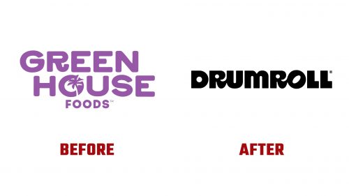
Drumroll, formerly GreenHouse Foods, has rebranded with a new name and logo, reflecting the company’s evolution and its goal to stand out in the competitive plant-based snack market. The updated identity brings a more modern and bold look, highlighting their plant-based mini donuts.
Previously, GreenHouse Foods featured a soft purple color palette, symbolizing eco-friendly products. The old logo included a rounded typeface with a palm tree inside the letter “O,” emphasizing natural ingredients. While appealing, it no longer matched the company’s growth and future goals.
The new logo marks a big change. The purple has been replaced by bold black, symbolizing strength and reliability. The thick and rounded typeface gives the brand a confident, modern look. These design choices reflect the company’s commitment to quality and innovation.
A standout feature is the playful design of the letter “O,” tilted into an oval, which creates a sense of movement and excitement—much like a drumroll. This hints at the shape of the mini donuts, adding a clever reference to the product.
The new name, Drumroll, reflects a sense of anticipation and excitement, mirroring the company’s mission to continue innovating and delighting customers with its plant-based snacks. This rebranding signals a fresh and confident direction, preparing customers for exciting new offerings.


