 Dude Perfect Logo PNG
The Dude Perfect logo depicts a difficult, dangerous trick. At the same time, all elements appear grouped and occupy their assigned positions. The emblem characterizes the group as professionals, creating a real show.
Dude Perfect is an American stunt show band with its own YouTube channels, including Dude Perfect Gaming and Dude Perfect Plus. Its acronym is DP. It creates video content featuring sports, extreme stunts, and utilitarian comedy, ranking 18th in the world in Internet subscribers. The team consists of five people who were roommates while at Texas A&M University. They are Tyler Toney, Cody Jones, Garrett Hilbert, and the Cotton twin brothers, Cory and Coby. They are still buddies and make a wide assortment of unusual videos. The showband’s origin is 2009. They are based in Frisco, Texas.
In early April 2009, friends posted a YouTube video of stunts they performed at Tyler Toney’s summer house. In just seven days, the video got an unbelievable 200 thousand views. This success inspired the buddies to record more shots for a second video. They filmed it at the Sky Ranch Christian camp, and it got 18 million views over the summer.
Then the guys got serious, saying they would sponsor kids through Compassion International after every 100,000 views. Once the Dude Perfect video went viral, ESPN, a cable sports channel, contacted the band members. As a result, excerpts from their signature videos aired on many TV channels and talk shows.
In 2010, the team got a mascot – Panda. It also brought recognition to the brand, becoming a symbol of Texas A&M basketball games. Now it’s a blog with nearly 57 million authentic followers. Its distinctive logo makes it universally recognizable across various platforms. The group has also attracted many stars to the show and set several world records.
Meaning and History
The original Dude Perfect visual identity sign consists of two elements. Surprisingly, they represent both graphics and text at once. It is a stylized abbreviation of the stunt team’s name, “DP.” They chose lowercase letters rather than uppercase letters for the identity. This is how the “d” and “p” resemble each other upside down. The characters don’t have serifs; they have smooth lines with a semi-oval that points right on one side (for the “p”) and left on the other (for the “d”). The legs of the signs do not touch; they run parallel, diverging up and down.
In terms of graphics, the emblem depicts two people (in top view, as seen from a drone) performing the same action in synchrony. The protruding legs of both letters look like arms outstretched forward as they throw. The line width emphasizes this: the end (hand) is narrower than the beginning (shoulder). This is why the stripes are not closed, which further emphasizes their resemblance to a human figure when viewed from a high vantage point.
What is Dude Perfect?
Dude Perfect is a team of five American bloggers that was formed in 2009. They run one of the most popular YouTube channels. Their content focuses on bowling, golf, soccer, basketball, darts, and many other sports. Their videos became famous for spectacular stunts and attracted millions of viewers.
2009 – 2010
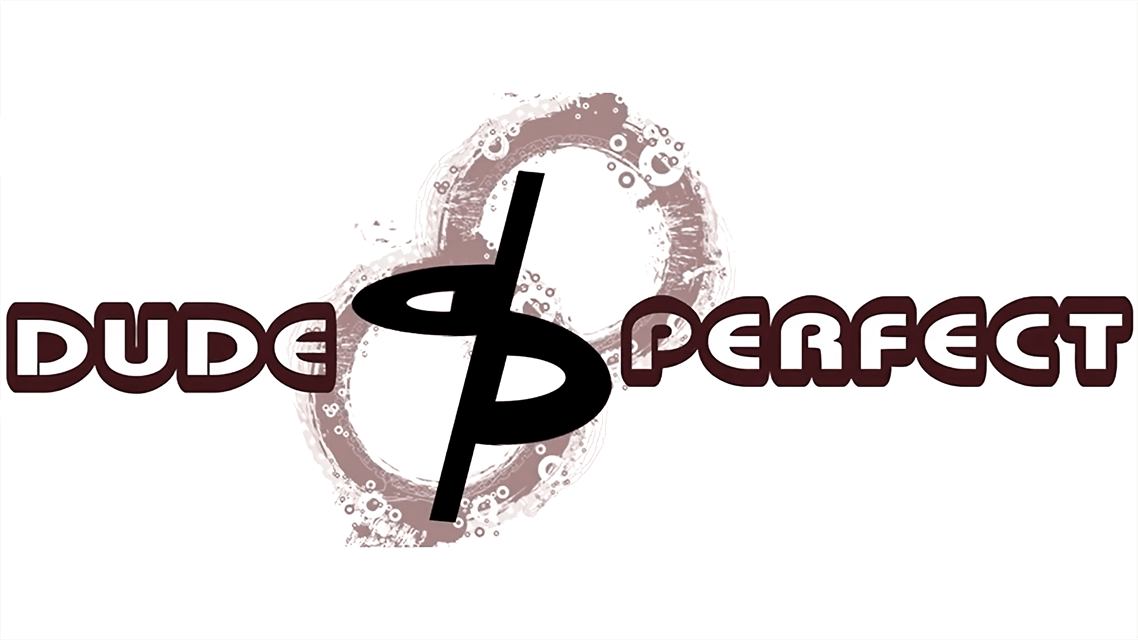
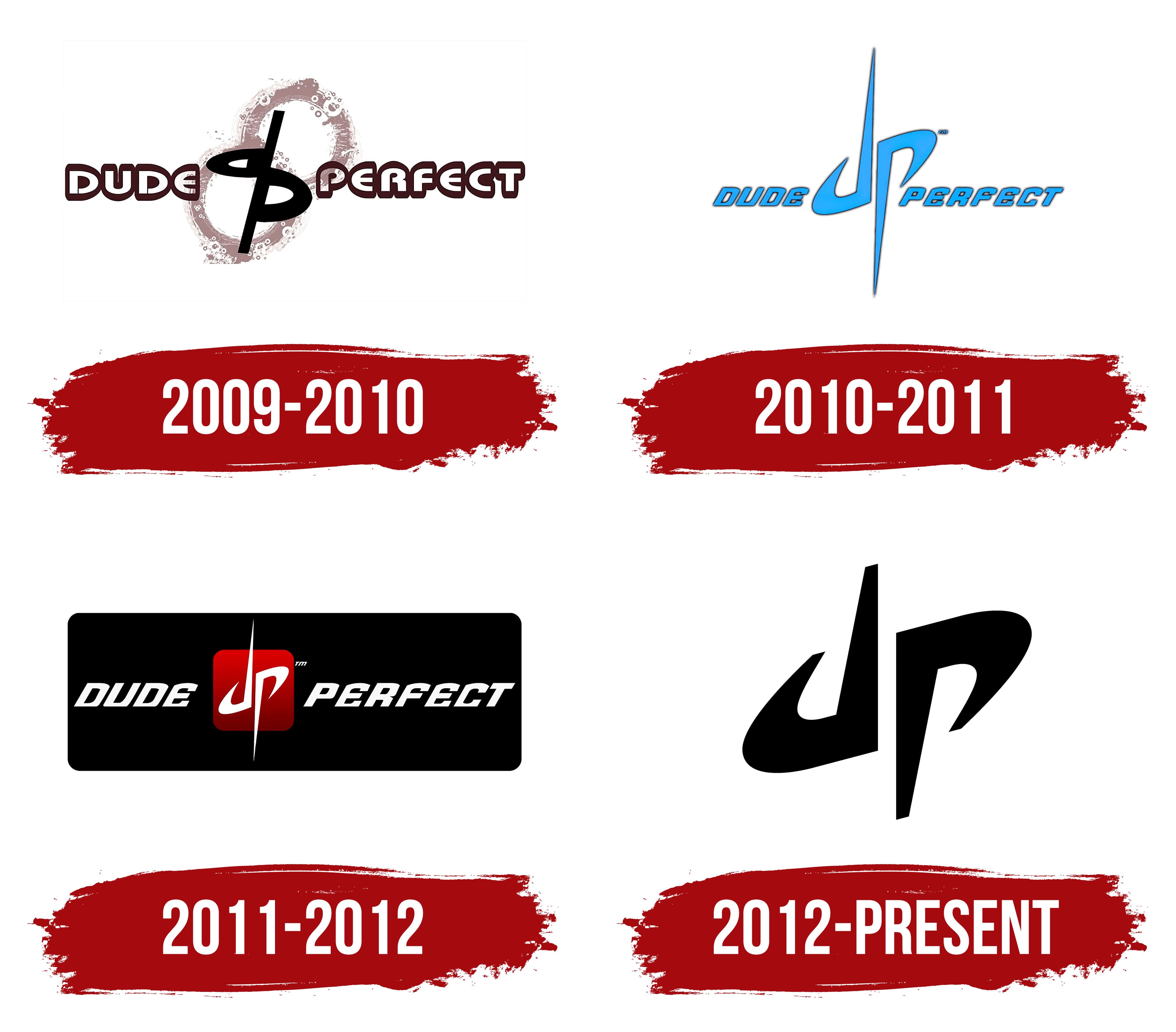
The Dude Perfect logo is designed in a “gymnastics” style. In fact, it passes one of the support tricks, in which two athletes participate. Graphic elements are located at the intersection of the words, as they are stylized letters “d” and “p.” They are very similar in lowercase, as if they were mirror images of each other. The show’s band name appears on the right and left. The white glyphs are outlined in dark purple shadows. In the center are two identical circles: wide and filled with chaotic bubbles.
2010 – 2011
After the redesign, the emblem became simpler and lighter, with fewer small details. The developers removed everything superfluous that didn’t convey a conceptual idea and kept only the team’s name with a unique sign in the middle. The inscription became italic and blue, with a thin contrasting stroke. The elements in the central composition are elongated and pointed, resembling a stele. However, they still depict athletes. For greater similarity, the designers did not connect the bend to the opposite side, as in a person’s hand during a gymnastic figure.
2011 – 2012
The designers added a black rectangle with rounded corners to increase the contrast. They transferred all the elements to it: the graphic icon from “d” and “p” and the full name of the video channel. The letters have turned white, and the central element has a red gradient square as its background. The letters’ spires were needle-sharp.
2012 – today
This version of the Dude Perfect logo has no points; they are “blunted” and completely cut off. The rest of the geometric sign’s details remain, including the gap between the rounding and the stem, the figures’ resemblance to human bodies frozen in a gymnastic pose, and the diagonal arrangement of the letters “d” and “p.” However, significant changes still affected the emblem, leaving only the central element.
Font and Colors
If we treat the emblem as an inscription, we can see it uses a custom typeface. It is smooth, lowercase, and chopped. A variant also includes the group’s full name. Each part is highlighted separately and typed in a different font. The word “Dude” is written in bold Bebas Neue or Trade Gothic, and “Perfect” in thin Roboto.
The brand palette has two versions. In the first, the white background is combined with black characters; in the second, with the aquamarine neon spectrum.