


![]() MrBeast Logo PNG
MrBeast Logo PNG
The author’s sharp style and willingness to defend his principles and ideals are evident in the Mr. Beast logo. The entrepreneur sees the goal precisely and moves towards it with confidence and assertiveness. The logo conveys youth, courage, and self-confidence.
MrBeast, created by Jimmy Donaldson in 2012, began as a small YouTube channel where a teenager made videos about video games and experimented with different ways to attract viewers. Over time, Jimmy started making videos that involved unusual challenges, giveaways, and stunts that got him noticed online. Gradually, his videos became known for their generosity and surprising scale, attracting millions of subscribers who enjoyed watching him give away money and expensive items. Beyond YouTube, MrBeast launched charity projects such as Team Trees, which planted millions of trees worldwide. Later, Jimmy expanded into the food business, launching MrBeast Burger, offering burgers through existing restaurant kitchens. He followed that with Feastables, a snack company famous for chocolate bars and creative promotions. Jimmy’s channel kept growing as he recreated popular culture hits like Squid Game in real life, gaining even larger popularity. Now, MrBeast is a massive online brand that makes entertaining videos, launches new products, and manages multiple business projects simultaneously.
Meaning and History
![]()
Since 2012, the MrBeast channel has changed its logo several times, though it has always featured a feline. Initially, it was a tiger; later, it was replaced by a panther rendered in vivid colors. These vibrant colors reflect the channel’s eccentric and wild content: huge cash giveaways, bizarre experiments, record-breaking stunts, and extreme challenges. The wild cat symbolizes the creator’s style, aggressive, bold, and always prepared to surprise millions of subscribers with original ideas and unconventional approaches.
What is MrBeast?
MrBeast is the pseudonym of the famous video blogger Jimmy Donaldson from Kansas and the name of his YouTube channel. This representative of modern show business was born in 1998 and earned almost $ 30 million (as of 2020).
2012 – 2018
![]()
Before gaining worldwide fame, MrBeast used a tiger image to represent his identity. The animal is located in profile and painted in black and blue. The tiger’s mouth is open in a formidable roar, and its sharp fangs are visible. The ears are pressed to the head, and the eyebrows are pulled back, which indicates the beast’s readiness to attack. The muzzle is turned to the left and placed on a square with a striped background. The nose and tongue are dim red.
January – May 2018
![]()
After the surge in popularity, the blogger sought a new emblem and used it for about five months. As a result of the redesign, the tiger received a slightly different interpretation. The lines on the back of the neck are longer and sharper at the ends. The strokes near the mouth (on a white background) are now shorter than before. The author removed the hump from the nose, straightening it, and the teeth, on the contrary, were drawn more clearly so that they were visually immediately striking. The ear is depicted raised, the eye narrowed. All black lines on the head and nape of the animal were given a soft tint. The number of stripes in the background was cut in half, from eleven to four dark blue and three blue, before.
2018 – today
![]()
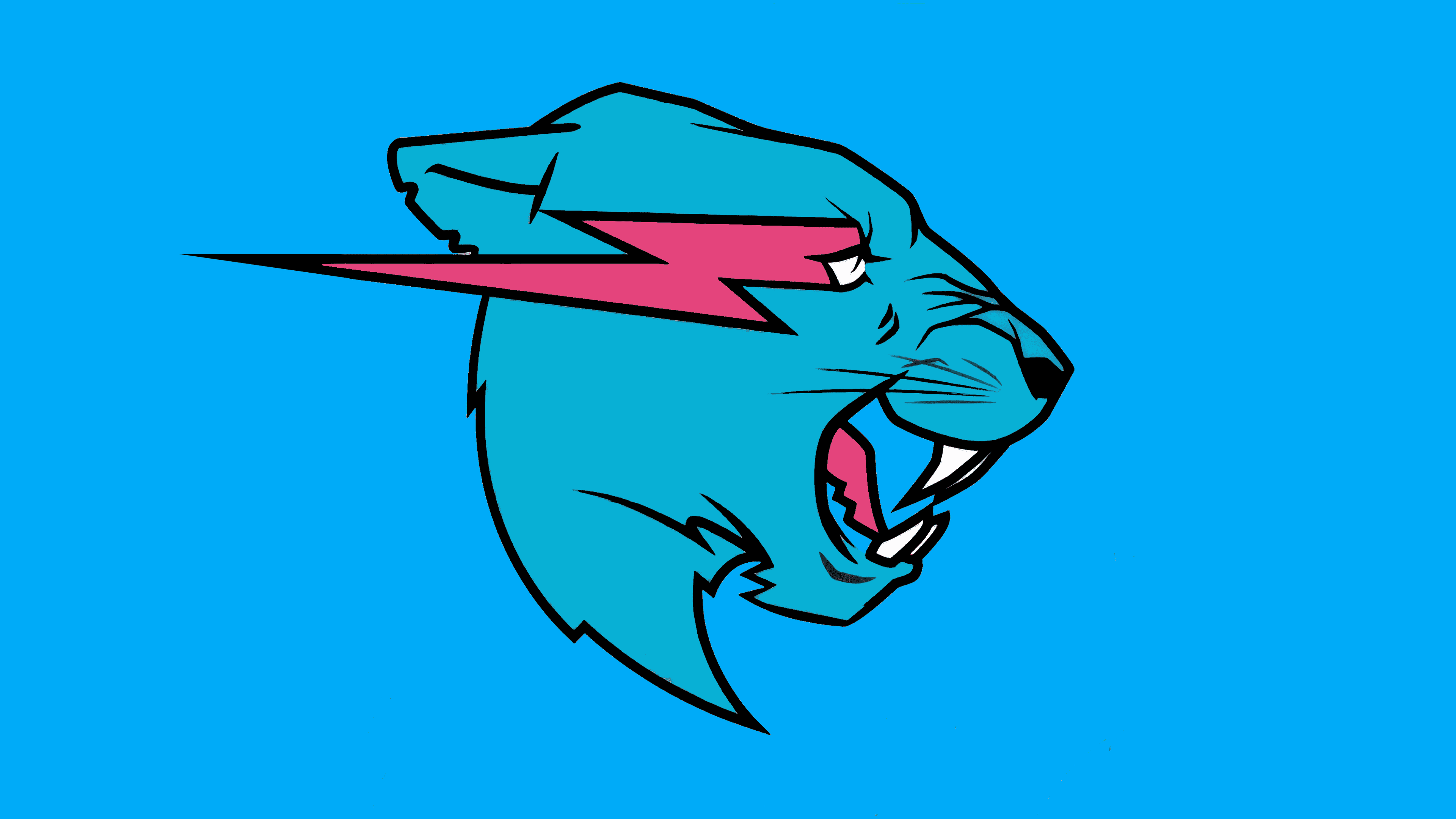
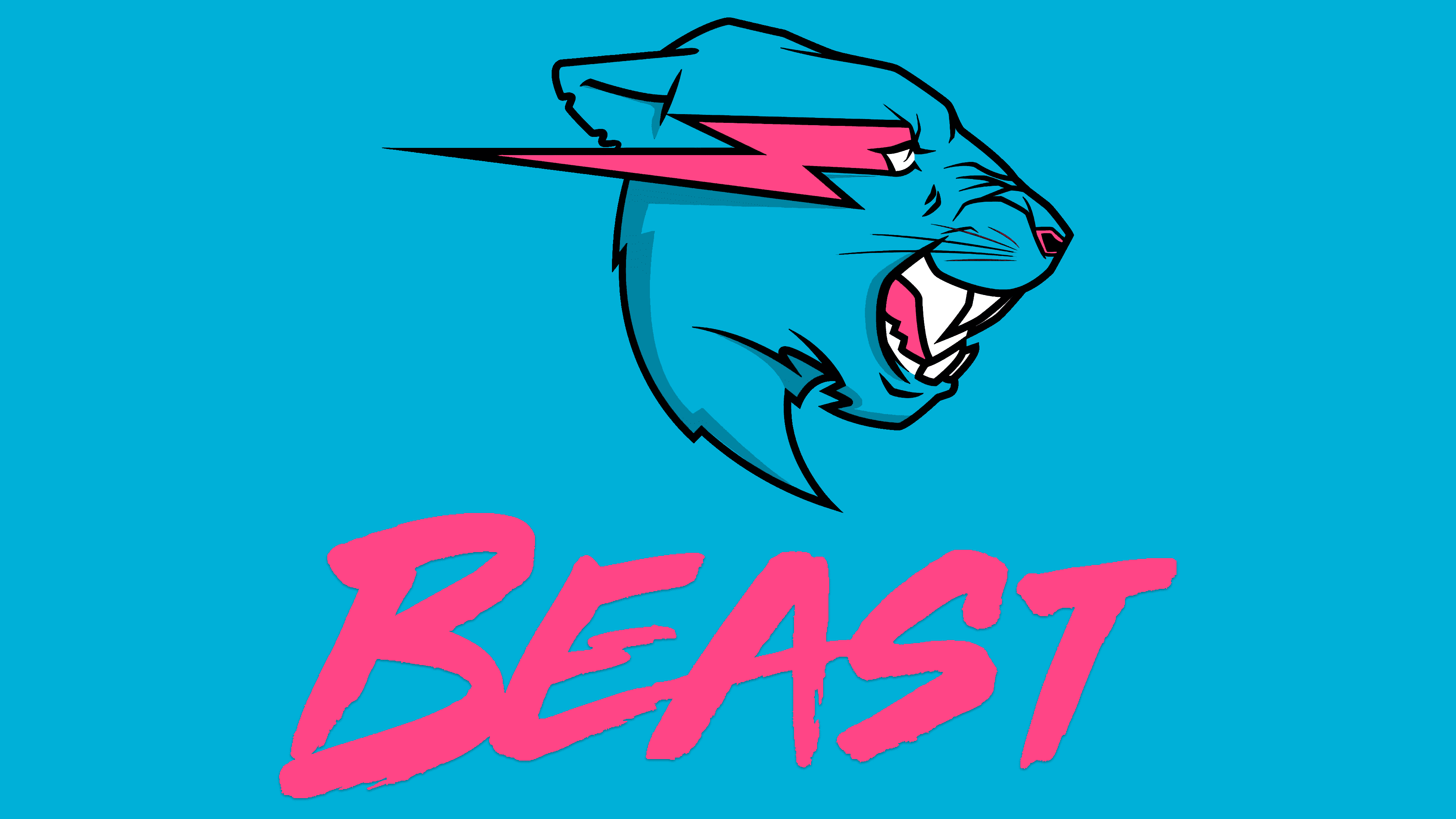
The new MrBeast logo features a vibrant blue panther image. Now, the animal is facing to the right, giving the image a more dynamic appearance. The image’s style is cartoonish, yet the panther’s expression and energy are evident.
A notable feature of the logo is a bright pink lightning bolt that passes directly through the panther’s eye and extends beyond its outline. The lightning bolt emphasizes the animal’s predatory nature and heightens its aggression. The panther’s face is carefully detailed: an open mouth reveals sharp and long fangs, the facial expression is tense, and the nose is slightly wrinkled as if growling. The animal’s ear is pulled back, highlighting readiness to attack or defend.
The brand’s name, the text “Mr Beast,” is rendered in black with handwriting-style lettering, appearing as a quick brushstroke tilted slightly to the right. The letters’ absence of clear edges and serifs emphasizes freedom and a relaxed writing style. The text design matches the channel’s video style, reflecting the ease and informal communication of Jimmy Donaldson’s team.
Backgrounds for the logo vary, but there is a white-and-blue variant with diagonal stripes of different widths resembling claw marks of a wild animal. It provides an additional association with strength and wild nature.
The panther’s image and the aggressive lightning bolt are closely connected to the character of the MrBeast channel and to the history of Jimmy Donaldson himself. The channel is known for bold, generous, original projects, large-scale charity events, and unexpected challenges. The panther and its expression can be compared to the content’s vibrant, energetic style, where decisiveness, originality, and a willingness to take risks are important. The channel actively grows its audience by attracting attention with unusual formats, such as large-scale competitions, extreme tasks, charity events, and unexpected large cash giveaways. The panther’s bright, energetic symbolism has come to reflect the brand’s popularity and uniqueness.
Font and Colors
The MrBeast identity stands out through its unusual and vivid color choices. The brand’s primary color is blue, used in various shades from deep turquoise to lighter sky blue. Blue symbolizes confidence and stability, reminding subscribers of the channel’s consistency and reliability despite Jimmy Donaldson’s most extreme and unexpected ideas.
The bright pink color adds contrast and emotional depth to the brand’s image. It is associated with excitement, emotion, and passion, complementing the channel’s overall style, which is always centered on unusual experiments and daring projects.
White in the logo plays a supportive role. It appears on the panther’s fangs and some background elements. The white color brings necessary balance to the palette, adding clarity and purity while highlighting the contrast and sharpness of other elements.
Black is used to enhance the image’s expressiveness, specifically highlighting details such as the panther’s nose and the channel name. Like white, it creates contrast with brighter colors. The black text, written in a freehand style, appears casual, even slightly bold, reflecting the team’s informal, relaxed manner with their audience.
The channel’s name is written in a unique cursive style, resembling quick, confident brushstrokes. The letters have a slight rightward tilt, without strict boundaries or serifs; everything looks lively and natural. Occasionally, the team uses the Obelix Pro font, created by designer Valentin Antonov, in channel designs. This is a free typeface with expressive, bold letters that emphasize the team’s creative approach to video content and the brand’s visual identity.
![]()
The combination of colors and fonts accurately conveys the essence of the channel. Together, these elements create a recognizable image that reflects the character of its projects and explains why these particular colors and fonts have become the brand’s hallmark.