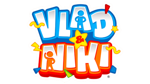
Vlad y Niki Logo, used by the popular YouTube Channel, is characterized by stylized, enlarged lettering. It consists of the names “Vlad” and “Niki,” positioned one above the other, rendered in a three-dimensional sans-serif font. The background is horizontally split into two halves, orange and blue, and the letter outlines echo this palette, while the interior of the characters uses smooth, light gray gradients. In the “A” of “Vlad” and the “N” of “Niki,” there are two abstract human figures. Additionally, the entire inscription is overlaid with small graphic icons in yellow, blue, and green, exceeding the lettering boundaries.
Using stylized, three-dimensional lettering in the logo adds a dynamic, engaging element to the design. This can signify the logo channel’s vibrant, energetic content, which often revolves around the brothers’ adventures.
The dual color scheme of orange and blue adds a playful contrast, further enhancing the energetic impression. Orange typically symbolizes enthusiasm and creativity, while blue represents trust and dependability – qualities the logo channel seeks to embody.
The abstract human figures in “A” and “N” could represent Vlad and Niki themselves, personalizing the logo and subtly communicating that the channel’s content is based on the brothers’ experiences and activities.
The small graphic icons overlapping the borders add a playful touch to the logo, emphasizing the fun, entertaining nature of the content, which is primarily aimed at children. The various colors used in these icons reinforce this playful, vibrant aesthetic.
The Vlad y Niki emblem embodies dynamism, enthusiasm, creativity, trustworthiness, personal experiences, and fun – qualities that accurately represent the brand and the content it delivers.
Vlad y Niki: Brand overview
| Founded: | 2018 – present |
| Founder: | Vladislav Vashketov and Nikita Vashketov |
| Headquarters: | Miami, Florida, U.S. |
| Website: | youtube.com |
Vlad y Niki, a YouTube channel, is helmed by Russian American-born brothers Vladislav Vashketov and Nikita Vashketov, whose innocent charm and lively antics have won the hearts of viewers around the globe.
In their brightly colored world of toys and adventure, these young content creators bring to life a multitude of scenarios, capturing the essence of childhood joy and curiosity. From toy unboxing to imaginative play and life lessons, their content resonates with their young audience and the people who care for them.
Meaning and History
The brand identity of this YouTube channel is centered around the vibrant personalities of the two brothers. Their logo, a simple, stylized representation of the boys’ names, is as cheerful and inviting as the content they produce. The accompanying visual elements, characterized by bright colors and playful designs, reflect the youthful spirit and exuberance that Vlad and Niki bring to their videos.
The channel’s tagline, “Playtime with Vlad and Niki,” perfectly encapsulates the essence of their brand – fun, friendly, and filled with youthful zest. It underscores the channel’s commitment to providing an engaging platform where kids can connect with relatable content that inspires play and fuels imagination.
What is Vlad y Niki?
“Vlad and Niki” is a popular YouTube channel featuring two Russian-American brothers, Vladislav (Vlad) and Nikita (Niki), who engage in creative play and adventures, often focusing on themes of togetherness and sharing. The channel, which began in 2018, has gained significant international following due to its engaging, child-friendly content which includes pretend play, science experiments, vlogs, toys unboxing, and indoor and outdoor play episodes. Their videos are multilingual, being translated into several languages, making them accessible to a global audience.
Through their dynamic content and infectious energy, Vlad and Niki have managed to transform their YouTube channel into a thriving digital playground. The brand has effectively built a community around joyous childhood experiences, and its identity stands as a beacon of positivity, creativity, and the simple joy of being a kid. They are not just content creators but influencers in the realm of children’s entertainment, using their platform to spread happiness, encourage learning, and celebrate the magic of childhood.
Vlad y Niki color codes
| Denim | Hex color: | #0163ba |
|---|---|---|
| RGB: | 1 99 186 | |
| CMYK: | 99 47 0 27 | |
| Pantone: | PMS 285 C |
| Picton Blue | Hex color: | #02b5ff |
|---|---|---|
| RGB: | 2 181 255 | |
| CMYK: | 99 29 0 0 | |
| Pantone: | PMS 801 C |
| Red | Hex color: | #ff0000 |
|---|---|---|
| RGB: | 255 0 0 | |
| CMYK: | 0 100 100 0 | |
| Pantone: | PMS 1655 C |
| Safety Orange | Hex color: | #ff7900 |
|---|---|---|
| RGB: | 255 121 0 | |
| CMYK: | 0 53 100 0 | |
| Pantone: | PMS Bright Orange C |
| Cadmium Yellow | Hex color: | #fff301 |
|---|---|---|
| RGB: | 255 243 1 | |
| CMYK: | 0 5 100 0 | |
| Pantone: | PMS 3955 C |
| Yellow Green | Hex color: | #74c801 |
|---|---|---|
| RGB: | 116 200 1 | |
| CMYK: | 42 0 100 22 | |
| Pantone: | PMS 802 C |


