


![]() Pewdiepie Logo PNG
Pewdiepie Logo PNG
The PewDiePie logo is an optical illusion. No matter how much you look at the elements of the emblem, they are constantly updated. Each time the blogger’s videos are revealed from a new angle, multiple viewings do not reduce the pleasure.
PewDiePie began in 2010, when Swedish student Felix Kjellberg launched a YouTube channel under the name PewDie. “Pew” referred to the sound of a laser, while “die” pointed to death. After losing access to that account, he created a new channel and renamed it PewDiePie. His early videos centered on horror game playthroughs, mainly Amnesia, where his commentary and reactions became the main draw.
In 2011, Kjellberg left Chalmers University to focus on YouTube full-time. The risk quickly changed his career. In 2012, the channel grew from 100,000 subscribers to more than 4 million. After moving to Italy and earning enough to support himself, PewDiePie made his main profession. Around the same period, he began adding comedy videos, vlogs, and broader gaming content.
In 2013, PewDiePie became the most-subscribed YouTube channel, passing Smosh, and signed with Maker Studios. By the end of that year, the audience had grown past 19 million subscribers. From 2014 to 2015, the channel moved into meme reviews, reaction videos, music parodies, the book This Book Loves You, and the mobile game Legend of the Brofist. In 2016, PewDiePie became the first independent creator channel to pass 50 million subscribers.
The 2018-2019 subscriber race with T-Series turned into a major internet event, built around the “Subscribe to PewDiePie” campaign and a wave of memes. In 2020, Kjellberg signed an exclusive streaming deal with DLive and expanded merchandise lines. From 2021 to 2023, he posted less often. He focused on book reviews, online trends, live streams, Japan-related videos, clothing, accessories, and brand collaborations.
Meaning and History
![]()
Felix was born in Gothenburg (Sweden) in 1989. He came to YouTube in 2010, taking the pseudonym PewDiePie. After posting a real-time walkthrough of passing games, with individual comments and curious remarks, on his channel, the young man gained unheard-of fame. He is one of the first owners of a personal (non-corporate) account that received many visits from unique users.
The most active periods in his blogging career were 2012 and 2013. Then he attracted widespread attention with the change in style and content. So, he got music videos, short films, shows, comedy shows, and video blogs. This was facilitated by the atmosphere in which the young man grew up, as computer technology surrounded him from childhood: his mother worked as an information technology director. She was recognized in 2010 as the best IT specialist in the country.
Therefore, Kjellberg was very fond of video games. Sometimes he didn’t even go to school; he just went to play at an Internet cafe. For this occupation, he spent whole days. Felix bought a computer with money he earned himself in the last year of his studies: he sold drawings created in Adobe Photoshop. When the blogger dropped out of college (in 2011), his parents refused him financial support. Then the young man began earning money by selling hot dogs at a kiosk and his creative paintings.
He first registered on YouTube in 2006 under the nickname Pewdie but abandoned his profile and forgot his password. He consciously used part of his first pseudonym the second time he came to this channel. Kjellberg pays great attention to its personalization and regularly changes its logo.
What is PewDiePie?
This is the pseudonym of a popular Swedish video blogger who gained fame for his humorous YouTube shows and comedic videos. Thanks to gaming videos featuring commentary and reactions recorded during gameplay, his popularity soared. The consistent release of new content and audience engagement made him one of the most well-known internet personalities. He was even included in Time magazine’s list of the 100 most influential people in the world. His channel has garnered over 110 million subscribers and billions of views.
2010 – 2013
![]()
The debut emblem contained only the user’s nickname – PewDiePie. It consisted of “encodings” resembling scraps of cloth or paper with slits in those places where there should be an intra-letter gap. The signs also looked like paint strokes on the wall. The typeface was uppercase and tilted to the left. The stylized logo looked more like wall graffiti than a symbol of personal identity, which is what the gamer was striving for. He wanted to surprise, attract attention, and express himself. The letters were white on the inside and had a thin gray outline. Overall, the logo style was rebellious.
2013 – 2016
![]()
In this case, the logo was a creative game. Several interesting images were concentrated in it at once, revealing the user’s character and the topic of his video blog. The fact is that the capital “P” from the nickname Felix contained a clenched fist inside. The designer perfectly captured this similarity by combining the two in one. To make the central element expressive and stand out clearly, he painted it blue and set it against a dark background. A gray mark surrounded the first and last characters of the word “PewDiePie.” By the way, the double “P” is visible. As a result, this combination turned out to be a very bold letter.
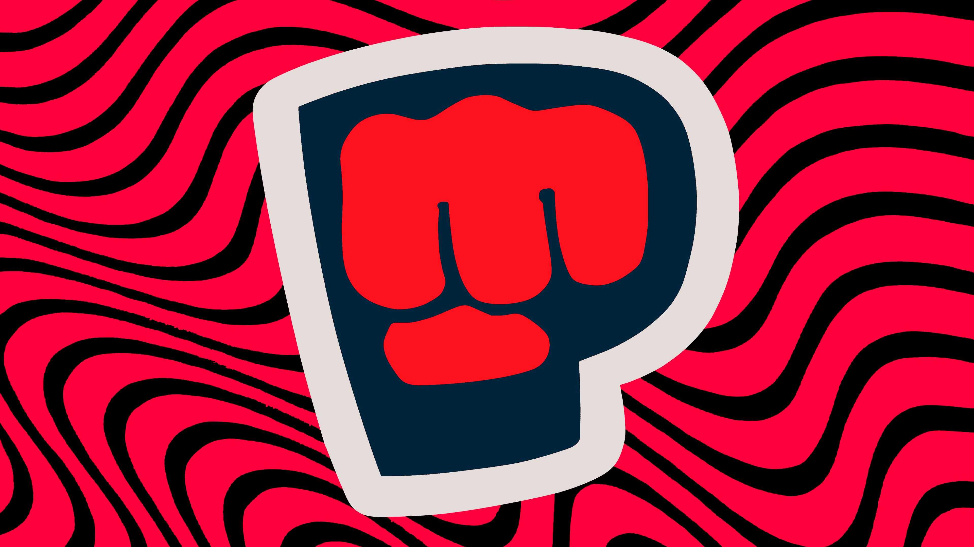
2016 – today
![]()
The logo introduced in 2016 became a visual symbol of changes in the creativity and life of Swedish gamer PewDiePie. The design stands out with its unconventional approach: alternating black wavy lines on a bright red background create an illusion of movement and depth.
The logo consists of repeating waves whose curves and intersections evoke motion and chaos. These lines do not intersect directly, but their shapes guide the eye across the image, resembling “visual noise.” The black lines add contrast, highlighting the red background. The combination of colors creates an effect that appears both orderly and chaotic.
The red background reflects energy, strength, and emotion. The black lines add seriousness and depth, while their curved shapes suggest continuity and adaptability. Together, these colors form a bold style that suits the content and breaks away from conventional norms.
The emblem emerged during a transition period in PewDiePie’s video format and approach to life. The design reflects the shift from traditional gaming content to experimental projects, emphasizing the inevitability of forward movement.
The logo captures the atmosphere of a time when experimentation and the search for a new style became central themes in PewDiePie’s work. It symbolizes individuality, creativity, and the drive to stand out.
Font and Colors

In this case, identity development went from simple to complex forms. If, at first, the PewDiePie logo looked like wall graffiti, in the latter version, it is perceived as no lower than the melting clock in the Dali painting. This is probably the growth line of Felix Arvid Ulf Kjellberg, who took up video blogging as a teenager. Moreover, the emblem has no text in the latest version; it is purely graphical.
The inscription appears only in the first logo, which uses the Feast of Flesh BB typeface. Blambot created the brushstroke letters. The color palette is more varied than the fonts. The emblems include gray, white, blue, black, and red.