


![]() Unspeakable Logo PNG
Unspeakable Logo PNG
The blogger’s eccentricity, folly, and wild imagination are depicted on the emblem. The idea of combining entertainment, knowledge, and a good mood is embodied in the Unspeakable logo. The channel surprises and delights viewers with unusual videos.
Unspeakable grew from Nathan Graham’s teenage interest in gaming in Kingwood, Houston. Born on December 5, 1997, he spent his childhood building Lego structures, playing Pokémon on Game Boy, and later focusing on Minecraft. Around age 13, he discovered YouTube and decided to make his own videos.
His first attempt came in 2012 with a channel called Mr. Gaming 1000, but he deleted it after a few uploads. On October 9, 2012, at 14, he created UnspeakableGaming. The first video appeared in November as part of a Minecraft Survival Island series. Growth was slow, but he kept posting gameplay, mods, custom maps, and collaborations.
The first real push came in 2013, when Graham created the Island Sprint Parkour map. Popular channels JeromeASF and JerryVsHarry used it in videos, sending new viewers to UnspeakableGaming. In March 2015, he earned his first YouTube Silver Play Button for 100,000 subscribers. After finishing high school, he chose YouTube as his main path.
In 2016, his Minecraft videos began reaching millions of views. On May 1, he launched Unspeakable for pranks, challenges, and vlogs, separating real-life content from gaming. In 2017, he added UnspeakablePlays and formed The Squad with MooseCraft and Shark. Merchandise followed with shirts, hoodies, backpacks, and accessories. By 2020, the store had more than 130,000 customers, and in 2021, he added a Shorts channel to expand the brand.
Meaning and History
To become famous, this man did not leave the city where he was born. Nathan settled in it, turning it into a platform for the successful growth of his popularity. What did he do? Nothing extraordinary. He persistently did what he loved – played Minecraft and shared his impressions with Internet users through the YouTube network. By the way, he dreamt of becoming a YouTuber since childhood, right after he gave up his unrealizable desire to be an astronaut because Unspeakable is a realist, a cheerful pragmatist, and a great businessman.
The blogger owns several channels. The first one, released in 2012, is entirely devoted to Minecraft. The second was launched in 2016, making it basic. It publishes his video blogs. The third was opened in 2017: this cycle became a gaming cycle and was almost entirely devoted to Roblox, although there are other stories. Another channel of a young blogger appeared in the fall of the same year. He is associated with a fictional user nicknamed ASWDFZXCVBHGTYYN, who behaves like a novice discoverer of the Minecraft world.
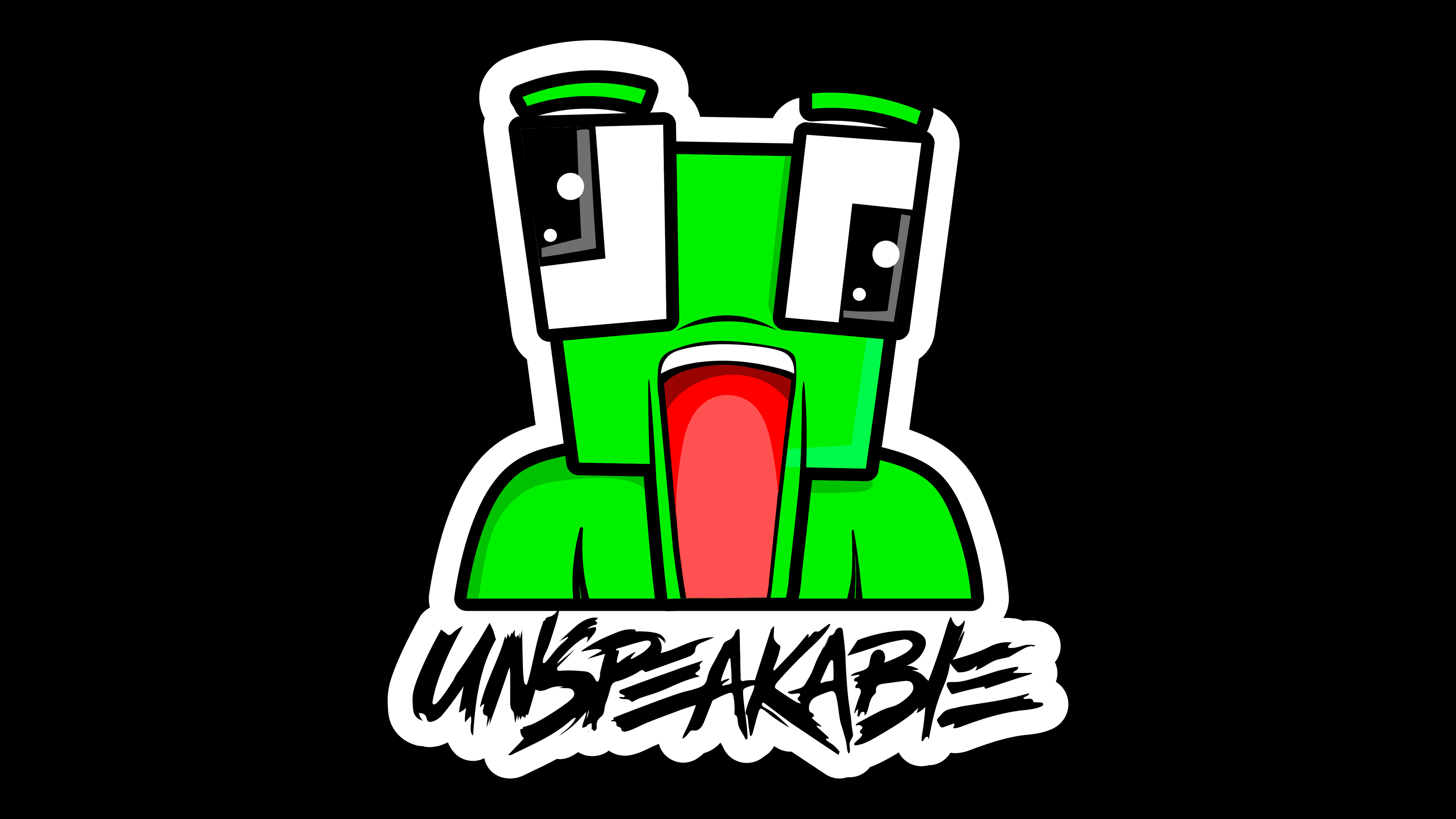
Unspeakable has three other YouTube channels that originated between 2018 and 2020. One of them revolves around the game Chasecraft; the second is tied to an online store; the third reveals behind-the-scenes secrets and shows how stories are filmed. The YouTuber uses a text logo and a frog mascot as an individual symbol.
![]()
Unspeakable chose the simplest possible logo for self-expression, popularization, and quick recognition. It has nothing but the nickname, presented sloppily. The letters seem to have been applied with a paintbrush. The strokes are executed in a big way, conveying the author’s emotions and making it seem as if they were drawn on the wall rather than written. For this purpose, a capital font is used, flat but choppy, with redundant strips in some places. Almost all the characters are closely connected, and some overlap. For example, the horizontal “E” lines look like a natural complement to the adjacent “P” and “L.”
In addition, the video blogger has a mascot, a bright green, geometric-shaped frog. It has rectangular eyes with equally rectangular pupils, a large trapezoidal head, and arched eyebrows. The freshwater’s mouth is wide open. A red tongue protrudes from it as if the frog intends to catch its next victim and swallow it. The mascot is encircled by a bold black band, with a white line serving as the background for the brand name below. The YouTuber’s nickname is written there. It’s done in the same style as the text emblem. The only difference between them is the palette; all other features are fully preserved.
Font and Colors
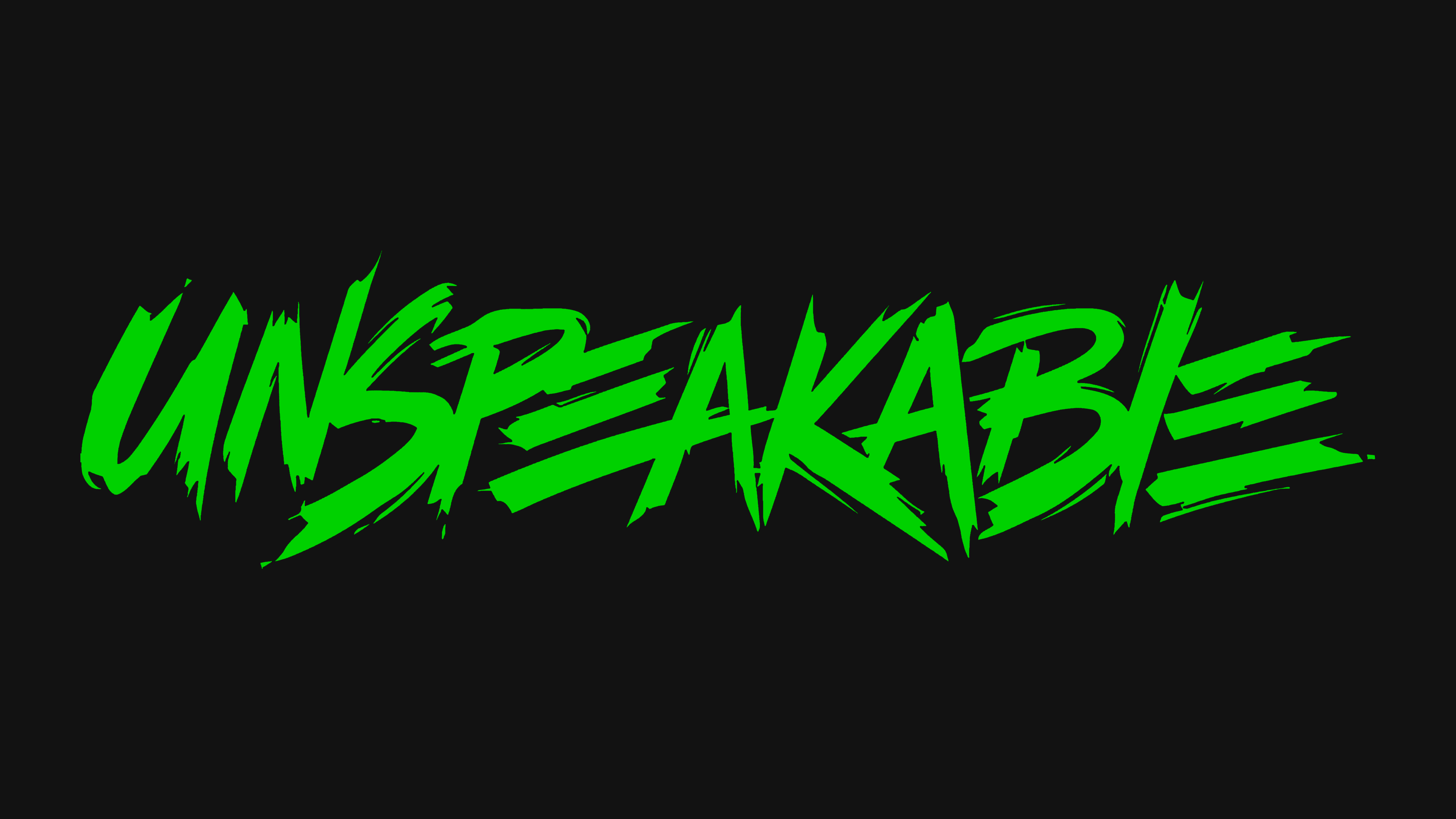
For the personal logo, we chose an original font we designed. The letters are stylized like graffiti writing on the wall. They are wide, sprawling, half-slanted, without serifs, with broken ends. The color scheme is bright and inviting. It consists of toxic shades of green and red. It also includes black and white.