


![]() Dutch Bros Logo PNG
Dutch Bros Logo PNG
The Dutch Bros logo has undergone a significant transformation in a short period. It has retained its main feature, authenticity, which has helped the chain become a major American franchise. The emblem played a significant role in this, as the transfer of standard rules involved the transfer of visual identity.
Dutch Bros is an American coffee and food service franchise established in 1992. It is a chain of cafes with a management center in Grants Pass, Oregon. Its founders are brothers Boersma–Dane and Travis.
In 1992, Dane and Travis Boerma, two brothers from Grants Pass, Oregon, started Dutch Bros Coffee. With a Dutch background and a childhood on a dairy farm, they were ready to start their own business. With just $12,000 and a passion for coffee, they opened their first cart and quickly became local favorites thanks to their friendly service.
During the ’90s, Dutch Bros stuck close to home in Oregon, gaining a reputation for its chill vibe. The baristas, or “broistas” as they’re known, became famous for their laid-back style and engaging conversations with customers.
In the 2000s, Dutch Bros. expanded beyond Oregon, reaching over 150 locations by 2010. They stood out with their wide range of drinks, including unique ones like “Annihilator” and “ER-911.”
For the Boerma brothers, Dutch Bros was more than a business; it was about people. They treated their team like family, held big events like Joey Day to honor friends, and started the Dutch Bros Foundation to give back, especially after co-founder Dane passed away in 2009.
Even as they grew to over 400 locations in the 2010s, they kept their unique drive-thru kiosks instead of opening standard cafes. In 2018, the remaining founder, Travis Boerma, was clear that they would not sell out or go public because keeping their culture and values was key.
With over 500 stores in 11 states and significant earnings, Dutch Bros is a heavyweight in the coffee world. Their story concerns maintaining a strong community vibe, delivering exceptional service, and staying true to their beliefs.
Meaning and History
![]()
Dane and Travis Boersma named their company after their grandparents, immigrants from the Netherlands who once moved to the United States. The name is a tribute to their ancestry. Over time, they developed a logo because the stationary kiosk required an informative sign. The first emblems were text-based and consisted only of the name. But as the product range expanded, the emblems became more diverse.
What is Dutch Bros?
Dutch Bros is a cafe chain in the United States that has quickly turned into a franchise. They serve several types of coffee, pastries, and refreshing beverages. The brand was founded by the Boersma brothers in 1992. The headquarters are located in Grants Pass, Oregon.
1992 – 1993
![]()
A simple inscription, “Dutch Bros,” written in thin sans-serif letters, replaced the logo. It served an informative purpose rather than a marketing one. This was a typical sign that listed the kiosk’s name and the type of drink they served: Dutch Bros + Coffee. The second part of the name was separate and executed differently, resembling a handwritten italic inscription.
1993 – 1999
![]()
After increasing the number of sales outlets and raising demand for hot and cold drinks, the management decided to take the brand’s identity seriously. As a result, a real emblem was introduced, taking into account:
- the type of product offered;
- the target segment of consumers;
- ease of reading;
- graphic uniqueness.
All of this was embodied in a text-based emblem with a three-level inscription. In the first line, the word “Dutch” was placed at an angle, most notably in the “D” and “u.” The second row was more level but had a slight tilt, as evidenced by the letter “B,” where the left corner was lower than the right. Both fragments were colored in dark coffee and outlined with a yellow border. The third line contained a “Coffee” inscription less formal than the first two. It was red-gold, handwritten, connected, and italic. The “C” loomed over the “o,” capturing it inside, making it look like an orbit.
1999 – 2016
![]()
When Dutch Bros became a franchise, the owners again focused on its visual identity. They commissioned a new logo to emphasize the brand’s high significance, popularity, and uniqueness. It highlighted the establishment’s high status and marked each location, thereby demonstrating the network’s integrity. This time, the base element was a windmill, indicating that:
- Coffee is made from freshly ground beans, so it’s always aromatic.
- The company is connected to the Netherlands, where windmills have played an important role in history.
The windmill was a classic pyramidal structure with four curved blades. The “grid” of the wings added dynamism to the emblem: such improvised squares were once used to make blades that rotated the millstones under wind pressure.
At the bottom was the name, typed in a grotesque font. The letters were bold, blue, and outlined in white. Next to each character was a grayish haze, indicating a shadow. The designers kept the tradition and left the word “Coffee” in italics, handwritten, red-orange, with an elegant yellow border.
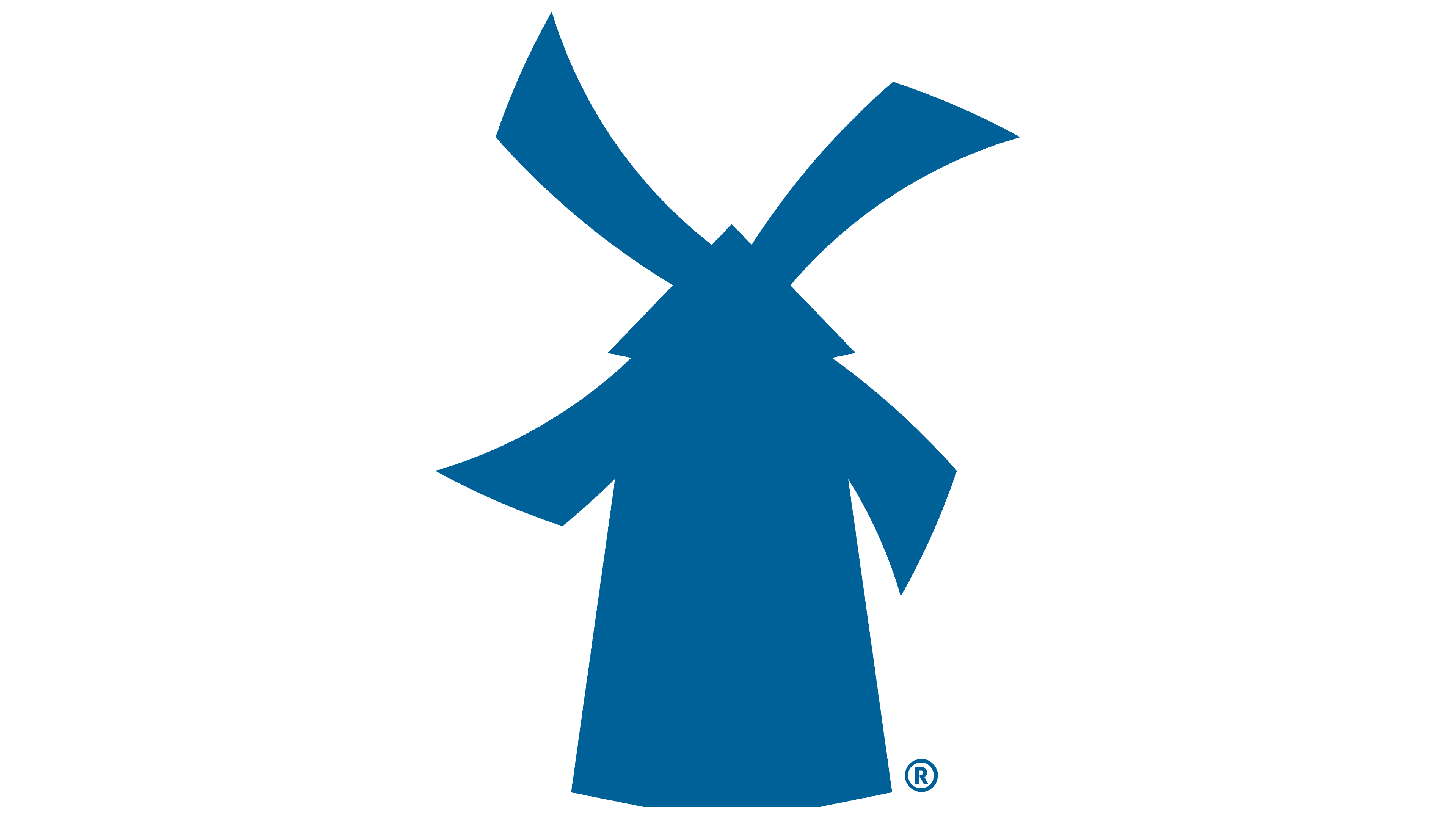
2016 – 2021
![]()
The Dutch Bros logo of those years contained a linear inscription with a graphic element placed in front. This role was fulfilled by a miniature windmill, fully colored in blue. This version’s designers removed all shadows, outlines, and small details. They also designed the inscription in a unified style, removing italics and red brick colors. The letters were all uniform: printed, strict, and without serifs.
2021 – today
![]()
A vertical stripe now separates the windmill silhouette and the strict inscription. To avoid contrasting with them, it is colored in the same blue, reinforcing the harmonious balance of the composition. At the same time, significant changes are noticeable. For example, the words “Dutch” and “Bros” are almost connected (they are in the top position), and “Coffee” (at the bottom right) has become italic, handwritten, and red-orange again, with a golden frame around each letter.
In addition, separate red, yellow, and blue stripes have appeared. They are combined with the last part of the name, which serves as the apex and direction indicator, adding inner energy to the emblem. The beginning of the triple rainbow line aligns with the letter “D” and ends under the “o.”
Fonts and Colors
The Dutch Bros logo uses a strict Peignot Demi/Bold typeface in Art Deco style. It was developed in 1937 by typographer A. M. Cassandre for the French company Deberny & Peignot. Interestingly, the emblem’s inscription is in capital letters, but compared to the large “D” and “B,” all other characters look lowercase. The word “Coffee” is in italics, reminiscent of a calligraphic inscription.
The corporate palette of the American coffee shop chain is historically associated with the Netherlands. The brothers sought to emphasize this from the very beginning since red and yellow are the colors of tulip fields. The tricolor stripe directly reflects the long rows of bright tulips stretching across the expanses of the Netherlands. They symbolize the founders’ homeland and are closely related to Dutch culture.
The combination of blue and white effectively complements the striking palette. Moreover, two shades of blue are used in the logo: the dark one highlights the X-shaped form of the windmill’s wings, and the light one colors the vertical stripe, roof, window, and door. Although the eye hardly catches these nuances, the designers say they are present.
FAQ
What is the meaning behind Dutch Bros?
“Dutch Bros” isn’t just a catchy name; it’s a tribute to the founders’ Dutch roots and their family’s entrepreneurial spirit. Dane and Travis Boerma, the minds behind Dutch Bros, grew up knowing the value of hard work. Before starting their coffee venture, Dane gained business experience and saved $12,000 from running a Dairy Queen. This money kick-started their dream into reality with just an espresso machine and a pushcart in Grants Pass, Oregon.
The name “Dutch Bros” honors their immigrant grandparents, symbolizing the brothers’ connection to their heritage and the resilient spirit they inherited. More than a nod to their Dutch background, it represents the values passed down through generations, showcasing the importance of family, perseverance, and community. This deep-rooted connection to their past shapes everything about Dutch Bros, from its culture to how it does business and engages with the community.
Is it Dutch Bros or Dutch Brothers coffee?
The company is officially known as “Dutch Bros Coffee.” The “Bros” part stands for “Brothers,” a nod to the founders, the Boerma brothers. They prefer the shorter “Dutch Bros” name for all their marketing and branding, which suits their lively, fast-paced service style, even if customers sometimes wait 40 minutes at night.
People’s willingness to wait for Dutch Bros coffee at night highlights how special the brand is. It’s not just the coffee that draws people in; it’s their entire menu, which features a variety of unique drinks like specialty coffee, flavored lattes, smoothies, teas, and energy drinks. The quality of the ingredients, the unique tastes, and the commitment to a fun, welcoming experience make Dutch Bros stand out. The friendly vibe and the personal touch the baristas, or “broistas,” provide also play a big part in making the wait worthwhile. It’s more than just grabbing a coffee; it’s about enjoying the Dutch Bros experience.
How big is Dutch Bros coffee?
Dutch Bros Coffee is the largest privately held drive-thru coffee company in the US. It started with just an espresso cart in Grants Pass, Oregon, and has grown to more than 250 locations across seven states: Oregon, California, Washington, Idaho, Nevada, Colorado, and Arizona.
This growth shows Dutch Bros isn’t just spreading its stores across the map; it’s also making a big impact on the coffee scene and communities. Every Dutch Bros shop promises great coffee, quick and friendly service, and a fun vibe that draws people back. Their story, from a humble cart to a major drive-thru chain, highlights their journey of building a business, connecting with communities, and getting what coffee lovers want. Dutch Bros has become a beloved brand, proving it’s a major part of coffee culture in America.
What are some fun facts about Dutch Bros?
Dutch Bros Coffee isn’t your average coffee shop; it has an interesting background full of unique stories. It all started with just $12,000 and a pushcart in Grants Pass, Oregon. This small beginning laid the foundation for what would become a major name in coffee. The “Dutch Bros” name is a tribute to the founders’ Dutch grandparents, reflecting their love for family history and the values passed down through generations.
Thanks to its popular coffee, the company quickly grew from one cart to five. By 1994, Dutch Bros. opened its first drive-through, changing how it served its coffee and making it easier for more people to enjoy their drinks. This move to drive-throughs wasn’t just about growing bigger; it was about changing the coffee game by making good coffee available quickly without losing the friendly touch Dutch Bros. is known for.
These stories from Dutch Bros show how the company blends tradition with new ideas while keeping community at its heart. From a simple cart to a big name in the coffee world, Dutch Bros stays true to its roots while continually seeking new ways to make coffee lovers happy.
How many drinks does it take to get a free drink at Dutch Bros?
You can get a free drink at Dutch Bros through their rewards program. For a free medium drink, you need 250 points. If you want a different size or a special drink, it’s 325 points. This setup motivates you to keep coming back to earn points toward a free drink, whether it’s your go-to favorite or something new you want to try. The more often you visit and make a purchase, the faster you’ll earn a free drink.
Is Dutch Bros cheaper than Starbucks?
Dutch Bros Coffee, known on the NYSE as BROS, offers its drinks at slightly lower prices than Starbucks, making it a great option for those who want quality coffee without paying more. Dutch Bros doesn’t cut corners on the quality or variety of its coffee and specialty drinks, even with the lower prices.
They’re also focusing on making their service more convenient. Many new Dutch Bros locations have drive-thru lanes and walk-up windows, making it easier for customers to get their coffee quickly. This focus on convenience and affordable prices shows Dutch Bros’ commitment to providing a great customer experience, challenging even the biggest names in the coffee world, like Starbucks.