![]() ECU (East Carolina University) Logo PNG
ECU (East Carolina University) Logo PNG
Although the ECU logo is modern, the university itself is old, having been founded over a hundred years ago, at the dawn of the 20th century. The emblem represents the educational institution’s main values, roots, and priorities. The color palette conveys the nobility of goals and the high standing in the educational system’s hierarchy.
The history of East Carolina University (ECU) began on March 8, 1907, when the North Carolina General Assembly authorized the establishment of the East Carolina Teachers Training School (ECTTS). Greenville was chosen as the site for the first campus, and Robert Herring Wright became its first president.
Classes began on October 5, 1909, with 104 women and 19 men in attendance. In 1921, ECTTS became a teacher’s college (ECTC) that awarded bachelor’s degrees.
A turning point came during the presidency of Leo Jenkins (1960–1978), when the school gained university status and adopted the name East Carolina University. The Medical School opened in 1977 and became a pioneer in robotic surgery in the U.S.
In 1972, ECU became part of the University of North Carolina system. The School of Dental Medicine opened in 2011, establishing rural service centers throughout the state.
Today, ECU is a major research university offering over 100 undergraduate and graduate programs, as well as professional degrees in medicine and dentistry.
The athletic teams of East Carolina University compete under the name East Carolina Pirates.
Meaning and History
![]()
Following the emergence of a need for teacher training in North Carolina, a special commission was established to support the idea and to select the site for the future university. Initially, it was East Carolina Teachers Training School, later renamed East Carolina Teachers College (in 1921). Now, it is the largest educational center in the state, an R2-level research university with a unique identity and its own athletic department.
The ECU (East Carolina University) logo is an officially registered trademark. The university has individualized the inscription “ECU” and the image of the university dome. Fragments of the Wright Auditorium facade (columns and arches) are present in almost all emblems. All of these are legendary symbols that make up the institution’s history. One of them, the Austin Building, no longer exists. But a replica of its roof (rotunda) still adorns the campus and serves as a venue for various celebrations. It is called the Old Austin Cupola.
What is ECU (East Carolina University)?
It is a public university located in Greenville, North Carolina. Initially founded as a teacher’s college, it expanded into a major regional center for medical education and research. The university is renowned for its medical, healthcare, and nursing programs, operating a large medical campus and a leading university hospital.
Before 2008
![]()
The East Carolina University logo used before 2008 was designed to reflect the university’s architectural heritage and to emphasize its connection to the campus’s history and traditions.
The graphic composition featured a stylized depiction of the facade of the university’s main building, Wright Auditorium. The design featured a rectangular shape with three identical semicircular arches, symbolically repeating recognizable architectural elements of the façade. The arches’ silhouette was carefully outlined and perfectly symmetrical, giving the composition geometric precision and evoking the look of an architectural drawing or technical blueprint.
The lower part of the logo consisted of a three-tier typographic arrangement, separated by horizontal lines of varying thickness. The words “EAST,” “CAROLINA,” and “UNIVERSITY” were set in the Matrix Extra Bold typeface, an old-style serif font with thick strokes and sharp serifs. This typeface featured precise proportions and strong vertical and horizontal strokes, reinforcing the university’s formal and academic image.
The chosen purple color throughout the visual composition carried symbolic meaning, representing royal dignity and the institution’s prestige. The purple palette, traditional for East Carolina University, provided strong brand recognition while underscoring the institution’s stability and deep historical roots.
This emblem was created as part of the university’s effort to transition from purely text-based identification to a more symbolic, visual concept rooted in the campus’s history and cultural heritage. Wright Auditorium was chosen for its recognizability and significance as a historic early-20th-century building that had become visually synonymous with the university.
2008 – 2017
![]()
The East Carolina University logo, introduced in 2008, represented an evolution of the university’s identity, combining tradition with modern graphic techniques.
The visual composition included a simplified image of the Wright Auditorium facade, the campus’s key historic building. The architectural silhouette was presented as a rectangular element with three symmetrically placed arches, referencing the building’s classical features. This motif was shifted to the upper left corner and simplified, taking on a more abstract character with smooth, rounded lines and clean geometry.
Below the architectural symbol were two stylized yellow lines resembling wave crests. This element is symbolically connected to the university’s geographic location in Greenville, near the Atlantic coast of North Carolina. The smooth lines with tapered ends added a sense of motion to the design, serving as a visual metaphor for progress and the university’s development.
The logo’s typography was divided into two text levels, each using a different font to create visual contrast and clearly distinguish the meaning of each element. The words “East Carolina” were set in a large old-style serif typeface with thin serifs and refined proportions. The letters featured elegant lines and balanced stroke thicknesses, emphasizing the institution’s academic prestige and its traditional educational approach.
The secondary element, the word “University,” was placed separately in the lower-right corner and set in an all-caps sans-serif font. The use of a simple sans-serif typeface added a modern touch. It ensured clarity, creating graphic balance within the composition.
The color palette was based on the university’s traditional tones: Pantone 268 purple and Pantone 123/109 bright yellow. Purple symbolized the institution’s historical continuity and status, while bright yellow represented optimism, energy, and innovative potential, highlighting the university’s focus on growth and achievement.
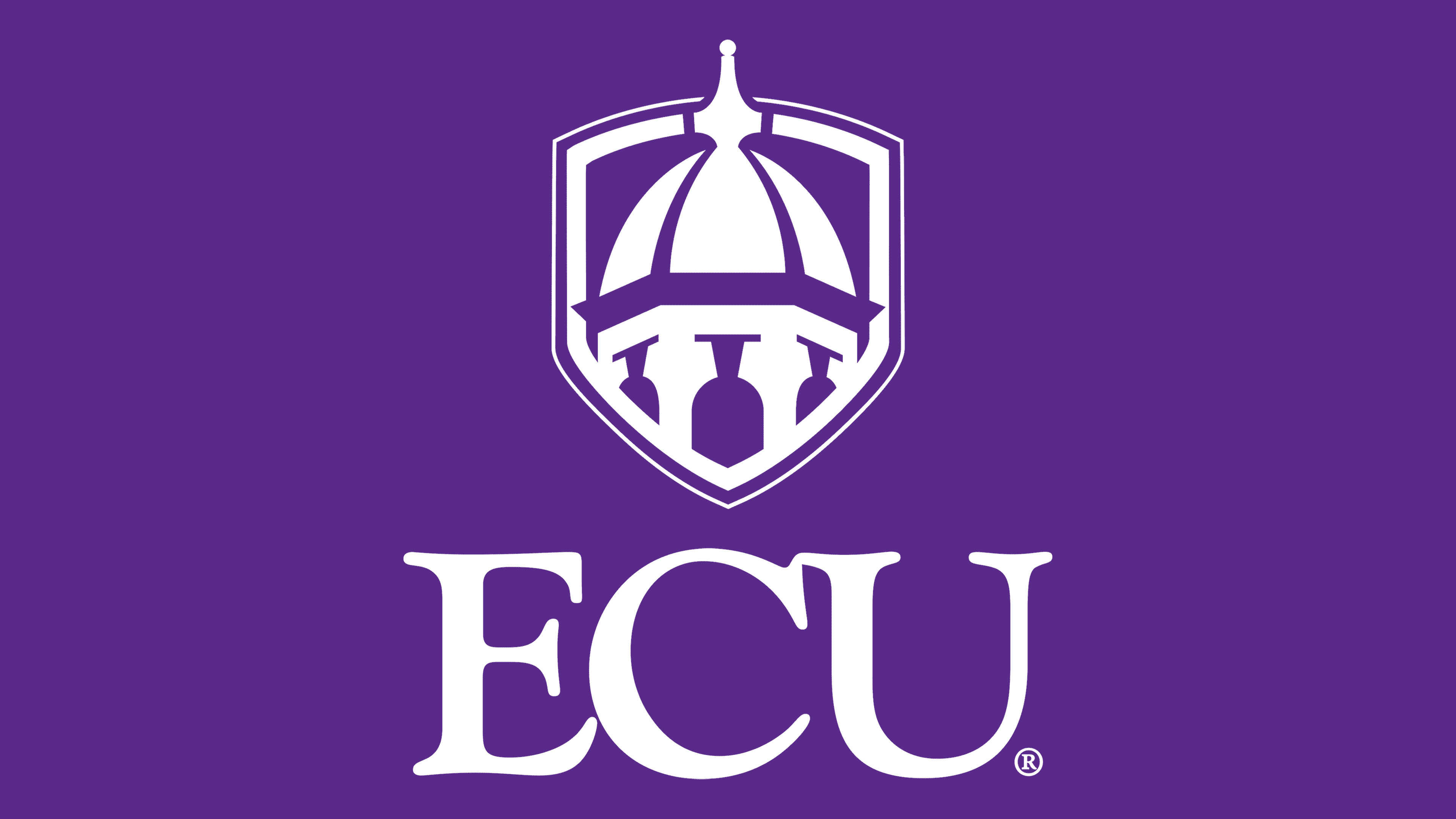
2017 – today
![]()
The new East Carolina University logo reflects the institution’s intention to visually emphasize tradition, academic reputation, and institutional stability.
The design features a stylized depiction of the dome of the historic Austin Building, constructed in 1929 and named after Chancellor Elvin Robert Austin. Known as the Old Austin Cupola, this architectural element has long been associated with the university and serves as a symbolic representation of its heritage. The dome’s visual form is simplified and placed within a heraldic pentagonal shield with a double outline. This creates an association with coats of arms, conveying a sense of protection and underscoring the institution’s authority.
The logo’s typography features the abbreviation “ECU” in a bold serif typeface with balanced proportions. The glyphs have smooth, classical shapes with wide letter bases. This typeface is reminiscent of Matrix Extra Bold, which is traditionally used in academic branding and reinforces the university’s seriousness, reliability, and confidence in its values.
The color palette features ECU’s traditional purple shade, which has been officially in use since the early 20th century. Unlike previous versions, yellow was removed from the design, resulting in a more uniform and formal palette that strengthens its association with the academic environment and the university’s authority.
The primary goal of the redesign was to create a logo that conveys academic solidity while preserving the campus’s historic symbols and ensuring maximum recognizability in the informational landscape. The stylized dome framed within the heraldic shape is perceived as an architectural landmark, metaphorically associated with a beacon of academic knowledge.
Font and Colors
The base font for the university, used in ECU logos (both academic and athletic), is Matrix Extra Bold. This serif font features sharp tips that resemble miniature hooks. It is complemented by Gotham, a font used in graphic designs and official documents.
The color scheme has remained standard since its approval in 1909. At that time, the administration of the newly opened educational institution held a contest for students to select a unique color palette. Royal Purple and Old Gold won the vote and remain part of East Carolina University’s visual identity.