


![]()
El Marrano, a brand rooted in Spain’s rich culinary traditions, has introduced a fresh logo and updated packaging designed by the creative agency Little Buddha. While honoring its deep roots, the new visual identity adds a playful touch, celebrating authentic Iberian flavors with an eye toward modern tastes. The rebrand comes as El Marrano expands beyond Spain, focusing on the Italian market and bringing its premium cured meats and gourmet products to new audiences.
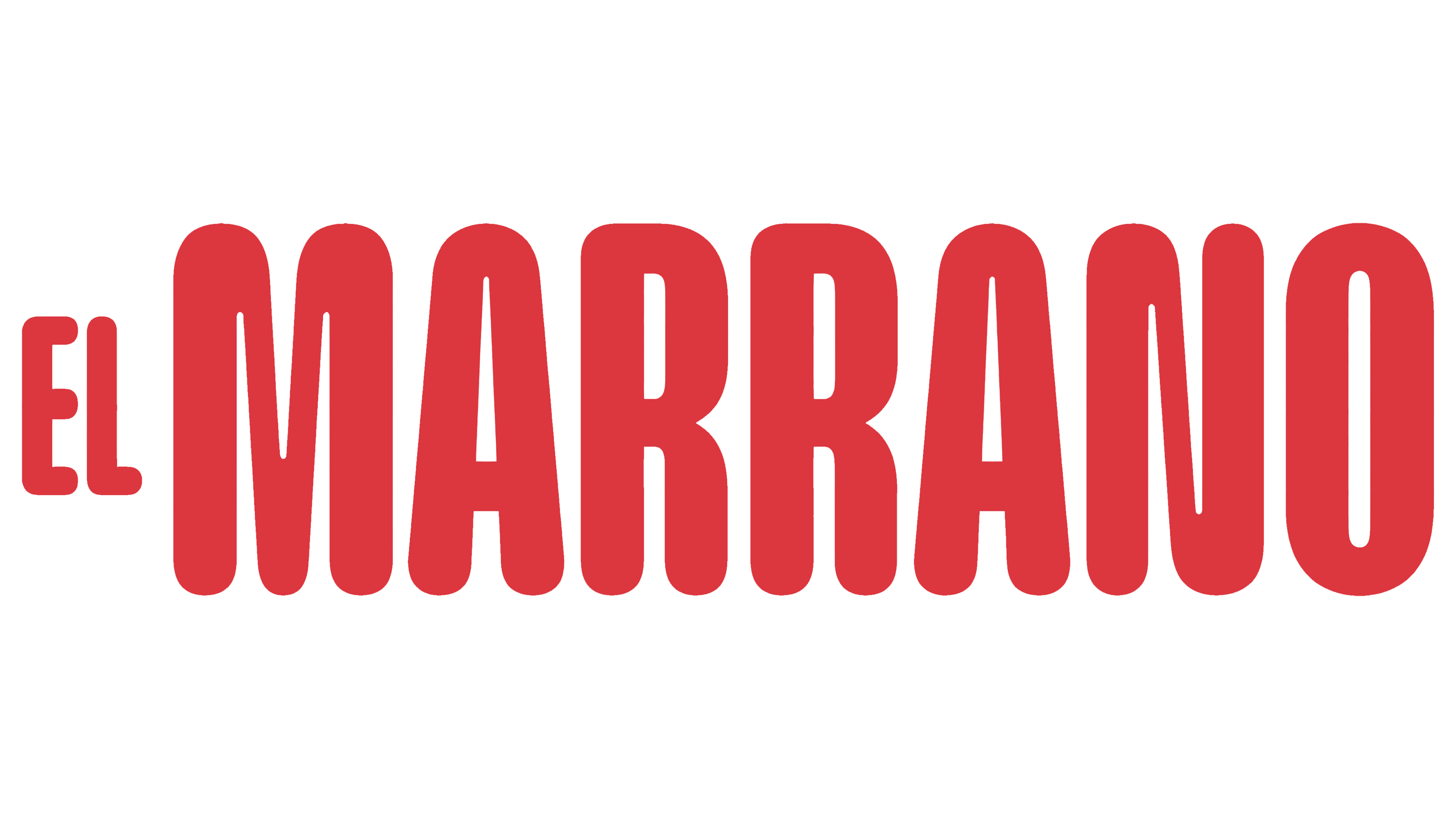
The new logo’s standout feature is a minimalist, stylized silhouette of a leaping pig, boldly rendered in vibrant red. The pig’s lively pose captures a sense of movement and energy, reflecting the company’s spirited, approachable vibe. A small, whimsical curl in the pig’s tail adds a friendly, cheerful note, balancing the bold design with a dash of charm. The playful detail mirrors the brand’s identity—grounded in tradition but full of life and joy.
The typography complements the logo with a thoughtful mix of contrast and cohesion. “EL” is a subtle introduction in a sleek, thin typeface. In contrast, “MARRANO” is set in bold, vertically stretched letters with rounded edges. The font hints at retro influence, nodding to the past while feeling fresh and relevant for today’s market.
The bold red palette evokes passion, warmth, and appetite—perfect for a food brand. Red is known to spark hunger, making it a natural fit for these flavorful offerings. Beyond that, the vibrant hue reflects the warmth and energy of Spanish culture, connecting the products to their origins.
The new packaging echoes the logo’s clean, bold style and is designed to stand out on shelves. Simple layouts, generous white space, and the striking red pig icon create a distinctive look. High-quality materials and subtle textures add a tactile element, reinforcing the premium quality of the products inside without overwhelming the minimalist aesthetic.

The packaging’s balance between tradition and modern design makes it truly special. It’s sleek and contemporary yet retains a sense of artisanal craftsmanship—the same care that goes into every product. The bold typography, vibrant colors, and playful logo combine to create a fresh brand identity while still honoring its roots.
The rebrand arrives at a pivotal moment as the company moves into new markets, starting with Italy. Founder Álvaro Morata, who has strong ties to Spain and Italy, dreamed of bringing the best Spanish cuisine to Italian tables. The updated identity supports this vision, helping the brand connect with new audiences while remaining true to its heritage.
Beyond the fresh look, the new identity reflects a mission to share Iberian cuisine’s rich, authentic flavors with the world. The bold design communicates a passion for quality and a commitment to traditional methods while embracing modern sensibility.