At El Pollo Loco, the logo is made in the national style – in red and yellow colors of a very bright palette. It carries a double meaning: it indicates the hot country of origin of the franchised fast food restaurant chain (Mexico) and the main ingredient of the menu (grilled chicken). At the top, the emblem has the shape of a wide-brimmed hat.
El Pollo Loco: Brand overview
El Pollo Loco is the name of an American chain of restaurants serving Mexican grilled chicken. Its founder is Juan Francisco Ochoa, who opened an institution in Guasave (Sinaloa) and Los Angeles, California. This happened in 1980. Since then, it has grown into a taste empire with 500 food outlets. They are especially popular in the southwestern part of the United States – in Costa Mesa. Both franchised and personal restaurants are decorated in a Mexican style, directly reflected in their logo. The fundamental principle of the American restaurant El Pollo Loco is its Mexican counterpart. In Mexico, a diner opened, serving grilled chicken with salsa and warm tortillas. The institution began to bring a good income in the first year, so its owner, Juan Francisco Ochoa, conceived the transfer to a neighboring country. He did not lose because, in the new place, he began to experiment a lot with the menu, creating a safe alternative to fatty, fried meat.
El Pollo Loco began in 1975 in Guasave, Sinaloa, Mexico, thanks to Juan Francisco Ochoa’s unique chicken recipe and grilling method. Five years later, the Ochoa family opened the first U.S. El Pollo Loco in Los Angeles, California, bringing their special flame-grilled chicken and Mexican-style sides to a wider audience.
The brand quickly became popular in California for its great food, fast service, and reasonable prices, leading to expansion across the Southwest in the ’90s. Significant changes came in the late ’90s and early 2000s, including new ownership that helped the chain grow even more. By 2014, El Pollo Loco had gone public, raising funds to expand and improve services.
El Pollo Loco has recently been updating its menu with healthier options, like antibiotic-free chicken, cauliflower tacos, and low-carb bowls, and modernizing its restaurant design. It’s also embraced digital technology for better customer service.
With over 480 locations, El Pollo Loco is a go-to for tasty, affordable Mexican food. Its journey from a single restaurant in Mexico to a major U.S. chain reflects its commitment to culinary innovation, quality, and adapting to consumer needs. Despite industry challenges, El Pollo Loco’s focus on flavor and service continues to drive its success.
Meaning and History
The experiments touched not only the cuisine but also the style to attract the American public. The result was the famous raised sign, the top of which resembles a Mexican and Texan hat.
Then, there was a series of restaurant transfers from owner to owner, contributing significantly to the menu and the emblem. Despite the frequent adjustments to the logo, it remained similar to the Mexican version because the parent company was still managed by the Ochoa family, who retained the first version of the identity. In the early 90s of the last century, the El Pollo Loco chain tried several concepts to become noticeable among serious competitors – KFC and Chick-fil-A. In total, she has five emblems.
What is El Pollo Loco?
El Pollo Loco is a franchised chain of fast food restaurants from Mexico. It was discovered in the USA in 1980 by the Ochoa family. Her specialty is grilled chicken marinated in citrus and quesadillas, enchiladas, burritos, tacos, and other national dishes. The network includes about 500 points. The head office is located in Costa Mesa (California).
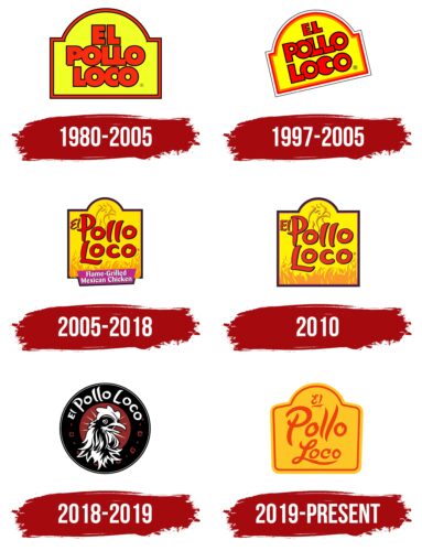
1980 – 2005
The logo looks like a label or label often used on products. Such an association arises from the raised top, which resembles a wide-brimmed Mexican hat. The emblem is painted neon yellow and complemented by a figure frame around the entire perimeter. In the center, there is a three-level inscription – the names of the restaurants aligned in the center. The font is bold and grotesque, with a dense arrangement of letters. They are all merged except for “EL.” The border and the text are red – the color of hot Mexican spices.
1997 – 2005
During this period, designers tilted the logo slightly and made it diagonal. They also changed the color to a warm yellow, separated the letters, and outlined them with a thin black line.
2005 – 2018
In 2005, another inscription appeared – wavy, reminiscent of a burning fire. The designers painted flames yellow to enhance this similarity and placed a chicken head at the top. They darkened the frame, and “El” was reduced and placed next to “Pollo.” Since then, the logo has used a lowercase font. At the bottom, the artists drew a purple rectangle indicating that the establishment serves Mexican chicken.
2010
In addition, there was a variant of the emblem without an advertising inscription at the bottom on a purple background.
2018 – 2019
As a result of experiments with visual identity, the El Pollo Loco logo has changed dramatically. The designers took the classic rondel as a basis – a round shape with a clear center and a strip along the edge. In general, the emblem began to resemble a seal. The colors have also been corrected: instead of bright red and yellow, a discreet palette appeared – black and brick. A realistic chicken head is drawn against their background. It is white, like the name of the restaurant chain. The inscription takes pride in place at the top of the wide ring.
2019 – today
The modern logo is an improved version of the emblems of previous years. It combines a bright yellow background, pointed letters resembling flames, a hat-like top, a three-level inscription, and a frame.
Font and Colors
El Pollo Loco has a common logo for the Mexican and American chains. Of course, there are some differences, but they are insignificant because the company from the USA was under the patronage of the founders, the Ochoa family, for a long time. Therefore, despite the division, the identity has a single style. However, a period of cardinal experiments ended with a return to the previous design. Such an icon emphasizes the soul and heart of the brand – signature chicken marinated with citrus and grilled. It is inextricably linked to the identity of Mexican restaurants.
The inscription in the emblem is not printed but drawn. This is a picture: all letters are handmade in an individual order. They are stretched up and slightly pointed to look like fire. The cult font is called El Pollo Loco. The palette is also associated with the flame-hot spices served with grilled chicken. They also resemble citrus fruits that are necessary for preparing a signature dish. Therefore, the predominant colors are red and yellow in several shades.
FAQ
What color is the El Pollo Loco logo?
The new El Pollo Loco logo has a fresh and modern look, featuring a red and black theme. They updated the chicken image to stand out and show the brand’s focus on chicken dishes. “El Pollo Loco” means “The Crazy Chicken,” and this new design connects with that name. They also created a new font for the logo to make it unique and show that the company is looking toward the future while still remembering its roots in Los Angeles. These changes help highlight El Pollo Loco’s promise to serve fresh, real Mexican-style food and show they’re always trying to be better and stand out in the restaurant world.
What is the El Pollo Loco slang?
“El Pollo Loco” means “The Crazy Chicken,” it’s a fun name that sticks in your mind, not just because it’s catchy but because it captures what the restaurant is about. Founded by Juan Francisco Ochoa, El Pollo Loco is known for its Mexican-style grilled chicken. They’re all about offering something special and different from your usual chicken place. The word “loco” (crazy) hints that their chicken is something unusual — tasty and prepared uniquely. This idea helps people remember them for the name and the delicious chicken they serve, making it clear they’re serious about making great food with a Mexican twist.
What is the history of El Pollo Loco?
El Pollo Loco’s story starts with a big dream and a love for fire-grilled chicken. In 1975, Pancho Ochoa, a young man from Guasave, Sinaloa, Mexico, decided to go all in on his dream. He sold everything he had to open the first El Pollo Loco in what used to be his shoe store. This move was more than just starting a restaurant; it was a leap of faith in his unique way of cooking chicken.
“El Pollo Loco” means “The Crazy Chicken,” showing Ochoa’s idea’s boldness. Starting with this first restaurant, El Pollo Loco grew into a famous chain loved for its special taste and Mexican-style grilled chicken. The original choice to open in a former shoe store marks how much Ochoa was willing to change his life for his passion. This beginning led to the growth of El Pollo Loco, not just in Mexico but also in the United States, sticking to its roots of authentic flavor and fire-grilling.
Does Mexico have Pollo Loco?
El Pollo Loco is a popular restaurant chain in Mexico, where it originally started. It has more than 50 locations in places like Mexico City and states such as Coahuila, Nuevo León, Michoacán, Sinaloa, and Tamaulipas, with a big focus in Nuevo León, with 28 restaurants. This shows that many people in Mexico enjoy El Pollo Loco’s food, especially their fire-grilled chicken, a big part of Mexican cooking. The chain has grown and spread across various regions, showing it can appeal to different tastes with its authentic, tasty, and freshly made Mexican-style grilled chicken. El Pollo Loco has kept growing in Mexico, sticking to its roots and adapting to what modern customers want.
Why is it called Pollo Loco?
“El Pollo Loco,” which means “The Crazy Chicken” in English, is a unique and catchy name that perfectly captures what the restaurant is about. Juan Francisco Ochoa started the first El Pollo Loco in 1974 in Guasave, Sinaloa, Mexico, kicking off a food revolution with his special Mexican-style grilled chicken. The name reflects the bold and adventurous spirit of its founder. Ochoa wanted to offer something different from the usual chicken dishes, using special ingredients and grilling methods to make his chicken stand out. The name “El Pollo Loco” draws people in and tells them they’re in for a special and flavorful meal different from anything else. This smart naming has helped the restaurant grow beyond its original location, becoming a favorite for many.
Does Pollo Loco use real chicken?
El Pollo Loco stands out because they use only fresh chicken in their recipes. Every day, a typical El Pollo Loco restaurant cooks up 147 whole chickens, and they make sure these chickens are always fresh, never frozen. But it’s not just the chicken that’s fresh. They also use 100% fresh cilantro, avocados, tomatoes, and hot peppers. This shows how much El Pollo Loco cares about the quality and taste of their food. They focus on fresh ingredients to make sure their meals are not only tasty but also healthy. This commitment to using fresh ingredients is a big part of what makes El Pollo Loco’s Mexican-style food authentic and high quality.
Is Pollo Loco chicken healthy?
El Pollo Loco’s fire-grilled chicken breast is a healthy choice, especially for lean protein. This dish has only 200 calories, making it a light but satisfying option. It’s low in fat, with 8 grams of total fat and just 2.5 grams of saturated fat. Plus, it has no carbs, which is perfect for anyone on a low-carb diet. With 34 grams of protein, it packs a big punch to help meet your daily protein needs. However, it does have 820 milligrams of sodium, so if you’re watching your salt intake, keep that in mind.
Overall, this chicken breast is great for anyone trying to eat healthily. It helps with muscle building and repair, supports weight management by keeping you full, and fits into various dietary plans. Remember to balance the sodium by eating other low-sodium foods throughout the day.
Is Pollo Loco only in California?
El Pollo Loco started in Los Angeles with a special Mexican-style chicken recipe that quickly became a hit. Thanks to a unique blend of citrus, garlic, and spices, it won over locals and grew there. Now, it’s not just a California thing; El Pollo Loco has almost 500 restaurants in 6 different states. This shows how much people love their food, which stays true to Mexican cooking traditions and uses fresh, high-quality ingredients. The fact that it has grown beyond California proves its success and appeal to a wide range of people while keeping the quality and taste that originally made it popular.
