


The modern automobile industry is characterized by two significant disadvantages: environmental damage and the non-renewability of the fuels used. As a result, the use of more affordable, environmentally friendly electricity, which was already used to power the first cars more than 180 years ago, has become relevant. The first modern mass-produced electric car was the GM EV1, introduced in 1996. Particularly popular models in this area include the Toyota RAV4 EV, ZENN, ZAP Xebra, General Motors EV1, Tesla, and others.
Electric cars offer several additional advantages, including reduced refueling costs, minimal environmental impact, low noise levels, improved traffic safety, greater reliability, and lower overall ownership costs. However, there are also drawbacks: an underdeveloped charging-station network, limited range, speed limits, long charging times, low load capacity, and the need to replace the battery every 3 years.
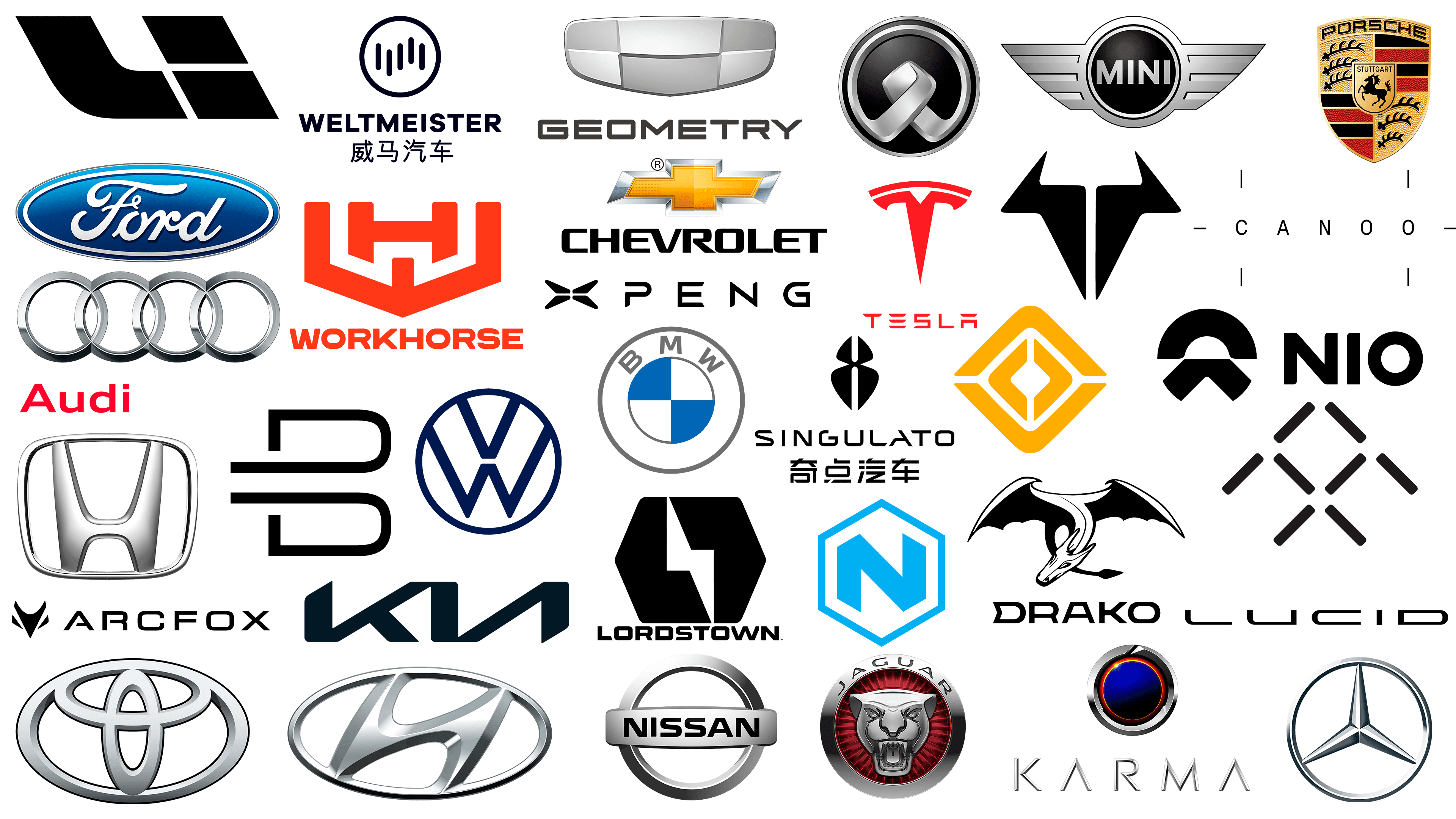
Lordstown Motors Corporation
![]()
The Lordstown Motors Corporation (LMC) is an electric-vehicle brand. It is located in Lordstown, Ohio, United States. Founded in 2018 by Steve Burns. The enterprise was created with the active participation of General Motors. The brand’s new electric car was based on the Workhorse W-15 model. However, issues related to the accusation of forgery that inflated pre-order figures slowed the process. A prototype of the Lordstown Endurance pickup truck was created. The brand’s logo is a black equilateral hexagon, separated by a symbolic white arrow representing an electrical discharge.
Tesla
![]()
Tesla, the American, world-famous manufacturer of one of the first modern electric cars, was named after Nikola Tesla. The brand was founded in 2003 by Martin Eberhard and Mark Tarpenning in Palo Alto, Santa Clara, California, USA. Today, the key figures are Elon Musk, Jeffrey Brian Straubel, and Ian Wright. The 2019 Tesla Model 3 sedan is widely recognized worldwide. The Tesla emblem is a stylized T in bright red. Its graphic design is presented as a schematic of the electric motor sector.
Karma Automotive
![]()
American electric car brand Karma Automotive was founded in 2014 in Irvine, California, following the acquisition of Fisker Automotive’s assets by China’s Wanxiang Group. In 2016, the Revero luxury sedan was launched. However, the model was discontinued in 2019 due to system failures. In 2021, a new GS-6 hybrid lineup and the all-electric GSe-6 were introduced. It includes the Karma GT luxury hybrid coupe, the all-electric Karma SC1 Vision Concept sports car, and a modified SC2. The Karma logo is an open ring, representing the constant pursuit of perfection inherent in nature. The sun’s spark symbolizes the endless renewal of energy.
Lucid Motors
![]()
Lucid Motors is another example of the American automotive industry’s focus on electric vehicles. Founded in 2007 in Newark, California, the brand became known for its Lucid Air premium sedan, originally called the Atieva Atvus. The company was founded and funded by the Chinese investment company Tsinghua Holdings. The brand unveiled its first production car in 2014. The logo’s style and graphics reflect tomorrow’s values. The brand name, set in an elongated black typeface, conveys a sense of perfection and strength while remaining elegant and modern.
Faraday Future
![]()
The American startup company Faraday Future was founded in 2014 by Jia Yueting, a businessman from China, in Los Angeles (California, USA). The name was a tribute to Faraday’s famous law of electromagnetic induction. In 2015, a new electric car project was announced. In 2016, the FF ZERO1, a single-seat sports car, was presented. In 2019, the first production crossover, the FF 91, was introduced. In 2021, the company merged with Property Solutions Acquisition Corp. The company’s logo consists of eight lines forming a slanted double-letter F within the visual space. The letter symbolizes the brand’s prospects, and the upward-pointing arrow signifies a commitment to continuous development and success.
Brammo
![]()
The American manufacturing brand Brammo was founded in 2002 by Craig Bramscher in Talent, Oregon, USA. The brand’s main products were electric motors, batteries, and electric motorcycles. As an automobile brand, the company became known for its Ultima Can-Am, an electric production car. The car was sold in kits with assembly instructions, allowing buyers to choose a model variant and assemble it themselves. The brand’s electric car models include the Enertia GT and a prototype, the Pro GT (Rogue GT), which is licensed from the Ariel Atom and features an exoskeleton. In 2015, the brand was purchased by Polaris Industries. At the brand’s founding, a ferocious bull’s head was chosen as the logo, which was later stylized to align with contemporary design trends.
Rivian
![]()
In 2009, R.J. Scaring founded Rivian Automotive, Inc. in Irvine, California, to manufacture electric vehicles. The brand’s lineup included sporty SUVs and pickup trucks. These vehicles were designed for both off-road and asphalt applications. In the future, the brand is preparing to develop an electric van. The project involves deploying a network of electric refueling stations. The compass inspired the logo, and the graphic design reflects this with four stylized arrows that symbolize the values and behaviors that inform any decision. It is rendered in an attractive, bright yellow color.
Workhorse
![]()
American manufacturing and technology company Workhorse Group Incorporated was founded in 1998 as AMP Electric Vehicles in Union City, Indiana, USA. Its founders are Stephen Burns and a group of investors. The company’s multi-purpose business includes electric vans for last-mile delivery, electric vehicles, and drones for cargo delivery. Following the 2013 acquisition of the assets of Workhorse Custom Chassis, LLC, the business changed its name from AMP Electric Vehicles to its current name. The brand’s emblem consists of two parts: a text block bearing the name in red and a bright red mark that combines the two letters of the name, W and H, rendered in a different font.
Nikola Corporation
![]()
Nikola Motor Company, an American company, was founded in 2014 to develop several electric car concepts. The brand, founded by Trevor Milton in Salt Lake City, Utah, USA, developed several designs over six years. In 2020, the company underwent a reorganization. In 2021, it introduced two Nikola Tre electric truck models. Litigation in 2021 led to a decline in production. The company developed seven electric truck models. Its logo was a large letter N with cut vertices inscribed in a regular hexagon. The mark was designed in a light blue corporate color.
Canoo
![]()
Canoo, a startup specializing in developing zero-emission vehicles, was founded in 2017 by Stefan Krause and Ulrich Kranz as Evelozcity in Los Angeles. The company adopted its current name in 2019, following the unveiling of the Canoo electric van prototype. After announcing the development of the MPDV (Multi-Purpose Delivery Vehicle) lineup, they teamed up with Hennessy Capital Acquisition. At the same time, preparations were underway to launch an electric pickup truck by 2023. The brand’s modern, concise logo is represented in the text version of its name by six bounding lines, which are repeated in the headlights of its models.
Drako Motors
![]()
Drako Motors, Inc., a young American company founded in 2013 by Dean Drako and Shiv Sikand in San Jose, California, has established itself as a manufacturer of luxury supercars. Among its offerings is the 2019 Drako GTE, a state-of-the-art electric car and four-door sport sedan. In 2021, the brand announced plans to develop a modernized Drako Dragon model. In keeping with its name and production direction, the brand has chosen a stylized image of a mythical dragon as the logo and the full company name as the text symbol. The horizontally elongated letters with the original black D are eye-catching.
NIO
![]()
The Chinese electric car industry is represented by NIO, a company founded in 2014 and headquartered in Shanghai. Its founder, William Li, is involved in launching several companies. The brand was introduced as a manufacturer of premium and smart electric cars. The brand’s first model was the NIO EP9 sports car, introduced on the company’s opening day. In parallel, the brand started launching battery stations. Since the beginning of 2021, the brand has expanded into the Norwegian market. The brand name is an English translation of the Chinese version, whose abbreviation has become an integral part of the logo. Translated as “blue sky,” it formed a sign whose upper part symbolizes the sky’s openness, a progressive vision of the future. At the bottom is the earth, action, direction, and forward movement.
Xpeng Motors
![]()
Xpeng Motors (originally Guangzhou Xiaopeng Motors Technology Co., Ltd.) is a Chinese manufacturer of electric vehicles. Founded in 2014, it is headquartered in Guangzhou and has an office in Mountain View, California, USA. The brand’s founders are Xia Heng (Henry Xia) and He Tao. In 2018, the first model, the XPeng G3 SUV, was released. The second, the P7 sedan, was released in 2019, with exports beginning in 2021. The lineup includes the XPeng P5 sedan and the G9 SUV. The brand logo consists of a stylized letter X and the name “PENG” in black. The letters are set in a modern, stylized electronic font.
Li Auto Inc.
![]()
Li Auto Inc. (Li Xiang), a Chinese manufacturer of modern electric cars, was founded in Beijing in 2015. The brand’s core business is the development and production of plug-in hybrid PHEVs. The company’s production unit is located in Changzhou. The company has released its flagship model, the Li Xiang One SUV. Its logo is a sign consisting of the two letters Li. The left-slanting graphic design and black color scheme make the sign easy to read and memorable. The letter “I” is formed from two figures placed one above the other, in the shape of slanted rectangles.
Weltmeister
![]()
Weltmeister is a Shanghai-based electric car brand founded in 2015 by Freeman Shen. The company launched its first model, the EX5, in 20018. The 2017 acquisition of the Chinese licensing company Polarsun Automobile enabled licensing of all passenger-type NEVs. The brand has two plants in Wenzhou and Huanggang. The list of models includes the E5 sedan, EX5 compact SUV, EX6 mid-size SUV, and W6 compact SUV. The centerpiece of the logo is the five dynamic, rounded stripes, symbolizing multi-lane driving. Its dynamism reflects not only the presence of artificial intelligence.
Geometry
![]()
Chinese car brand Geely created the Geometry car brand in 2019 to produce modern electric vehicles, or NEVs. The brand is focused on the domestic Chinese market, and its project aims to introduce 10 new model lines by 2025. All of them will be based on cars already developed by Geely. Among them, they have already announced the compact sedan Geometry A and the crossover EX3, both of which are based on the Geely Vision X3. The logo completely duplicates the shape of the Geely emblem, except for the color scheme. The inner sectors are staggered in light and dark gray.
Byton
![]()
Byton, a Chinese manufacturer of all-electric vehicles, was founded in 2017 in Hong Kong by Carsten Breitfeld and Daniel Kirchert. In early 2018, the brand unveiled its first concept, the Byton M-Byte SUV. In the same year, a luxury sedan concept car, the K-Byte Concept, was created. In 2021, the brand filed for bankruptcy, suspending all partnership agreements with Foxconn. The name was created as an acronym, “byte on wheels.” The logo design, which forms the visual identity of the letter B, was created from two identical elements that symbolize the brand’s two equally important directions: automotive and digital technology.
Arcfox
![]()
The Chinese automobile brand Arcfox was founded in 2017 in Beijing, China, by its parent company, BAIC Group. The brand’s mission was to develop and manufacture electric vehicles, passenger cars, and crossovers. The first model was the premium microcar, the Lite. Then, a large SUV, ECF, was prepared for Europe, and the second was a supercar GT in two versions: basic and Race Edition. The brand name consists of two parts, as reflected in its logo. ARC from “arctic” symbolizes courage and breakthrough, and FOX intelligence, grace, and secrecy. A stylized fox face and metallic gray are the basis of the logo.
Singulato Motors
![]()
Another Chinese brand, Singulato Motors, is also focused on producing eco-friendly NEV-powered electric vehicles. Founded in Beijing in 2014, the company combines and applies modern cloud computing technologies. The brand’s first electric vehicle was the Singulato iS6 mid-size SUV. In 2017, small-scale production was launched; in 2018, mass production began. Today, developments of the iM8 minivan and the iC3 city car are available. The brand uses a mark that is original in its execution, referring to the essence of the technological singularity, the moment when progress or development becomes so fast and complex that it is beyond comprehension.
Zinoro
![]()
BMW Brilliance launched Zinoro, a special brand of all-electric crossovers in China, in 2013. The brand name in Chinese is pronounced “Zhi Nuo,” which means “Promise”. In the same year, the first electric crossover based on the BMW X1 (E84) was launched, powered by a new energy source: the NEV. The vehicle has been available in Beijing and Shanghai since 2014. This year, license plates for the model were issued free of charge. The brand’s emblem is a circular sign featuring a central stylized image of intertwined hands, symbolizing the two companies’ commonwealth and demonstrating a commitment to designing cars that are caring and respectful toward their users.
Chevrolet
![]()
Chevrolet was founded in 1911 by Louis Chevrolet and William Durant, who created General Motors in 1908. Today, the brand is a trademark of General Motors, based in Detroit, Michigan. In line with industry trends, the brand began developing electric vehicles, launched the 2016 Chevrolet Bolt EV and Volt, and discontinued the Spark EV and Volt. The Bolt EUV and Bolt EV 2022 were announced. The Chevrolet emblem is known worldwide and is cruciform. The sign is gold with a silver border. Below is the brand name in black font.
Ford Motor Company
![]()
A famous American automobile manufacturer is the Ford Motor Company, founded in 1903 by William Ford Jr. in Dearborn, Michigan. It added all-electric and hybrid models to its lineup. Today, it produces the Ford Fusion Hybrid SE, Fusion Energi SE, C-Max Hybrid SE, and C-Max Energi SE. It recently discontinued several electric car models, including the Focus Electric and the 2017 Focus Electric. At the same time, the brand announced the development of the new Ford E-Transit 2022 and 5 variants of the electric Mustang Mach-E. The Ford logo remains unchanged at this stage: a traditional oval emblem with the company name in capital letters on a dark blue background. The emblem’s font and border are silver.
Porsche AG
![]()
Porsche AG is a German automobile manufacturer based in Stuttgart, Baden-Württemberg, Germany. It was founded by the Porsche family in 1931. The brand has opened the development and production of a new line of environmentally friendly electric cars. In 2019, the brand launched the all-electric Porsche Taycan. However, since 2011, the brand has produced hybrid models, exemplified by the Panamera S Hybrid and the 2014 Cayenne S E-Hybrid. The brand has an original logo that is memorable and recognizable. In the form of a heraldic shield, it features a central horse symbolizing strength and constant forward movement.
Mercedes-Benz
![]()
The German car brand Mercedes-Benz has been known since 1926, when the Benz and Daimler brands merged. The brand’s headquarters is located in Stuttgart. The company gained popularity thanks to luxury cars, buses, and vans. In addition, the company began to produce electric cars. The first in this category was the discontinued B-Class Electric Drive. Currently, the first all-electric crossovers, EQC and EQV (a passenger van), and the eVito (a commercial minibus) are being produced, and a new project for a compact hatchback, EQA, has been announced. The Mercedes-Benz logo is known worldwide as a three-pointed star enclosed in a circle.
BMW
![]()
Like many modern automakers, BMW, founded in 1916 by Karl Friedrich Rapp and Gustav Otto, develops environmentally friendly electric vehicles. The company is headquartered in Munich. Among the new direction vehicles, the company currently offers three electric cars: the BMW i3 hatchback, the Mini Cooper SE, and the BMW iX3 crossover. There are production i4 and iX models under development. The BMW logo is circular, with two circles inscribed within one another. The inner one is divided into four white-and-blue segments. The brand name is located on the outer circle.
Audi
![]()
Audi is a German luxury brand founded in 1909 by the engineer August Horch as Audi Automobil-Werke, which later merged with Auto-Union. Today, the brand, headquartered in Ingolstadt, is actively developing several lines of electric vehicles but is not in a hurry to abandon traditional directions. Today, the power model group includes several models: the E-Tron GT, E-Tron GT RS, E-Tron Sportback, and Q5 E-Tron. These models are also accompanied by the brand’s classic logo, featuring four intertwined rings that symbolize the four united manufacturers.
Volkswagen
![]()
The German “people’s car” was created by Volkswagen, founded in 1937 by Ferdinand Porsche, and is now headquartered in Wolfsburg. Having earned well-deserved trust in German quality, the brand has consistently sought to apply the latest technologies while maintaining the affordability of its products. The development of a new eco-friendly direction, electric vehicles, has also become a promising sector, to which the brand plans to allocate 42 billion dollars over the next two years. Today, the brand’s electric lineup comprises six models across various profiles, including both fully electric and plug-in hybrid variants. Another six models are in development. They are accompanied by the company’s traditional logo, two Ws enclosed in a circle.
MINI
![]()
The British MINI was granted trademark protection in 1959 under the British Motor Corporation. As a trademark, it was registered in 1969 following the 1968 acquisition of British Leyland. From 1986 to 2000, the brand was owned by the Rover Group. In 2000, following the sale of BMW’s Land Rover division to Ford in Germany, Mini became a Ford subsidiary. The brand first entered the electric car market in 2009. The current Mini Cooper SE addresses all shortcomings of the first variant. At the same time, the new hybrid SE Countryman All4 fully aligns with contemporary trends. The Mini emblem is an unfolded wing with a double round element, and the brand name is inscribed in black and silver corporate colors.
Nissan
![]()
Nissan Motor Co., Ltd, headquartered in Yokohama, is Japan’s largest automaker. It was founded in 1933 by Yoshiyuki Aikawa, Dan, Kenjiro, and William R. Gorham. By 2017, the brand was ranked No. 8 globally. Its new portfolio includes three electric models: the Leaf e+ with a higher-capacity battery, the 2018 Leaf with autonomous driving capability, and the e-NV200 van, which features advanced technologies from the popular Nissan Leaf. Five new developments in the models are announced. The brand has retained its traditional emblem: a silver circle crossed at the center by a plate bearing the brand name.
Honda
![]()
The Japanese automobile brand Honda Motor Co., Ltd. was founded in 1948 by Soichiro Honda and Takeo Fujisawa in Tokyo. The company’s production facilities are located in Japan, the USA, India, and Brazil. The brand ranks second globally in car production. By 2030, the company plans to shift 65% of its production to electric vehicles. The electric vehicle lineup includes:
- The all-electric Honda E.
- Clarity Plug-In Hybrid 2017 and the Accord Hybrid sedan.
- A hydrogen engine powers the 2017 Clarity Fuel Cell.
All are finished in silver color.
Toyota
![]()
Toyota, a leading Japanese automaker founded in 1937, is the world’s largest producer and seller of hybrid vehicles. Today, the company produces vehicles under five brands: Toyota, Hino, Lexus, Ranz, and Daihatsu. To date, Toyota and Lexus have announced plans to prepare 15 model lines of electric vehicles. The company, founded in 1937 by Kiichiro Toyoda, is now headquartered in Toyota City, Aichi. The company envisions a future in which transportation produces no harmful emissions. The company’s first electric vehicle was the 1997 Toyota RAV4 EV SUV. The 2021 Toyota bZ4X is the first mass-produced electric vehicle. The company’s founder selected the optimal logo: an image of the word “Toyota” rendered in katakana.
Jaguar
![]()
In 1922, William Lyons and William Walmsley founded Swallow Sidecar in Coventry (UK) to produce sidecars. After the war, the brand was renamed Jaguar. In 2012, the brand was discontinued. The brand was later revitalized as a division of the Indian brand Tata Motors, and in 2018, it introduced its first hybrid electric car, the Jaguar I-Pace. In the future, the renewed brand aims to transition entirely to electric vehicle production. As for the emblem, the brand has retained the latest version of the logo: a profile image of a grinning jaguar face in a dark green circle, set within a larger black circle with the brand name inscribed around the circumference. The rim of the circle, the font, and the jaguar are silver.
Hyundai
![]()
South Korean automobile manufacturer Hyundai Motor was founded in 1967 as a subsidiary of the Hyundai conglomerate headquartered in Seoul. As the largest automobile manufacturer, the brand ranks 4th globally. Naturally, an automobile brand of such caliber began to pay attention and develop a new direction for zero-emission vehicles powered by alternative energy sources. Today, the brand offers the IONIQ 5 hatchback, Ioniq 6 sedan, Ioniq 7 SUV, and KONA Electric, which are characterized by advanced technology and improved performance. The new models are marked with the brand’s traditional emblem: a stylized letter H slanted to the right, rendered in an oval. It symbolizes a handshake between two people.
Kia
![]()
In 1944, the Kia Corporation was registered in Seoul, the capital of Korea. Today, it is a subsidiary of Hyundai Motor Group. In light of recent developments and trends in the automotive industry, the brand has begun actively developing environmentally friendly technologies and implementing measures to reduce harmful emissions from its products. Today, the company offers seven promising electric car models, a strong signal of its commitment to moving in this direction. Especially impressive are the 2021 Soul EV and 2021 Niro EV models, as well as this year’s anticipated EV6. The new eco-friendly models can be identified by the company’s new logo, which lacks the traditional oval, and by the name text in a sportier, more aggressive font.
Aspark
![]()
The Japanese engineering company Aspark was founded in Osaka in 2005. Advanced technologies, robotics, and complex engineering challenges characterize the company’s profile. Among its various activities, the automotive project earned the brand international recognition. This refers to the Aspark Owl hypercar, whose development elevated the company to a global level. The electric Owl was presented as a production vehicle with extremely high performance figures, serving as a clear demonstration of the brand’s technical capabilities.
The logo is built on a combination of a symbol and the name. In the upper part, a group of curved shapes points upward, forming an abstract silhouette resembling the letter A. Volume is achieved through a gradation of blue color. The transition goes from a lighter shade in the upper area to a deeper blue at the bottom. A dark arc at the base connects the upper symbols. The name ASPARK is placed below the symbol. The lettering is set in uppercase in a modern, strict style, and the typeface resembles Gotham or Proxima Nova. The letters are dark, while the central A is highlighted in light blue. Its crossbar is curved and visually echoes the symbol’s lines.
Xiaomi
![]()
Xiaomi is a Chinese technology brand that entered the electric vehicle market in 2021. During that period, the company announced the launch of the Xiaomi EV division and formed a separate team with independent organization and financing. In the early years, specialists with automotive industry experience were recruited. The project involved engineers in aerodynamics, chassis development, electric motors, battery systems, and software. The brand’s first vehicle was unveiled to the public in 2023. It was the Xiaomi SU7 electric sedan. Production started a year later, after which the model entered the Chinese market.
The logo conveys Xiaomi’s technological focus and restrained style. Visually, it appears as a dimensional badge resembling a metallic button with softly rounded edges. The surface has a calm metallic sheen, enhanced by subtle shadows. This creates a sense of a cool and smooth material associated with machined metal. In the center, there is a black mark composed of the stylized letters “m” and “i”. Together, they form the abbreviation Mi. The letters are built on a strict geometric grid, with clean lines and rounded corners. In terms of style, the mark is close to technical typefaces such as DIN, while retaining its own visual identity and an impression of engineering precision.
Zeekr
![]()
The Zeekr brand entered the market in 2021 as a separate direction within the Chinese automotive group Geely. The company was established to operate in the premium electric-vehicle segment. The main emphasis was placed on modern technologies, digital features, and high-quality construction. Driver and passenger comfort plays a major role, along with the introduction of intelligent services. The first production model was the Zeekr 001 liftback. The vehicle received a modern exterior, a spacious interior, and a driving range reaching up to 700 kilometers on a single charge.
A restrained, neat presentation characterizes the Zeekr style. The mark is a square with a thin black outline. Inside is a simple symbol arranged vertically. In its contours, it remotely resembles a distorted letter Z stretched vertically. The image is perceived abstractly, leaving room for interpretation. Next to the mark is the name ZEEKR. The lettering is set in large uppercase sans-serif letters. The typeface is strict and modern, with even lines and calm proportions.
Fisker
![]()
Fisker was founded by designer Henrik Fisker, known for his unique approach to automobiles. The brand combines stylish design, advanced technologies, and environmentally friendly solutions. The company offers attractive, technologically advanced, and affordable electric vehicles. The flagship model is the Fisker Ocean electric crossover, developed in cooperation with Magna. The model is based on a modern electric platform, allowing efficient use of space and achieving a solid driving range.
The Fisker logo is a circular mark framed by a metallic border with smooth, three-dimensional lines. Inside the circle, a horizontal line divides it into two parts: an orange upper section and a blue lower section. Two vertical metallic lines with highlights and shadows run through the center. In the upper part of the circle, the company name “FISKER” is placed in large letters following the curve of the upper edge.
Euler Motors
![]()
Euler Motors is an Indian company operating in the electric commercial transportation sector. The main focus is on three-wheeled electric cargo vehicles for urban deliveries. Such vehicles are designed for dense traffic and frequent operation in congested areas. The key model in the lineup is the HiLoad. It is designed to deliver increased payload capacity, a respectable driving range, and reliable performance in challenging urban conditions.
The visual identity is centered on a logo bearing the name EULER. The name is set in a serif typeface. The letters are uppercase, with smooth transitions in stroke thickness. The typeface creates a sense of solidity and a classic, calm character. Above the wordmark is a symbol composed of three identical triangles. They are arranged vertically. All triangles are shifted to the right and are parallel, reading as a single figure. The composition evokes a stylized initial letter E from the name. The symbol’s outline may resemble a wing or an air current. A smooth transition from light gray to a darker shade adds volume and a soft sheen to the surface. The logo’s background is almost black. In the center, a soft glow creates a sense of depth and space.
Polestar
![]()
Polestar is a Swedish automotive brand that emerged from Volvo’s racing division. Over time, the brand became an independent manufacturer of premium electric vehicles. The project was developed in collaboration with Geely and Volvo Cars. The main focus is on modern technologies, a restrained exterior appearance, and an environmentally conscious approach characteristic of the Scandinavian school of automotive design. The first model was the Polestar 1 coupe, powered by a hybrid powertrain. The car was produced in limited numbers and demonstrated the new brand’s potential. Later, the company fully transitioned to electric vehicles and launched the Polestar 2, 3, and 4 models.
The logo is built on four wedge-shaped forms. They radiate outward from the center in different directions, forming a symmetrical composition. The shapes are elongated and feature sharp edges. Narrow gaps are preserved between them. The mark appears light and balanced. The color scheme is monochrome and based on shades of gray. Light and shadow are unevenly distributed across the forms’ sides. This approach creates a sense of depth and volume.
Arcimoto
![]()
Arcimoto is an American manufacturer of electric vehicles for urban transportation. The company operates in Oregon and produces compact three-wheeled electric vehicles. Such vehicles are intended for everyday urban use and short-distance travel. Arcimoto vehicles are suitable for personal travel, deliveries, and special service tasks. The main emphasis is on practicality, an environmentally conscious approach, and affordability. The key model is called the FUV. The name stands for Fun Utility Vehicle. The vehicle has two seats and a semi-open body design. The format is intended for straightforward use in urban conditions.
The brand’s logo is built around a stylized letter A. The shape is rendered in a silver color with a metallic sheen. Light reflections create a sense of volume. Lines resembling elongated wings extend outward on both sides of the letter. They are composed of segments in shades of blue with smooth color transitions. Due to the gradient, the surface appears smooth and visually similar to glass. Below the mark is the name ARCIMOTO. The lettering is set in uppercase letters with rounded corners. The stroke thickness is uniform throughout the form. The metallic tone and soft-light accents impart a sense of refined depth and completeness.
Proterra
![]()
Proterra is an American company that produces electric buses and components for commercial electric transportation. The manufacturer develops complete vehicles and also designs its own batteries, power modules, and energy storage systems. The equipment is intended for use in cities and large population centers, where reliable operation under constant load is essential. The core of the lineup consists of urban electric buses of various classes. They are designed for long mileage and support fast charging.
The Proterra logo is built around a green hexagonal mark. Inside is an abstract form composed of intersecting lines. In outline, it resembles the letter P, constructed along its edges. The arrangement of the lines creates a sense of closure and repetition associated with the theme of energy operation. Below the mark is the name PROTERRA. The lettering is set in uppercase, using a strict technical typeface. The letterforms are straight.
HiPhi
![]()
HiPhi is a Chinese high-end electric vehicle brand founded by Human Horizons. The brand focuses on developing smart, technologically advanced vehicles with an emphasis on human–machine interaction. The main focus is on digital features, unconventional engineering approaches, and a memorable exterior appearance. The brand’s first vehicle was the HiPhi X electric crossover. It demonstrated the direction of the brand’s development. Subsequently, the HiPhi Z and HiPhi Y models were introduced. They continued to evolve the established ideas and technical solutions.
The HiPhi logo includes the brand name and a symbol. The HiPhi wordmark is set in Latin letters with a unique form. The typeface is geometric, with uniform stroke thickness and unconventional details. The appearance of the letters creates a sense of technology and a futuristic mood. Next to the name is a symbol consisting of a vertical bar and two curved elements. The arcs are symmetrical and extend in opposite directions. The overall form resembles the Greek letter Φ. This shape is associated with balance and harmony.
Vinfast
![]()
VinFast is a Vietnamese automaker founded by the Vingroup conglomerate and focused on the global electric vehicle market. Initially, the brand produced vehicles with conventional engines. Later, the company fully transitioned to electric transportation. Today, the lineup includes models of various classes, from compact city cars to large family crossovers. The core of the range consists of the VF e34, VF 8, and VF 9 models.
The logo centers on the letter V and is composed of downward-sloping lines that gradually narrow toward the bottom. Varying line thickness creates a sense of volume. The shape is perceived as a recessed structure with perspective. Below the symbol is the name VINFAST. The lettering is set in large sans-serif letters. The typeface appears dense and solid. In style, it is close to modernist typefaces such as Eurostile and Microgramma, while maintaining a strict and composed character.
Einride
![]()
Einride is a Swedish technology company operating in freight transportation. The main focus is on electric autonomous vehicles and digital control systems. The company develops autonomous electric freight vehicles without a traditional driver’s cab. These vehicles are called Pod. Control is exercised remotely by operators and AI-based software. Physical human presence inside the vehicle is not required.
The brand identity is built around a simple mark and name. The symbol is placed on a black square background. Inside is a white curved line. In shape, it resembles a road or route. To the right of the symbol is the name Einride. The lettering is set in lowercase letters. The typeface is sans-serif, with clean geometry and rounded forms. It is close to modern typefaces such as Circular or Gotham Rounded.
Coggiola
![]()
Coggiola is an Italian automotive company with a long history in design and coachbuilding. The company was established in 1966. It was founded by Sergio Coggiola, who had previously worked with the Carrozzeria Ghia studio. Over time, Coggiola established itself as a design bureau specializing in concept development and low-volume body production. In recent years, the company’s work has focused on electric transportation. The main direction is to adapt body structures to electric platforms, integrate battery packs, and implement new engineering solutions for individual projects. Coggiola is more often perceived as an independent studio with a strong engineering focus rather than a mass-market car manufacturer.
The brand image is built on concise typography. The logo is a bright red COGGIOLA wordmark. The letters are horizontally stretched and designed in a unified style. The lettering was created specifically for the company and is not based on classic typefaces. In terms of mood, it conveys a technical, futuristic environment that reflects Coggiola’s orientation toward bespoke, technology-driven projects.
Ora
![]()
Ora is an automotive brand created by the Chinese conglomerate Great Wall Motors to produce mass-market urban electric vehicles. The brand focuses on affordable, modern cars for everyday travel. The approach combines new technologies with styling that references retro forms. The most well-known model is the compact electric car Ora Funky Cat. In China, it is sold under the name Good Cat. The model gained popularity for its distinctive design, modern features, and reasonable price.
The logo is designed as an oval with two openings. The upper opening is elongated and oval. The lower one is shaped as a small circle. The inner surface around the openings is black and glossy. Light reflects softly, creating a sense of depth. The outer contour is finished in silver. Smooth tonal transitions enhance the impression of a metallic surface. The name “ORA” is set in all caps. The typeface does not resemble common typographic solutions. The overall style suggests an industrial, conceptual approach aligned with the future automotive theme.
Quantron
![]()
Quantron is a German company operating in the zero-emission commercial transportation sector. The brand emerged from the Haller Group and, over time, became an independent market player in electric and hydrogen-powered vehicles. The primary activity is converting diesel-powered trucks and other commercial vehicles to electric or hydrogen-powered models. At the same time, the company develops its own buses, trucks, and vans designed from the outset for alternative energy sources. The work is carried out in two directions. One is related to battery systems. The second is based on hydrogen fuel cells.
The Quantron logo is executed in a blue-and-white color scheme. On the left is a stylized shape resembling a horizontally stretched oval with a solid frame and rounded corners. A small separate symbol is added in the lower part. This detail associates the form with a digital screen or a generalized vehicle silhouette. Such an image corresponds well with the company’s field of activity. The name “QUANTRON” is set in uppercase. A strict typeface is used.
Leapmotor
![]()
Leapmotor is a Chinese automotive company operating in the electric transportation industry. The brand was founded in 2015 and has focused on in-house development since its early years. The company seeks to control key stages of vehicle creation. Within a single cycle, platforms, electric drivetrains, electronics, and software are developed. This organizational structure helps maintain consistent quality, reduce costs, and introduce new technologies more quickly. The vehicle lineup is aimed at the mass consumer.
The logo includes a symbol and the company name. The symbol is rendered in black and is composed of vertically elongated elements. They represent the letters L and P, which are associated with the name Leapmotor. The entire composition is arranged in a neat hexagonal structure. Below the symbol is the name LEAPMOTOR. The lettering is set in large sans-serif letters. The typeface has smooth lines and soft corners. It is similar to industrial typefaces such as Microgramma or Bank Gothic, reinforcing the image of a modern, technology-oriented company.
Bollinger Motors
![]()
Bollinger Motors is an American automotive company founded in 2015. The manufacturer focuses on highly durable electric vehicles designed for harsh operating conditions. The brand first gained attention with the B1 SUV and B2 pickup concepts. Both models featured simple and robust construction, fully electric layouts, and aluminum bodies. The forms are angular, and the platform uses a flat modular architecture. In the central section, a pass-through tunnel enables the transport of long items, including boards and pipes.
The Bollinger Motors logo includes a symbol and the company name. The symbol consists of two identical shapes resembling right-pointing angle brackets. The elements are positioned vertically, one above the other, with a small gap between them. Together, the form reads as an abstract letter B. Below is the name BOLLINGER MOTORS. The text is set in uppercase letters and enclosed between two horizontal lines above and below. This treatment creates a sense of order and rigor. The typeface is technical and monospaced, stylistically close to industrial typefaces such as Microgramma Bold Extended.
Tevva Motors
![]()
Tevva Motors is a British company that produces electric and hydrogen-powered trucks. The manufacturer produces medium-duty vehicles for urban deliveries and regional routes. The vehicles are intended for frequent and intensive operation. The main distinguishing feature of Tevva trucks is the combination of batteries and a hydrogen fuel cell. This increases driving range and reduces dependence on long charging stops.
The brand identity is built around the name TEVVA. The wordmark is set in a custom typeface with softly rounded forms. The letters have uniform stroke thickness and strict geometry. The final letter A is designed unusually. Instead of a conventional crossbar, a small orange circle serves as a subtle accent.
E.GO Mobile
![]()
e.GO Mobile is a German startup from Aachen operating in the field of urban electric transportation. The company develops compact electric vehicles for everyday travel in dense city environments. The core concept focuses on practical, economical transportation suitable for narrow streets, frequent maneuvers, and low operating costs. The company’s main model is the e.GO Life. The vehicle is a compact, three-door electric car. Its construction uses an aluminum frame and plastic body panels.
The logo is presented as the e.GO wordmark, executed in a restrained and tidy manner. The letterforms are nearly square and feature smoothly rounded corners. As a result, the wordmark appears both strict and friendly. The color scheme is based on black. The only accent is a small square stroke beneath the letter e. The name can be read as “eGO” or “e.GO”, underscoring the association with electric transportation and a modern urban identity. The letterforms and their arrangement support a sense of technical simplicity, openness, and a clear, accessible approach.
NEVS
![]()
NEVS is a Swedish automotive company established in 2012 from the assets of the bankrupt Saab Automobile manufacturer. The company operates in Trollhättan, where Saab vehicle production was previously located. NEVS gained access to factories and engineering developments and subsequently focused on electric transportation and urban mobility solutions. The first models were built on a reworked Saab 9-3 platform with an electric powertrain and updated components.
The logo displays the short name “NEVS” in a custom typeface. The letters are rendered in black, with thin strokes and softly rounded terminals. Due to its form, the wordmark appears modern. The typeface is reminiscent of techno and futuristic grotesques, such as Neuropol or Qanelas Soft.
Volta Trucks
![]()
Volta Trucks is a manufacturer of electric trucks, developed in collaboration with specialists in Sweden and the United Kingdom. The company develops freight vehicles for operation in urban environments. The main objective is to reduce harmful emissions, improve safety, and simplify everyday operations in large cities. The company’s flagship product is the Volta Zero electric truck. The model was designed from the ground up and is not based on existing platforms.
The brand presentation is built on restraint and engineering logic. The mark is executed as a two-line wordmark. The upper line reads “VOLTA,” with “TRUCKS” placed below. Both words are set in uppercase. The letters are vertically elongated and have slender proportions. The typeface is neat. The black color emphasizes the company’s practical focus related to modern urban freight transportation.
Aiways
![]()
Aiways is a Chinese automotive company founded in 2017. From the outset, the brand was oriented toward international markets, with Europe as a primary focus. The company emphasizes affordable electric vehicles that meet environmental standards, offer comfort, and prioritize practicality. The model range is based on the proprietary MAS platform. It is modular, allowing the creation of different vehicles on a single technical base. Aiways brought the U5 crossover to market, its first successful model outside China, and later introduced the sportier U6, aimed at a younger audience.
The logo consists of a symbol and the company name. The upper part is composed of five elongated shapes with rounded edges. The arrangement of the elements loosely resembles the letter H. On the sides are two groups of two shapes, with a fifth element in the center connecting them. Below is the name AIWAYS. The wordmark is set in large uppercase letters. The typeface features rounded line connections and a strict structure. It is closely associated with the techno aesthetic and is characterized by modern industrial typefaces such as Eurostile or Orbitron.
Ola Electric
![]()
Ola Electric is an Indian company within the Ola Group that operates in the electric transportation sector. Its main focus is on two-wheeled vehicles. The brand was created to make electric scooters accessible to a wide range of users and to accelerate the transition of Indian cities to cleaner modes of mobility. To achieve this, the company built the large Futurefactory plant in Tamil Nadu. The facility is designed to produce a high volume of electric scooters and batteries and to provide a full production cycle on a single site. The best-known product is the Ola S1. The scooter features a modern design, a solid driving range, and advanced technical features.
The logo is designed as a two-word wordmark on a bright green rectangular background. The upper part features the name OLA. The letters are large and bold. The letter A is shaped as a simple triangle without a horizontal crossbar. Below is the word ELECTRIC. It is set in a thinner typeface with vertically elongated proportions. The overall image remains simple and modern, conveying the company’s focus on accessible electric transportation.
Sono Motors
![]()
Sono Motors is a German startup founded in 2016. The company offers its own approach to urban electric transportation. The core idea is to integrate solar energy into the vehicle body. The car can partially recharge its battery autonomously and rely less on plugging in. The main development was the Sono Sion electric vehicle. It is a compact urban minivan with a surface covered in solar panels. In daylight, they recharge the energy reserve, allowing the car to travel additional kilometers without conventional charging. This format makes the vehicle convenient for everyday city use.
The Sono Motors mark is built on a very simple form. At its core is a thin ring symbol with a small black dot in the center. The composition is perceived as a reference to an energy source and a focus on the company’s key idea. On the sides is the name SONO MOTORS. The lettering is set in black uppercase letters. The letterforms have geometric outlines and softly rounded lines. In terms of style, the typeface is similar to techno fonts such as Neo Sans.
Rimac
![]()
Rimac is a Croatian automotive company founded by Mate Rimac in 2009. In a relatively short time, the brand became known worldwide for its electric vehicles and automotive engineering. The primary focus is on developing electric hypercars. The first major project was Concept One, which drew attention for its specifications and acceleration performance. Subsequently, the Rimac Nevera production model was introduced. The vehicle is equipped with four electric motors and a carbon-fiber load-bearing structure.
The logo includes a symbol and the company name. On the left is a shield with a pointed lower section and a smoothly rounded upper line. Inside is the letter R. It has angular, sharp edges. The RIMAC wordmark is set in a custom typeface that evokes a techno-industrial style. Individual letters feature unconventional construction. In the letters R, M, A, and C, familiar character parts are omitted, giving the wordmark a distinctive appearance. This lettering emphasizes the company’s focus on technology, engineering experimentation, and the development of next-generation electric vehicles.
Lightning eMotors
![]()
Lightning eMotors is an American company operating in the electric commercial transportation industry. It was founded in Loveland, Colorado. The main activity involves converting vans, school buses, and special-purpose vehicles to electric power. The company focuses on retrofitting existing vehicles and developing new electric models in cooperation with major manufacturers.
The symbol appears as a black ring broken diagonally. In the breaks, green arrows point in different directions. They are elongated and sharp. The composition is associated with the exchange-and-energy-use cycle. The name Lightning eMotors is placed to the right. The top line displays the word “LIGHTNING”. It is set in large sans-serif letters. The typeface is strict and clean. Below is the word eMOTORS. The first letter e is lowercase and rendered in green, matching the arrows’ color. The remaining letters are black, thinner, and more loosely spaced.
Lightyear
![]()
Lightyear is an automotive company from the Netherlands, founded in 2016. The company develops electric vehicles that can partially recharge using solar energy. The project aims to reduce the car’s reliance on charging and increase its driving range through solar power. The main development is the Lightyear 0 model. It is a production vehicle with solar panels integrated into its body. The panels help recharge the battery while parked and while driving.
The Lightyear mark uses a black-and-white color scheme. On the left side, three black lines stretch diagonally upward to the right. The lines have a soft curvature and resemble the flow of air or light. The central line is larger than the other two. On the right is the Lightyear wordmark. It is set in a geometric typeface with rounded forms. The first letter is uppercase, with the remaining letters lowercase. The typeface is close to fonts such as Helvetica or Google Sans.
Video