


![]() Ellesse Logo PNG
Ellesse Logo PNG
The businesslike, strict style of this company’s identity suggests it offers serious offerings. Indeed, the Ellesse logo is practical. At the same time, it is soft because it consists of smooth lines and curves. The key factor in its success is convenience, as it specializes in sportswear.
Ellesse began in Perugia, Italy, in the late 1950s. Its founder, Leonardo Servadio, came from a family that ran a textile shop and grew up around fabrics and fashion. A keen skier, he saw a gap in ski clothing: most available gear was either uncomfortable or lacked style. In 1959, he opened a small atelier and started making fitted ski pants designed for active use.
Local support helped the brand grow, and in 1966, Servadio opened a full factory. By the end of the 1960s, the Leonardo name was known across Italy in ski apparel. The brand name Ellesse came from his initials, L and S, pronounced in Italian as “elle” and “esse.” Its half-ball logo, inspired by a ski slope’s side profile, became one of the brand’s most recognizable features.
In the 1970s, Ellesse entered the tennis market, entering a field where Fila and Sergio Tacchini were already strong. The brand brought a more fashion-led view of sportswear and introduced pieces such as a tennis skirt with built-in shorts. Chris Evert wore Ellesse on court, giving the label visibility at major tournaments.
The brand expanded internationally in the 1980s, opening offices in the UK and the US. In Britain, Ellesse became linked to football casuals, alongside Fila and Sergio Tacchini, through anoraks, polos, and knitwear. In 1994, Pentland Group acquired the brand. After losing visibility in the 2000s, Ellesse returned in the 2010s as retro sportswear gained renewed interest across European streetwear.
Meaning and History
![]()
The name Ellesse is derived from the combination of the words “ELErra” and “SErvadio.” Elerra is the city where the sportswear manufacturer is based. At the same time, Leonardo Servadio opened the first Ellesse store in 1959 to sell men’s stretch-knit trousers.
In the 1970s, the brand introduced a line of tennis apparel that was revolutionary for its use of color, as tennis players had previously worn only white. During this time, the famous logo was created, featuring a semicircle composed of three segments. Two symbolic colors were used:
- Orange represents the brightly shining sun;
- Red symbolizes a passion for sports and active recreation.
With enough imagination, the semicircular shape could be seen as half of a tennis ball connected to sharp-edged skis. This connected the two sports for which the company produces equipment. The original emblem and the elegant wordmark have undergone several redesigns.
What is Ellesse?
This Italian sports brand has gained international recognition for its tennis and ski apparel. Italian flair and functionality combine in sports and casual wear design, particularly in its signature tracksuits, jackets, and tennis polos. The skillful fusion of modern streetwear trends with its sports heritage has attracted a younger audience and boosted its popularity. The brand actively collaborates with renowned athletes and designers, emphasizing a unique style that blends Italian aesthetics with the practicality of sportswear.
1959 – 1968
![]()
The first logo was quite detailed. He proposed the company’s name, the founder’s name, the place of work, and the direction of the company’s activities.
Servadio decided to immortalize his name in the emblem by placing the initials “L&S” in the center of the composition. On the sides, from top to bottom, there is a transcript with the businessman’s name and surname. The information seemed to be placed within the walls created by Leonardo and Servadio’s words. They formed a kind of defense, indicating that the brand’s idea was born and grew in the founder’s heart and is the product of his work alone. As fame grew, the fashion designer’s first and last names were removed from the sides.
At the head of the logo was: “prodotto italiano di fine artiqianato sartoriale” (Italian product, fine tailoring). The inscription focused on selling not just sports goods but designer items. The lower part of the emblem reinforced the effect: “sale of products made from fine fabrics” (creazione commercio tessuti pregiati). All phrases created the feeling of a special offer, a design masterpiece, a new sports fashion.
The composition was concluded with the name of the street (Corso Vannucci) and the city (Perugia) where the studio was located. Such an emblem was both a business card and an advertisement for the product.
1968 – 1975
![]()
New production facilities in Eller were launched. Tailoring in large quantities, popularity, and fame required a rethinking of the logo. It is much easier than the first one. All explanatory inscriptions were removed as the brand became recognizable. Only one word remained on the emblem: Ellesse, a derivative of the combination “L&S.” Servadio combined the Italian pronunciation of the letters L (elle) and S (esse), giving the company its modern name. The central letter is common to the two parts and links the initials. The new name added style to the brand.
To keep the focus on the design work, the logo is presented as a work-in-progress layout. The lines in the background are like guides to indicate the center, top, and bottom of the pattern. They also look like ski tracks. The pre-drawn feel is enhanced by the lack of color and the use of a simple pencil for all elements. The inscription demonstrates the process of creating new works, which begins with a sketch.
The lack of a capital letter fits perfectly with the spirit of the outline. The brand is still seeking new development ideas and implementation strategies. It serves sports and athletes. Therefore, attention should focus not on the name but on the wearer’s convenience and personality.
The letters that make up the initials (l and s) are highlighted with a beautiful print formed from different variations of machine stitches. This demonstrates the combination of the factory’s sewing machines and the fashion designer’s elegant ideas. The remaining letters that form the pronunciation are indicated schematically.
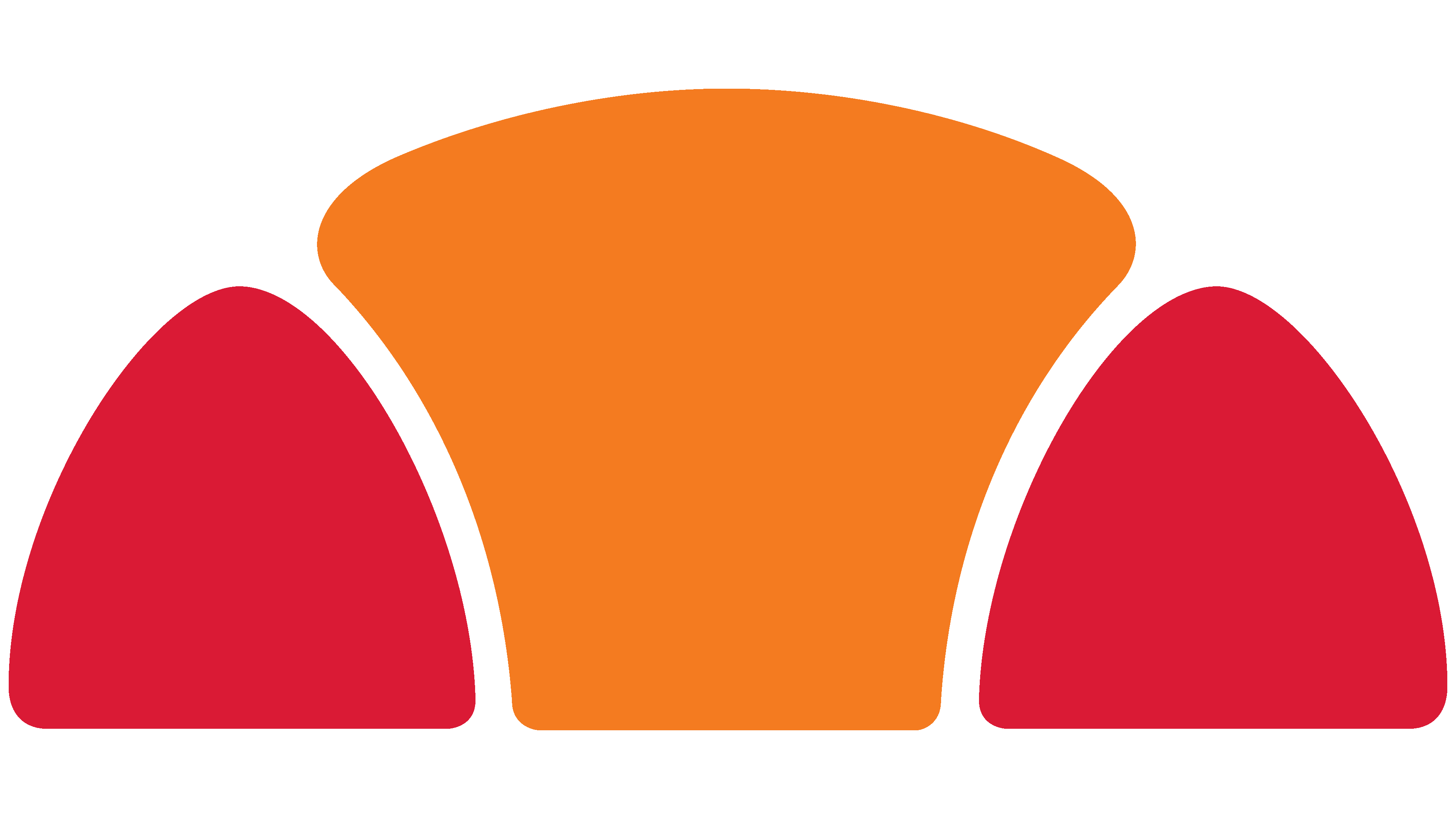
1975 – 2006
![]()
In the 70s, tennis-player items were added to the range. It was then that the idea of a visual image emerged, supplementing the name. It combines elements of tennis and skiing: a half-ball with sides painted to resemble ski tips.
The image was placed above the “esse” segment. In height, it was equal to the tops of the letters L. This made the logo complete and harmonious. The ball and skis seemed to take off because of the word, showing that the brand has succeeded in these directions. The image’s title and border are dark blue. This is a shade of experience and confidence, a symbol of intense regular training.
The composition was ideal for placement on clothes and distinguished all the designer’s suits, which Pentland actively exported to a British audience.
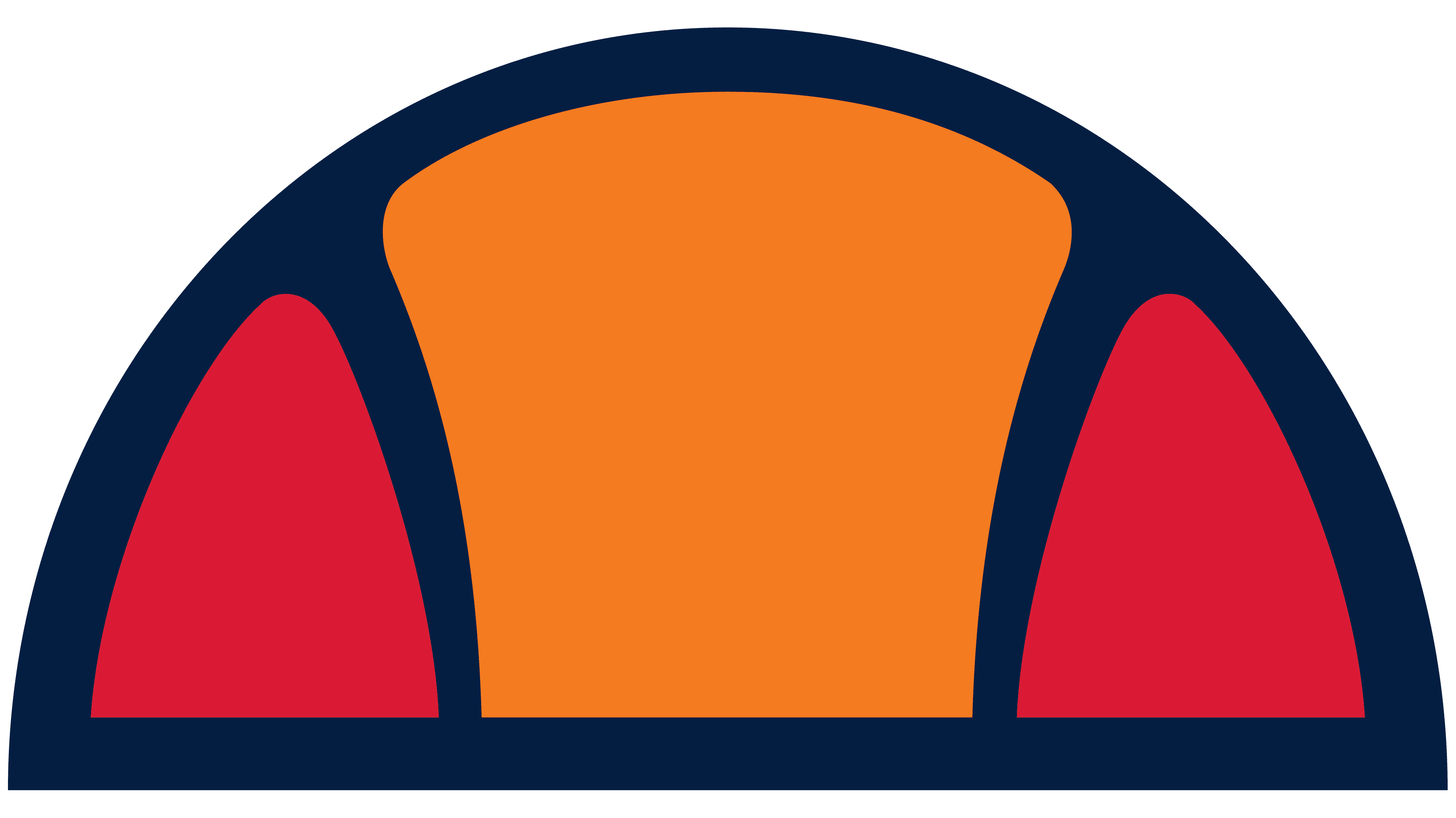
2006 – 2010
![]()
In 1994, Pentland, which had been the brand’s distributor since 1981, bought Eless, leaving Servadio with a 10% stake. The fashion designer had already retired and agreed to transfer the brand to his permanent major partners for further development, who have promised the company a long life.
The new owners lightened the visuals by removing the dark blue border. Instead, all parts of the compound hemisphere were demarcated with white lines, and each ski triangle and the ball’s central part were rounded, giving the pattern a soft, friendly look. The new version of the image supported the impression of flight, giving the brand the freedom to grow and expand.
The hemisphere’s share of the whole world has become smaller. It fits over the double S. The division of the sphere and the doubling of the letter indicate the two main sports the brand focuses on. Reducing the size also demonstrates the subject’s expansion. The company actively collaborates with fashion designers to create branded items for sports and everyday wear.
The title is in light grey. The word Italy has been added below to emphasize the country of origin. The designation helped Pentland integrate Eless into its family of British brands and highlight the overseas manufacturer to local buyers.
The spacing between the logo’s petals, the light colors, and the increased spacing between the letters created a sense of space and lightness, hinting at globality, elegance, and sales growth. Light gray, cold shades evoked snowy mountains, and half of the ball resembled a rising sun, foreshadowing a new dawn for the brand.
2010 – 2020
![]()
In honor of the 50th anniversary, the brand released a special Ellesse heritage collection featuring the most popular models from past years and slightly updated the logo.
Rebranding touched the logo palette. The Ellesse lettering is now rich gray, and the ski triangles are closer to crimson. The word “Italy” was removed since the brand is known worldwide and has long been owned by an English concern.
2020 – today
![]()
This Ellesse logo is very similar to the original from the 1970s. The only difference is that the semicircular ball has a darker and more saturated color scheme that meets modern demands. The emblem shows that bold colors, extravagance, and the ability to stand out in a crowd are currently in vogue. The brand name is located in the same place as before, under the semicircle, directly above the doubled “ss.” It still uses a contrasting serif font similar to BODIDLYbold Medium from Lorvad, Kremlin Chairman Bold from Bolt Cutter Design, or Standard Poster Regular from ParaType.
Font and Colors
Primary colors of the logo:
- Red – passionate, bright. Demonstrates the fashion designer’s love for skiing, which captivated him and allowed him to create world-famous models. It is also a symbol of superiority (the brand was created with ski suits in mind).
- Orange – sunny, warm, active. Represents light summer clothes for playing tennis.
- Gray – reliable, constant, measured. This shows that the brand continues to develop systematically and confidently. It has a solid foundation and a fan base in the sports world.
A rounded font was used for the name, similar to Broadway TS Regular. The letters resemble tennis balls, and the two L’s are ski poles. The bolder middle sections of the letters end in graceful, thin lines that reflect the blend of sports themes and design developments.