Ergo: Brand overview
ERGO originated in 1997 as a subsidiary of Munich Re, a well-known reinsurance company based in Germany. The company was born out of the merger of three different insurers – Hamburg-Mannheimer, Victoria, and D.A.S. – with its operating base in Düsseldorf. As a universal insurance company, ERGO serves both individual and corporate clients.
During its formative years, ERGO expanded beyond Germany, covering significant European territories: Poland, Spain, Austria, and Greece. In 2009, in order to create a sense of unity and coherence among the various European subsidiaries, ERGO developed a unified corporate identity, including a name and logo.
In the following years, ERGO strengthened its position through strategic acquisitions of smaller insurance companies in Germany and abroad. ERGO currently operates in more than 25 countries in Europe and Asia and employs around 40,000 professionals.
ERGO’s portfolio includes life, health, property and casualty, legal, and pension products. As of 2022, premiums collected amounted to €20 billion, and policy payouts amounted to €15 billion. Operating under the umbrella of Munich Re, ERGO remains a dominant player in the German insurance market.
Meaning and History
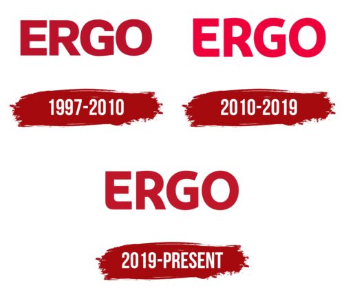
1997 – 2010
2010 – 2019
2019 – today
One of the European leaders in insurance chose a simple logo with its own name. The text emblem has not lost its appeal as it serves marketing purposes and successfully promotes the company’s name. This is facilitated by large glyphs, thanks to which the name is memorable. The font is unique, especially the letter “E,” which has a sharp upper left corner and a rounded lower corner. This mix of styles speaks of the insurance company’s flexibility and its desire to understand the needs of its customers without taking risks. All other letters also have smooth outlines. All letters are typed in bold upper case.
The sharp and rounded edges of the letter “E” seem to mix sharpness with convenience. Bold capital letters are reminiscent of a confident voice that can be trusted but is not too loud. It’s like talking to a good friend; it is easy to understand and memorize.
Ergo color codes
| Safety Red | Hex color: | #bf1528 |
|---|---|---|
| RGB: | 191 21 40 | |
| CMYK: | 0 89 79 25 | |
| Pantone: | PMS 185 C |
