


![]() Ermenegildo Zegna Logo PNG
Ermenegildo Zegna Logo PNG
The fashion industry is unpredictable. The Ermenegildo Zegna logo is simple and functional, free of decoration. Its straightforward lettering carries a sense of individuality. It reflects the brand’s distinctive approach to familiar things. The clothing is designed for people with diverse styles and ways of life, yet always with a personal touch.
Ermenegildo Zegna founded Lanificio Zegna in 1910 in Trivero, Piedmont, starting with four looms. The Biella region offered soft water suited for wool processing. From the outset, Zegna aimed to compete with British fabric makers, combining their techniques with traditional methods and sourcing high-quality wool globally.
By the 1920s, the workshop had grown into an enterprise with over 700 workers. In the 1930s, Zegna traveled across Australia and South Africa to secure raw materials. By 1938, fabrics were sold in the United States, and by 1945, distribution covered more than forty countries.
After he died in 1966, leadership passed to his sons, Aldo and Angelo. In 1968, the company entered ready-to-wear production, opening facilities in Novara, Spain, and Switzerland, while expanding its retail network across Europe and the US.
In 1972, Zegna introduced Su Misura, a made-to-measure service. The first branded store opened in Paris in 1980, followed by Milan in 1985 and New York in 1989.
During the 1990s, Gildo Zegna and Paolo Zegna focused on reducing production time and building a vertically integrated supply chain, from sourcing wool in Australia and Mongolia to retail.
Expansion continued with the acquisition of Lanerie Agnona in 1999, entry into fragrances in 2003, and the purchase of Tessitura di Novara in 2009. In 2018, Zegna acquired Thom Browne, competing with brands such as Brioni.
In December 2021, Ermenegildo Zegna Group went public on the New York Stock Exchange through a SPAC deal valued at $3.2 billion, with the family retaining a 62% stake. In 2023, the group secured a license for Tom Ford Fashion.
Meaning and History
![]()
What is Ermenegildo Zegna?
It is an Italian fashion house named after its founder and owner. It specializes in producing clothing, accessories, and fragrances for men who are confident in their irresistible attractiveness. Using innovative technologies, the brand skillfully combines classic style and innovative design, creating comfortable, durable, and lightweight fabrics from high-quality wool.
1950 – 1984
![]()
From the early days, the Ermenegildo Zegna logo emphasized the company’s formality and status. Its first version combined classic principles with restrained elegance, expressed in every symbol.
At the top, the word “Cloth” appears, set in a refined serif typeface with an antique character, closely resembling the Didot and Bodoni families. The letterforms are thin and graceful, evoking associations with refinement and high quality.
Below it sits the brand name “Ermenegildo Zegna,” rendered in a heavier typeface that visually echoes the upper lettering while standing out due to its larger size.
The composition is completed by a heraldic emblem placed beneath the name. It resembles an old circular seal with a decorative border and wavy edges. In style, it recalls an award given for first place. At the center is a shield featuring a heraldic lion and a crown, symbols traditionally associated with prestige and heritage. Around the shield, the brand name appears in uppercase sans serif lettering. The final elements of the composition are two ribbons that descend symmetrically from the base of the seal.
1975 – 2021
![]()
Starting in 1975, the Ermenegildo Zegna logo changed. Abandoning the previous decorative elements, the company retained only the restrained wordmark “Ermenegildo Zegna.” The lettering uses the same typeface as the earlier version, with the letters’ style and form left unchanged.
The company moved toward simplification. The coat of arms, seal, ribbons, and secondary inscriptions were removed. Emphasis on the name highlighted the brand’s formal, restrained nature.
Minimalism reinforced Ermenegildo Zegna’s classic identity and its alignment with the highest product standards.
2021 – today
![]()
The current version of the Zegna logo has changed, becoming even more minimal. The name is now shorter and reads “ZEGNA.” The brand adopted a concise single-line wordmark set in uppercase letters.
The new typeface remains serif-based, rooted in antique traditions and reinterpreted through a modernist lens. The letters appear formal and well-proportioned. The logo color is black.
Shortening the name Ermenegildo Zegna to a single word marked a step forward for the company. The new logo conveys the brand’s core. It reflects restraint, stability, and a premium positioning. While preserving the previous aesthetic, Zegna refreshed the label’s perception and moved closer to contemporary standards.
Emblem
There is also another text version of the logo featuring a symbol. Thus, the fashion house effectively identified itself, standing out from its surroundings, as Italy is the homeland of great trends. The emblem uses the phrase “Ermenegildo Zegna” in retro-script. This is clearly indicated by the curved line with a dot at the end, the large loop of “g,” the ornate “r,” and the extended tail of “a.” Additionally, “l” is made an identical copy of “i,” and the legs of “d” are identical to the legs of “d.” The upper and lower serifs are so elegantly turned in opposite directions that it becomes immediately clear: this is the logo of a fashion brand.
The graphic symbol is a round label with a black border. On a white background among three diagonal stripes, the letter “Z” is visible, the first letter of the word “Zegna.” The negative space here is very important; the icon is set against a contrasting background (usually white) and complemented by two-line text.
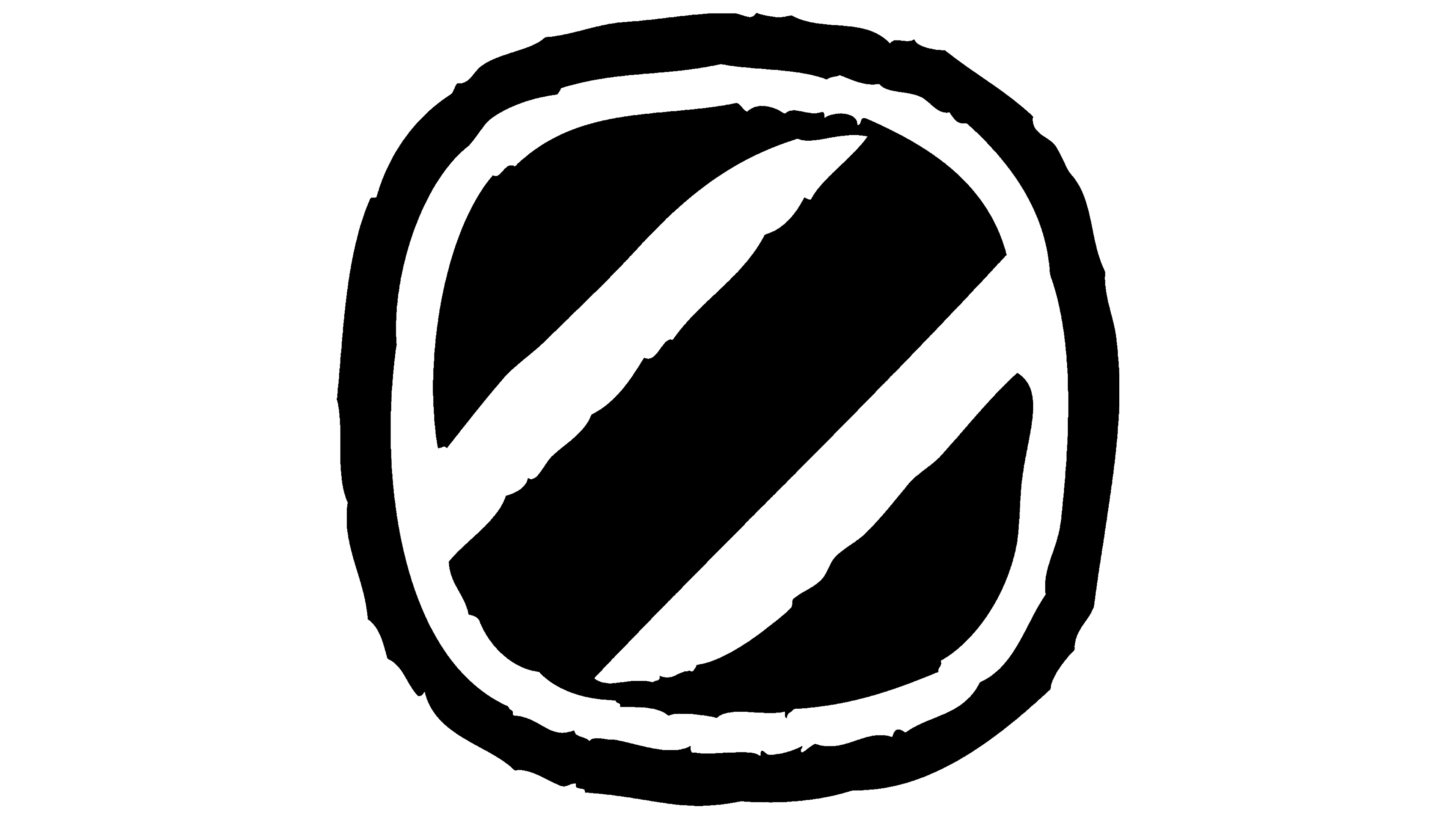
A custom font was developed by the Alias studio, which included two renowned graphic designers, Gareth Hague and David James. They proposed a retro-style logo with fine, elegant elements as a visual identity symbol. The letters are streamlined and rounded, except for “E” and “Z,” which are angular. The logo’s color palette is monochromatic, consisting of black and white.