


![]() Estrella Logo PNG
Estrella Logo PNG
One look at the Estrella logo is enough to understand that the emblem belongs to the popular star brand. The elements are reminiscent of crisps’ curling edges and evoke the popular snack’s crunchy, toasted sound and rich flavor.
Estrella is a Swedish snack brand owned by the German company Intersnack Group GmbH & Co. The brand is best known for potato chips, including smooth chips with bacon, cheese, onion, and salt, as well as ridged varieties such as sour cream with mushrooms, cheese, onion, and salmon in cream sauce.
The brand was founded in 1997 with support from Intersnack Group, which wanted to introduce a premium chips label to the Scandinavian market. Estrella quickly became popular in Sweden by offering flavors that differed from more standard snack products. Its seasoning blends used citrus, garlic, and spices, giving the chips a more recognizable taste profile.
During the following years, Estrella expanded into Norway, Denmark, and Finland. The company adapted its range to local preferences, adding potato snacks, dips, popcorn, nuts, peanut butter, and drink straws. In the 2000s and 2010s, it paid more attention to healthier, organic products and to new flavors inspired by Scandinavian cuisine.
The brand later expanded into Central and Eastern Europe. It broadened its product line to include Pop Chips and Lentil Chips. Its catalog grew to around 200 snack products, and exports reached about 20 countries. Estrella’s bright yellow packaging, playful logo, and humorous advertising helped form a recognizable brand image. At the same time, Intersnack Group gave it the scale needed to compete outside Sweden.
Meaning and History
![]()
The brand’s history began the year after World War II ended (1946). Estrella means “star” in translation. The company’s name is Spanish, and the owner, Folke Anderson, spent much time in Spanish-speaking Ecuador. Under the Estrella brand, the businessman imported fruits to his homeland, Sweden, and his banana plantations were in South America.
The fruit entrepreneur was inspired to produce snacks by visiting America, where he tried chips and saw their popularity. The first conveyor was launched in the 57th year.
The brand changed its owner several times, becoming part of ever-larger corporations.
- In 1965, Anderson sold Estrella to the Swedish chocolate maker Marabou. Under their leadership, the brand actively developed, opening production in Finland and Denmark and exporting chips and popcorn to the Baltic States and Iceland.
- Kraft Foods acquired Marabou, which became part of Kraft Foods Sverige (Mondelēz International).
- In 2014, Estrella was resold and became part of the German Intersnack Group GmbH & Co.
All brand owners were leaders in their fields. They helped achieve the brand’s main goal of development and leading positions. The company collaborates with leading manufacturers and studies popular snacks across different countries, continually improving and adding new flavors. Therefore, Estrella associated her name and visual symbol with leadership.
What is Estrella?
This is a Swedish food processing company that produces chips, snacks, peanut butter, nuts, and more. It also has a selection of beers. The brand name is translated from Spanish as ‘star,’ which is reflected in the Estrella logo. He used to specialize in fruit imports (under founder Folke Anderson) and then moved into making chips (after moving to Marabou). The trademark is now owned by Intersnack Group GmbH & Co.
1997 – 1999
![]()
After joining Kraft Foods, the brand received its first logo dedicated to chips. Before that, they wrote on the packages “American chips.” The company’s emblem was still associated with fruit, a green banana bunch. Despite the popularity of snacks, no one has changed the visual signs. Therefore, the new owners took up the issue.
The chips’ emblem was white Estrella lettering on a red ribbon with white stripes. The lettering font is italic, reminiscent of Swedish capital letters, except for the letter r.
The red background meant leadership. The brand was the first in Sweden to produce chips, and the company prospered. The color is also bright, as is the taste of snacks. The white lettering was associated with potatoes, and the white lines were associated with the flags of Sweden and America (the headquarters of Kraft Foods in the USA, and the first owner’s production of chips was inspired by a visit to New York).
The background strip also resembles a potato chip production line.
However, the logo generally had little in common with the product’s name and essence, so another option was chosen three years later.
1999 – 2003
![]()
The second emblem also has a ribbon, but not straight, but slightly twisted and without white stripes. It is similar to Marabou labels. The ribbon’s end rises, symbolizing the Star’s development and path to the sky.
Under the first letters of the name, there is a three-dimensional star with rays bent in different directions. She looks like a living character, standing in the pose of a winner and a fighter. He seems to be looking up at the sky, hugging everyone with one arm and flexing his biceps with the other, hinting at his strength and power.
The star became a visual representation of the name and conveyed the product’s aspirations for leadership positions.
The name, placed directly horizontally, balanced the entire composition. The lettering and color have not changed.
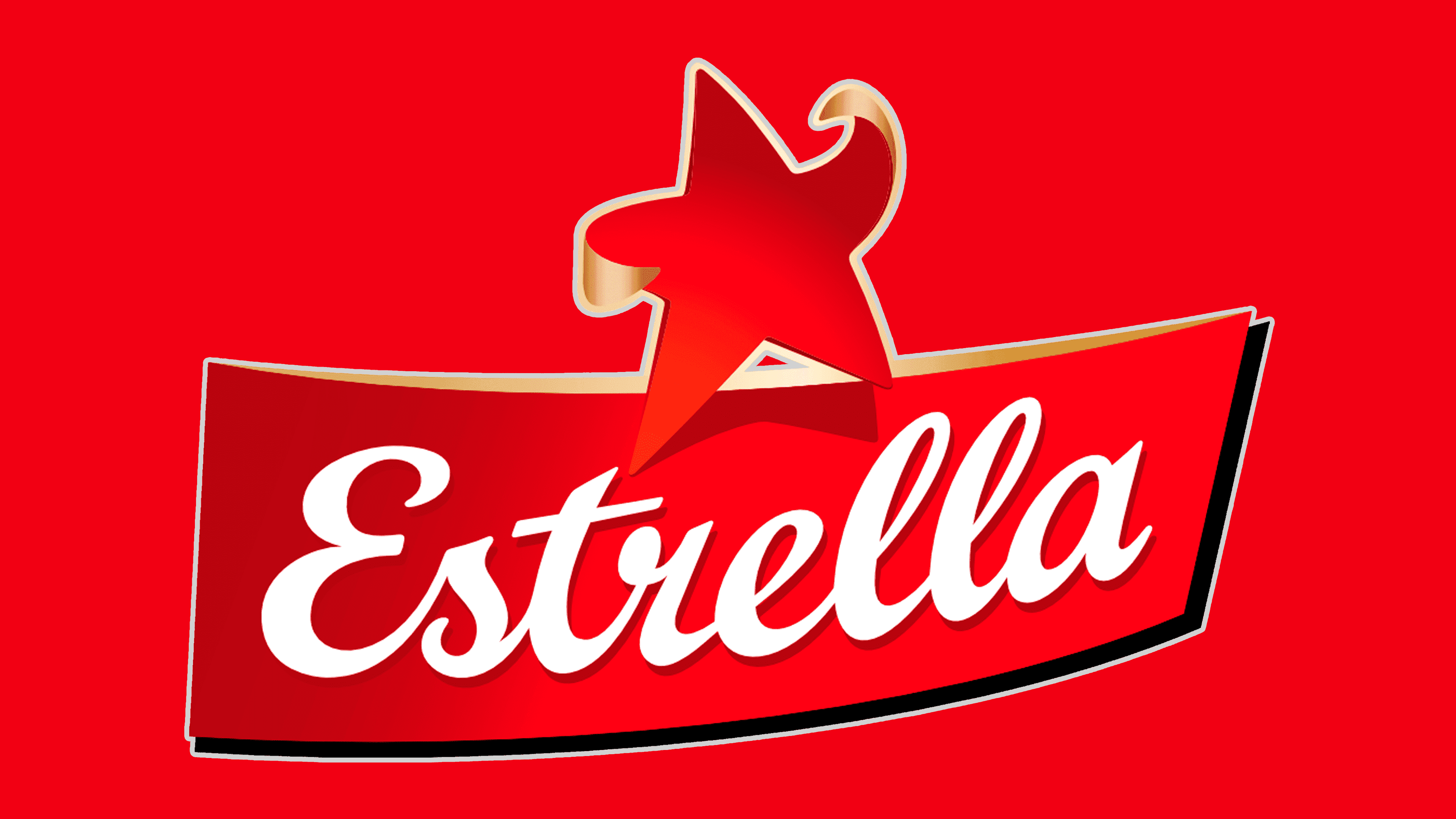
2004 – today
![]()
In 2003, Kraft Foods’ head changed. The new head developed his marketing policy, reflected in the brands’ visual signs.
The logo further emphasized Estrella’s leading star positions. The star has risen above the ribbon and immediately attracts attention. Symbolizes a clear leader. The reverse side of the rays featured a golden helmet as a symbol of victory, and it was the first among Swedish snack producers. The ribbon at the top took on a golden shadow from the starlight. The black shadow below underscores the brand’s confident development, its stable position, and the power of the corporation behind it.
The inscription has also changed, becoming more authentic. The name’s font exactly corresponds to the capitalization of Swedish letters and emphasizes the brand’s birthplace.
Font and Colors
The main colors of the emblem are red and white. The first and second are signs of leadership, first positions, and high aspirations. Red represents the hot flame of roasting chips, their sharp, bright taste, and the brand’s rapid rise to the top. White represents constant renewal, the emergence of new products, and the use of natural ingredients in the base.

The first logo font was more in line with Edwardian Script ITC. The latter version uses an analog of Brush Script MT, which is closer to the Swedish style.
FAQ
Who owns the Estrella chips brand?
Intersnack, a German snack company, owns Estrella chips. In 2014, Estrella was sold to Intersnack by Mondelez International, formerly Kraft Foods. This sale was a big moment for Estrella, shifting it from a part of a huge global food company to an important part of Intersnack’s collection of snack brands. Intersnack, which offers a variety of European snack products, became even stronger in the snack market after buying Estrella. This is especially true in Scandinavia, where Estrella chips are very popular.
What countries have Estrella chips?
Estrella, a snack brand famous for its chips and popcorn, started in Sweden in 1957. It was the first of its kind in Sweden. In 1993, Estrella decided to expand its market and entered the Baltic region, starting with Lithuania. Not long after, the brand also entered Latvia and Estonia. This wasn’t just about reaching new places and connecting with new customers. Estrella managed to keep its quality and flavor, winning over people in these countries. Today, Estrella is still a favorite in Sweden and has a strong presence in Lithuania, Latvia, and Estonia. This shows how well Estrella has grown while keeping its original charm.
Where did Estrella Crisps come from?
Estrella Crisps is a Swedish snack brand founded in 1957. It was the first company to make chips and popcorn there. Since the beginning, Estrella has been all about making snacks that taste great and are of good quality. They were the first to bring packaged chips and popcorn to Sweden, a novelty at the time.
As Estrella grew, they kept introducing new snacks, adding different flavors and types of salted snacks to their lineup. They’ve always aimed to make snacks people love eating, focusing on getting the taste right. This effort to keep making new and tasty snacks has made Estrella a favorite and a leader in the snack market.
Estrella’s main concern is making sure its snacks are delicious and high-quality. They spend a lot of time and effort checking that every new snack they make meets their standards. This dedication to quality and innovation has helped Estrella remain popular in Sweden and worldwide for over 60 years.
What companies are part of the Intersnack group?
Intersnack Group is a major name in the snack world, with many brands under its belt. These brands offer everything from chips and nuts to cookies and special snacks. Let’s talk about some of these well-known brands:
- Funny-Frisch is famous for its potato chips and snacks, especially in German-speaking areas. They’re known for their unique flavors and quality.
- Chio makes a variety of snacks, such as chips and popcorn, known for their tasty flavors. They’re a go-to snack choice in many European homes.
- Estrella originated in Sweden and was among the first to sell packaged chips and popcorn there. Since then, the company has expanded to include more salty snacks and has always focused on good taste.
- Hula Hoops are fun-shaped, crunchy snacks that come in different flavors. Both kids and adults in the UK and elsewhere love them.
- POM-BÄR offers snacks shaped like little bears, designed for kids, made with safe, tasty ingredients, and free of artificial colors and preservatives.
- McCoy’s makes ridged chips, known for their bold taste and crunch, appealing to those looking for a fuller snack experience, particularly popular in the UK.
- ültje is a top nut brand in Germany, providing a variety of high-quality nuts, including almonds and cashews, known for their freshness and unique flavors.
- Vico is a French brand known for its potato chips and snacks that match the French love for good food.
- Tayto is an iconic brand in Ireland. It is credited with creating the first flavored potato chips. The company has a strong fan base and offers a wide range of snacks.
- Griffin’s is a leading brand in New Zealand for cookies, crackers, and snack bars. It is loved for its long history of tasty treats.
Intersnack Group has a wide reach, catering to different tastes worldwide with classic chips, new nut mixes, and snacks perfect for kids. They’re a key player in the snack industry, bringing flavors and joy to snack lovers everywhere.
What is the meaning of the Estrella Logo?
The Estrella logo is more than just a design; it tells a story about the brand. At its heart, it’s about giving you a quick energy boost and making you feel refreshed. Estrella wants to be more than just a way to stop hunger; it aims to leave you feeling better than before.
The star in the logo isn’t just for show; it’s a big part of the brand’s message. “Estrella” means “star” in Spanish, and this star symbolizes being a leader in the snack world. It’s their way of saying they’re at the top, leading the way with standout quality snacks.
The color red plays a big role, too. It’s a color all about energy and action, which fits perfectly with what Estrella snacks are supposed to do for you. The red in the logo signals that Estrella is all about bringing excitement and a burst of energy to your day.
What does the Estrella logo symbolize?
The Estrella logo uses simple symbols to tell a story about what the brand stands for. It shows a star-shaped bodybuilder, representing strength and leadership. This isn’t just about looking strong; it’s about what Estrella wants its snacks to do for you: give you energy and make you feel alive.
The star in the logo isn’t just any star. Since “Estrella” means “star” in Spanish, it’s a nod to the brand’s name and its goal to be a snack leader. The image of the star as a bodybuilder drives home the point that these snacks are meant to boost your energy.
The logo is red, which screams energy and action. This isn’t by accident. Red is used to show that Estrella snacks are more than just tasty; they’re supposed to make you feel refreshed and ready to go.
What’s cool is the logo uses a handwritten font, which makes the brand feel more personal and approachable. It’s a nice touch that makes Estrella stand out, showing that they’re about connecting with their customers on a human level.