The sportswear manufacturer’s corporate identity for boxing symbolizes the spirit and characteristics of this sport. The modern Everlast logo represents resistance strength, fighting spirit, resilience, and perseverance, which are characteristic of athletes.
Everlast: Brand overview
| Founded: | 1910 |
| Founder: | Jacob Golomb |
| Headquarters: | Manhattan, New York, U.S. |
| Website: | everlast.com |
Meaning and History
The trademark appeared simultaneously with the launch of the brand and has remained one of the most recognizable for 110 years. The font and letter size have never changed; only the color palette and graphics have been revised.
What is Everlast?
Everlast is an American sports equipment brand known for its boxing and other sports gear. The company also offers clothing and footwear for active lifestyle enthusiasts. Founded in 1910, it became the official supplier of boxing gloves for the Olympic Games just two years later. Since then, many famous boxers, including Mike Tyson and Muhammad Ali, have worn its equipment.
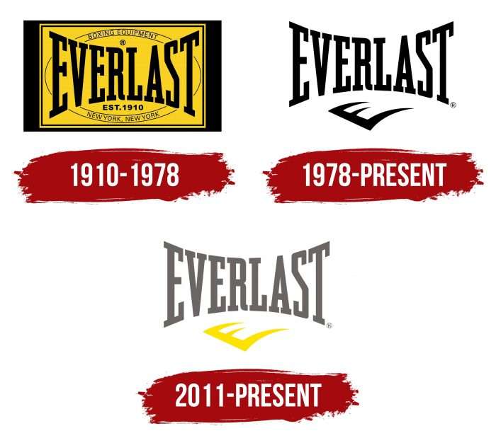
1910 – 1978
The debut version contains much information. An oval, the name, foundation year, and company location are depicted in a rectangular frame on a dirty yellow background.
1978 – today
Designers radically changed the logo, removing the excess data and background square. A stylized letter “E” appeared under the brand name.
2011 – today
In this year, developers made minor changes to the logo, changing the color to black.
The redesign of the sports brand logo Everlast progressed slowly, as redesigns were conducted at significant intervals. Changes affected the background elements and did not impact the name, whose style has remained unchanged to this day.
The debut version was essentially an advertising label with a lot of useful information: the brand’s location, year of foundation, and assortment. The second emblem is much simpler: it contains none of the above – only a comb-like stroke at the bottom, resembling a lying letter “E.” It is also used in the modern logo. The rest of the space is occupied by the word “Everlast,” executed in letters narrowing towards the middle.
Everlast: Interesting Facts
Everlast is a company that makes sports gear, especially known for its boxing stuff.
- Starting Out: It began in 1910 in New York by Jacob Golomb, a tailor’s son. He first made swimwear but wanted to create sports gear that would last forever, which is why it’s called Everlast.
- Boxing Gear: The big shift to boxing came when a young boxer, Jack Dempsey, asked for durable headgear for training. Dempsey liked the gear so much that he used Everlast gloves for a big fight in 1919. That’s how Everlast got closely linked to boxing.
- Making Better Gear: In 1925, Everlast made boxing gloves with elastic bands, which were a big deal because they fit better than the old lace-up gloves. This idea is now standard.
- More Than Boxing: Although Everlast is famous for boxing, It also makes products for other sports, such as MMA, fitness, and yoga.
- Worldwide: Everlast products are available in over 75 countries, making it a well-known international brand for sports gear.
- Famous Fans: Some of the greatest boxers, like Muhammad Ali and Joe Frazier, have used Everlast gear. The company still supports professional athletes and sports events today.
- Changing Hands: Everlast has had different owners over the years. In 2007, a British company called Sports Direct bought it, adding Everlast to its collection of sports brands.
- Beyond Sports: Everlast isn’t just for athletes; it’s also appeared in movies, music videos, and fashion, becoming a symbol of toughness and endurance outside of sports.
Everlast started with a simple idea in New York and grew into a big name in sports gear, known for durability and innovation. From boxing gloves to fitness equipment, it’s all about helping athletes everywhere.
Font and Colors
The word part is executed in Grand Canyon RR font, characterized by bold, slightly thickened, and clear lines. The letters are positioned as if moving towards the center, gradually decreasing. As a result, “E” and “T” are the largest, while “R” and “L” are very small.
The graphic part is an original presentation of the first letter in the name. “E” is positioned diagonally and complemented by sharp, elongated ends reminiscent of claws—the ideological meaning of the sign: resistance strength, fighting character, resilience.
The logo’s colors are yellow, black, and dark gray on a white background. The author’s intention is for them to demonstrate seriousness, power, momentum, and the energy of moving forward.
Everlast color codes
| Granite Gray | Hex color: | #6b6566 |
|---|---|---|
| RGB: | 107 101 102 | |
| CMYK: | 0 6 5 56 | |
| Pantone: | PMS 410 C |
| Cavendish Yellow | Hex color: | #ffe200 |
|---|---|---|
| RGB: | 255 256 0 | |
| CMYK: | 0 11 100 0 | |
| Pantone: | PMS 108 C |
