Logos are a crucial point of contact in the automotive world, directly linking to brands such as Ford, BMW, Bentley, and many others. Over the decades, these symbols have solidified their position, becoming instantly recognizable icons that transcend borders and cultures.
Different in design, some logos charm with their elegance, like the Aston Martin emblem, while others, like the Volvo emblem, appeal with their austere simplicity. The artistic essence embedded in each logo is irreplaceable; it serves as a magnet for potential customers and distinguishes one brand from another.
These logos mean more than just corporate identity. For passionate car enthusiasts, these symbols are often the epitome of a lifestyle, a statement of prestige and individuality. It is common to see brand loyalists, company employees, and enthusiasts proudly wearing accessories featuring these logos, be they lapels or cufflinks. The appeal of these badges is such that they become an object of lust, and some even resort to illegal ways of obtaining them.
Car Badges and Vehicle Emblems: An Introduction
In automotive branding, cars proudly wear symbols of their origin, heritage, and quality. These signs, ranging from emblems to ornate hood ornaments, provide immediate brand recognition and, often, a sense of prestige.
The most common emblems are rectilinear emblems symbolizing, for example, Ford’s famous blue oval. Such emblems are usually mounted on the grille, steering wheel, and rear of the car, which ensures their visibility from different sides.
In contrast, luxury cars, synonymous with luxury and status, often have a distinctive hood ornament. These intricate sculptures, such as those on Bentley and Rolls-Royce cars, have historically symbolized grandeur and extravagance. Located predominantly on the front of the car, they are eye-catching and reflect the brand’s legendary heritage.
The appeal of these hood ornaments was not always admired. Sometimes, their appeal has led to unauthorized removal, causing some automakers to rethink their branding strategies. In response to such incidents, many companies are phasing out hood ornaments in favor of more robust badges.
Ford Logo
Since its inception, Ford has ushered in a new era in the automobile industry, setting standards and benchmarks for others. The brand’s emblem is a testament to its long-standing tradition and unwavering commitment to quality.
The dominant element of the Ford emblem is the iconic blue oval. This element, which first appeared in 1927, has become an enduring symbol of the brand, reflecting its rich heritage. Within this oval is a pristine white font, a beacon of clarity and precision. Created by Ford’s Chief Engineer Childe Harold Wills, the font draws inspiration from the company’s origins. It is believed to echo the handwriting of Henry Ford, the company’s visionary founder. This design choice reinforces the brand’s connection to its roots, which Ford represents in the automotive world.
Chevrolet Logo
The Chevrolet bowtie emblem, commonly called Chevy, is a prominent and aesthetically pleasing symbol in the automotive world. Many theories of its origin exist historically. One states that William C. Durant, the visionary co-founder of Chevrolet and General Motors, was inspired by the emblem based on a pattern he noticed on French wallpaper.
This version was later challenged by Durant’s wife, who claimed that the emblem was influenced by a design from a newspaper advertisement. Another persuasive version is attributed to Louis Chevrolet, who attributes the emblem’s design to the fact that he was paying homage to his family’s Swiss ancestry by drawing parallels to the Swiss Cross.
The evolution of the emblem has retained its essence regardless of its origins. The strict geometry of the bow tie combined with luxurious shades of gold and silver reflects high quality and durability. Today, it is a logo and testament to Chevrolet’s heritage in the automotive industry.
Toyota Logo
The emblem of Toyota, one of the most recognizable automotive brands in the world, offers more than meets the eye. Although a closer look reveals an artistically rendered “T” encased in an oval, there is a complex story behind the emblem.
A closer look reveals the emblem’s intricacies. Its design is not just a reference to the brand’s name but an embodiment of the deep relationship Toyota seeks to establish with its consumers. The choice of intersecting ovals was thoughtful. These converging figures symbolize the deep connection and mutual trust between the automaker and its loyal customer base. The intertwining design reflects the symbiotic relationship in which both entities thrive and grow.
The negative space of the emblem, which may seem like an artistic decision to some, has a story of its own. It is a void and a promise of uncharted territories and unexplored innovation. It symbolizes Toyota’s commitment to a future filled with potential, innovation, and new horizons.
The emblem’s bright red hue is not just a color but an emotion, a statement. The color red encapsulates Toyota’s full range of feelings: the fiery passion for creating superior vehicles, the power that drives them, and the unwavering strength that underpins the brand’s heritage.
Honda Logo
Honda’s emblem, characterized by its simple design, is a prime example of how simplicity often leads to universal recognition. The unmistakably recognizable capital letter “H” was placed in a rectangle decorated with slightly rounded edges. The casual observer immediately catches the connection with the brand name.
The emblem carries a depth beyond the initial perception. While it certainly represents the name “Honda,” paying homage to company founder Soichiro Honda, the subtle layer of design often goes unnoticed. The configuration of the letter “H” with its wider upper part compared to the lower part conjures up the image of a human figure with arms held high, bathed in the rays of triumph.
Tesla Logo
The Tesla logo—a simple and elegant letter “T” at first glance —has long been the subject of intrigue and speculation. The enigmatic design has made many people ponder its deep meaning, leading to theories beyond aesthetics. What was this elegant logo trying to convey? Was there a tribute or a deep scientific subtext behind it? These questions lingered until one tweet by Elon Musk himself revealed the truth behind the mysterious emblem.
For years, there was a theory that the Tesla logo was modeled after the cross-section of an electric motor in honor of the famous inventor Nikola Tesla, after whom the company was named.
The theory was confirmed when a man named Peter James Dean, driven by curiosity, asked Elon Musk on Twitter to clarify the logo’s meaning. Musk’s response was as clear as it was instructive: “Similar to SpaceX, the ‘T’ resembles the cross-section of an electric motor, and the ‘X’ resembles the flight path of a rocket.” With these words, the veil was lifted, and the deeper meaning of the logo was revealed.
The Tesla logo is not just a symbol but a multifaceted message that reflects the company’s core values, vision, and mission. Its design pays homage to Nikola Tesla, the visionary who found the key to unlimited energy far ahead of his time, and also conveys other important aspects of the brand.
The monochromatic black-and-white color scheme gives the logo a luxurious and powerful feel. It’s not just an artistic choice; it fits Tesla’s business model. Before targeting the mass market, Tesla’s strategy was to sell high-end cars to affluent customers who could purchase any vehicle they wished. This element of luxury was crucial to the company’s early success, and the logo was designed to reflect this.
The design of the Tesla logo is far from random: every curve, every line, and color was carefully chosen to reflect the company’s defining characteristics.
Nissan Logo
Occupying a prominent place among automotive emblems, the Nissan logo is a testament to the power of branding and heritage. Unlike logos with intricate patterns, the Nissan emblem takes center stage with the company’s name in bold capital letters.
Its past association with the Datsun company is intertwined in the tapestry of the Nissan emblem’s history. The Datsun emblem featured the brand name in a blue rectangle above a bright red circle. This configuration unmistakably captured the symbolic motif of the rising sun in Japan, evoking an echo of national pride and heritage.
In 2001, a new era dawned for Nissan when the company changed its logo. Although the emblem was designed in a modern style, it retained echoes of the Datsun emblem, blending tradition and modern aesthetics. The Nissan emblem can now shimmer in chrome, reflecting the brand’s commitment to innovation and elegance. Alternatively, it can be finished in deep black, which exudes sophistication and forward-looking ambition.
The Nissan logo’s chrome and black duality signifies aesthetic appeal and symbolizes the fusion of innovation and modernity.
Jeep Logo
The Jeep logo, a unique emblem in the automotive industry, features an authentic design that conveys brand identity through visual and symbolic elements. Unlike many automotive logos that use ovals, circles, or shields, the Jeep logo is reminiscent of a car’s grille, flanked by two circles symbolizing headlights. This configuration distinguishes the logo from other automobile brands and ties it to the appearance of the Jeep automobile. Above this characteristic motif, the name “Jeep” is written in Helvetica Bold font, emphasizing the reliable and simple character of the brand.
The color scheme of the Jeep logo has changed, reflecting the brand’s journey and transformation. Originally, the logo was designed in red and gold, but after AMC acquired Jeep, the color scheme changed to blue. The modern version of the logo is in a solid dark green color. This color choice is not just aesthetic—it points to Jeep’s historical ties to the U.S. military, linking the brand’s past to its current look.
The Jeep logo is known for its simplicity. Sometimes, the brand refers to itself only by the word “Jeep,” completely omitting the grille and headlight design. This frank approach to branding is in keeping with the brand’s philosophy and the characteristics of its vehicles. Jeeps are known for their ruggedness, reliability, and lack of unnecessary embellishments. The simple logo design echoes these traits, giving a clear idea of what Jeep represents.
There is an intriguing urban legend associated with the name “Jeep.” Some believe it is an acronym for “Just Enough Essential Parts.” While the origin of this story may not be entirely clear, its essence resonates with the brand’s ethos. Jeeps are known for their durability and efficiency without unnecessary features. The logo, in its unassuming design, reflects these qualities.
BMW Logo
BMW is the epitome of luxury and engineering precision and holds a rightful place among the world’s automobile brands. This German automobile giant has made a name for itself with cars characterized by sophistication, performance, and timeless design. The company’s corporate identity is based on the iconic circle emblem, a symbol with a rich history and various interpretations.
One of the most common interpretations of the BMW emblem is related to the brand’s aviation heritage. According to this theory, the emblem depicts a propeller parting the azure skies. Given that BMW was originally involved in producing aircraft engines, this interpretation carries weight with many enthusiasts and historians.
Another interpretation links the emblem not to the manufacture of products but to its geographical origins. Bavaria, the region in Germany where BMW was founded, proudly carries a blue and white checkered flag. The emblem’s design resembles this flag, suggesting that the round mark indicates the brand’s Bavarian roots.
Regardless of the emblem’s origin story, its modern influence is undeniable. The circular design with alternating segments of blue and white colors instantly gains recognition and respect in the automotive arena. These colors reflect the brand’s potential historical ties to Bavaria and evoke the sense of reliability and dependability that BMW has consistently demonstrated across its lineup. This simple but effective emblem embodies the brand’s rich past and commitment to excellence.
Mercedes-Benz Logo
Known for its refined simplicity, the Mercedes Benz emblem symbolizes elegance in the automotive industry. This emblem, easily recognizable worldwide, has a deeply personal origin and was conceived by Paul and Adolf Daimler as a tribute to their late father.
The Mercedes logo was based on the symbolic star. The star was more than just an aesthetic choice; it was imbued with symbolism, embodying hopes of prosperity and good fortune for the fledgling business. As the brand began to carve out a niche in the market, it trademarked two versions of the star: a four-pointed star and the iconic three-pointed star that still resonates with audiences today.
If one delves deeper into the meaning behind the appearance of the three-pointed star, one discovers Mercedes’ broad vision. The triad of dots was not just a design decision but symbolized the brand’s ambition to dominate transportation in three spheres: land, water, and air.
With its sleek silver color and minimalist design, the emblem embodies sophistication, attracting worldwide attention and admiration. It shows that the Mercedes team understands the power of branding, seamlessly blending symbolism with modernity.
Subaru Logo
The Subaru emblem echoes celestial iconography, drawing inspiration directly from outer space. If you delve into the origin of the company’s name, you’ll find a fascinating tapestry of celestial symbolism intertwined with the company’s history.
The word “Subaru” comes from the Pleiades star cluster in the constellation of Taurus. This cluster, characterized by its brightness and visibility from Earth, not only gave the brand its name but also influenced the design of its emblem. Indeed, the emblem’s aesthetics are a direct allusion to the night sky, depicting a constellation that has captured the human imagination for millennia.
The emblem depicts six stars chosen for their pronounced position in the constellation of Taurus. These celestial bodies, especially visible to stargazers, have a double meaning. On the one hand, they reflect the celestial inspiration behind the brand’s name, and on the other hand, they symbolize a turning point in its corporate journey. The five small stars surrounding the dominant large star symbolize the historical unification of the five companies. These smaller companies merged, leading to the creation of the conglomerate known as Fuji Heavy Industries.
Subaru’s symbolic colors of silver and blue further reinforce the brand’s association with space. These hues, reminiscent of the vast and mysterious night sky, are not just an aesthetic choice. They echo the sentiments associated with the vastness of space: reliability and trustworthiness. Just as the stars have been reliable landmarks for navigators throughout history, Subaru strives to be a beacon of reliability in the automotive world.
The Subaru logo is more than just a brand symbol. It is a celestial tapestry, a snapshot of the company’s history, and a testament to the brand’s core values harmonized into a memorable symbol.
Hyundai Logo
The Hyundai emblem, characterized by a seemingly simple design, may not immediately seem special, especially if you put it in a row with iconic automobile logos. One might even see parallels between the emblem and the emblems of other auto giants. However, if you delve into its design, you will find a deep and peculiar meaning.
The pronounced letter “H” is on the emblem – an obvious hint to the brand “Hyundai.” However, the symbolism here is much deeper. The silhouette of the letter “H” is thought out to the smallest detail and resembles two people located opposite each other and shaking hands. Around this symbolic handshake is an oval, which is far from arbitrary. The Hyundai logo subtly conveys the brand’s values and aspirations, uniting them in an elegant and meaningful design.
Ram Logo
The history of the Ram emblem is rich and multifaceted, intertwined with Dodge’s evolution and the creation of the RAM brand. Over the decades, the emblem has become not just a symbol but an embodiment of the brand’s identity and its connection to truck enthusiasts.
In the 1970s, the ram-like hood ornament appeared on various models, including heavy haulers. This revival was a nostalgic nod to its origins in the 1930s when Avard T. Fairbanks designed the radiator cap. The legend of Walter P. Chrysler’s skepticism and the eventual realization that the word “Dodge” was a perfect match for the image of a ram added to the symbol’s mystique.
Aries signifies power, strength, fearlessness, and masculinity in astrological symbolism. These traits echo the characteristics that Dodge wanted to convey, perfectly matching the brand’s image.
After the Ram’s head appeared on the updated Dodge pickup trucks, the brand began calling them Dodge RAM. This name cemented the association between the symbol and the vehicles, creating a consistent brand identity.
By the 1990s, the hood ornament had fallen out of use, and there was a need for a consistent, easily recognizable badge. From 1993 to 2010, the Ram emblem was present on almost all Dodge models, cementing its status as a brand symbol.
After Fiat acquired Chrysler in 2009, the RAM brand became independent. Recognizing the appropriateness of the Ram head badge, symbolizing the strength and power of RAM trucks, Dodge company transferred the logo of this brand of pickup truck.
Lexus Logo
Although Lexus is a newcomer to the vast world of automotive giants, it has quickly established itself in the echelon of luxury car brands. In the center of the emblem, the letter “L” rises proudly. This single symbol is of great significance, epitomizing “Lexus.” If we delve into the origin story, the name “Lexus” is derived from the word “Alexis,” originally chosen by Toyota for the luxury car segment.
The central “L” is surrounded by a circle, an aesthetically pleasing and symbolism-rich design element. While it may appear simply a design decision, a deeper look reveals unity, integrity, and global appeal. Such interpretations may suggest Lexus’ desire to create community among its customers, thus emphasizing its inclusive approach.
As the automotive industry has evolved, so has the importance of brand representation. The streamlined design of the Lexus logo, with its clear and uncomplicated visuals, reinforces the brand’s presence in the minds of car enthusiasts and casual observers alike.
Volkswagen Logo
Volkswagen, a titan of the automotive industry, has a simple but easily recognizable emblem. This emblem captures the brand’s essence and tells a story deeply connected to its heritage.
At the heart of the emblem are the intertwined letters W and V. These letters are more than just an alphabet; they represent the German words “Volks” and “Wagon,” meaning “people” and “cars,” respectively. This design choice reflects the brand’s mission: to create cars for people. The way the letters stack elegantly on top of each other adds to the aesthetic appeal and emphasizes the harmony between the company and its vast clientele.
The interlocking letters are framed by a circular border, which is not just a design decision. This circle symbolizes unity, suggesting a global community united by a common appreciation of automotive quality. It exudes a sense of unity and emphasizes Volkswagen’s commitment to producing vehicles aimed at various consumers.
Audi Logo
The Audi emblem, consisting of four interlocking rings, is a testament to its heritage and commitment to innovation. This seemingly simple design has a rich history that tells a story of collaboration, evolution, and endurance.
The Four Rings Company, formed through a strategic merger in 1932, amalgamates four pioneering German automakers: DKW, Audi, Wanderer, and Horch. By joining together, these companies set out to change the automotive industry by combining their expertise and laying the groundwork for creating the world-renowned Audi brand.
By 1985, the name “Auto Union” had faded into the annals of history, giving way to “Audi” as the dominant brand identifier. The modern version of the emblem may be more elegant and streamlined, but its basic meaning remains unchanged.
The emblem’s four rings may also resemble an automobile’s four wheels. This interpretation, sometimes referenced by the brand itself, gives the design another level of significance to the car and its continued commitment to automotive excellence.
Cadillac Logo
Recognized worldwide as the epitome of durability and sophistication, the Cadillac emblem is a modern interpretation of its historical counterpart. The emblem is deeply intertwined with the legacy of Señor Antoine de La Mota Cadillac. As historical records show, this man was instrumental in the founding of Detroit, Michigan, in the early 18th century, and his legacy later served as the foundation for the Cadillac brand.
Early versions of the emblem featured a coat of arms associated with Detroit’s founder. While that connection has become more subtle over time, careful observers can still catch echoes of the past in modern design. Although the current logo lacks some intricate details, such as the once-common shield, the pedigree of the design remains evident.
The Cadillac logo has retained its signature appeal. The strategic use of colors such as red and gold echoes the attributes of strength and luxury.
Chrysler Logo
The distinctive design of the Chrysler emblem stands out in the panoply of iconic automobile logos. Chrysler, a subsidiary of the Stellantis conglomerate, takes its cue from the Kruessler family crest. This connection to heritage was reinforced in the 1930s when wings were incorporated into the emblem to signify the brand’s commitment to the highest quality.
Drawing on historical context, some experts believe that the Chrysler emblem resembles a royal wax seal, a symbol traditionally associated with authority and authenticity. Over the decades, the brand has undergone several changes to its look, even briefly adopting the “Pentastar” design, among other choices. However, a consistent theme on the brand’s journey to uniqueness has been a return to the winged emblem.
Chrysler’s winged emblem conveys more than just the brand’s name. Its evolution shows Chrysler’s resilience and ability to adapt while remaining true to its core values.
Porsche Logo
The Porsche emblem stands out among the pantheon of iconic automotive emblems, evoking a sense of luxury, prestige, and deep heritage. Distinct from many of its counterparts, this emblem featuring a galloping horse evokes comparisons to Ferrari’s emblematic stallion. However, the symbolism and background of the Porsche emblem trace a unique lineage deep into its origins.
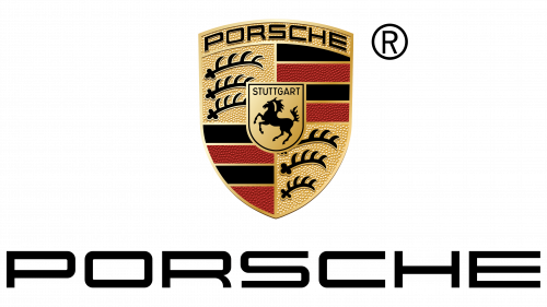
Shimmering with gold, red, and black hues, the luxurious crest is a beacon of sophistication. The emblem, radiating modern elegance, recalls its appearance in 1952 when the Porsche brand was in its infancy but full of ambition.
The emblem signifies luxury and indicates the brand’s geographical roots. The main design elements of the coat of arms are intricately woven into the main design elements of Stuttgart, the city where Porsche is headquartered. The emblem crest is not just an artistic statement; it echoes the city seal of Stuttgart, signaling the brand’s deep connection to its hometown.
The periphery of the emblem, decorated with stag antlers and a combination of black and red stripes, pays homage to the vast region of Württemberg in Germany. It emphasizes the brand’s German pedigree and points to the significance of the region’s history and heritage in shaping Porsche’s identity.
The Porsche emblem is a masterclass in design that seamlessly blends modern luxury with traditional elements.
Mazda Logo
Mazda, founded in 1936, began its journey with the distinctive three-letter “M,” symbolizing Mazda Motor Manufacturers. As the brand evolved, this initial design underwent many transformations, experimenting with different elements to embody Mazda’s essence.
In its early years, the company incorporated wings into the emblem to symbolize speed, agility, and freedom. This representation demonstrated Mazda’s commitment to producing cars that were not only efficient but also exciting. However, as is often the case in branding, the desire for simplification led the company to depict itself as a lone “M” enclosed in a circle.
By 1992, Mazda needed to update the brand’s image, which led to a new emblem. It was a circle enclosed in a curved diamond shape, which gave the brand a modern look.
The Mazda emblem demonstrates a harmonious blend of past and present. A pair of stylized silver wings can be discerned in its oval frame, representing the brand’s desire to soar and its unwavering commitment to innovation. Resembling wings, the central part of the logo is cleverly intertwined with the surrounding oval to form the letter “M,” paying homage to the brand’s origins. This logo is a testament to Mazda’s rich heritage and its constant pursuit of future horizons in automobiles.
Buick Logo
Buick, which originated from the huge General Motors, is a testament to the pioneering spirit of David Dunbar Buick, who founded the brand in 1899. With over a hundred years of legacy, the Buick emblem is iconic and has made American automotive history.
Although the emblem has undergone several changes, the shield motif remains unchanged, a testament to the brand’s heritage and enduring values. The current design features three shields inspired by the coat of arms of the company’s founder’s ancestors.
Each shield, distinguished by its unique color, pays homage to three significant models that have made up the Buick lineup: the Invicta, LeSabre, and Electra. These vehicles emphasize Buick’s commitment to excellence and are key milestones in the brand’s historic journey. These colors are complemented by a metallic silver hue, positioning Buick as a brand that harmoniously blends its past with a vision for the future.
The Buick logo is not just a brand mark but a rich tapestry of history, innovation, and an unwavering commitment to automotive excellence. As Buick continues to move forward, its logo serves as a beacon reminding us of its origins and journey in the annals of automotive history.
Acura Logo
The Acura logo, representing Honda Motor Company’s luxury car division, is more than just an elegant design. It is a multi-dimensional emblem that embodies the brand’s philosophy and aspirations.
The Acura logo looks like a stylish slanted “A” symbol at a cursory glance, clearly identifying the brand name. However, a closer look reveals a resemblance to the letter “H,” which is a subtle allusion to the parent company, Honda. This establishes a connection between Acura and its famous parent brand while maintaining its identity.
The name “Acura” is not just a random choice; it combines the prefix “acu,” meaning sharpness or precision, with a phonetically pleasing ending. This combination is not just aesthetically pleasing; it captures the essence of the Acura brand, emphasizing precision, accuracy, and craftsmanship, as once articulated in the slogan “Precision crafted performance.”
The most distinctive feature of the Acura logo is the image of a pair of calipers. Calipers, instruments used to measure objects with amazing precision, symbolize the brand’s commitment to technical excellence and attention to detail. The placement of the calipers, which resemble the “A” in the Acura word, is not just a coincidence but a deliberate design choice that ties the symbol to the brand’s commitment to luxury and precision.
The Acura logo features a modern, eye-catching design that retains a recognizable connection to the original Honda design.
Volvo Logo
Volvo, synonymous with durability and innovation, traces its etymological history back to the Latin term “Volvere,” meaning “to roll.” This choice of name sheds light on what cars do: they roll, taking people to places and creating countless memories.
The evolution of the emblem provides an intriguing insight into the company’s journey and philosophy. Originally, the emblem was presented as a minimalistic blue oval with the name “Volvo” in the center and the inscription “Gothenburg, Sweden” below it, indicating the company’s origins. This simple design honored the brand’s roots and its founding ideals.
As the brand evolved, so did its symbolic representation. Including an upward-pointing arrow and a diagonal line reminiscent of the symbol of Mars, the Roman god of war, marked a significant shift in branding. More than just an aesthetic choice, this design element is associated with the strength, defense, and assertiveness embedded in Volvo’s DNA.
The upward-pointing arrow emphasizes the brand’s desire to continuously progress and explore innovative frontiers. Volvo effectively communicates its core values by intertwining the symbolism with its corporate identity.
Infiniti Logo
The Infiniti emblem, representing Nissan’s luxury division, perfectly combines modern design and symbolic depth. Against the metallic-colored open oval is a distinctive triangle pointing inward. Despite its apparent simplicity, this design carries a rich history and thought process.
The triangle, strategically placed in the center of the oval, is more than just a design element. It serves as a visual metaphor, embodying a roadway that flows gently into the horizon and evokes the notion of infinity. This symbolism aligns seamlessly with the Infiniti brand, suggesting endless possibilities, unrivaled travel, and constant innovation.
Due to its minimalism, the emblem’s elegance allows it to remain memorable despite the brand’s relatively young age in the automotive arena. The combination of understated design with profound symbolism allows the Infiniti logo to become more memorable and firmly take its place in the annals of emblematic design.
Ferrari Logo
The Ferrari emblem is undoubtedly one of the most iconic symbols in the automotive industry. The distinctive emblem “Cavallino Rampante,” which means “galloping horse,” is recognizable worldwide and evokes a sense of speed, luxury, and perfection.
The origin of this emblem is rooted in the eventful meeting of Enzo Ferrari, the visionary founder of the brand, with the noble Count Enrico and Countess Paolina Baracca. Their valiant Italian fighter pilot’s son decorated his airplane with an emblem depicting a horse. Tragically, he died prematurely. In memory of his son and his courage, the Count and Countess gave Enzo Ferrari the horse emblem, believing it would become a good luck charm.
Over the years, the emblem has become synonymous with success and prestige. Set against a bright yellow background, the running horse emblem consistently represents the Ferrari heritage. This emblem reflects the brand’s rich history, commitment to innovation, and unrivaled results in motorsports.
Alfa Romeo Logo
The emblem of Alfa Romeo, the famous Italian automobile brand, is a testament to its rich heritage and enduring values. Exquisitely crafted, this badge is not just a badge of honor; it tells a story of history and tradition.
The genesis of the Alfa Romeo badge can be traced back to the early 20th century. Its creator, Romano Cattaneo, created this iconic design in 1918. Over the past decades, the emblem has undergone many changes, but its basic elements have remained unchanged. They embody the brand’s essence, which has conquered over one generation.
The emblem is a double image, each half telling about different stages of Milan’s history. On the left, on a pure white background, is the Milanese cross, which echoes the city’s deep Christian heritage. This cross symbolizes faith and steadfastness and ties the brand to its Milanese origins.
The right half features a more mystical symbol, the Biscione, a snake devouring a human figure. This striking image is rooted in the heritage of the Visconti family, former rulers of Milan in the 14th century. Biscione, in addition to its historical significance, is a symbol of strength and cycles of regeneration, embodying the transformative nature of the brand.
The emblem is colored in gold, blue, red, and green. These colors are not just an aesthetic choice. Gold is associated with perfection and grandeur, blue with purity and reliability, red with passion and energy, and green with growth and harmony.
The Alfa Romeo logo is not just a logo; it is a symbolic tapestry woven from symbols and stories from Italy’s past, representing a brand that seamlessly blends tradition and modernity.
Jaguar Logo
The iconic Jaguar emblem, depicting the swift leap of a ferocious jaguar with bared teeth, symbolizes luxury, craftsmanship, and dynamism. The emblem does not just symbolize an animal; it has deep historical roots. Look into the annals of automotive history. You will find that the choice of this emblem was associated with the Swallow Sidecar company, which produced the SS Jaguar in the 1930s.
The design of the emblem is more than just aesthetics. It embodies the brand’s essence – the swiftness and unrivaled power inherent in the majestic animal it depicts. It also indicates the brand’s commitment to engineering excellence and elegant design, often associated with the grace and power of the jaguar in the wild.
A broader look at automotive branding reveals a trend: the frequent use of animals to symbolize a brand’s core values. In the case of Jaguar, the brand’s emblem affirms its rich heritage, commitment to luxury, and relentless pursuit of excellence. When observers see a galloping jaguar on a car, it is a silent but powerful message about the brand’s values and place in the automotive pantheon.
Maserati Logo
Since its founding in 1926, Maserati has been synonymous with its striking Trident logo, which has stood the test of time with minimal changes. The genesis of this emblem can be traced back to the majestic statue of Neptune in the town square of Bologna, Italy. Maserati’s journey as a renowned automobile manufacturer began in this city, rich in history and culture.
Neptune, the sea god from Roman mythology, is depicted on the statue with his trademark trident with three prongs. This emblematic trident, representing strength and power, appealed to the founders of Maserati, who decided to incorporate it into the brand’s identity. The emblem reflects the heritage of the city and includes the official colors of Bologna: white, red, and blue, which symbolize the deep connection of the brand with its place of origin.
The choice of the trident and the city’s hues creates a logo and a story. It tells the story of Maserati’s heritage, its foundational roots in Bologna, and the inspiration drawn from the deity’s powerful emblem.
Bentley Logo
The Bentley emblem symbolizes the luxury and sophistication of the automotive industry with its majestic wings. This British luxury car brand has cemented its reputation over the decades, becoming synonymous with high craftsmanship and unrivaled elegance on British shores and worldwide.
The brand originated in 1919 with a design by Walter Owen Bentley. The emblem’s winged motif is because the company was originally called Bentley Aero. This nomenclature is a subtle hint of Bentley’s initial endeavors before diving into the world of automobiles. During World War I, the company was heavily involved in the production of rotary engines for airplanes, a testament to its engineering prowess and desire to help the country.
The winged emblem fits seamlessly into Bentley’s storied history. It reminds the brand of its evolution from aircraft to road ruler. Wings are not just a tribute to the past. They have become a speed symbol, epitomizing Bentley cars’ swift and powerful character.
The Bentley emblem is not just a logo; it’s a story. It tells the story of a brand that has gone beyond its original aero-engineering designs to become a symbol of luxury in the automotive sphere.
Lamborghini Logo
Known worldwide as a luxury brand, the Lamborghini emblem is a testament to its rich heritage, luxury, and unrivaled performance. The emblem depicts a bull as a symbol of strength and power and a tribute to the brand’s founder, Ferruccio Lamborghini.
The background to the bull’s choice is intriguing and deeply personal. Ferruccio Lamborghini witnessed a grand bullfight while visiting Don Eduardo Miura’s ranch. This experience and the company founder’s affinity for these majestic creatures provided the foundation for the bull to take center stage in the brand’s uniqueness.
Lamborghini’s commitment to this symbol is not limited to the logo. The names of some of the company’s cars date back to bullfighting. Models such as the Islero, Jalpa, and the ferocious Diablo are inspired by the iconic fighting bulls and the terminology associated with this traditional sport.
The emblem’s color palette—gold and black—is not arbitrary. Gold represents luxury, opulence, and grandeur, reflecting the brand’s desire to offer premium cars. On the other hand, Black speaks to the brand’s elegance, sophistication, and timeless appeal. The shield-like shape embodies these values, symbolizing the unwavering promise of reliability, sustainability, and unparalleled performance. The Lamborghini emblem, rich in symbolism and meaning, echoes the brand’s core principles and commitment to automotive excellence.
Aston Martin Logo
Car emblems often include symbols that represent qualities inherent in the brand’s ethos, and wings, evoking ideas of flight, speed, and freedom, are a popular choice among automakers.
Founded in 1913 by the enterprising duo of Robert Bamford and Lionel Martin, Aston Martin quickly gained a reputation for building cars that combined luxury and dynamism. As the brand developed, its symbolism also changed.
If the first versions of the emblem were a combination of the letters “A” and “M,” then by 1927, it appeared as a pair of wings, symbolizing the soaring ambitions of the brand. These wings became more than just a decorative addition; they reflect the dynamism and forward movement characteristic of Aston Martin cars.
The emblem is accompanied by the elegantly inscribed brand name, which remains a constant element of the emblem. The choice of green background for the name is green, which is often associated with luxury and grandeur. This emphasizes the status of Aston Martin in the luxury car market and its British heritage.
The Aston Martin logo reflects the brand’s journey from its inception to its heritage. It conveys speed, innovation, and luxury, embodying the brand’s desire for perfection in every curve and contour.
Bugatti Logo
The Bugatti brand takes its name from the visionary entrepreneur Ettore Bugatti. His legacy of automotive craftsmanship and innovation is captured in every car with the iconic Bugatti logo.
Founded in 1909 in Italy, Bugatti has had an amazing journey in the automotive world. The cars, renowned for their unrivaled quality, speed, and engineering prowess, have set many benchmarks in the high-performance car segment. Even with limited production, Bugatti cars remain coveted treasures for car connoisseurs.
In the era after Ettore Bugatti’s death, the production of Bugatti cars was significantly reduced, with less than 8,000 cars hitting the roads. However, this hiatus was not the end of the brand’s history. Recognizing the hidden potential and rich heritage associated with the Bugatti name, the Volkswagen Group stepped in. Under their leadership, the brand experienced a renaissance, and the focus was once again on sports cars, paying homage to Ettore Bugatti’s vision and pushing the boundaries of modern automotive technology.
The Bugatti emblem is more than just a brand logo. Bugatti cars continue to set new standards in the field of luxury sports cars, and the spirit of Ettore Bugatti is ever present, guiding the brand to new horizons.
Lotus Logo
Founded by visionary Anthony Chapman, the Lotus brand has steadily evolved to become a dominant force on the roads and racetracks. The iconic emblem subtly conveys Chapman’s full initials, honoring his name and middle names, Colin and Bruce. This attention to detail shows the brand’s fidelity to its founder’s legacy.
Time changes many things, but the Lotus symbol is an exception. Its unchanged elements, present since its creation in 1952, testify to the brand’s rich heritage and desire for excellence. The emblem’s color palette includes the classic British racing green. Complemented by a vibrant yellow hue, the design evokes a sense of joy and vitality – qualities inherent in the very spirit of racing.
For decades, Lotus cars have been more than just vehicles; they have become legends. This is especially true in Formula 1 racing, where the brand has left an indelible mark. Championship titles, record-breaking laps, thrilling races—Lotus was central to many of motorsport’s iconic moments. Although Chapman, the pioneering spirit behind the brand, is no longer there, his story thrives. Lotus is a testament to his vision, continuing his journey of creating some of the most revered racing cars on the planet.
Saab Logo
In the annals of automotive branding, the Saab emblem is a testament to the brand’s evolution, seamlessly blending its aviation origins with automotive aspirations. The emblem is steeped in history and respect for the hard-working spirit of Sweden.
The Saab brand was created in the aviation industry rather than the automotive industry. The company was originally known as Swedish Aeroplane Limited or Svenska Aeroplan AB and specialized in aircraft production. However, with the advent of the 1950s, a strategic twist led this aviation expert into the automotive industry.
Saab’s original emblem, depicting the front of an airplane propeller, bore the imprint of its aviation heritage. Although symbolic in origin, the symbol was inappropriate in an automotive context. Saab transformed the brand, recognizing this contradiction and settling on an emblem incorporating fantasy elements. The result was the selection of a majestic red griffin topped with gold, a creature synonymous with fantasy literature and an emblem of greatness.
The choice of the Gryphon reveals an intriguing relationship in the Swedish automobile industry. This mythical creature was not chosen by chance; the emblem of Vadis-Scania, a well-known truck manufacturer, influenced it. This connection was not merely symbolic: Saab’s parent company had established business ties with Vadis-Scania, intertwining their heritage.
The griffin is not just a figment of imagination; it has national significance. This regal creature adorns various Swedish coats of arms, emphasizing the brand’s deep connection to its homeland.
The Saab logo represents the brand’s journey from the sky to the roads, intertwined with Sweden’s national and industrial symbols. It is a beacon that captures the essence of the company’s rich history while driving its automotive future.
Celebrating Famous Car Logos
The global auto industry has many car logos, each vying for attention and recognition. Even those not particularly keen on cars can easily recognize many emblems, a testament to their ubiquitous presence in everyday life.
Car emblems are not just decorative elements that adorn cars. They play a vital role as distinctive identifiers in the vast automotive marketplace. Each carefully designed logo carries the values and history distinguishing one brand from another. These symbols encapsulate the essence of the brand, its history, and its vision for the future.
The most iconic logos don’t just signify the car’s identity; they evoke emotion and resonate deeply with the audience. Such emblems become synonymous with the qualities they represent: luxury, reliability, or innovation. Over time, they often engender loyalty and camaraderie among enthusiasts and owners, turning them into consumers, brand ambassadors, and advocates.
In the grand tapestry of the automotive world, these logos serve as beacons, guide choices, influence perceptions, and often become symbols of aspirations and achievements. Their design and weight underscore the profound influence and importance of branding in the automotive industry.
