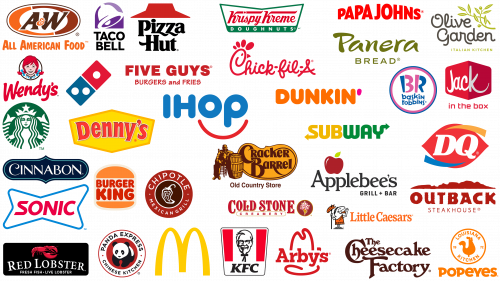
The fast food industry is not only a showcase of mouthwatering treats but also a battleground for brand supremacy, with logos serving as the banners under which these culinary giants unite. Symbols such as McDonald’s recognizable golden arches or Subway’s sleek logo have become cultural icons, immediately evoking thoughts of delicious food.
According to industry forecasts, the fast food market will reach $931.7 billion by 2027. Amidst this vibrant sector, with countless eateries catering to local tastes, the big players with their iconic logos dominate the spotlight and public discourse.
The success of these large fast-food chains is not only due to taste preferences. Branding plays a crucial role. These companies have carefully designed their visual identity to connect deeply with the audience. These brands evoke feelings and associations through the strategic use of mascots, each with its own story and character and the careful selection of color palettes. It’s not just about hunger but familiarity, warmth, and a sense of belonging. Every design choice, from font to hue, is a thoughtful move to cement a strong relationship with the consumer and keep them coming back for more than just food.
McDonald’s
The McDonald’s emblem, which has become the quintessential symbol of the fast food industry, serves as a beacon lighting up streets and highways on every continent. Unrivaled in the industry, McDonald’s has been a leader with a multitude of outlets spread across the globe.
Throughout its glorious history, the McDonald’s brand has undergone various metamorphoses. However, the famous “golden arches” remain an invariable element of its visual identity. This stylized image of the letter “M” went beyond a simple alphabetical meaning. Instead, it has become an emblem synonymous with fast food and global culinary culture.
Equally strategic is the choice of colors underlying the visual brand. The vibrant combination of red and yellow is not just a design whim. Research shows that this color palette can evoke feelings associated with hunger and appetite. This skillful use of psychology in branding shows McDonald’s deep understanding of its audience and that it takes its palates into account. In the crowded arena of fast food restaurants, this attention to detail has solidified McDonald’s position as a titan of the industry.
Starbucks
The Starbucks emblem is one of the most recognizable fast-food logos. The centerpiece of its emblem is the image of a siren – a charming figure from mythology on a background of green cloth. The symbolism of the siren calling for maritime adventure reflects Starbucks’ journey in the uncharted waters of coffee culture.
Throughout its existence, Starbucks has changed and improved its logo to reflect changes in its product line and corporate strategy. The current version, created in 2011, is a more streamlined depiction of a siren. This ethereal figure, rendered entirely in white, contrasts vividly with the rich green background, which enhances its visual appeal.
Starbucks skillfully uses this emblem in a multitude of touchpoints. Both on cups with the branded beverage and on a variety of products lining the shelves of retail outlets, the siren is ubiquitous. Thanks to such elements, Starbucks has cemented its status as a benchmark for fast food and beverages.
Subway
The Subway company, which appeared in 1965 in the United States, over the years has become a giant of the sandwich industry, present all over the world. The main products offered under this brand are sandwiches, wraps, and salads that are prepared according to individual preferences.
Subway terminology reflects the ethos of the brand. The term “sub” refers to sandwiches. When combined with the word “way,” it emphasizes the brand’s commitment to customization, allowing customers to create sandwiches that meet their unique tastes and dietary needs.
The brand’s visual style is characterized by a vibrant color palette of yellow and green. Yellow, often associated with joy and positivity, harmoniously complements green, symbolizing freshness and organic products. Together, these colors highlight the logo and subtly emphasize the brand’s uniqueness through the use of fresh and natural ingredients. Through strategic branding, Subway has positioned itself as a premier destination for those seeking a healthier alternative in the fast food industry.
Taco Bell
Throughout its history, the Taco Bell brand has undergone various transformations of the logo, each one aimed at capturing its essence while remaining relevant and modern.
The logo uses a vibrant color palette of purple, pink, white, and yellow. The central element of the logo, the “bell,” is very cleverly designed: in its center is a section resembling the silhouette of a taco, bordered by a golden outline that subtly hints at the brand’s core proposition.
The brand name, “TACO BELL,” is rendered in a robust sans-serif font. The capital letters give the wordmark a bold and authoritative feel. The combination of colors and design elements perfectly symbolizes the brand’s commitment to serving vibrant, flavorful, and iconic Mexican-inspired food.
Burger King
Established in 1954, Burger King quickly rose through the ranks to become a formidable player in the global fast food market. Despite the fact that in the beginning, the company was just another establishment specializing in burgers, it later cemented its position alongside iconic brands, with McDonald’s being one of its main competitors.
A significant part of Burger King’s corporate identity is its emblematic logo. The modern logo is a clear red word mark located between two bright orange semicircles, conjuring up the image of a burger, with the fiery orange hues symbolizing the buns. This design decision is not arbitrary; it reflects the essence of Burger King and serves as a visual cue to the appetizing delicacies one can expect when visiting its establishments.
Although the current version looks minimalistic, it has its roots in the more complex design that graced the company’s corporate identity from 1999 to 2020. The transition from the previous design to the current one is a testament to Burger King’s adaptability in keeping up with changing consumer tastes while remaining true to its core values and offerings.
Domino’s Pizza
Established in 1960, Domino’s Pizza has written its name in the annals of the global pizza industry. Thanks to the entrepreneurial spirit of James and Tom Monaghan, which began with the acquisition of a small pizza chain in Michigan, the company has grown into a pizza colossus with a ubiquitous global presence. As a result, Domino’s has become so recognizable that a simple symbol without a direct reference to the brand name is enough.
The modern emblem associated with Domino’s epitomizes its name – it resembles a domino shape. This symbol has an elegant structure consisting of two rectangular divisions, one of which is made in a rich red color and the other in blue. These rectangles are decorated with white circles, further cementing the domino tile image. It’s a testament to how a brand can evolve and adapt, bridging the past with the dynamic present.
Dunkin’, once better known as Dunkin’ Donuts, holds a significant place in American fast food, especially known for its coffee and donut offerings. With a rich history, the brand is expanding its horizons, making its way around the world. The brand’s widespread popularity is evidenced by its 12,900 outlets located in 42 countries.
Since its inception in 1950, the brand’s visual identity has undergone many changes. The constant evolution of the logo reflects shows Dunkin”s desire to remain relevant and appealing to an ever-changing demographic of customers. The current logo, characterized by simplicity and brightness, is a glowing orange wordmark. What makes the emblem quirky and memorable is the pink apostrophe, subtly alluding to the brand’s historic donut-shaped brand. This combination of bright hues embodies the vibrant spirit of the brand and its promise to deliver fresh and delicious treats. The straightforward and modern design ensures that the Dunkin’ style stays in the minds of customers and continues to symbolize a morning filled with aromatic coffee and mouthwatering doughnuts.
Pizza Hut
Pizza Hut, which has become a hallmark in the field of pizza-centric fast food establishments, is prominent on a global scale. The emblem that currently represents the brand has historical significance. It first appeared between 1974 and 1999. After a redesign and evolution, this iconic emblem returned to the U.S. in 2019, regaining its time-honored appeal.
Pizza Hut’s genesis dates back to 1958, marking the beginning of a journey that saw the brand grow into an international phenomenon. The brand proudly oversees an extensive network of 18,703 outlets located across the globe. But such a wide reach is not Pizza Hut’s only attraction. The brand operates under the umbrella of Yum Brands, which is one of the world’s largest owners of multiple fast-food outlets. This association further strengthens Pizza Hut’s position by intertwining its success with the achievements of its parent conglomerate.
Chick-Fil-A
Chick-fil-A, which has become a dominant figure in American fast food, has left an indelible mark with its uncomplicated but strong brand identity. The chain’s seemingly simple emblem is rife with subtleties that capture its essence.
The Chick-fil-A logo, located in the center of the bright red canvas, is typed in italic white font. Characterized by smooth and sprawling lines, this font effortlessly combines playful whimsy and sophistication. This combination resonates with a wide range of audiences, from young people looking for a quick bite to adults seeking a comfortable vacation.
The brand skillfully integrates a visual cue into its logo that hints at its signature offerings. The initial “C” in the tagline artfully echoes the silhouette of a chicken, thus emphasizing that Chick-fil-A specializes in poultry delicacies. Such clever design nuances not only contribute to the brand’s memorability but also demonstrate its commitment to its core offerings, ensuring that Chick-fil-A’s core message is always present in the minds of consumers.
KFC
KFC, an acronym for Kentucky Fried Chicken, holds a prestigious place in the annals of fast food history. Beginning its journey in 1952, the brand has undergone significant evolution over the decades, reflected in the various incarnations of its logo. However, the classic serif font used to inscribe “KFC” and the indelible image of the brand’s founder, the Colonel, remain constant elements.
The image of the Colonel is not just an image of a man but a symbolic figure that evokes a sense of tradition, quality, and authenticity. It demonstrates the power of a well-designed mascot, emphasizing its ability to resonate with consumers and give depth to the brand’s identity. When people see this iconic figure, thoughts of crispy chicken and a unique blend of herbs and spices come to mind.
KFC is a formidable entity. It competes for market leadership with established brands such as McDonald’s and Burger King. While each brand showcases its distinctive culinary offerings and signature styles, its shared ambitions are clear: to expand its reach and conquer taste buds on a global scale.
Panera
US-based Panera Bread is known for a wide range of dishes, from pasta and salads to a variety of baked goods; the brand has become synonymous with quality and diversity in culinary offerings.
Over the years, the brand’s visual identity has undergone significant changes. Initially, the logo was a symbolic figure holding a flatbread, illustrating the brand’s commitment to the bakery and its centrality to the range. However, the winds of change have led to a more streamlined and minimalist approach to the brand’s design.
A striking aspect of the updated style is the word mark, rendered in olive green. This color, often associated with freshness and organic products, blends seamlessly with the brand’s commitment to natural and wholesome ingredients. This thoughtful design decision communicates the brand’s values and ethics, emphasizing its commitment to artisanship, handmade craftsmanship, and unique culinary recipes. Through these design elements, Panera Bread blends its rich history with modernity to appeal to a wide range of customers.
Wendy’s
Wendy’s, a well-known name in the fast food market, has left an indelible mark on the public’s memory with its iconic red-headed figure. More than just an emblem, this character has metamorphosed in the digital age, utilizing the power of social media to engage with audiences in new ways.
The modern version of the Wendy’s logo pays homage to its roots while reflecting contemporary design concepts. It incorporates a handwritten word mark with the quintessential fast food color red and reflects the essence of nostalgia intertwined with freshness. The wordmark is complemented by an illustration featuring a Wendy’s character, characterized by the signature red hair. An intricate design detail – ruffles around the collar subtly hinting at the word “mom” – gives the brand’s persona a warm and familiar feel. This emblematic image reflects the brand’s journey, symbolizing its heritage.
Chipotle
Emerging as a beacon of Mexican culinary delights in fast food, Chipotle, more formally known as Chipotle Mexican Grill, stands out in a crowded marketplace for its unique blend of flavors and quick-service approach. With a global reach that spans not only its native United States but also the shores of the United Kingdom, the cultural centers of France and Germany, and the vastness of Canada, the brand’s reach is unmistakable.
Chipotle’s logo is a striking visual representation that encapsulates the essence of its culinary offerings. Dominating the emblem is an image of a Chipotle pepper – a smoked and dried jalapeño, synonymous with the brand’s name and its penchant for distinct flavors. This pepper is highlighted by a distinctive swirl in the center, suggesting the dynamic combination of flavors and fresh ingredients that the brand prides itself on.
The color palette, rich in burgundy and red hues, evokes the sense of heat and spice that is characteristic of the brand’s Mexican culinary line. Such vibrant colors reinforce the brand’s ethos and point to the essence of its menu – a delectable assortment of customizable burritos and tacos prepared to individual preferences. Through visual and culinary cues, Chipotle successfully offers a gastronomic journey that pays homage to traditional Mexican cuisine while focusing on contemporary flavors.
Sonic
Sonic, often referred to as Sonic Drive-In, is an iconic drive-in restaurant chain characterized by its style of operation. It is part of the umbrella corporation that also controls Arby’s, indicative of the parent company’s diversified approach to running fast food businesses.
A characteristic feature of Sonic is the use of “carhops” as wait staff, gracefully maneuvering on roller skates. This gives the restaurant a nostalgic and entertaining character and serves as a testament to the brand’s commitment to preserving tradition. To celebrate this unique aspect, Sonic holds regular competitions to determine the best roller-hop team from its extensive network of establishments.
Sonic’s iconic logo reflects a simple yet impactful branding strategy. It is based on a crisp sans-serif font, displaying the brand name in bright red. The brand name is further emphasized on a white background designed in the shape of a butterfly. An outer outline in bright blue completes the design, encapsulating the logo and giving it a modern appeal. With these design nuances, the logo captures the essence of Sonic’s ethos in the fast food sector.
Olive Garden
Founded as a beacon of American-Italian culinary collaboration, Olive Garden combines the rich gastronomic heritage of Italy in an American atmosphere. Offering a wide variety of Italian-inspired dishes, the restaurant positions itself as a “gateway” that allows numerous diners to enjoy a taste of Italy without traveling far from home.
The signature element of the restaurant’s corporate identity is the elegantly designed logo. Smooth, cursive font not only gives sophistication but also reflects the restaurant’s desire to create an unquestionably Italian atmosphere. The logo is not just visually appealing; it reflects the ethos of the establishment, offering an immersive dining experience based on time-honored traditions.
In addition to skillful typography, the logo utilizes an olive branch, a deliberate design choice that has a multifaceted meaning. Not only is the olive branch a visual element to ensure brand memorability, but it also symbolizes Olive Garden’s commitment to using ingredients consistent with Italian culinary principles. Embedded in this symbol is a promise: diners can expect dishes made with authentic ingredients that reflect the heart and soul of Italy. Amidst the plethora of eateries, Olive Garden’s carefully considered branding sets it apart, making it a popular destination for those who crave Italian-inspired cuisine.
Papa John’s
Papa John’s Pizza is one of the most famous names in the fast food market, especially in pizza delivery. Ranking fourth among the largest pizza delivery chains in the United States, it was founded by founder John Schnatter.
When analyzing the visual identity of Papa John’s, one can identify the rectilinear word mark in a blocky sans-serif font. Each letter is capitalized, giving the brand authority and consistency. The striking feature of this design is its bright red hue. This color increases the recognition of the logo and strategically positions Papa John’s in line with other heavyweights in the fast food industry, especially those who share the culinary space of pizza.
One of the most subtle nuances in Papa John’s logo design is the smooth crescendo in letter size. Increasing the size of the letters towards the center of the logo creates a subtle curvature. This design choice gives the logo a dynamic and forward motion, making it in a highly competitive fast food industry.
Dairy Queen (DQ)
Dairy Queen, often abbreviated as DQ, has been in the annals of American fast food history since its founding in 1940. The brand, which specializes mainly in soft-serve ice cream, has successfully distributed its sweetness to numerous outlets in 27 countries around the world.
The visual style of Dairy Queen is a harmonious combination of simplicity and elegance. The dominant letters, “DQ,” executed in a classic serif font, contrast with a modern oval background – this combination of classic font and modern geometric shape creates a dynamic balance in the emblem. The vibrant color palette makes it more noticeable and gives it a playful vivacity. This combination of color and design gives the logo both a light-hearted charm and sophisticated grace, echoing the brand’s ethos of delivering delicious treats with consistent quality.
Arby’s
Among American sandwich chains, Arby’s holds a special place, especially for those who prefer premium meats like turkey, beef, and steak. The mere mention of the name stirs the culinary imagination, and the brand’s recognizable logo plays an important role in this.
Arby’s corporate style is based on an uncomplicated and effective emblem. It is a word mark with serifs, emphasizing the authority and longevity of the brand in the market. Above this font is a clear outline of a cowboy hat.
The cowboy hat is not just a random design element; it points to the brand’s offerings. It subtly hints at rustic, authentic, and hearty cuisine reminiscent of the vast American plains and the rugged life of cowboys. It is this emblematic design detail – the cowboy hat – that has long been a consistent part of Arby’s brand, reinforcing its heritage and consumer trust.
Jack in the Box
In 1951, Jack in the Box carved out a significant niche in the American fast food industry, and its legacy has stood the test of time. Over the years, this well-known chain has gained the attention and love of burger lovers from coast to coast, offering a diverse menu to satisfy the tastes of Americans.
The visual style of Jack in the Box is a harmonious blend of simplicity and appeal. Central to the branding is the emblematic logo, where the name “Jack” stands out in white against a bright red background reminiscent of a box. This design subtly echoes the brand name and emphasizes its memorable character. Below this image, the phrase “in the box” is subtly inscribed in a regular sans-serif font, further emphasizing the brand name. This design captures the essence of the brand: straightforward, eye-catching, and unmistakably American.
Five Guys
Five Guys LLC, simply known as Five Guys Burgers and Fries, debuted in the gastronomic world in 1986. Since its inception, the brand has become influential in the global fast-food arena. The brand’s ethos is based on simplicity and quality, and the menu consists of staples such as fries, burgers, and hot dogs cooked to order. As a testament to its growing popularity and craftsmanship, the company has rapidly expanded its presence around the world.
Five Guys takes a minimalistic yet impactful approach. The brand’s emblem is rendered in a bold and crisp sans-serif font, ensuring immediate recognition. The robust wordmark exudes confidence and solidity, reflecting the brand’s commitment to consistent quality. The phrase “Burgers and Fries” often accompanies the main mark, giving it a quirky feel and emphasizing the brand’s offerings. It is presented in a casual and slightly playful font, balancing formality and informality in the brand’s visual representation.
Little Caesars
In the annals of the global pizza industry, Little Caesars has firmly established its name since its founding in 1959. Spanning across continents, this renowned pizza chain has carved a culinary niche for itself by offering a multitude of pizza flavors to customers in a variety of countries. Speaking of the company’s position in the pizza arena, especially in the United States, Little Caesars holds a respectable third place, vying for prominence with such stars as Pizza Hut and Domino’s Pizza.
An important element that reflects the brand’s ethos is its signature logo. It creatively blends antiquity and modernity by depicting a cartoonish Roman figure. This figure, reminiscent of the bygone Roman era, intriguingly holds a pizza slung on what appears to be a staff. This fusion of eras, where ancient Roman motifs are intertwined with modern images of pizza, makes the logo recognizable and resonates with a wide audience.
Complementing the visual image is the brand mark. This serif font in a mesmerizing orange hue not only identifies the brand but also subtly hints at its refined sensibility and deep heritage. Through branding elements, Little Caesars positions itself not only as a pizza purveyor but also as a brand that values tradition and history while offering its customers delicious slices.
Denny’s
Denny’s, often referred to as Denny’s Diner, stands out as a prominent diner-style establishment with more than 1,700 locations. Founded decades ago, the chain has entered the culinary world by offering a combination of traditional and contemporary American fare.
The visual identity of Denny’s continues its legacy, as evidenced by its logo, which has remained unchanged since 2002. The design elegantly embodies the brand’s ethos, emphasizing simplicity and relatability. The name “Denny’s,” in a distinct sans-serif font, is highlighted in a bold red shade that contrasts vividly with the golden yellow background. This combination of colors not only increases its recognizability but also creates an atmosphere of warmth and hospitality that the brand promises to its visitors. The straightforwardness of the design complements the brand’s straightforward approach to offering hearty meals in a friendly environment. The combination of colors and design elements provides an impactful and easily recognizable logo, which is in keeping with the diner’s long-standing reputation in the food service industry.
IHOP
Founded in 1958, International House of Pancakes, commonly known as IHOP, has firmly established a niche in American cuisine. Owned by Dine Brands Global, IHOP is widely recognized for its mastery of delicious pancakes and a variety of breakfast foods. And while the brand has evolved its offerings over time, adding dishes like burgers, the essence of IHOP undoubtedly lies in its iconic pancakes.
IHOP’s visual emblem is an eye-catching logo that not only draws the eye but also evokes pleasant associations for regular visitors. The bright blue font of the logo serves as an unmistakable brand marker. One of its distinguishing features, however, is the discreet red curve underneath, reminiscent of a barely perceptible satisfied grin. This element is not just a design move; it reflects IHOP’s commitment to offering unforgettable food. It also emphasizes the brand’s affability and friendliness, setting it apart in the competitive restaurant arena.
In the bustling fast food and casual dining industry, where restaurants compete for consumers’ attention, IHOP’s distinctive logo and brand ethic serve as an anchor, reminding diners of the hearty meals and warm experiences that await them.
Baskin-Robbins
Baskin-Robbins was born in 1945 and has carved out a niche for itself in the fast food sector by offering ice cream and cakes rather than the usual salty treats. This brand, which originated in the United States, claims to be the most extensive chain in the world, specializing exclusively in ice cream.
A deeper examination of the brand’s visual style reveals a design rich in subtle nuances. The logo embodies a fun and welcoming atmosphere encapsulated in two concentric circles. Rendered in playful shades of pink and blue, it reflects the brand’s ethos: a combination of fun, youthfulness, and an invitation to relaxation. The colors seamlessly reflect the fun and quirky offerings on the menu, providing an instant connection with diners, young and old.
The Baskin-Robbins logo goes even further in its design narrative. The pink portions of the letters “B” and “R” combine to depict the number “31.” This isn’t just a design quirk; it’s a nod to the brand’s history, signifying the original number of ice cream flavors it introduced. This thoughtful inclusion demonstrates the brand’s commitment to its heritage and brings an element of surprise and delight to those who notice it.
Popeyes
Popeyes Louisiana Kitchen, which gained fame as one of the key players in the fast food sector with a focus on fried chicken delicacies, began its gastronomic journey in 1972. Since its inception, the brand has evolved dynamically, periodically refining its visual identity. In the transition from one logo to the next, bold serif typography has been vividly displayed, lending a whimsical character to its presentation.
The Popeyes logo is rendered in a captivating orange hue, giving it a warm and vibrant feel. The top part of the emblem is a vintage stamp reminiscent of a bygone era. It is centered on the image of a chicken, paying homage to the brand’s main product. Surrounding this avian illustration are the words “Louisiana Cuisine” printed in a straight sans-serif font. As a tribute to the brand’s heritage, the number 1972 is painted on the stamp, a testament to the brand’s long journey and rich culinary history.
Outback Steakhouse
Outback Steakhouse occupies a unique niche in the competition of Australian-style eateries. Despite the fact that this restaurant chain is from the USA, it offers its visitors a flavorful journey to Australia, offering a carefully selected menu in which a special place is occupied by hearty steaks and spicy pasta.
Paying homage to Australian culture, the brand shows itself not only in the dishes offered but also in the visual design. The logo, while simple in design, tells the story of Australia’s untouched regions. It visually represents the vast and rugged terrain, conjuring up images of the vast Australian wilderness. Above it is the bold “OUTBACK” lettering, clearly indicating the brand’s thematic inspiration.
The emblem uses capital letters for the words “OUTBACK” and “STEAKHOUSE.” This design decision has a dual purpose. Firstly, it emphasizes the brand’s connection to the wildlife of the Australian regions, echoing its namesake. Secondly, it provides brand recognition in a field overflowing with multiple logos and themes. Outback Steakhouse’s branding is a great combination of theme and design, giving it a strong foothold in a busy market.
Red Lobster
Distinguished by its specialization in seafood offerings, Red Lobster occupies a unique niche among casual dining establishments. While Red Lobster is primarily known for its wide variety of seafood delicacies, it prides itself on serving fresh and live lobster, which sets it apart from typical fast food establishments.
The Red Lobster emblem stands out prominently. The carefully crafted image of a red lobster takes center stage in its design, emphasizing the uniqueness of the establishment to seafood dishes. This iconic crustacean reinforces the brand name and serves as a symbolic ambassador, representing the quality and freshness that diners can count on.
Complementing the lobster illustration is the restaurant’s name, rendered in a sophisticated serif font and elegantly positioned above two descriptive taglines. The words “Fresh Fish” and “Live Lobster” are positioned below the main tagline, emphasizing the brand’s commitment to sourcing and delivering the freshest seafood to customers. Through these design elements, the logo effectively reflects what Red Lobster represents in the culinary world.
Applebee’s
The fast food industry in the United States features a variety of well-known brands, among which Applebee’s stands out. Originating in the United States, Applebee’s boasts a wide network of restaurants across the country. This brand emphasizes the essence of casual dining by offering a wide range of popular dishes catering to a wide audience, including staples such as pasta, burgers, and various chicken preparations.
When looking at Applebee’s logo, there is an immediate association with its name. The dominant emblem is a glowing red apple strategically placed to catch the eye. Beneath this visual element is a carefully chosen font in a classic serif style that spells out the brand’s name. At the bottom, adding to the brand’s personality and perhaps hinting at its offerings, are the words “Grill & Bar,” allowing customers to understand the range of culinary specialties awaiting them.
The Cheesecake Factory
The Cheesecake Factory is a beacon of culinary delight, known primarily for its variety of cheesecakes and delightful savory dishes. Its reputation depends on the unrivaled quality matched with elegance that customers associate with the brand.
The logo is a complex aspect of branding that resonates deeply with the brand ethos. The typeface is strong, rounded, and adorned with vibrant strokes that give it sophistication. This meticulous design blends seamlessly with the brand image, clearly demonstrating the brand’s commitment to excellence. The use of only two colors in the design gives it a timeless feel and provides versatility, allowing it to be easily adapted to different media platforms.
The Cheesecake Factory’s unwavering commitment to its brand is evident, as the logo has remained unchanged since its founding in 1978. This consistency underscores the brand’s desire to preserve its history and continue to conquer the tastes of its customers.
Cold Stone Creamery
A well-known name in the American dessert market, Cold Stone Creamery has carved out a niche for itself with its unique approach to ice cream making. Standing out among many others, this brand offers ice cream that is not only made in-house but also catered to individual preferences. Despite appearing in the annals of fast food history relatively recently, in 1988, the company’s journey has been marked by diversification. In addition to its core assortment, Cold Stone Creamery today delights diners with an expanded menu that includes sandwiches, pies, and delicious ice cream cakes.
Cold Stone Creamery’s logo exudes a sense of time-honored tradition. The choice of a serif font combined with the intricate image of an ice cream cone gives the brand an aura reminiscent of a bygone era. Given the brand’s relatively modern origins, this design choice may seem paradoxical. However, this intentional juxtaposition gives Cold Stone Creamery the appeal of centuries of experience and craftsmanship in a modern context. It’s a nod to artisanal craftsmanship in the face of the fast food industry’s rapid evolution.
Cinnabon
In the busy arena of fast food branding, the Cinnabon emblem stands out for its distinctive blend of classic elegance. Unlike the casual or modern designs associated with fast-food restaurants, the Cinnabon logo conveys a sense of tradition and sophistication. The wordmark is enclosed in a scroll-shaped frame, evoking old-world craftsmanship and attention to detail.
One particularly intriguing design element is the initial “C” in the brand name. The stylized, twisted shape of the letter “C” not only adds an artistic twist, but also subtly echoes the signature spiral that adorns the famous Cinnabon cakes. This thoughtful design brings to mind the sweet cinnamon buns for which the brand is famous, inviting customers to experience the pleasure that awaits them. Through design nuances, the Cinnabon logo has managed to create a harmonious blend of artistic excellence and product representation, making it both memorable and symbolic of the brand’s offerings.
Cracker Barrel
Cracker Barrel’s logo stands out in the vast sea of fast food logos with a more sophisticated design. Founded in 1969, the visual style of this brand is a detailed illustration of a figure resting beside a barrel. This design element and the golden yellow oval background for the word mark “Cracker Barrel” resonate deeply with the observant eye.
The palette, dominated by shades of brown, reflects the rich and warm atmosphere of the earth, evoking timeless traditions. The logo detailing emphasizes the brand’s commitment to its roots, harkening back to the classic heritage of the South. This intricate approach to design is a testament to the brand’s historical depth and a strategy to stand out in a market filled with minimalist and modernist symbols. In this logo, one can see more than just a logo but feel the warm embrace of Southern hospitality and the rich tapestry of stories woven over decades of existence.
Panda Express
Establishing itself as one of the best Chinese food restaurants, Panda Express boasts an impressive presence in more than 2,200 locations across the United States. This vast territory confirms its reputation as paramount in the Asian restaurant sector. Initially, Panda Express found its niche in familiar locations such as shopping malls and food courts. However, over time and through strategic expansion, the brand entered many other venues, increasing its reach and resonance.
If we pay attention to the visual identity of the brand, there are several notable elements. First of all, it is a complex typography, executed in a characteristic style with serifs and subtly hinting at the brand’s deep connection with Chinese culture. Complementing the typeface is the phrase “Chinese Cuisine,” succinctly emphasizing the brand’s culinary prowess and offerings. But perhaps the most striking element of this visual ensemble is the emblematic image of a panda. More than just a mascot of the same name, this symbol easily makes contact with the audience, evoking a sense of authenticity, tradition, and depth of Chinese culture.
A&W Restaurants
In the rich tapestry of American fast-food brands, A&W Restaurants stands out as a testament to enduring appeal and branding success. Founded in the early 20th century, specifically in 1919, the company began not with an extensive menu but with a single, tantalizing offering: rich, frothy root beer. It was the vision of Roy Allen, who started from a humble roadside spot, intent on introducing passersby to this uniquely delightful beverage.
A&W Restaurants has grown and evolved but has remained connected to its roots. The “All American Food” tagline that adorns their brand indicates an expansion of their menu, but they are still widely known for their signature drink of root beer floats.
A look at the brand’s logo confirms this heritage. It is dominated by brown tones, reminiscent of the deep amber hue of the famous root beer. It serves as a visual bridge to the days when Roy Allen’s drink laid the foundation for the brand that has become synonymous with American fast-food culture. The design choice, while subtle, is a slight nod to the beverage that catalyzed the establishment of the fast food titan.
Krispy Kreme
Krispy Kreme, an established manufacturer of sweet treats, boasts a distinctive emblem that stands out in the bustling world of fast food branding. The emblem, aptly nicknamed “Bounty,” has stood the test of time, retaining its basic design since its introduction in 1937 thanks to creator Benny Dinkins.
The centerpiece of the design is an eloquent cursive font signifying the brand name “Krispy Kreme,” which gives it an elegant and nostalgic feel. It contrasts with a straightforward, unapologetic sans-serif font denoting the company’s main product: donuts. This font combination effectively communicates the brand’s heritage and straightforward promise of delicious donuts.
The color palette, which harmoniously combines red and green, emphasizes the brand’s identity and creates a festive, almost holiday-like atmosphere. This combination, perhaps subconsciously, evokes a feeling of warmth and celebration, which goes well with the joy that often accompanies eating the famous doughnuts.
Popular Fast Food Logos
In the fast food industry, the importance of distinctive logos cannot be overlooked. Each logo embodies a certain essence, reflects the brand’s ethics, and appeals to the target audience. Examining the logos of famous fast-food restaurants reveals the key strategies and creative nuances of modern establishments that ensure the memorability and resonance of their branding.
These emblems, despite their apparent simplicity, are the result of careful design. They embody the brand’s heritage and align with current market trends, allowing them to remain both timeless and contemporary. Whether it’s the color scheme, font, or image, each element plays a key role in connecting with the consumer.
Understanding the intricacies of creating these logos provides a glimpse into the dynamic world of branding in the food industry. It emphasizes the importance of visual identity to create a lasting impression, build loyalty, and set yourself apart in a competitive marketplace.
